Hello GoMediaZine/Arsenal blog readers! Simon here with a new step-by-step tutorial. We will be leveraging the contents of our brand new Crest of Arms vector pack to create a poster for the release of PWR.CLRS’ first, self-titled, album. We’ll talk about inspiration, layout exploration, and execution.
Buy the Crest of Arms Vector Pack
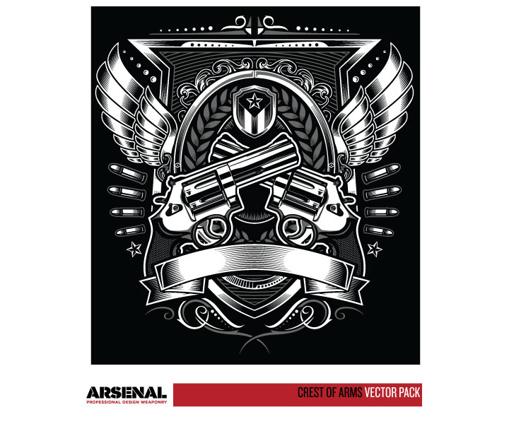
The brief
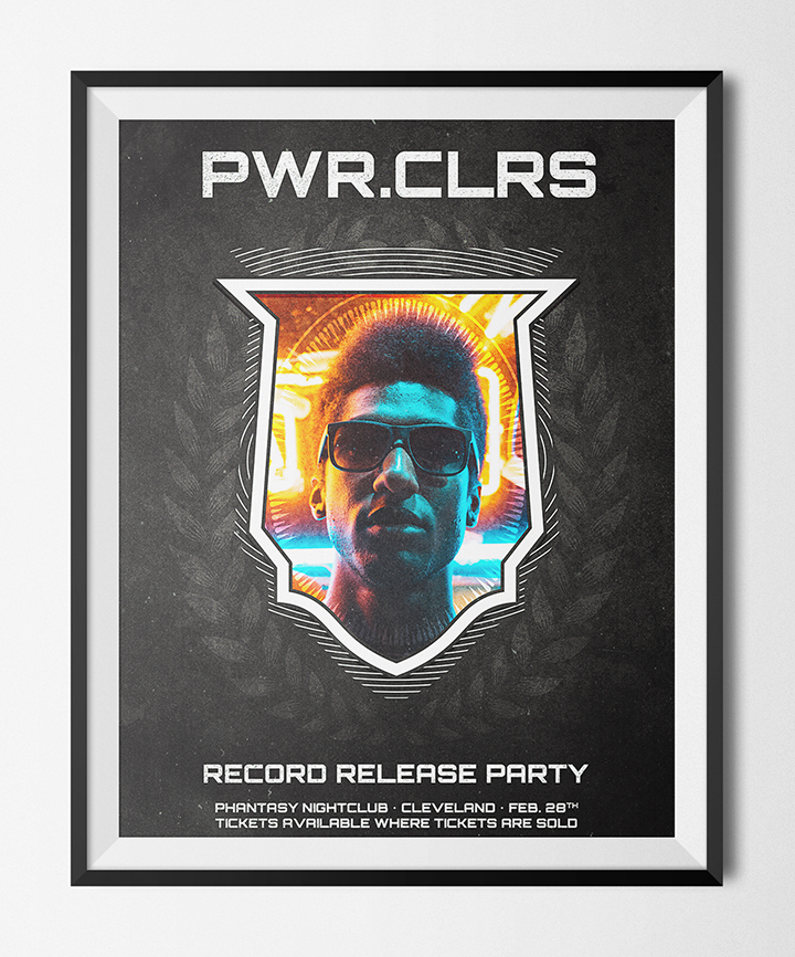
Our framework for the tutorial is that we’ve been contracted to create a poster for up and coming musical act PWR.CLRS. The experimental musician is based in Cleveland, and produces a mix of hard-hitting electronic beats, distorted guitars, and spoken word surrealistic poetry. He’s releasing his first record, and needs to let the masses know about the fun night ahead. As we’re pressed for time, we’ll be leveraging the library of visual assets provided by the vector set to speed up our design process.
Gathering some inspiration, and putting a concept together
Buy the Crest of Arms Vector Pack
The inspiration from this piece came from three different sources: the vector pack itself, a superb portrait bathed in neon, and wide array of album art examples.
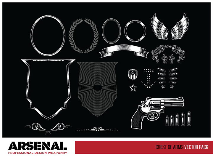
The vector pack features a lot of clean cut, precisely drawn shapes, with careful highlights, shadows, and ornaments. The elements that immediately jumped at me were the shield shapes (actual shield, circular patterned version), the stalks, and some of the oval frames. Although all the elements are exquisitely drawn, their complex highlight and shading made them hard to mix with other elements. We’ll look at techniques to remove some of the fluff.
The next bits of inspiration came from two photos available from the wonderful collections over at Unsplash. The first photo is this striking night portrait, taken by Alex Iby. I knew rapidly this would become my centerpiece element.

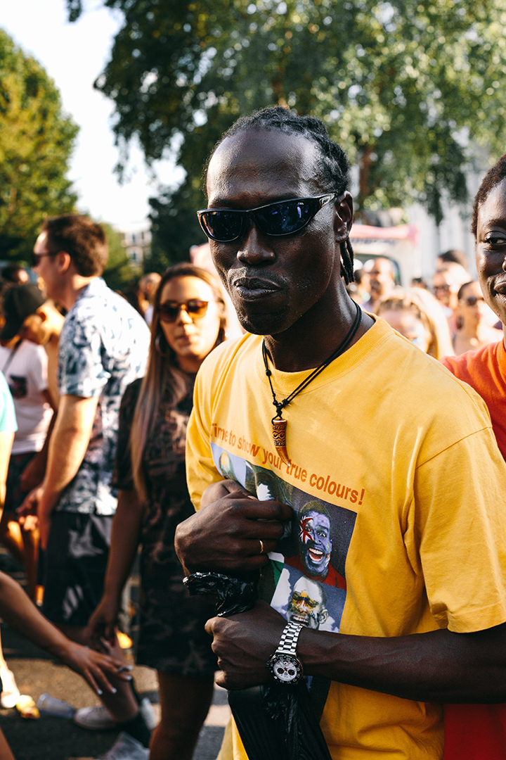
The second photo that helped to shape the piece was this other portrait, taken by Jay Clark. The slogan on this gentleman’s shirt was the key to the band name. I started with TRVE.COLORS, which morphed to PWR.CLRS (Power Colors).
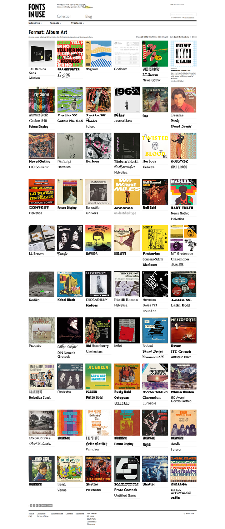
Lastly, the amazing library of album art through the ages hosted at Fonts In Use proved good jump-starting material.
With the elements in hand, it became clear that the shield shapes would support, and frame, our neon portrait. A dark background featuring white text would make for increased contrast. Some additional visual elements (stalks), sprinkled with some textures would tie the whole piece together.
Additionally, we’re locating this era-defining performance at the Phantasy Nightclub in Cleveland (Lakewood), OH. The Phantasy is a special place:
“Nine Inch Nails debuted at the Phantasy. The Ramones, Iggy Pop, the Pogues, the Damned, the Psychedelic Furs, the Cramps, Motorhead and the B-52s all played there. The Phantasy was also fertile soil for Cleveland’s ascending 1970s and 1980s music scenes (…)”
(via this old news article)
Let’s set a date of February 28th for the performance, and indicate that tickets are available everywhere.
The execution
A few technical notes and reminders
We are going to use both Photoshop and Illustrator for this piece. Photoshop is were 99.9% of the work will happen, but Illustrator will be necessary for opening the pack’s files, and to customize the vector elements themselves.
We are going to work extensively with textures. It’s a good time to remind you guys of a few base rules, and processes:
- Don’t know what a clipped layer is? Glad you asked! This means that the layer is only visible/applies to the layer directly below it. You can very quickly do this by holding ALT down on your keyboard and clicking between the two layers. Here’s a quick demonstration.
- Every time we’ll work with textures, we’ll follow this simple process: place as smart object, sharpen1, desaturate, enhance contrast with levels, and modify the blending mode.
- Placing the textures as smart objects, and using adjustment layers to tweak them, allows us to stick to a non-destructive workflow. We’ve explored in depth the numerous pros and few cons of such a workflow in this past tutorial: “How to Use Textures The Right Way.”
Notes: 1 – accessed through the Filter > Sharpen > Sharpen menu.
With this in place, it’s time to get started!
Document setup
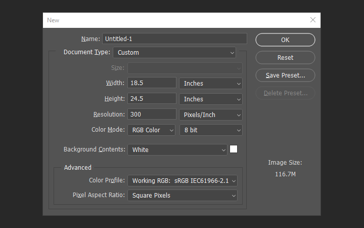
We’re working with an 18″x24″ canvas. I made mine 18.5″x24.5″, in order to work in some bleed area. I’m at 300 ppi, and using RGB, as some of the texture magic happening in the finishing touches rests on it.
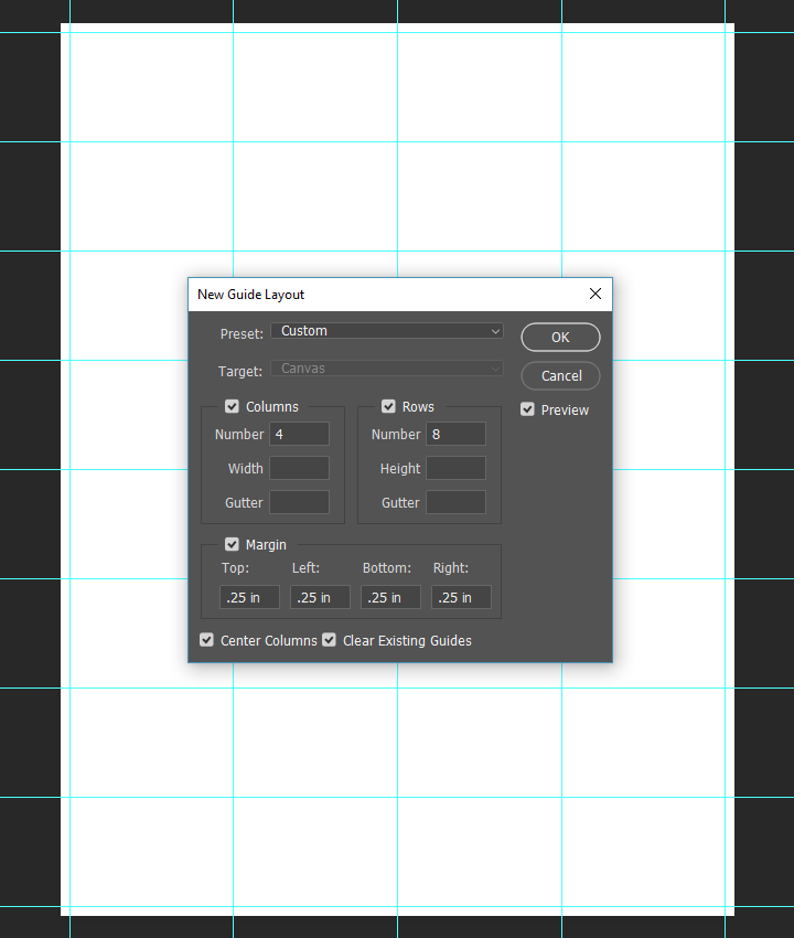
Next, we’ll use the automatic guide tool (View > New guide layout) to create a grid to align our elements on. We’ll be using four columns, and eight rows. The margins are set at .25″, so the inside of our outer guides will be our 18″x24″ canvas.
Main elements: the portrait
If you haven’t yet, grab Alex’ portrait over at Unsplash.

Let’s place it as a smart object in our document. It’s sized at 22.5% of its original height and width, and its center is located at X: 9.25″, and Y: 13″.
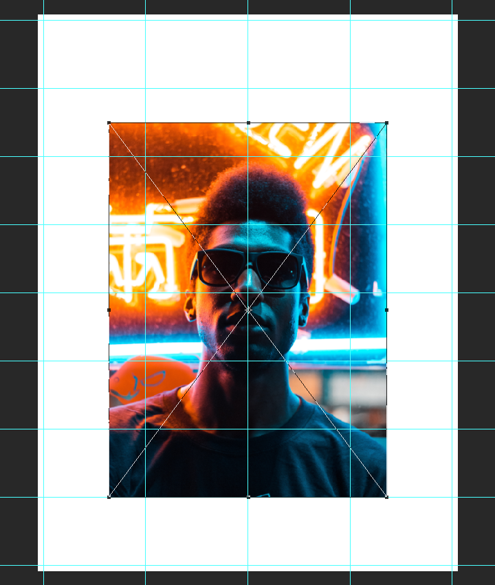
Next, we need to change the color of the background to #231f20 (a rough equivalent to CMYK rich black).

Main elements: the vectors
It’s time to grab the assets we’ll need from the vector pack. Let’s start by opening it in Illustrator. All of the ones we’re interested in are on that first artboard. I’ve highlighted them in red:
- The shield
- The “circular patterned” shield
- The wheat stalks
- The oval “toothed” frame
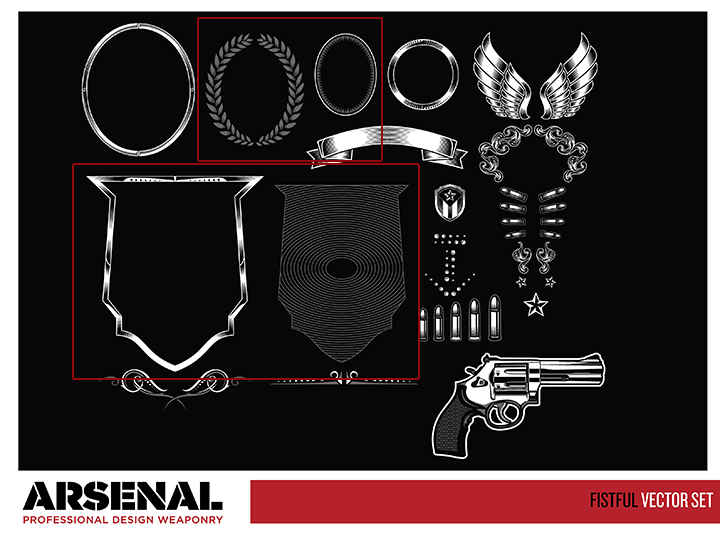
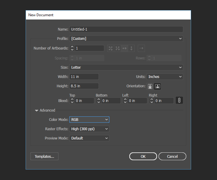
Let’s start by copying all of these in a new, empty Illustrator document to remove some of the clutter out of the way. I suggest a sheet that is at least 8.5″x11″, and in RGB color mode (to match the PSD document). A dark background (#231f20 for instance) will also help us to see our modifications to the assets more clearly.
Next up: to copy and paste these four assets to the empty Illustrator document.
Prepping the shield
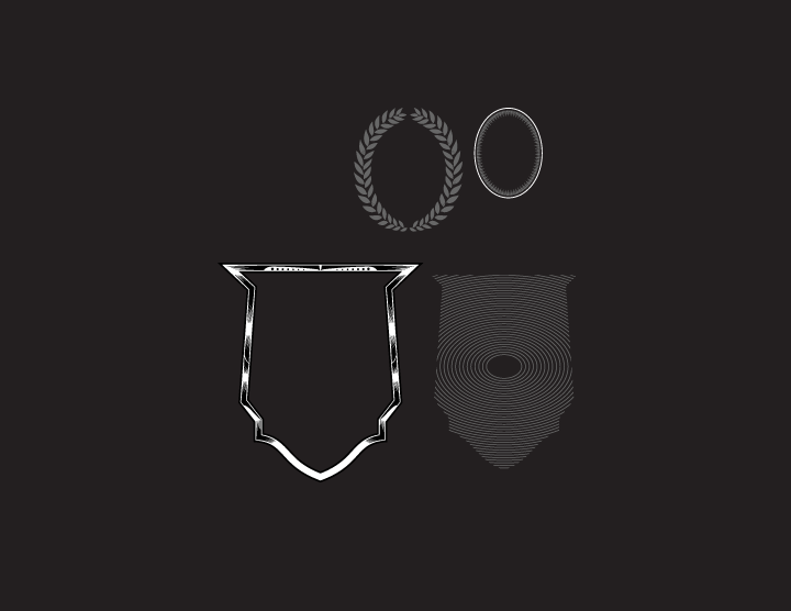
The main change we need to make is to remove all the fluff from that main shield shape. All the shading do-dads have to go. The fastest solution is to ungroup the asset (Right click > Ungroup), to manually select all of the extra elements by hand, and to erase them.
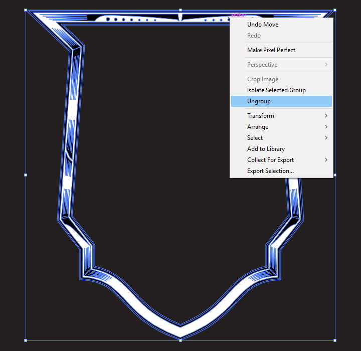
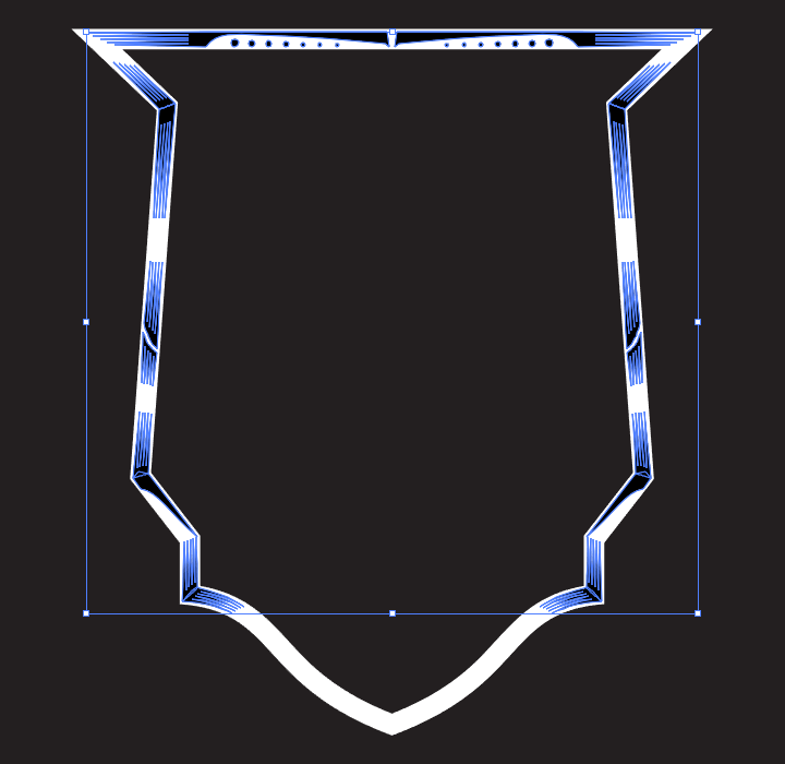
At that point, we’re left with this neat, thick, white shield.

Next, we simply have to paste it in our Photoshop document, as a smart object. It’ll be sized 425% of its original size, and its center placed at X: 9.25″, and Y: 12.25″.
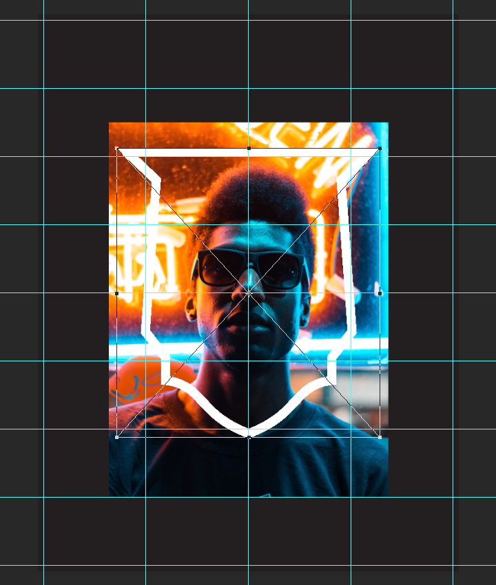
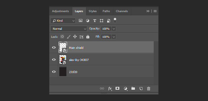
Once in place, this is what our layer stack looks like: the background, the smart object photo, and the smart object shield.
Masking the image using the shield
One of Photoshop many useful features is the ability to click on a layer thumbnail, and to load its content as a selection. Let’s click on the shield layer thumbnail while pressing the CTRL (PC) or CMD (Mac) keys to load it as our selection.
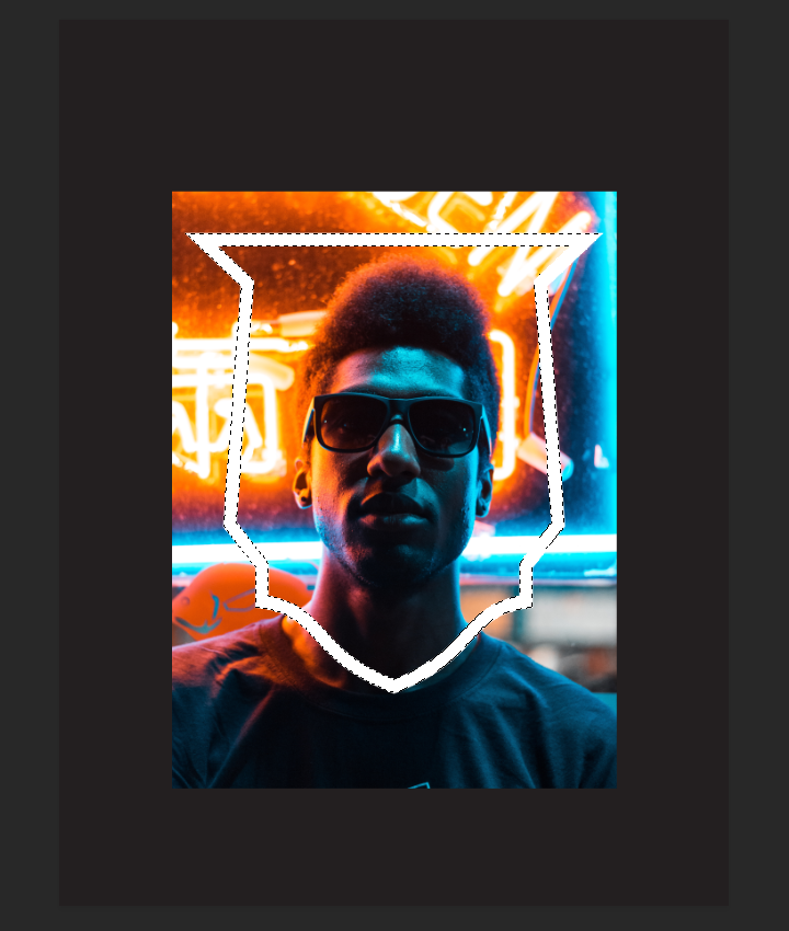
From there, with the photo smart object highlighted in the layer palette, we can simply click on the Add layer mask shortcut at the bottom of the palette to start the masking.
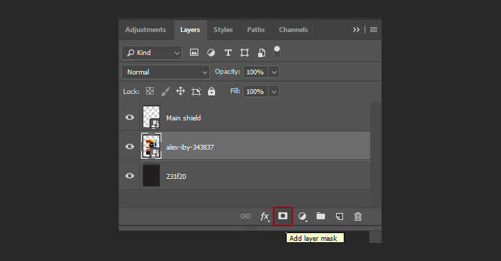
Et voilà, we have a mask in place. It isn’t showing/hiding the right thing yet, but we’ll get there shortly.
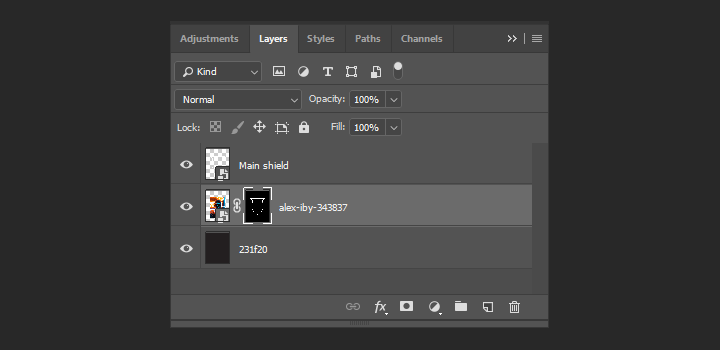
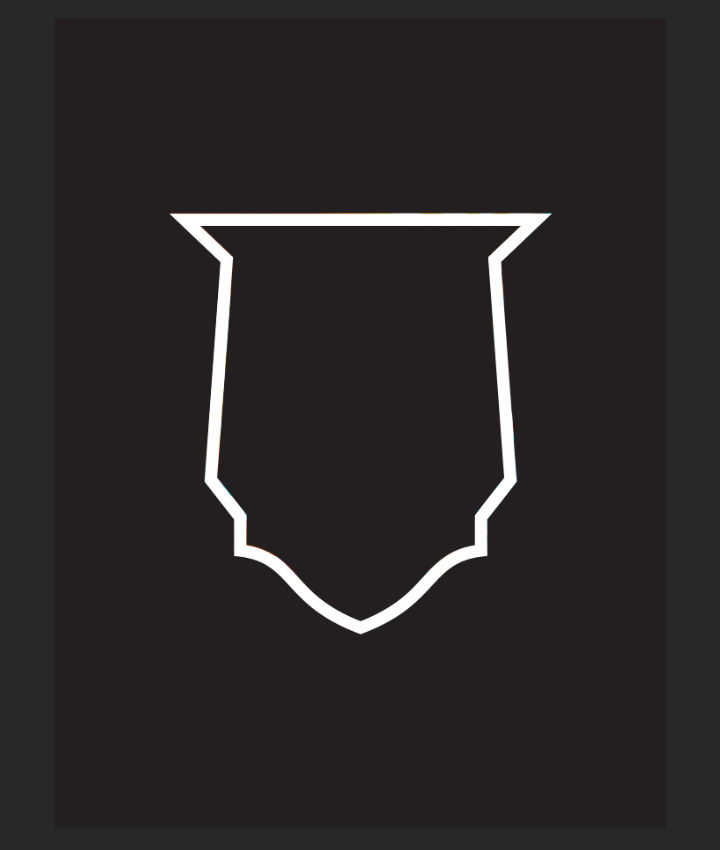
If we click on the layer mask thumbnail and press ALT/OPTION at the same time, we can have access to, and edit, its content. We’ll start by inverting the image, so it shows the proper thing.
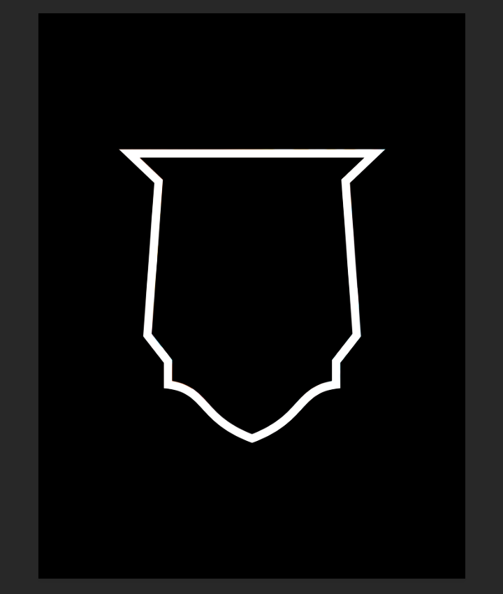
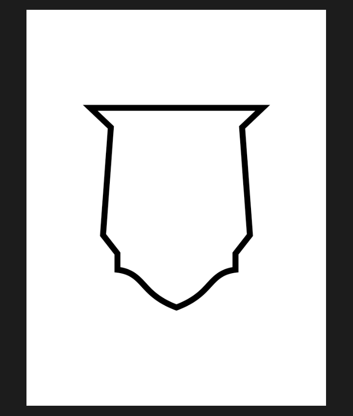
Better, but we also need to mask the photo past the edges of the mask.

Let’s go back to our mask view (click + ALT/OPTION), and paint the outer side of the shield edge in black as well to hide the rest of our portrait.

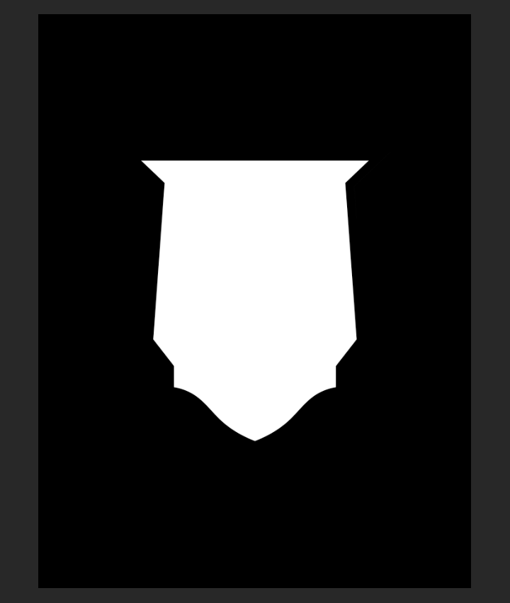
If you use the paint bucket to quickly fill the area, remember to use a solid paintbrush to clean the seams.
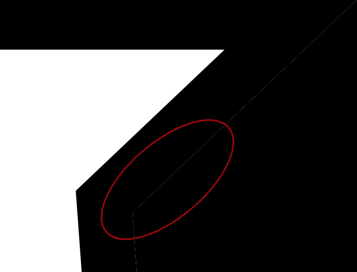
And with that work done, the photo is properly masked!

A bit of extra depth
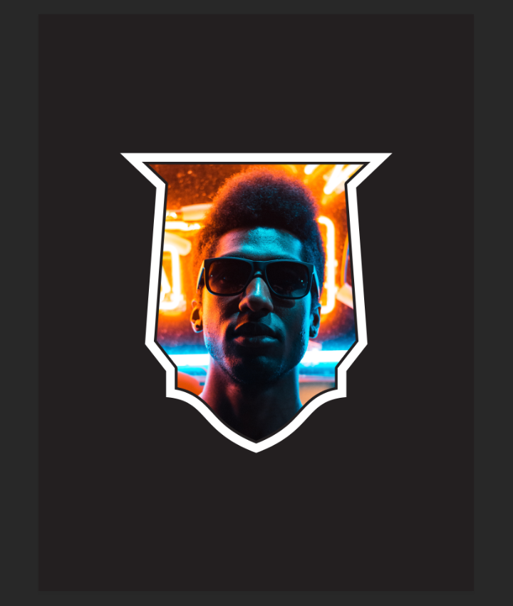
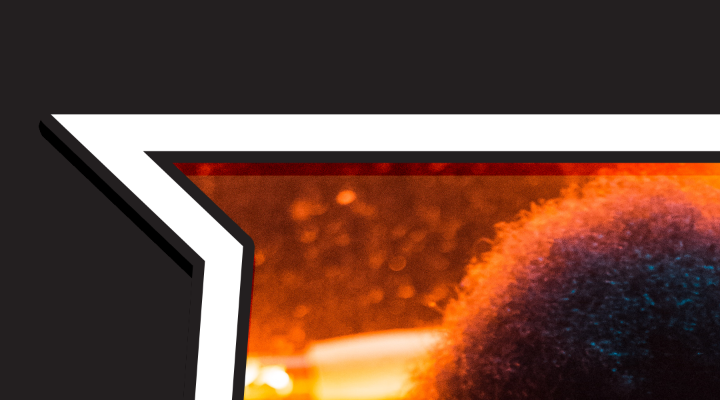
In order to give the shield around the photo a bit more visual presence, we are going to give some extra layer styles to simulate a real thickness. First, a thick stroke. It’ll be 35 pixels thick, and has the same color as the background (#231f20).
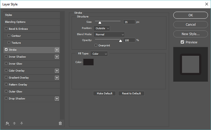

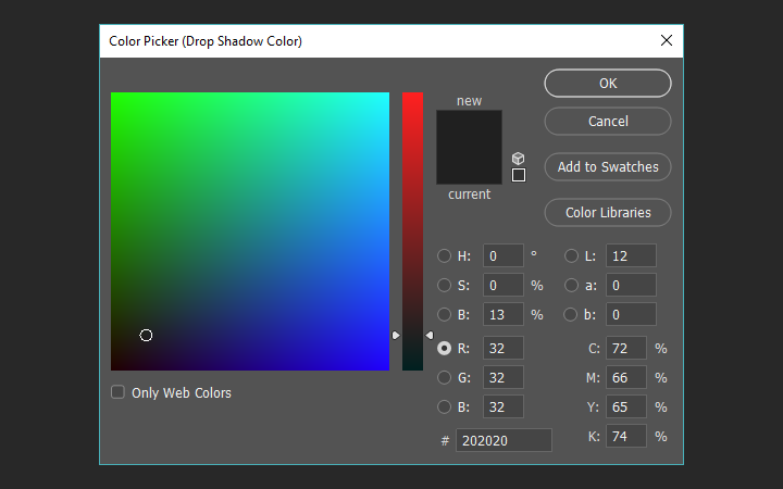
Next, a strong drop shadow, for the illusion of depth. Note the darker color used (#202020).
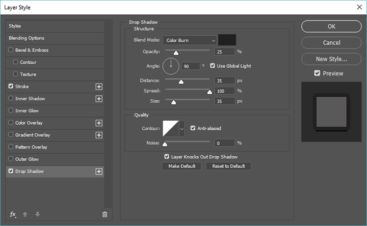
The result is a satisfactory illusion of depth and layers.

The circular shield
Time to add the “oval patterned” shield in the mix. After heading back to Illustrator, let’s change its color to pure white (#ffffff), then paste it as a smart object into our Photoshop document behind the photo layer.
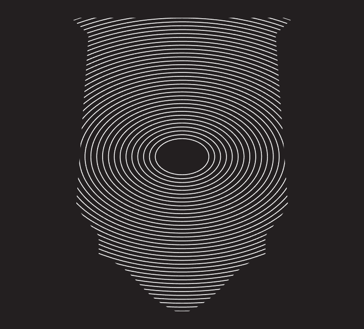
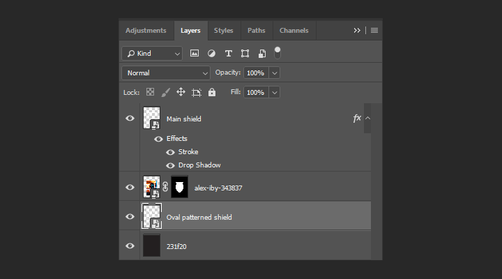
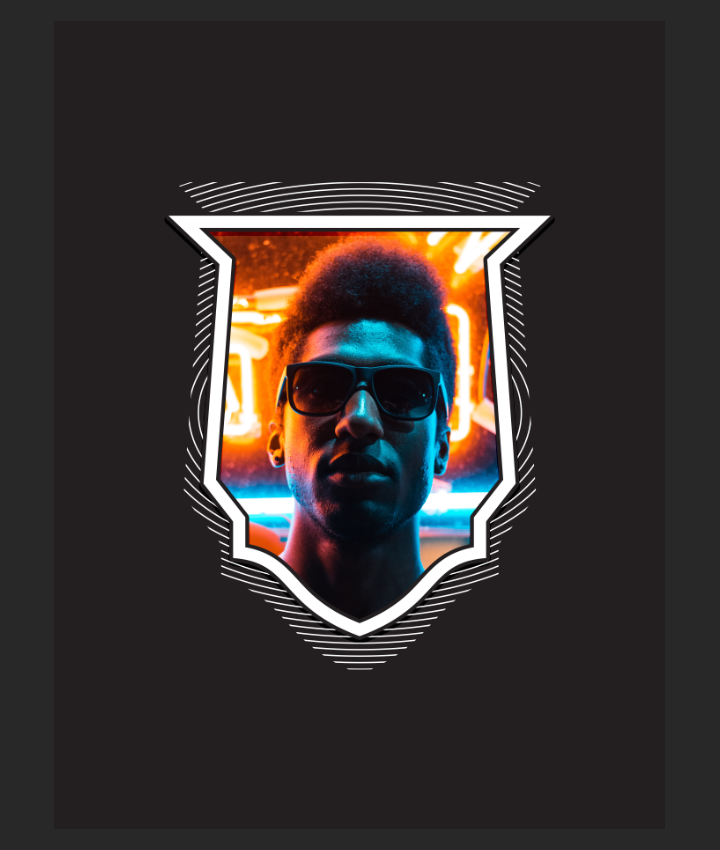
It’ll be sized at 550% of its original size, and positioned with its center at X: 9.25″, and Y: 12.25″. Additionally, we’ll change its blending mode to screen, to interact more with texture elements later.
The circular, “toothy” frame
This little one needs to be adapted a bit.
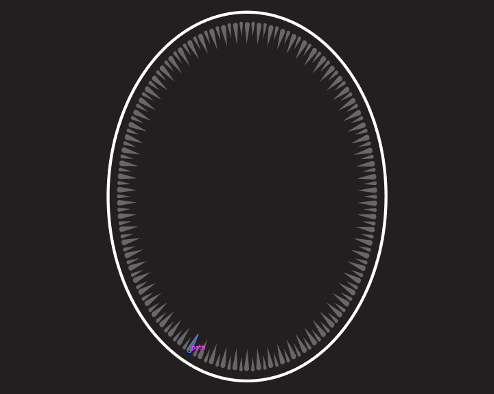
First, its color needs to be changed to all white.
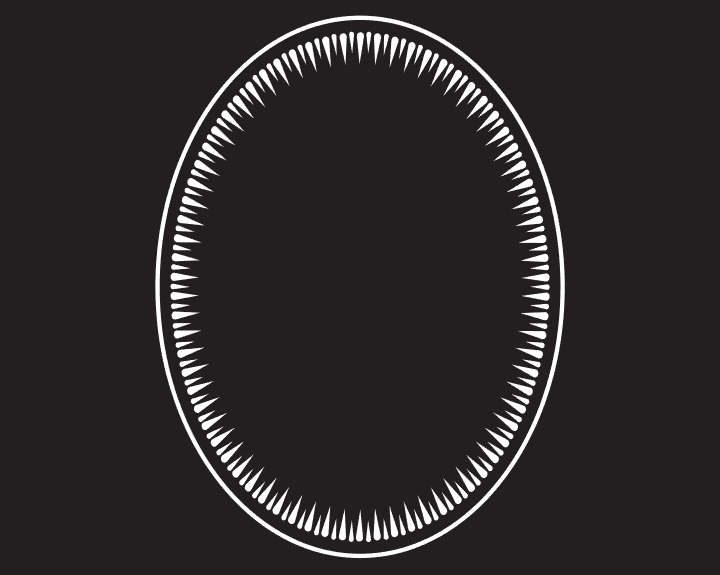
Next, it needs to be pasted as a smart object between the photo, and the main shield shape. It’ll be sized at 950% of its original size, and positioned at X: 9.25″, and Y: 12.03″.
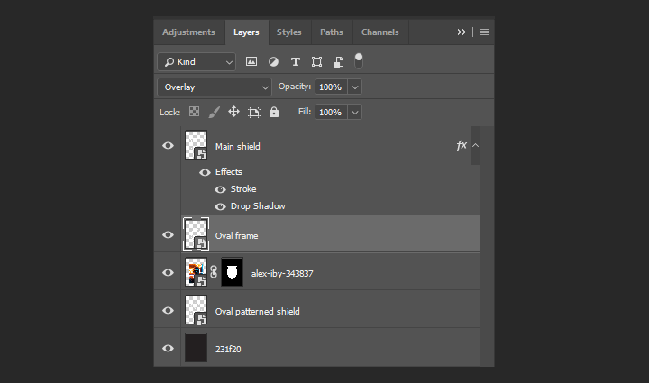
After changing its blending mode to overlay, we get a neat secondary frame effect in place around the portrait, highlighting the face even more.

Last vector element: the wheat stalks
This last one is the finishing touch of the vector assets. It frames the overall piece, and also gives it a visual anchor within the canvas. We first need to head back to Illustrator to change their color to pure white.

Next, we’ll paste it as a smart object right above our background layer. We’ll size it at 1000% of its original size. Its blending mode will be overlay @ 50% opacity, and its center is at X: 9.25″, and Y: 12.3″.
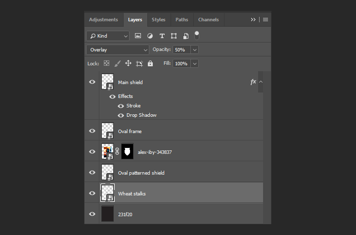

And all of our elements are in place! Next, we need to talk text.
Copy copy copy
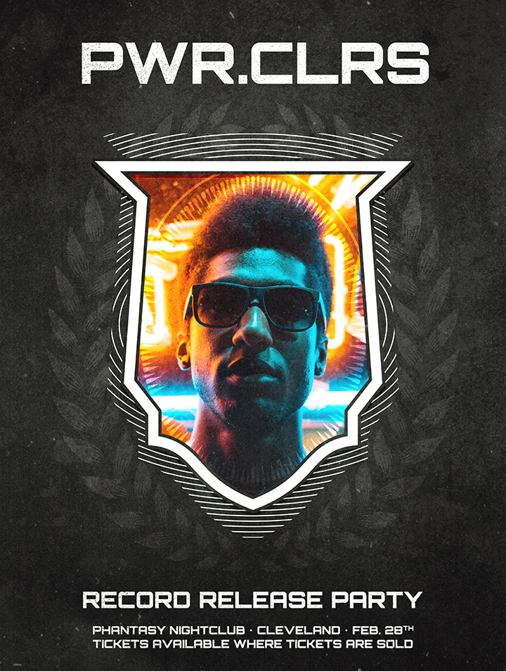
The copy for the poster will be straight to the point: the name of the act, the occasion we’re summoning people to show up for, the location/date line, and the ticketing information. All spelled out, we have:
- PWR.CLRS
- RECORD RELEASE PARTY
- PHANTASY NIGHTCLUB • CLEVELAND • FEB. 28TH
- TICKETS AVAILABLE WHERE TICKETS ARE SOLD
The typeface we’ll use for our poster is a free one, and comes from the League of Moveable Type. It’s called Orbitron, and has been designed by Matt McInerney. It’ll be the one used for all of our text elements.
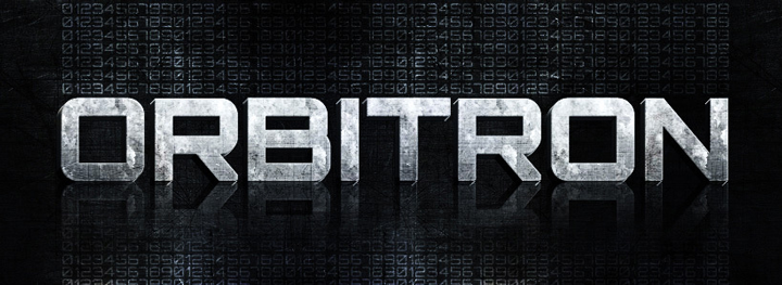
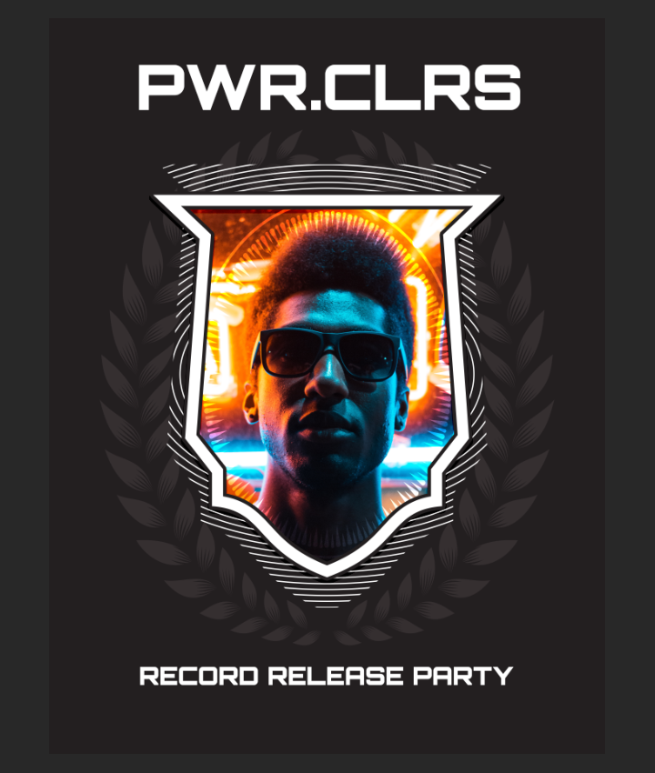
PWR.CLRS is typed at 150 points tall, centered. Its center is located at X: 9.33″, and Y: 2.40″. Note that the kerning is set to optical.

RECORD RELEASE PARTY is typed at 60 points tall, centered. Its center is located at X: 9.22″, and Y: 21.94″. The kerning is set to optical as well.
Next, PHANTASY NIGHTCLUB • CLEVELAND • FEB. 28TH / TICKETS AVAILABLE WHERE TICKETS ARE SOLD are all part of the same text object. The “/” indicates a line break. It’s written 30 points tall, and placed at X: 9.25″, and Y: 23.21″. The kerning is set to optical as well.
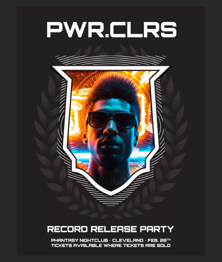
And with that, all of our text elements are in place. Here’s a look at how our layers are organized up to now. Note the new Background layer group, to separate its elements from the rest.
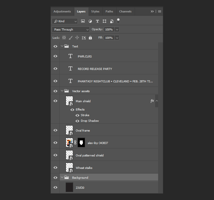
Time for textures!
Now that everything is all well organized, it’s time to add textures. If you looked at some of my past tutorials, you already know that I LOVE textures. They help us to give substance, depth, and, well, texture, to very clean digital shapes. Luckily for us, the Arsenal has quite the library.
First up, the text
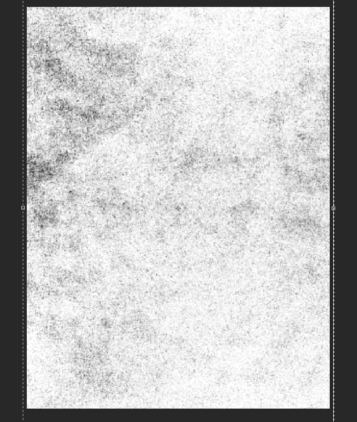
In order for the text to be more worn out, we’ll be using a texture from the Vintage Organic Noise Texture Pack. The texture in question is gma_tex_herbal-organic_09.jpg.
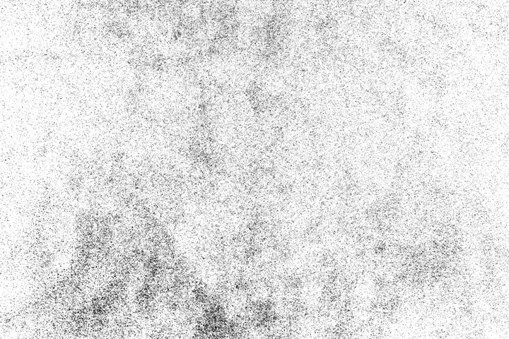
Remember how we used click+ALT/OPTION to edit the content of the shield’s layer mask earlier? Well it turns out that we can do much more than using brushes and the paint bucket when doing that. We can also paste the content of a texture file in that layer mask. Depending on the texture, it can make for a very rapid, and efficient way to give things a worn out aspect.
Let’s start by opening the texture in Photoshop, and copying the content of the file (CTRL/CMD+A to select everything, CTRL/CMD+C to copy).
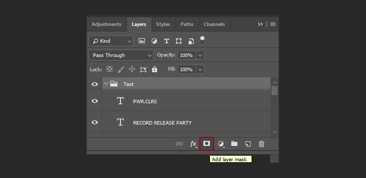
Then, let’s add a layer mask to the Text layer group.
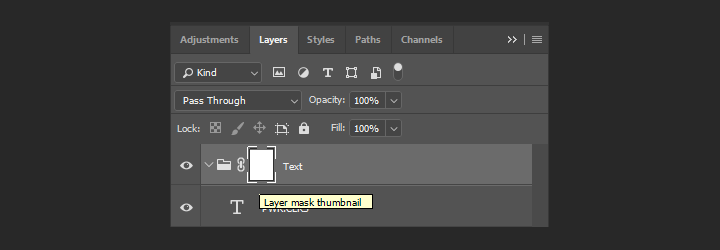
By clicking+ALT/OPTION on the layer mask thumbnail, we have access to that pristine layer mask’s content.

By pressing CTRL/CMD+V, we can paste the texture at the center of the layer.
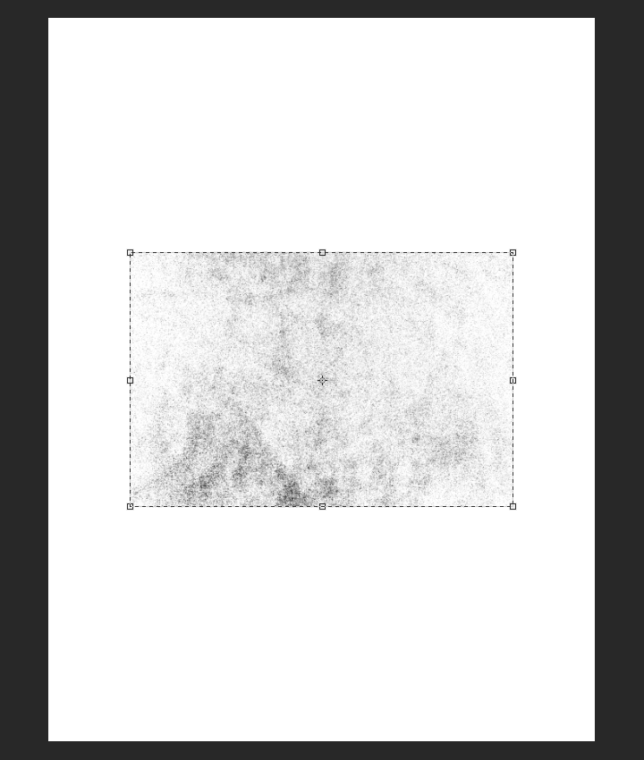
In order to cover the whole piece, we’ll rotate the texture clockwise 90°, and size it up to 220%.
From there, in order to soften the intensity of the texture, we’ll use levels (CTRL/CMD+L) to fade the texture some.
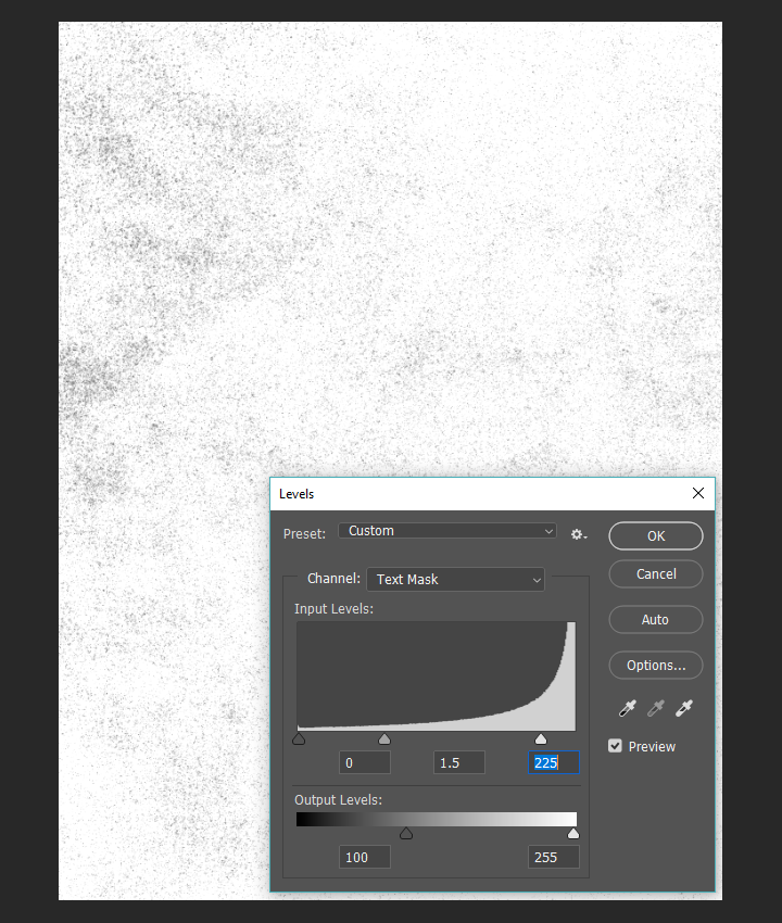
The result is this beautifully, organically worn text.

Next, the background. We’ll be using a painterly texture from the Brush Stroke Textures, Volume 02 pack. It’s brush-strokes-textures-volume-02-004-sbh.jpg.
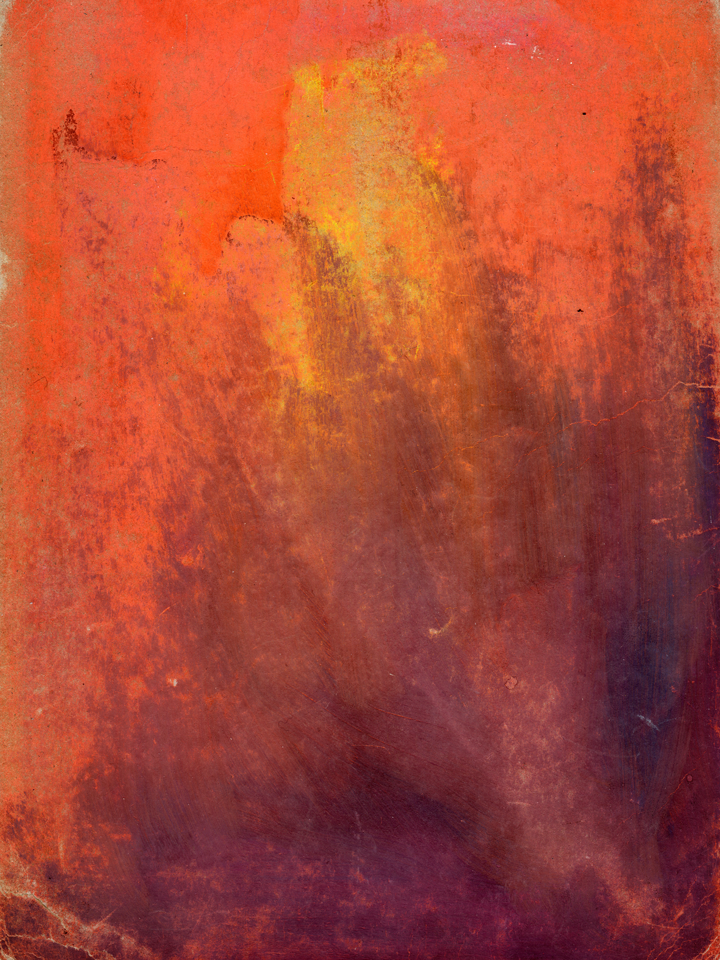
Let’s place it dead center right above the background layer, sized at 105% so it covers the whole background.
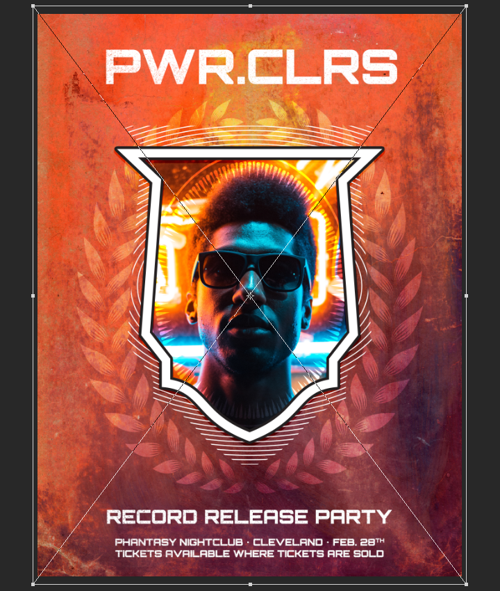
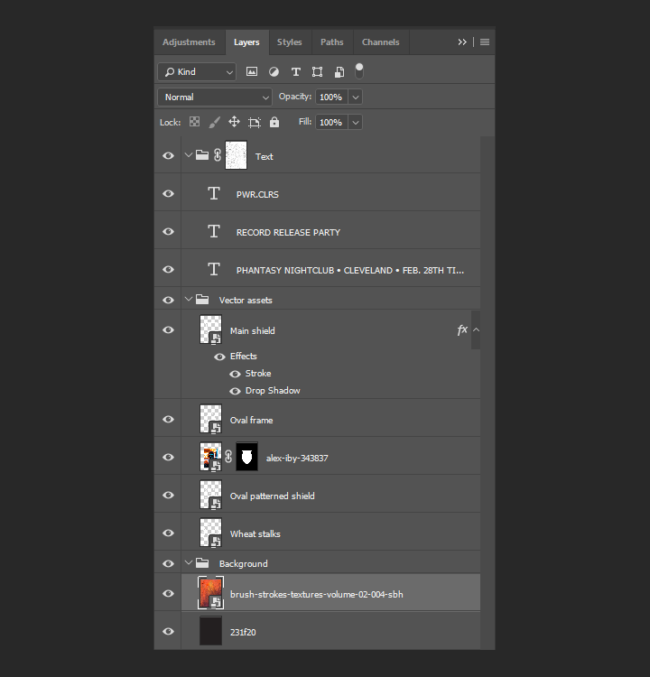
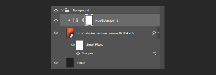
Remember the technical notes from earlier? Don’t forget to sharpen the texture smart object (Filter > Sharpen > Sharpen).

After using a clipped hue/saturation to desaturate the texture layer, we’ll be using a clipped levels adjustment layer to enhance its contrast.

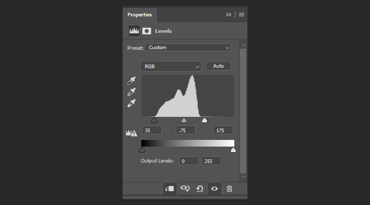
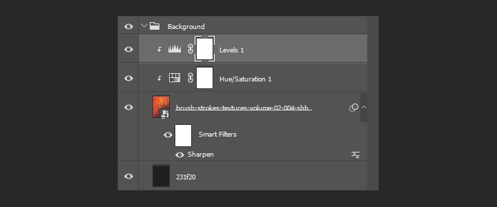
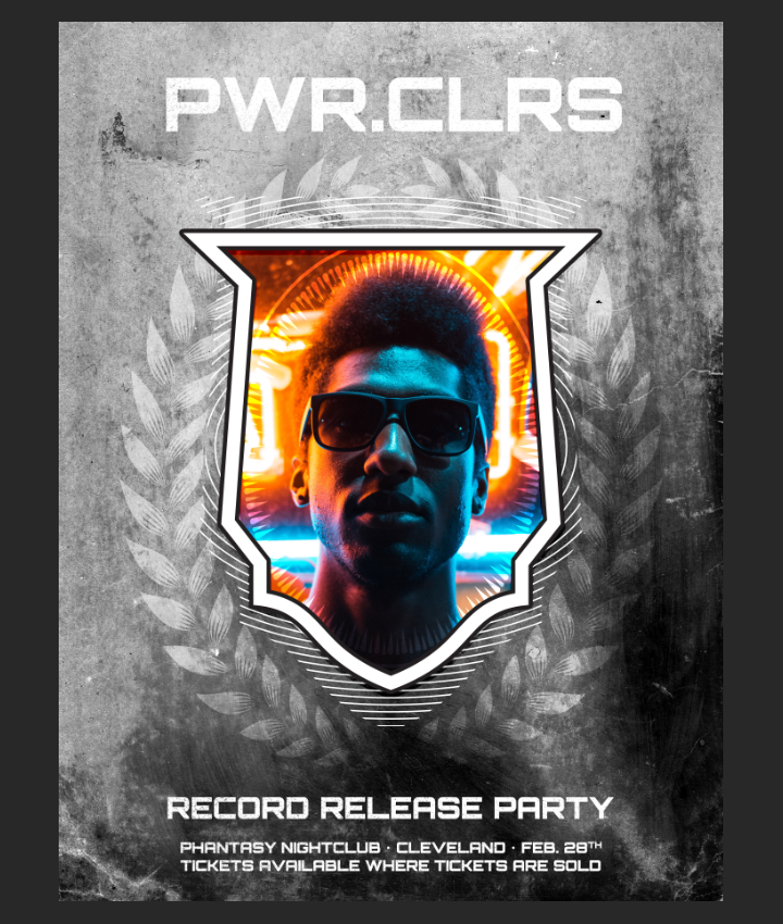
Lastly for the background, we just need to change the blending mode to soft light @ 35% opacity for our effect.
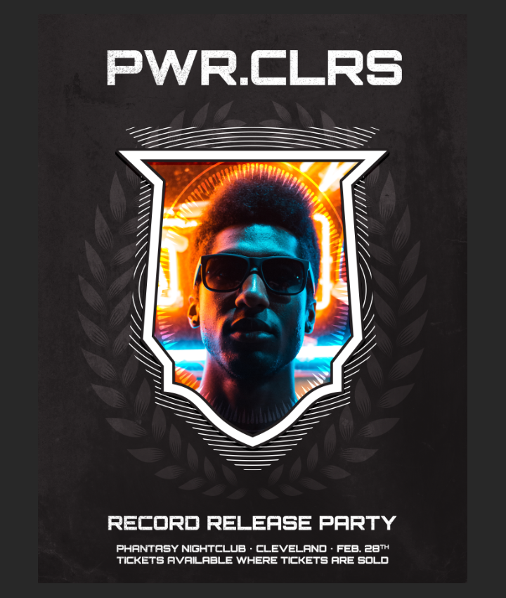
With that our background is fully textured. Time to move on to texturing the piece as a whole, to tie everything together.
Texturing the full piece
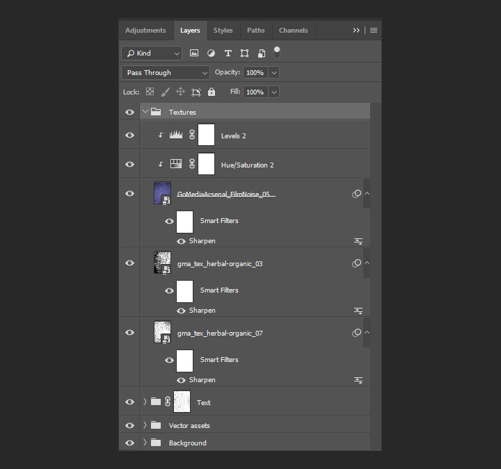
The first texture we’ll use for the piece as a whole is from the Vintage Organic Noise Texture Pack again. It’s gma_tex_herbal-organic_07.jpg.
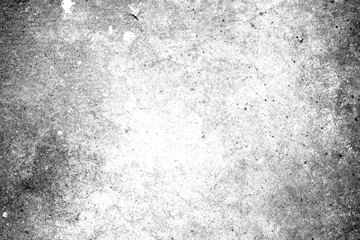
We’ll place that texture centered in the frame, and rotate it counterclockwise 90°.
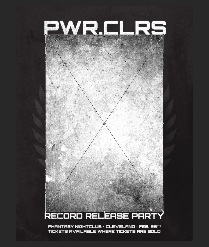
It’s sized up to cover the whole piece, at 55%.
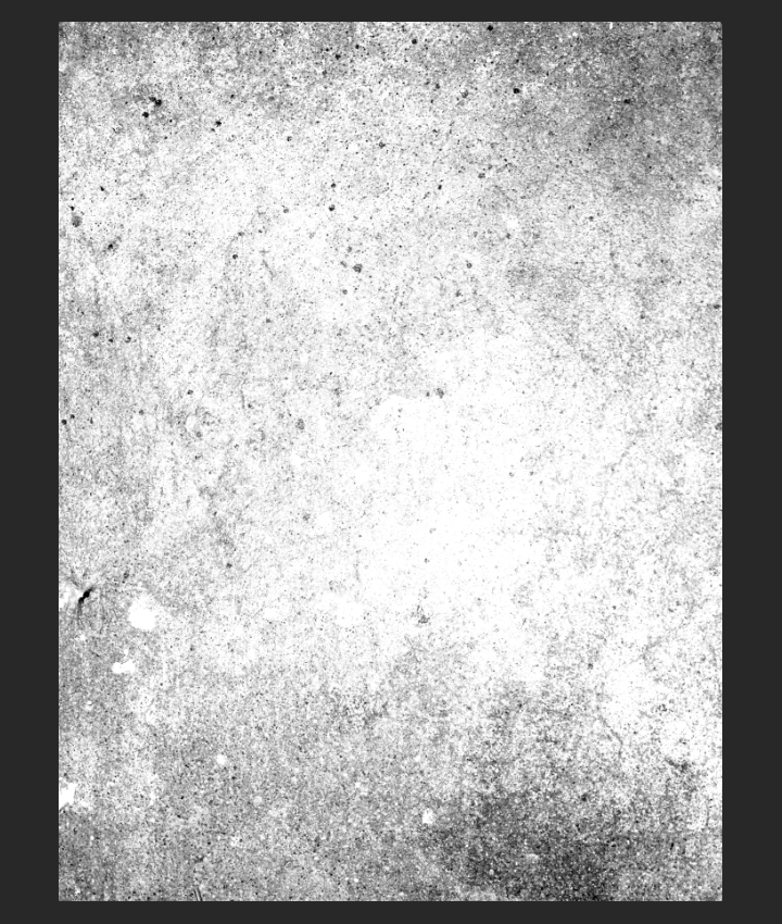
After sharpening the texture, we can simply change its blending mode to color burn @ 35% opacity. There’s no need to desaturate it, as it’s already a black and white texture.
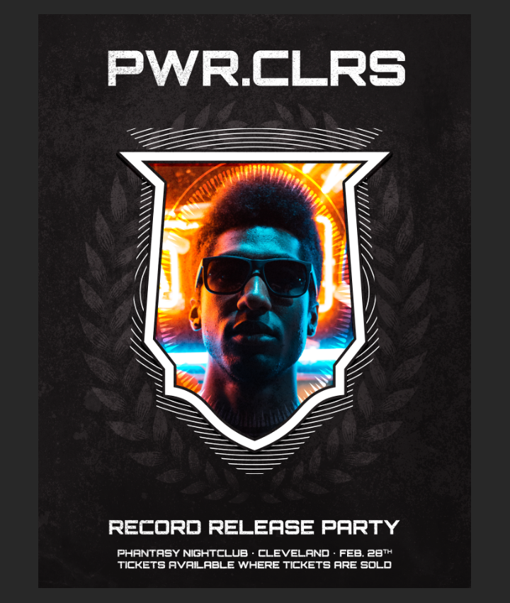
In order to add some highlight at the top of the poster, we’ll then add gma_tex_herbal-organic_03.jpg in the piece.
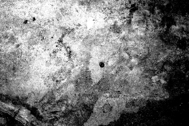
This one is rotated 90° clockwise, and also sized up at 55% to cover the whole piece.
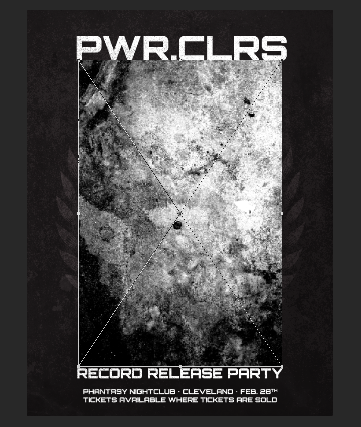
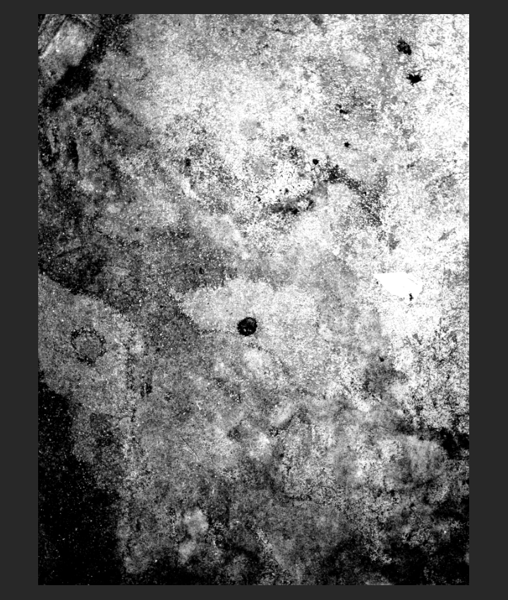
After sharpening, we can change its blending mode to soft light @ 25% opacity.
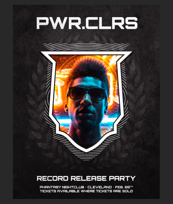
To add a hair of film noise, we’ll use GoMediaArsenal_FilmNoise_05.jpg from the film texture pack.
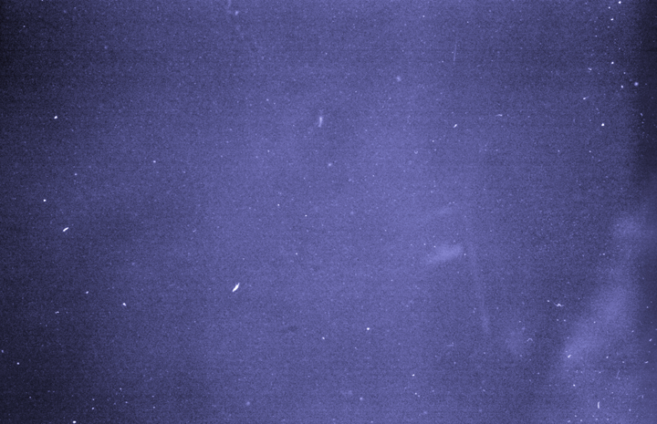
This texture needs to be rotated clockwise 90°, and sized up 2100% to fill the whole piece.
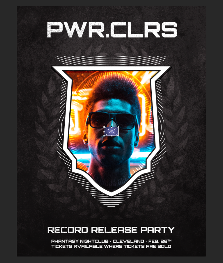
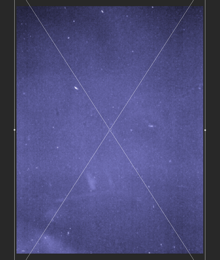
Once we have used a clipped hue/saturation layer to desaturate the texture, we need a clipped levels adjustment layer to enhance the texture’s details.
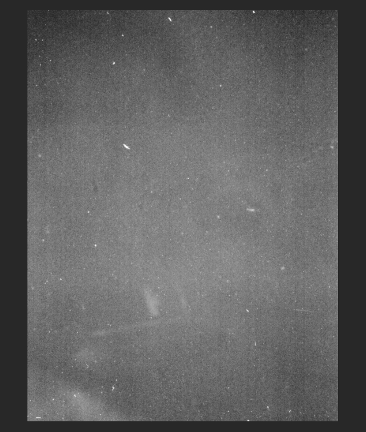
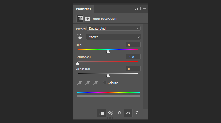
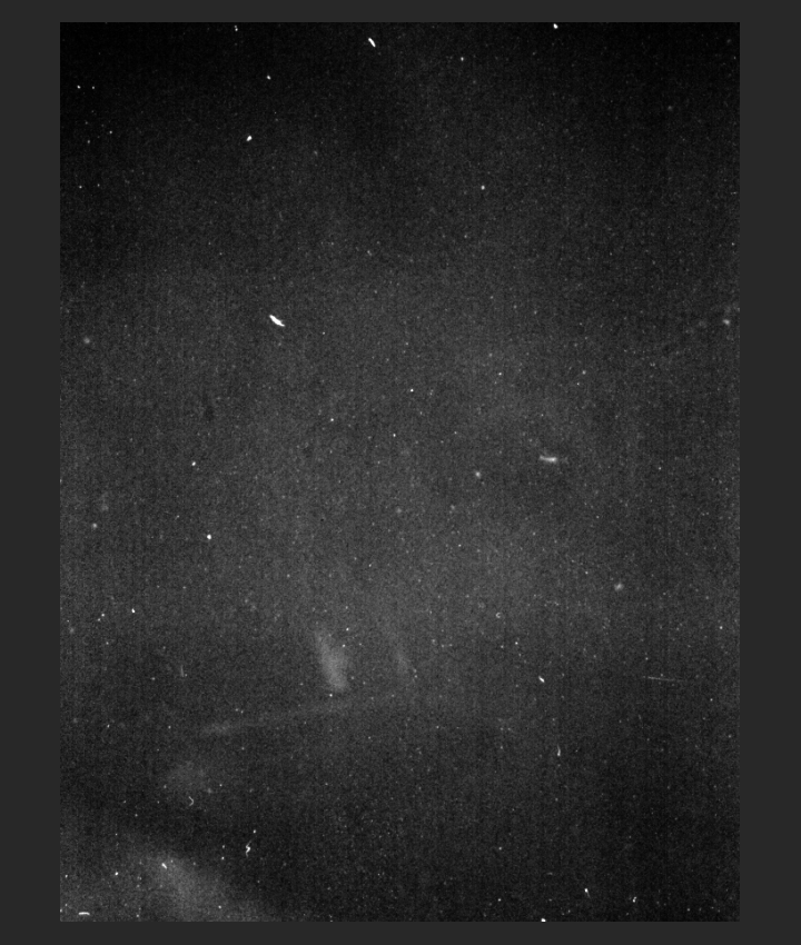
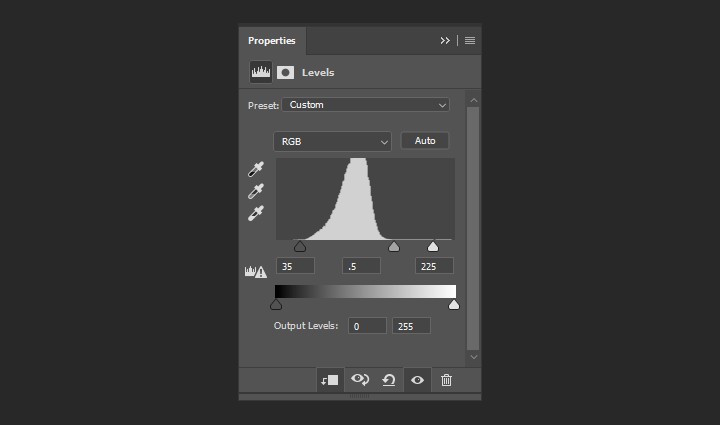
With that done, we just need to change the texture’s blending mode to screen @ 35% opacity.
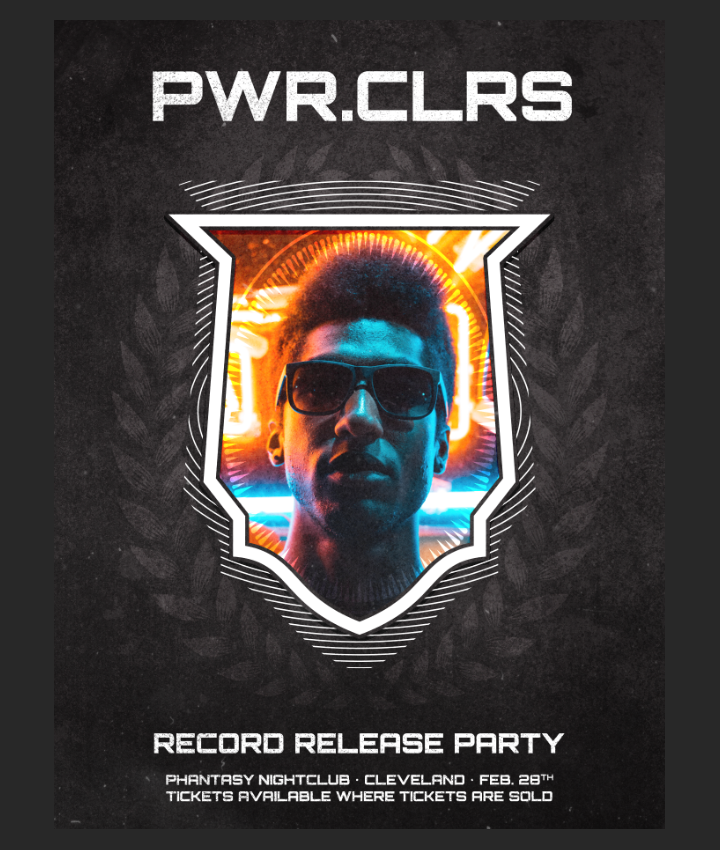
With that, we’re almost done. Here are what our layers should look like at this stage:
Finishing touches
The last bit of stuff we need to do to this poster to wrap things up is to add a little bit of a halftone effect. Let’s start by making a merged copy of all the layers so far, by using the keyboard shortcut CTRL/CMD+SHIFT+ALT/OPTION+E. This will create a new layer at the top of our stack.
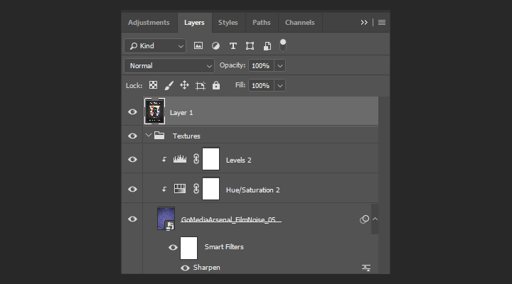
Let’s rename it to Halftones.
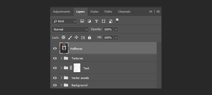
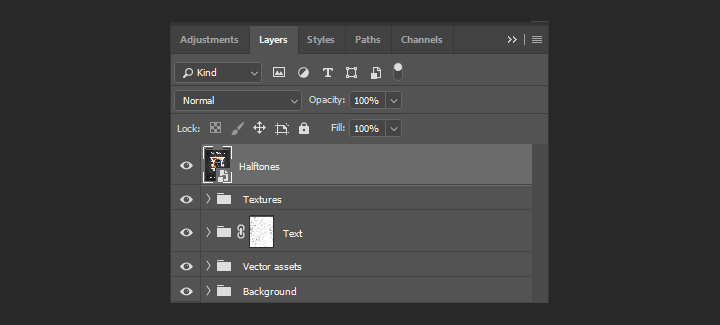
After that, we have to turn it into a smart object. With the layer highlighted, head to Filter > Convert for smart filters.
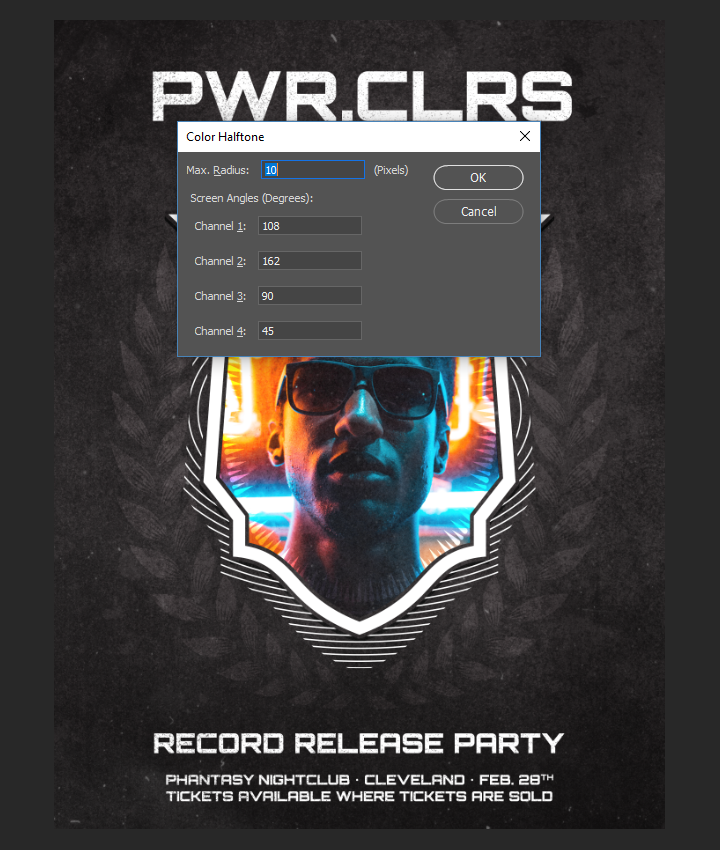
With that done, we can head to Filter > Pixelate > Color halftone. Note the value of the Max. Radius, up to 10, from the default value of 8.
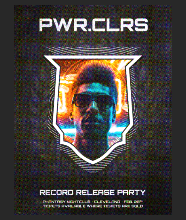
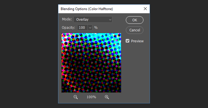
The cool thing with smart filters is that the layer has a blending mode, and the filter itself has one as well. What that means is that we can make the effect even more subtle and believable. Let’s start by assigning the halftone filter a blending mode of overlay @ 100% opacity. To do this, let’s double click on the double arrow icon on the right-hand side of the layer thumbnail.
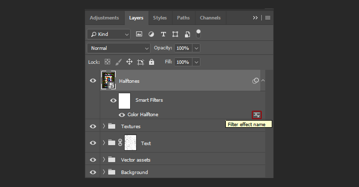
We then get access to this drop down menu to choose the blending mode.
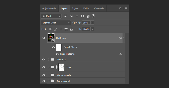
From there, we can change the blending mode of the layer itself to lighter color @ 35% opacity.
If everything went according to plan, this is what the layer stack should look like.
Additionally, here are a couple of detail shots @ 100% zoom.
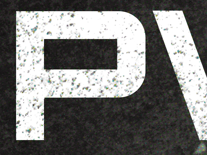
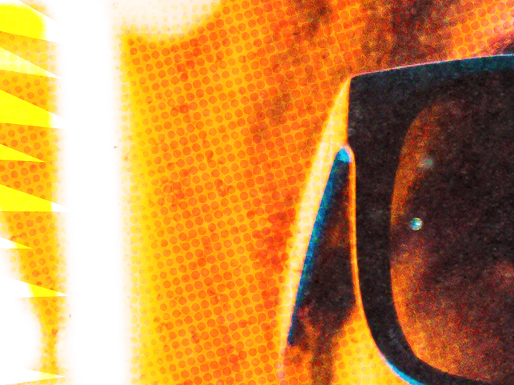
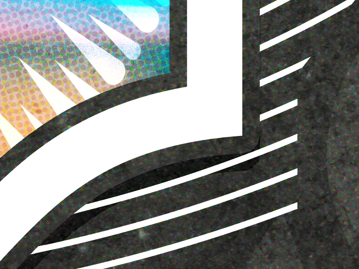
And here are some close-ups:
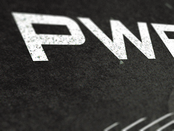

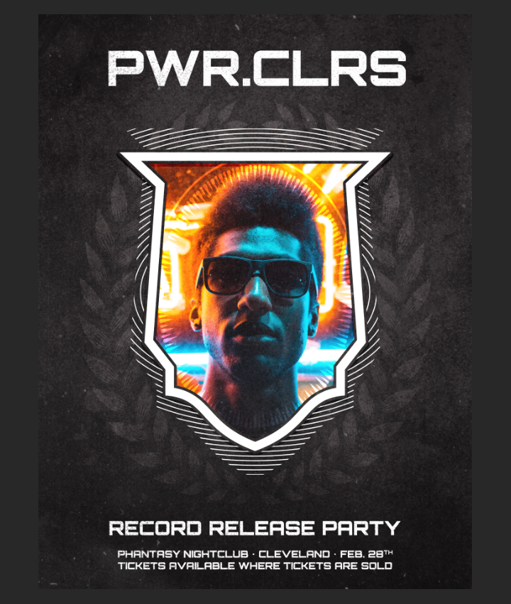
And finally a full view of the final piece:
Wrapping things up
Phew, that was a long one! I hope that you enjoyed following along the tutorial as much as I enjoyed creating it, and that your outcome matches the goals you set for yourself before diving in. Did I leave anything unclear? Any suggestions? Don’t hesitate to reach out in the comments below! I’ll be happy to help.
The Crest of Arm vector pack is now available! Go grab it! If you already have, I hope you enjoy it, and that this tutorial gave you a sense of what you’ll be able to accomplish with it.
Buy the Crest of Arms Vector Pack
And on that note, I’ll see you next time. Cheers!
How to easily create a record release promo poster with the Arsenal’s Crest of Arms vector pack

