

The creative director of agency ShopTalk on the power of narrative and illustrations in data visualisation.
Picture a time-poor stressed-out executive receiving yet another data-loaded tome. Dumped in their inbox, PDF after PDF of 8pt text, pie charts and graphs, almost impossible to decipher properly on a small mobile device. No way to track, navigate or interact. No wonder so many reports like these are never actually read, even when paid for and downloaded.
There are ways around this, though. Presenting complex data through a storytelling lens, humanising information with animations, illustrations and interactive design, can turn reports’ fortunes around, helping them achieve greater reach and traction, as well as setting them apart from the competition.
Most of us love a good tale. A narrative that draws us in, intrigues us and builds to a satisfying conclusion. Stories help us develop a better understanding of the planet on which we live and the people with whom we share it. Our brains are powerful pattern-seeking instruments that look to put the chaos of the world into some kind of recognisable order – and stories, especially visual ones, represent a powerful and meaningful way of doing that.
But despite this being fairly common knowledge, so much business communication is delivered in a dry, lacklustre format. There’s no beginning, middle and end, no discernible journey, just some kind of word dirge. But by bringing data to life in a human way, by using visual storytelling techniques, you can engage with a wider audience. It’s about providing a scaffolding for all that complex information, making it easier to navigate and digest. Because, let’s face it, few people jump for joy at the prospect of wading through dense documentation, no matter how prescient they believe the content will be.
It’s the way you tell ’em
Delivery is as important as content. So often, the passion and creativity that is invested in research and discovery doesn’t make it onto the final page. There’s no hook, build and pay-off. Scant attention is paid to scene-setting and context, to holding the reader’s attention.
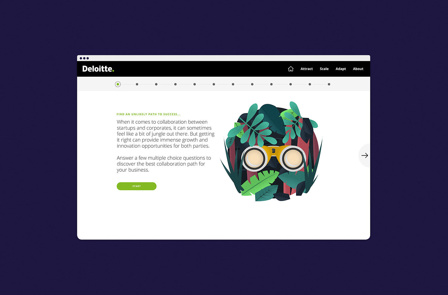
When we began working with professional services network Deloitte, it was in a frustrating position. It was producing in-depth reports for corporations all over the world, outlining what businesses needed to do to remain strong and resilient in a rapidly changing global economy. It was providing data and information that had the ability to change the plight of individuals and businesses alike, addressing common concerns and giving the answers to burning questions. But Deloitte knew it could go further with its research and reach more of the right people.

The problem was, the resource was written in a format that many found difficult to access and decipher. We decided to look at it through a storytelling lens and create a universal visual language that more people could relate to. Our role was to decode and translate, and then provide the mechanisms by which readers could find their way to the information that was relevant to them.
Businessmen and women are just ordinary people. They like to watch the latest boxsets just like everyone else, so to communicate in a rarefied way makes no sense. By taking a more accessible approach, you’ll increase the chance that your target audience will grasp the message and act upon it. All that hard work and research is less likely to go to waste, and people will come back for more.
Increase the reach
Long-form reports have a gravitas and depth that is appreciated by executives looking for detailed, contemporary data to inform their key decisions. But we also know that these execs are now consuming news and information across myriad platforms, and that some of the more traditional delivery formats are turning them off. In this day and age, information needs to work across all devices. Deloitte’s clients need its thoroughly researched insights, but in a way that they can access and comprehend quickly and easily, wherever they are.
Rather than create a precis, our approach was to pick out key themes and work them up into striking concepts and metaphors. By using the power of storytelling and data visualisation – in tandem with the long-form master – we found that the target readers were much more likely to absorb and remember the report, and be able to identify it as specifically Deloitte.

The human touch
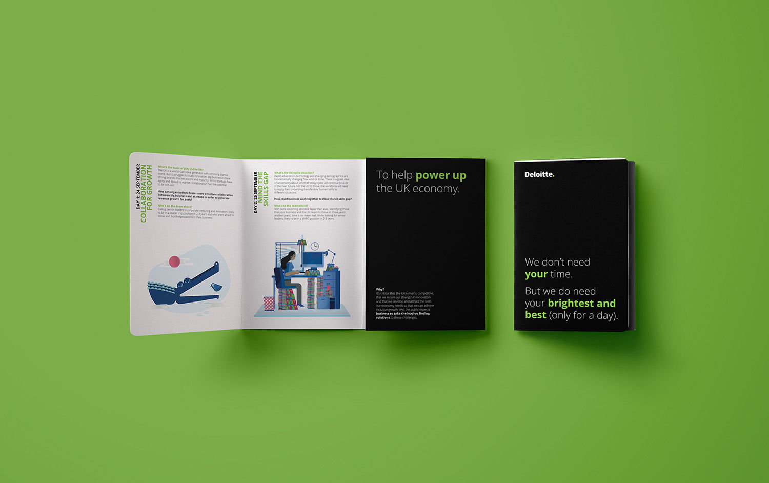
In a recent report that looked at what the UK economy can do, post-Brexit, to cope with a potential loss of 36% of its non-British workforce, we used engaging illustrations and animations to bring to life the problems and solutions outlined in the long-form report. Taking a crocodile and a bird as the central characters, we were able to communicate Deloitte’s message of ‘collaboration for growth’.
Working alongside the full version, this approach made it easier for subscribers to steer through the data, dipping in and out where and when they chose to do so.
The aim was simple: it was about improving the relationship between recipient and research – people and things – and finding the most appropriate way to do this. In this instance, distilling complex data and communicating it in an appealing and arresting way really worked.
Taking a more visual and human approach, one that responds to the fact that we are all time poor, on the go and increasingly relying on hand-held devices to keep up, is how to get the story across, and keep your readers gripped from ‘once upon a time’ to ‘happy ever after’.
James Wood is co-founder and creative director of creative agency ShopTalk.
Read next: Amy Cesal’s Play-Doh infographics bring fun and colour to datavis
https://www.digitalartsonline.co.uk/features/interactive-design/how-humanise-data-through-storytelling/