Alto’s Odyssey is an ‘endless runner’ game with a soft, ever-changing colour palette and a low-poly landscape packed with hidden details that change over time. We interviewed its British lead artist and developer Harry Nesbitt about its creation.
Highly anticipated – and much delayed – Alto’s Odyssey is the sequel to 2015’s Alto’s Adventure, a boarding game where you snowboard along a never-ending landscape collecting coins, jumping over hazards and doing tricks as you go.
The more tricks you pull, the more points you get – and completing certain tasks opens up new experiences, abilities and things to do, jump on/off or break.
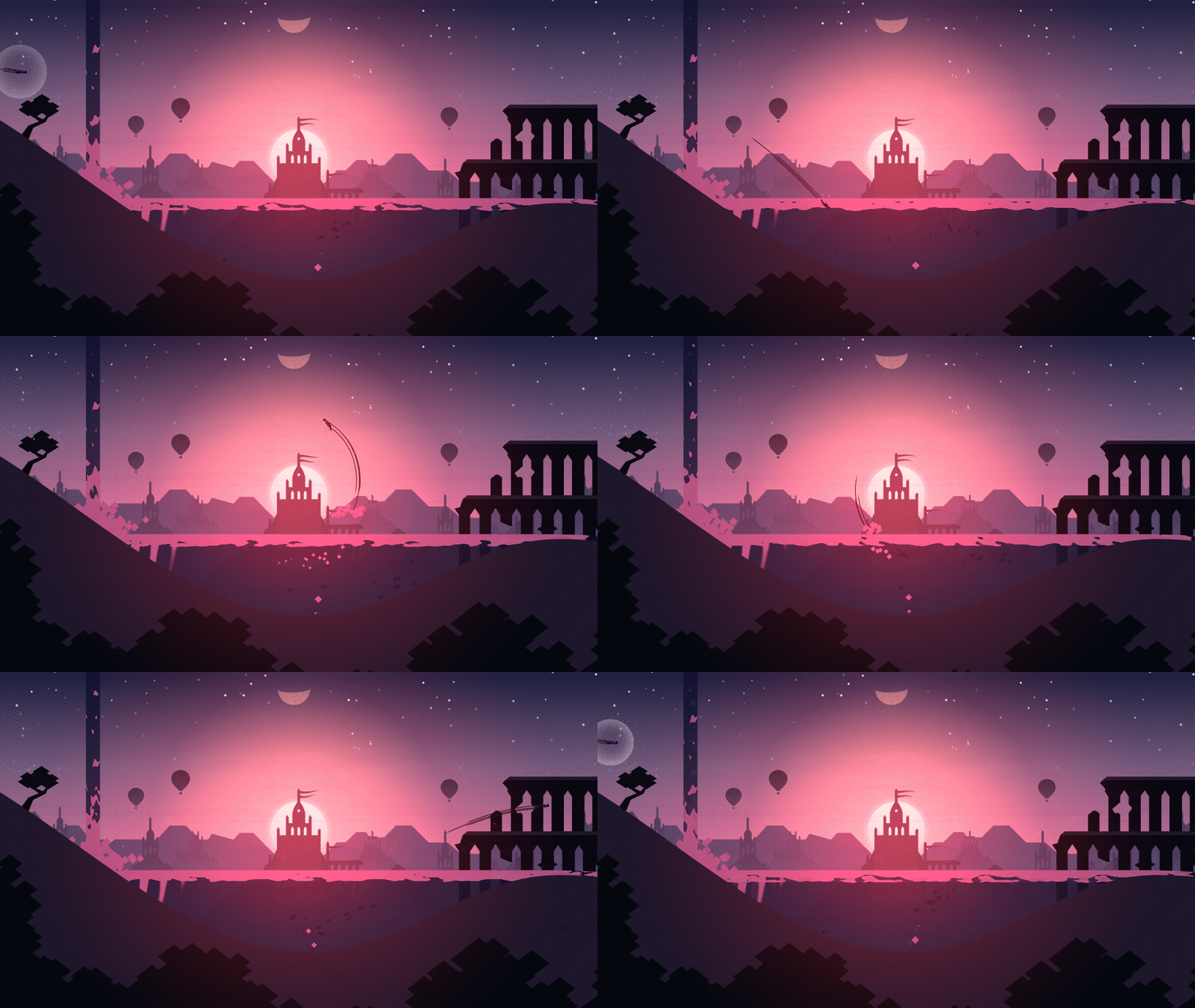
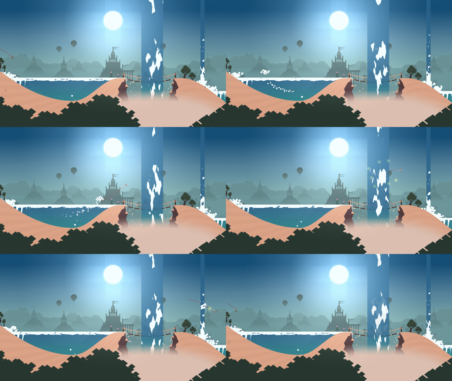
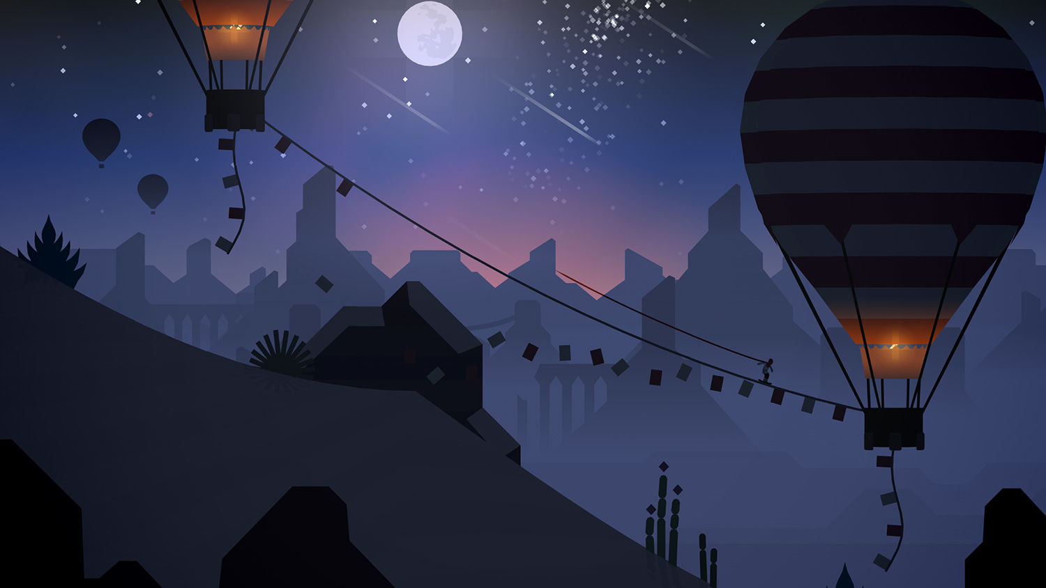
Alto’s Adventure was most-praised for its aesthetic and soundtrack, and Odyssey maintains the soft glow of the original while moving its action from llama-strewn mountains to a desert that you er, ‘sandboard’ through. The desert has ruined temples, hot air balloons – some of which you can bounce off – waterfalls and crumbling bridges. It’s somewhat reminiscent of Monument Valley, though its identity is very much its own.
For me personally, it’s the little details that really delight in the game – the birds, animals, plants that sway when you go past them and the water that burbles.
I caught up with lead artist and developer Harry Nesbitt from Team Alto. Before reading the interview you can see Alto’s Odyssey in action below, or buy it here for iPad or iPhone. Alto’s Adventure is available for iOS, Android or Kindle Fire.
Neil Bennett: What was your background before coming to work on Alto’s Adventure?
Harry Nesbitt: My background is in illustration and design. I studied Graphic Arts at Liverpool School of Art and continued to work as a freelancer for about five years before working on Alto’s Adventure. I’ve always had an interest in art and technology and the way they interact, so making the jump to games was actually quite a seamless transition. I see games as the ultimate cross section of all my interests, so it’s a medium I’m really excited to be working in.
NB: Were you surprised at how much critics and players loved the aesthetic and design of Alto’s Adventure?
HN: “Absolutely, in fact it’s something I still can’t quite wrap my head around. However, it’s also incredibly heartwarming and validating to know that the things I care about can resonate so strongly with other people.”
NB: What was your initial approach to the look and feel of Alto’s Adventure?
HN: “We knew we wanted to make something a little more minimalist and stylised compared to other games we were seeing on the App Store at the time. It felt like a lot of mobile games, particularly in the endless runner genre, wanted to almost deliberately overwhelm players in an attempt to create a sense of excitement. I wanted to see if it was possible to filter out the noise and boil things down to the core experience, without losing what makes these games fun and accessible. From an art standpoint, I was also really excited to try and hint at a much larger living, breathing world that exists beyond the frame – to create a setting with it’s own history and culture that players could connect to and feel like they’re visiting a real place”
NB: How did you want Alto’s Odyssey to be different from Adventure?
HN: “With Odyssey, we knew we wanted to explore a different range of feelings. A lot of the team had experienced some form of personal upheaval in the months leading up to development, so I think this inevitably fed into the core themes of the game. While Alto’s Adventure was about creating a cosy space for players to call home, we wanted this game to be much more about stepping outside of that comfort zone into the larger world.
“From an aesthetic standpoint I think this manifests in much brighter, more confident use of colour – as well as more extreme variations in the environments and obstacles that you encounter and the mechanics you use to traverse them.”
NB: How did the aesthetic inform the gameplay (and vice-versa)?
HN: “I think aesthetics and gameplay are intrinsically linked. It’s important to make sure you’re using a clear and consistent visual language to aid readability and reduce cognitive load – player shouldn’t have to spend time trying to interpret what is interactive and what is not. You can use things like colour and patterns to achieve this, but we often found it was the silhouette of objects that players would recognise first – for example, we try to use smooth curves for interactive surfaces, and hard angular edges for obstacles as much as possible.
“It’s also important to consider how the game feels to play in motion, beyond all the trappings of things like scores and goals. Just moving through the world should be rewarding in own right.”

NB: I’ve seen a bunch of reviews for both games mention playing them feeling a bit like meditation, which is unusual for an ‘endless runner’ game. Was this intentional and how does your choice of visual and game design contribute to this?
HN: “We definitely wanted to allow players to approach the game in a variety of ways. That might be chasing a high score or competing with friends, but it might also just be to tune out distractions and enjoy the scenery for a few minutes. I think engaging with something that requires all of your focus, but not necessarily all of your brain power, can lead to a very relaxing experience. I’ve heard this is a big part of why people enjoy spending time in nature, so was keen to try and capture a little of this in the game.”
NB: Why was it important to have different times of day and weather in the game, and how did you design these to fit in with the overall aesthetic?
HN: “I’ve always been really fascinated with light and the way it changes throughout the day. I think you can evoke so much just by shifting the light and colours that compose a scene. We rarely experience the world as being totally static, so I think it actually taps into something quite primal.
“At the very least, it helps create a sense of variety and intrigue for players and the world moves around them.”

NB: How did you design the delightful details of the landscape in a way that a player would notice these but they didn’t become distracting from playing the game?
HN: “We tried to allow ourselves to just have fun and add things excited us, even if they weren’t necessarily part of the core gameplay experience. There’s a lot you can add, without necessarily distracting the gameplay and these ambient details can go a long way towards helping players develop a personal connection with the world.”
NB: What’s your favourite little detail?
HN: “We actually have a full lunar cycle in the game, allowing the moon to wax and wain as it does in real life. There are some interesting complexities (albeit simplified from the real world) that inform how the moon and other celestial bodies interact. If you’re playing for long enough, you might just be lucky enough to witness some rare events.”

NB: What tools and software did you use?
HN: “The game is built with Unity, but we also use software like Photoshop, Maya and Cinema 4D for creating 2D and 3D assets. As far as hardware goes, I couldn’t survive for long without my trusty Wacom tablet – even for non-art related tasks, I always feel slightly lost without it.
NB: What’s next?
HN: “Our main priority over the coming months is to support our players, and bring the game to new platforms. However, we also want to make time for being creative and exploring new ideas.
“Beyond that, I really have no idea what comes next, but I couldn’t be more excited to find out!”
https://www.digitalartsonline.co.uk/features/hacking-maker/inside-art-design-of-2018s-most-beautiful-mobile-game/

