Illustrators Brian Millar, Cassandre Monoriol, Matt Johnson and Michael Driver reveal their techniques for creating landscape artworks in different styles.
Brian Millar
The best landscape illustrations use masterful technique to make a statement. The statement, chosen by the artist, can be about anything: a particular quality of light, a mood, a season, the relationship between objects in the scene, etc. This statement, this point of view, is enhanced by every decision the artist makes and in the end, the viewer feels it, responds to it, and is forever changed by the beauty the artist captured.
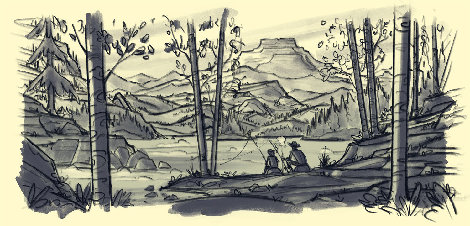
My process changes and evolves based on my interests – but these days, I typically start my sketches on an iPad Pro and Apple Pencil using the Procreate app.
I’ll explore quick thumbnail compositions until I’ve landed on the idea I want to move forward with. I create a larger sketch in Procreate using digital pencils and once it’s time to paint, I’ll transition to using Photoshop on my iMac & Wacom Cintiq. I use a handful of customized pressure-sensitive brushes for painting.
Capture the landscape in a simple visual statement first. Work with big simple shapes and try to capture the way the landscape feels. Once you have your composition locked in, you can begin addressing more complexity and detail as you go.
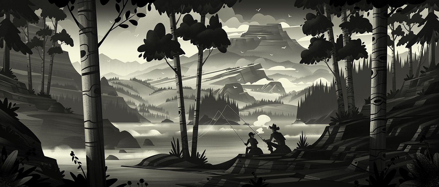
I draw from life when I’m able and I use reference images whenever possible. Drawing from life always surprises me because you see the infinite complexity and design present in our world. Drawing from reference helps me to accurately study and represent what it is I’m painting. This helps ground my pieces, especially the illustrations which don’t depict an actual setting I can visit (such as space or alien worlds or memories).
Creating compelling landscapes is always a process of exploration, inspiration, and technique. While the steps of that process often look the same for all pieces, each piece will present unique challenges you won’t know how to solve instantly. Capturing the beauty of a lake will be different than trying to capture the beauty of a tree stump. Finding beauty in the seemingly mundane can be a major challenge but if you’re able to solve it, the reward is worth it.
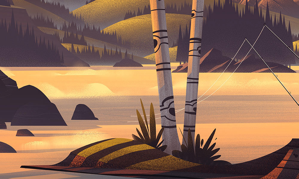
In my Popgun Summers illustration (shown here), one of the techniques I use often is focusing on the mood I am trying to capture in my illustration before my pencil ever hits the page (or the stylus hits the screen in this case). I focus on the mood of the piece (often by finding a single song which reflects the feeling and playing it on repeat) and then I sketch out of that feeling.
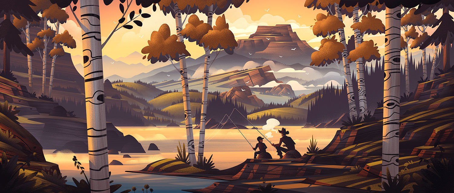
From a technical standpoint, I always try to break the composition down into 3 parts: background, middle ground, and foreground. This helps the composition feel more manageable and it allows me to create landmark features in each part: a mountain peak in the background, landmasses in the lake in the middle ground, and the figures in the foreground framed by the surrounding trees.
Very often I save the colour for the very end of my process. I tend to focus the strengths of each step in my process… when I’m pencilling, I’m focused on composition. When I’m adding black and white values to the pencils, I’m focusing on lighting. Finally, when I focus on colour, I determine which colours best reflect the overall mood and tone I’m aiming for.
Remember, it takes time and practice to reach a point where you can draw a landscape the way you want to. This is a numbers game. You have to put in the effort and practice, creating thousands of studies and drawings in order to see how far you’ll be able to go. Every drawing you complete is a step in the right direction. Keep after it!
See more of Brian’s work at orlincultureshop.com
Matt Johnson
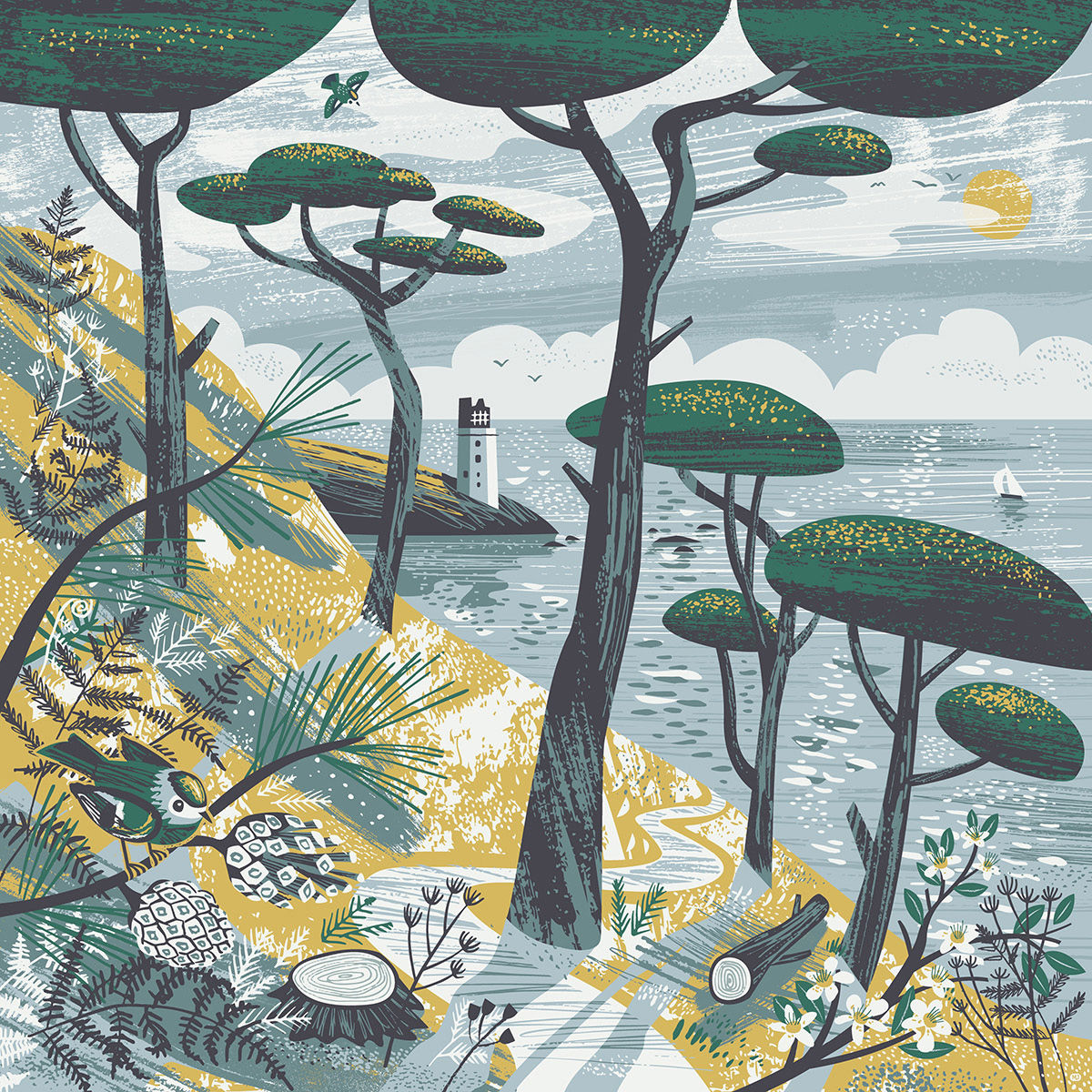
The landscape art that I admire has three key ingredients – A sense of depth, some stylisation and an obvious feeling or story. Landscape is something that you’re in the middle of and you experience by moving around. So, for me, the most important thing is a real sense of depth and space and suggest a feeling of taking a path through that space.
I like it when there is some kind of stylisation or abstraction going on. This could be with expressive marks, or simplifying things into block shapes or areas of texture, distorting the perspective, and so on. I like illustrations that are recognisable as a real place but also work as abstract patterns and shapes at the same time.
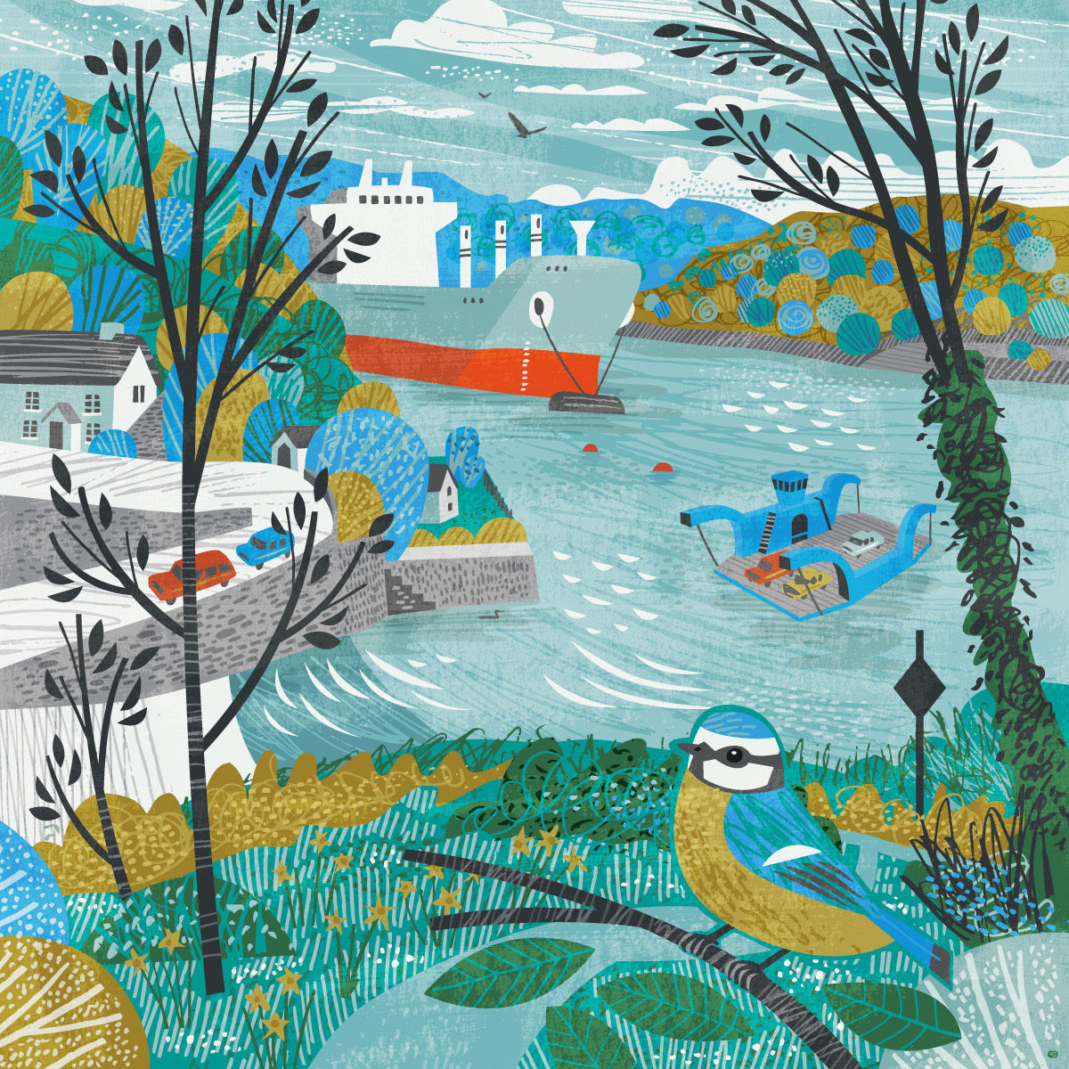
Looking at a landscape illustration, I think you should immediately know how the illustrator feels about it, or there should be some kind of story going on within the picture. It should communicate something to the viewer in a really clear way.
Sketching from life is definitely the most important. I mainly make sketches, notes and reference photos on location, then work from those back in the studio. I like to depict landscapes I know really well, with birds and animals I’ve seen there. I’ll do lots of sketches and photos from different angles and then amalgamate all the ideas into a single image.
I think what you are trying to capture is how you see the landscape in your memory, or in your mind’s eye. I don’t think a single-point, photographic perspective is really suited for this.
People have a much wider field of vision than most camera lenses and experience things moving in time. I like to combine multiple viewpoints and things seen at different times to reflect this. But squeezing all of this into a simple square or rectangle, in a pleasing way is tricky. It’s a bit like a puzzle so I spend quite a while planning. You have to decide what to leave out and what to show and how those things are going to fit together.
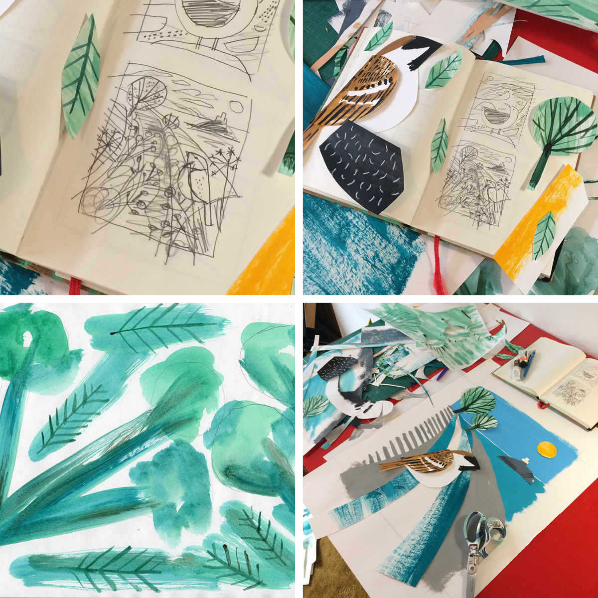
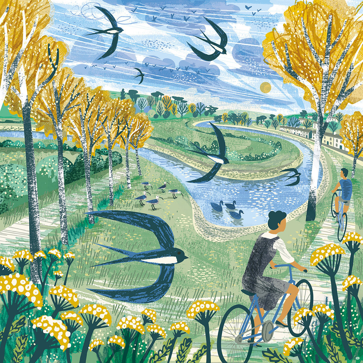
Last Autumn I produced some greetings cards for Reliefprint Press using a collage technique I like a lot. The one above is of a path through fields, overlooking Mounts Bay, that I know quite well from walking and sketching there many times.
The process started with a small thumbnail sketch to work out the composition. Next, I chose a colour scheme for the whole series: natural blues, greens and greys plus yellow and brown as accent colours. Then I painted a bunch of papers with different elements I needed for the picture. Things like plants and leaves, parts of the sparrow, as well as dry brush textures and areas of block colour. I cut out all the bits I needed and played around with their positions on the paper.
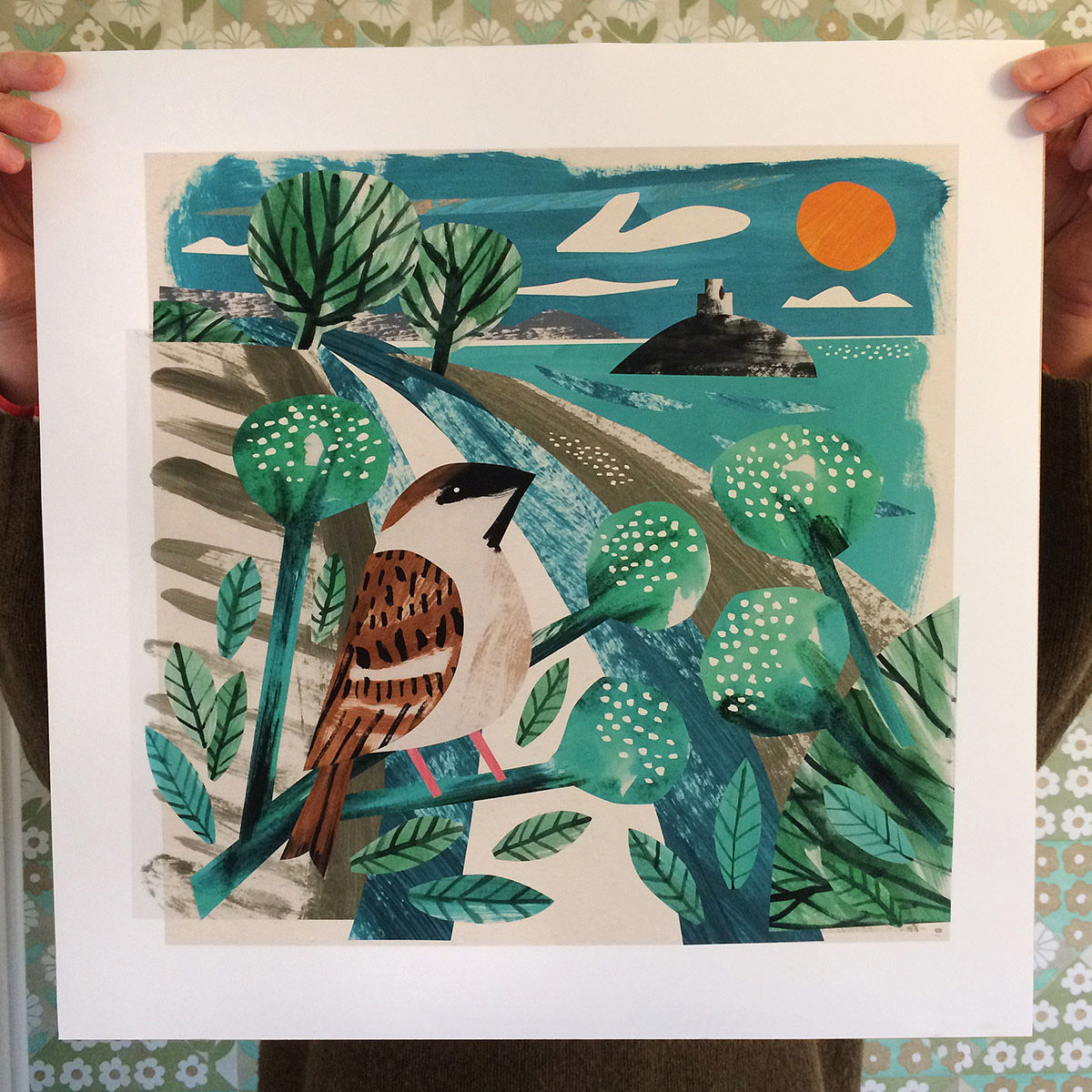
Finally, I scanned the different bits and reassembled in illustrator to make the final card design. I used clipping masks on my scans to mimic the paper cuts and also added some white speckly highlights. The original paper collage was glued down and donated to the charity, Hospital Rooms, and used to decorate an NHS unit in Exeter.
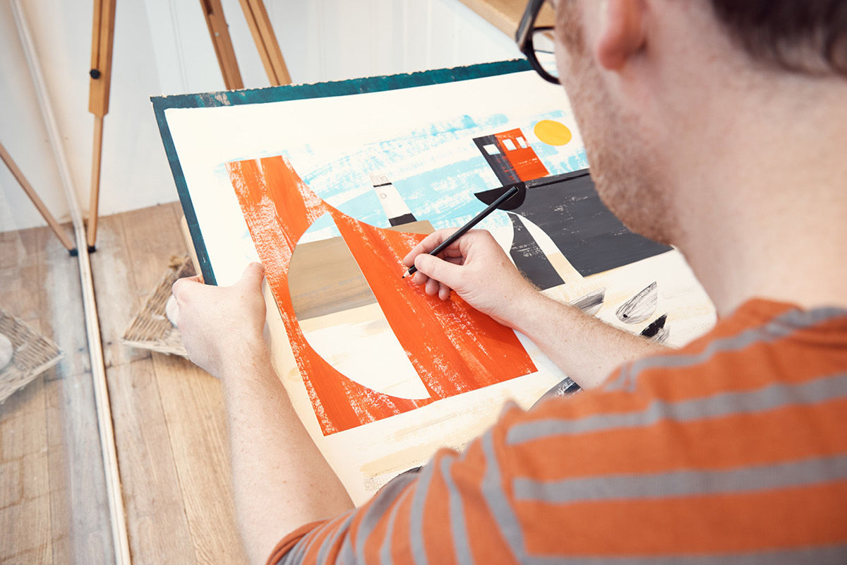
I mainly draw with a mechanical pencil as you don’t have to stop and sharpen it, midflow. I use a refillable one so it doesn’t go in the bin when the lead runs out. I like drawing and painting on cartridge paper as it’s inexpensive but has a bit of weight and texture to it.
I draw and paint a whole bunch of stuff and then scan it and assemble in Adobe Illustrator. I considered trying an iPad with Procreate but I like the drawing and painting on paper part of my process too much. Working on paper is so much better and quicker for planning and creating whereas I find digital tools brilliant for finishing and editing.
Thinking about colour as early as possible in the process is good. I love colour but creating colour schemes is not my strong suit. My colour sense is very unsophisticated and left to my own devices, I just turn everything up to eleven.
Working for a fashion brand has often meant strict limits on colours which has really helped me. Designs have to fit with the colours of the rest of the collection and those colour schemes are created by designers way more talented at colour than me.
A lot of designs for textiles and accessories are screen printed, so you might be limited to 3 or 4 colours maximum. Fewer colours often make for a stronger image. It also forces you to be more creative. If you haven’t got the right colour for something available you have to think of a way round it, that will still make visual sense. This can make for lots of interesting stylisations and quirks.
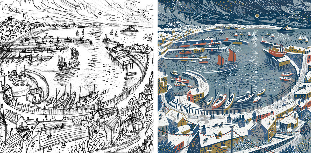
The best piece of advice I can give for landscapes (or any picture) is to start with a small thumbnail sketch to get the composition set. A picture will never work if the composition is wrong and it’s hard to change once you’ve started.
Make your sketch as small as possible – two or three inches wide at most. At this scale you can’t get lost in any details and you can’t help but see the whole picture at once, as you draw it. The goal is to layout how the main elements will fit together. If it goes wrong, do another and another. Try out a few different options.
You can then scale up the thumbnail onto a larger sheet, or computer or whatever you are using for your finished piece. I find working very small to plan composition always gives me a more lively and pleasing result.
See more of Matt’s work at mattillustration.uk
Cassandre Monoriol
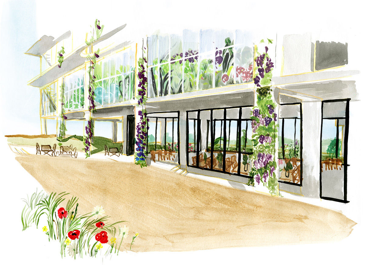
The key quality is to pass on the feeling of the space. Huge or more intimate, with more or less depth. I use analogue and digital methods; painting first, then scanning my drawing. I work on the colour, and add other scanned elements. I draw on location but of course it’s not something I do often, depending on the subject of the project. I love working from my own photographs, and I use stock images, and a lot of magazines and books.
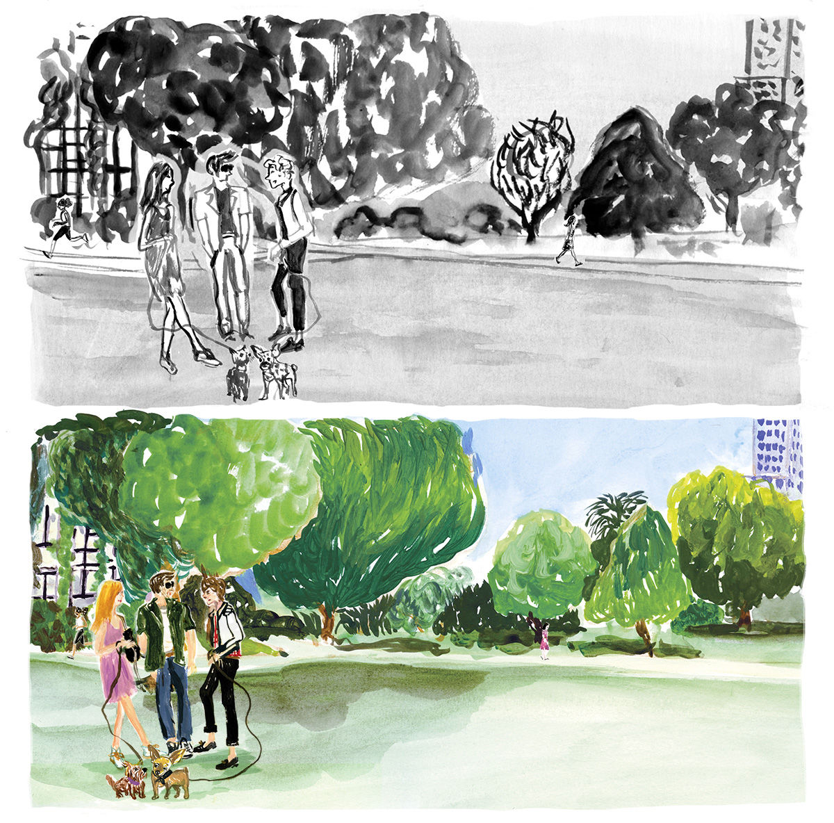
I think it is most important to draw from life where possible. The way you look at a landscape, the way you focus on something or not, the feeling you have of background and first plan, and your framing.
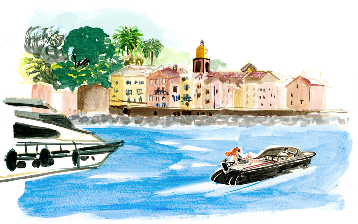
Try to communicate a feeling, an overall impression, and find the detail which will make it touching. That’s where the drawing can cheat, if i may say, and bring an element or whatever that would maybe not being this way in real life.
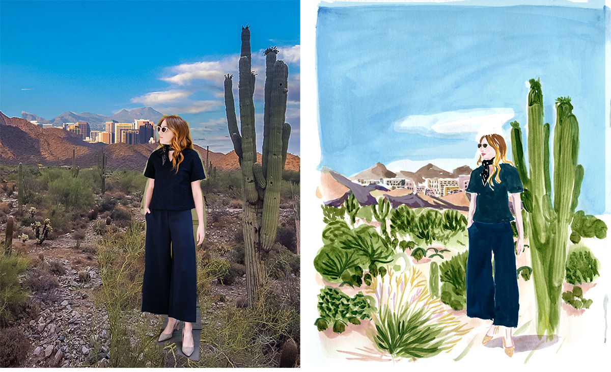
This is a drawing I did a few years ago for MM Lafleur where I have to draw one of their model & outfit around the city of Austin. I looked for a Texas’s desert landscape photo and added in the background the shape of the city, plus the character itself. Then I interpreted it. There’s a lot of collage work in my process, before the painting stage. I compose an image that makes me want to draw it.
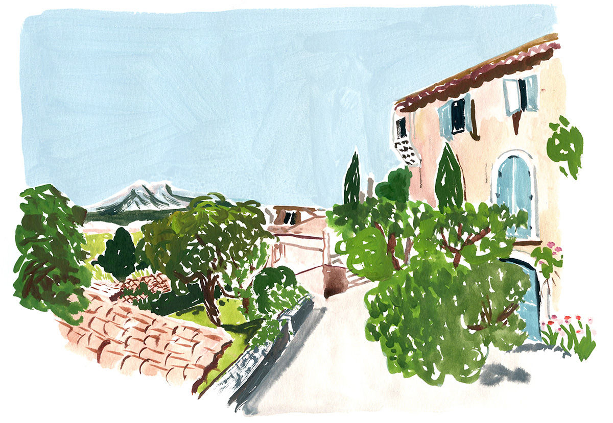
I draw with my paintbrush. So colour is there from the very beginning and is part of the process. I also use the white background of my paper, as a colour.
See more of Cassandre’s work at cassandremontoriol.com
Michael Driver
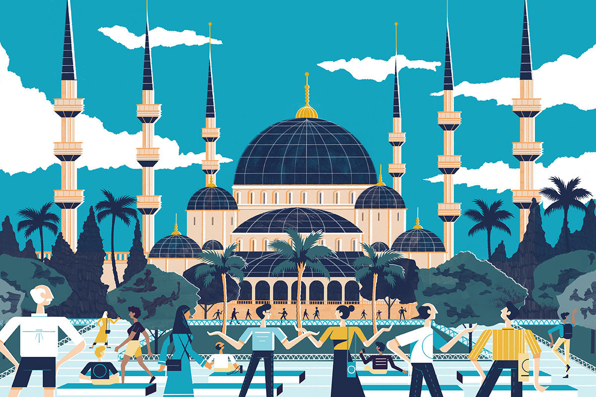
I think getting the scale right is always pretty hard along with striking the balance of what is enough detail and what is too much detail. I really try to play with scale a lot and I think its really important when illustrating a scene to think about how illustration can be used in a way where it isn’t just trying to do what photography can do.
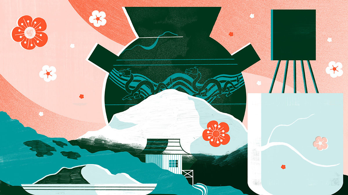
I recently worked on these pieces (above and below) for Culture Trip for an article about Wabi Sabi, I had to do a few mountainous scenes for the article, I find that a really good way of approaching trees and foliage from a distance is to paint acrylic on to a heavy paper stock then rip the paper and scan it in. It creates a really interesting texture and allows me to approach the form in a very different way to how I would draw it.
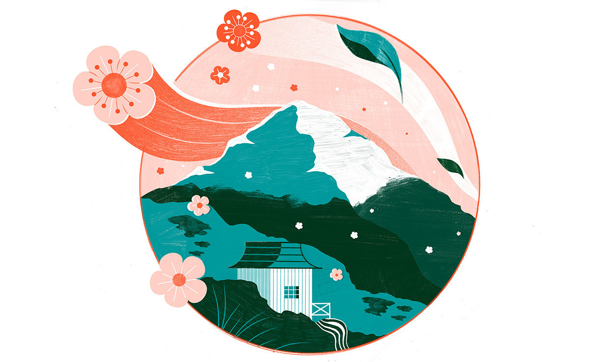
All of my compositions start out as thumbnails, I try and find something interesting about the layout of the image before I start to work things up.
My general process starts with me doing rough thumbnails, I then work the images up a tiny bit more, redrawing important details like characters and pieces of architecture then I colour-rough the image, this can take a while to do, once it’s roughed out I work the image up, my favourite bit of image making is the explorative parts, I love the initial ideas stage and then working out how to bring in an interesting palette.
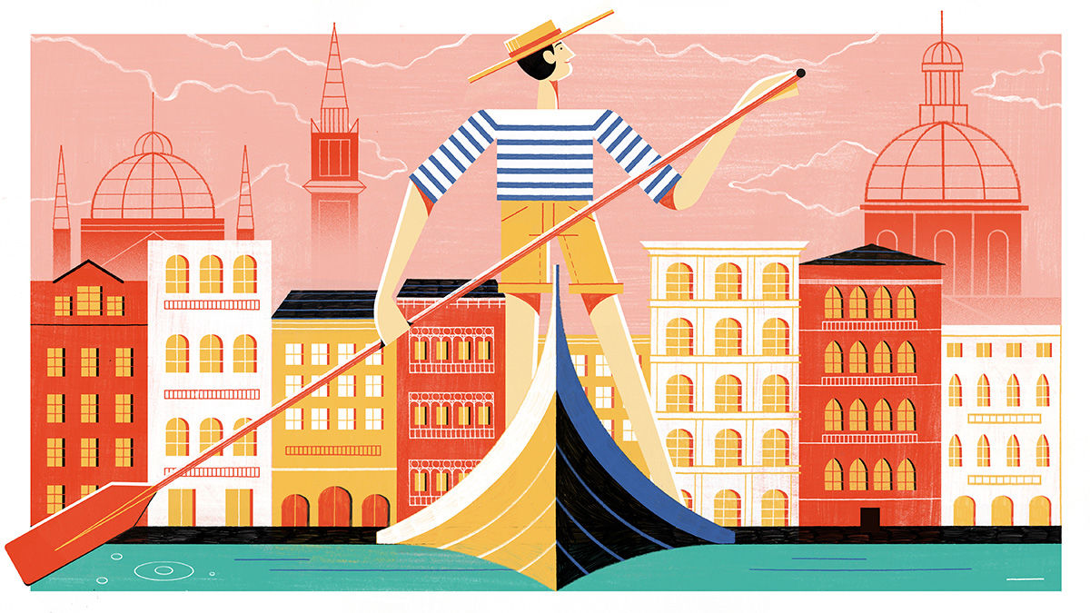
Try and work out what is important in the composition and build everything else around that, think about ways you can reference the place and turn that on it’s head.
See more of Michael’s work at michaeldriver.co.uk
https://www.digitalartsonline.co.uk/features/illustration/landscape-illustration-tips-from-leading-illustrators/

