Book design and illustration advice from the award-winning Shreya Gupta.
I’m originally from India, and currently working as an illustrator and book designer in New York. I grew up reading children’s books and fiction a lot, so I knew that I eventually wanted to make art for books.
However, being in a creative field was not my first career. As a kid my parents encouraged me to study math and science. I also liked taking pictures, but they told me I was ‘too young to carry around a camera.’ As a result I started drawing things and places I wanted to remember. This is how I was first introduced to art!
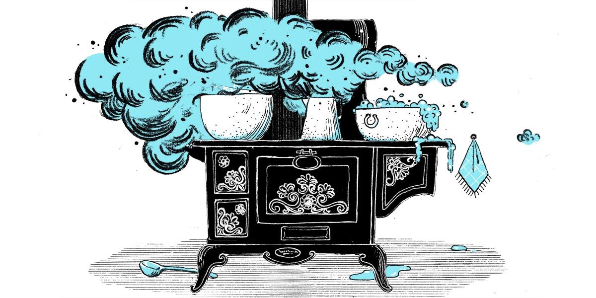
I went on to become a computer engineer and worked at a very well known IT company in India. But I realised that I can’t keep doing that for the rest of my life, and began exploring options in a creative field, and came across the Illustration program at the School of Visual Arts.
Being at SVA, working with my mentors and peers, and meeting many art directors through the MFA Illustration program was very instrumental in getting my career started in the field of Illustration.
You can , including my award-winning cover to Blackbird Girls by Anne Blankman.
How the project came about
When I was in my final year trying to come up with my thesis topic, my mentor Lisel Jane Ashlock introduced me to Invisible Cities by Italo Calvino. It’s a very visual collection of short stories about mind-boggling fantastical cities, both unsettling and charming. This was perfect for me, and I did a series of illustrations on some of my favourite stories. I think this series of works caught the eye of many art directors and I got a lot of work because of this project, including Little Women.
Carina Guiterman, who was then an editor at Little, Brown publishers, came across my work and reached out to know if I would be interested in working on it. Of course I was! Little Women was also one of my favourite books I read growing up, so I was thrilled to get this project.
The timeline was very short, though. Everything needed to be delivered within two months: the cover, the endpapers and 47 chapter headers alongside reading the entire novel! But working with Carina and the art director, Mario Pulice, was such a pleasure.
Initially I was commissioned to do the front cover, the chapter headers, and the endpapers. But as they loved the front cover, I was asked to do the spine and back cover as well.
Making your mark on the cover
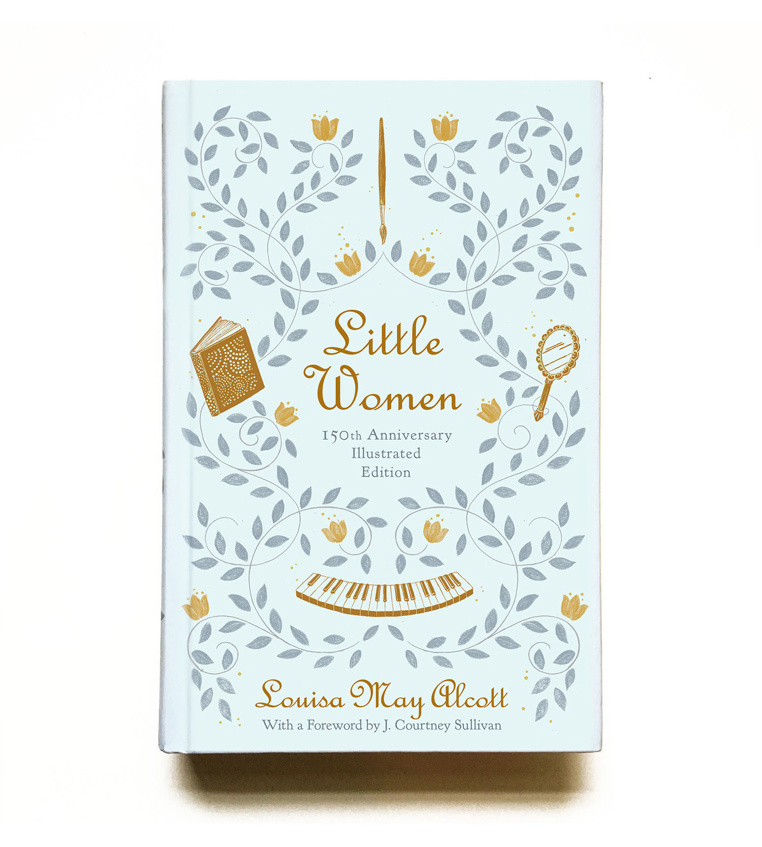
My editor had mentioned at the beginning of the project the book should look very contemporary, even though the story is over a hundred years old. I know the book has been printed many times, and most times an artist had interpreted the March sisters in their own way on the cover. I really wanted to stay away from repeating that.
I do editorial illustrations also, in which I use symbols a lot, and I wanted to bring that approach to the cover. Each March sister has a very different personality and things they like. So I used a hand mirror for Meg (who cares about beauty), a book for Joe (who loves reading and wants to be a writer), piano keys for Beth (who loves music) and a paint brush for Amy (who aspires to be an artist). We also wanted the book to look charming and timeless, which is why I decided to use flower patterns to bind all the symbols together.
Getting ahead of the book
For the chapter headers, I first read the chapters, and then sent sketches for ten chapters at a time, until completing all 47 chapters in total. The size for a chapter header is generally small, so your illustration should be able to work well at small sizes.
One of my favourites is the chapter ‘Little Faithful’, where Beth is going to their neighbour in windy weather.
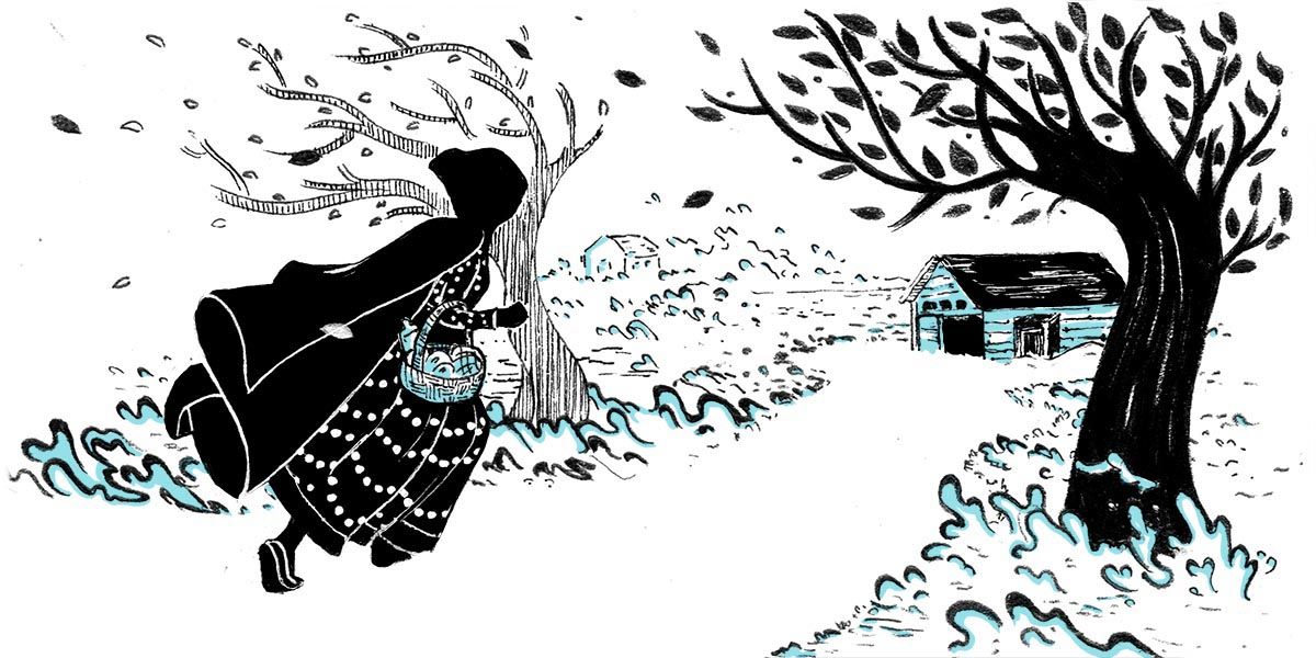
I wanted to show a storytelling concept about the March sisters, which my editor liked too, so we went ahead with that. Throughout the entire process, my editor and my art director put a lot of trust in me, and I think that gave me the opportunity and freedom to create something very special.
When I submitted sketches for the cover design, I also did different colour schemes for them. They picked the blue one that you see as the final cover. When working on the chapter openers, I wanted them to have a similar look as the front cover. Also there were going to be 2-colour illustrations. One colour was black, and I decided on blue as the second colour as that was the dominant one on the front cover.
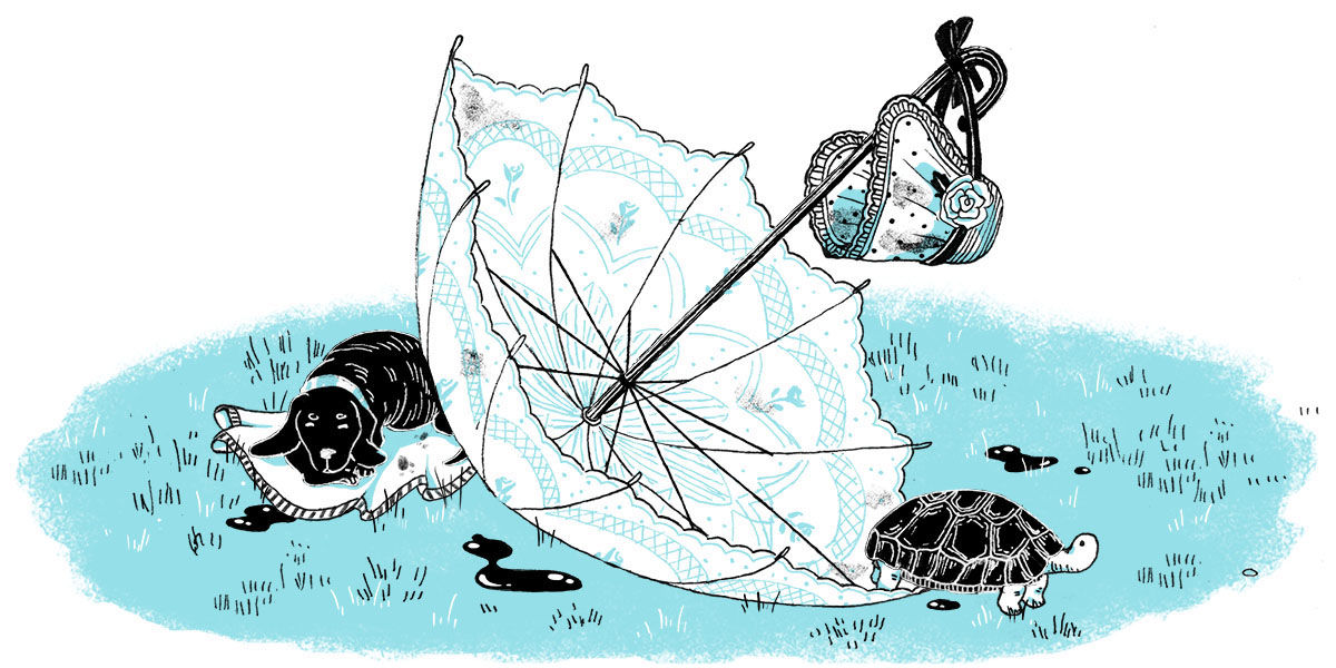
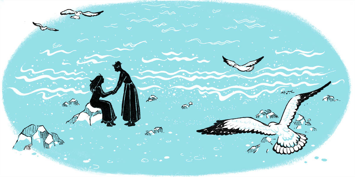
All of the illustrations are drawn using ink pens on paper, which is how they have the ‘ink’-like feel to them. I scanned and coloured them after in Photoshop.
Endpapers (but not The End!)
Designing an endpaper is such a wonderful opportunity to give a surprise to a reader when they open the book. Creating a lush beautiful endpaper can really give a beautiful start to a story.
I personally like endpapers that give a glimpse of the story, so the reader gets interested and looks forward to what’s to come!
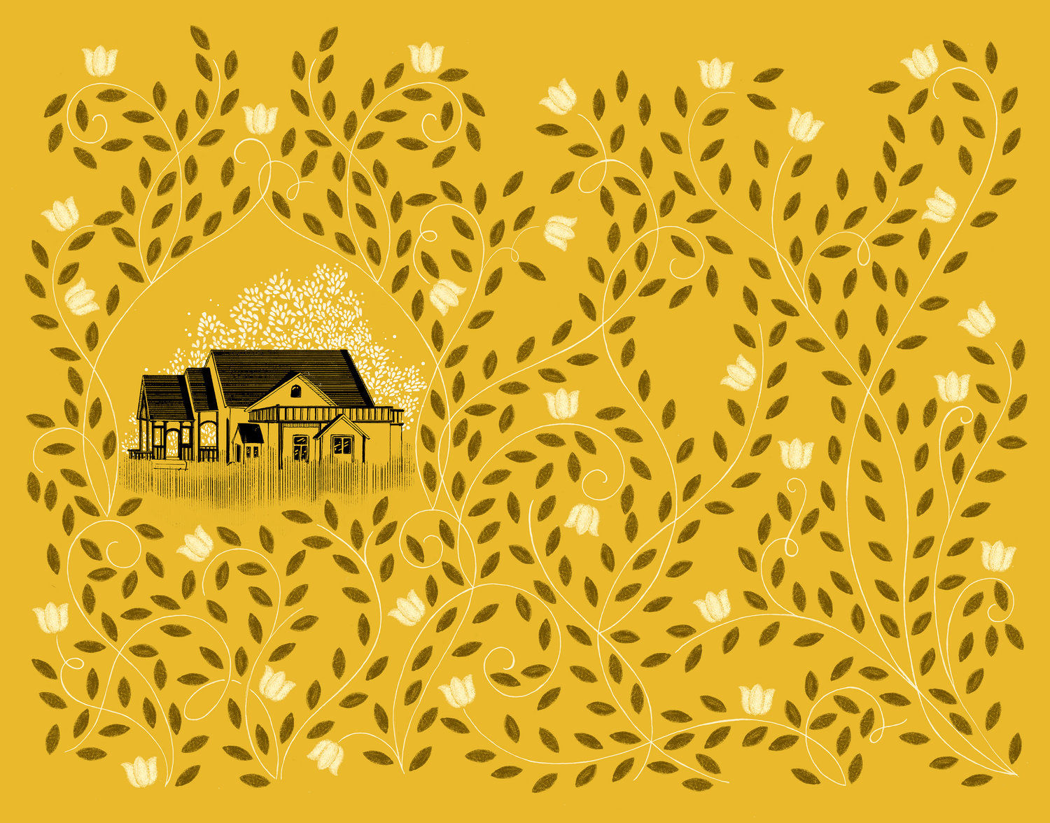
Little Women was my first project to include endpapers and chapter headers. Since then, I have illustrated maps for endpapers of YA novels. But Little Women was definitely exciting as my editor asked me to pitch ideas for the endpapers.
They were all done – rather appropriately – at the end of the project, because I wanted to do them after I had read the entire book which I was doing as I was sketching the header illos.
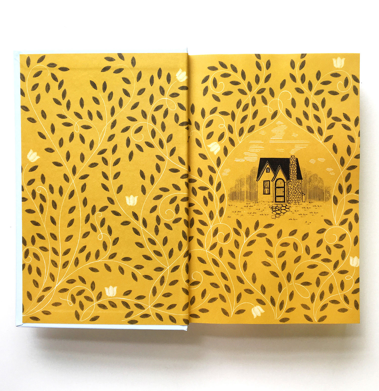
I wanted to do a story telling concept for them, and suggested the idea of showing the two homes of the March sisters. At the beginning of the story, the sisters are poor but still happy, but at the end they have inherited a mansion and are very happy with their own families.
I continued the flower pattern on to the endpapers; on the front one a few are blooming, but in the end one they are in full bloom.
Finding the font
For the quote on the back cover, the final type was decided by the art director, Mario Pulice.
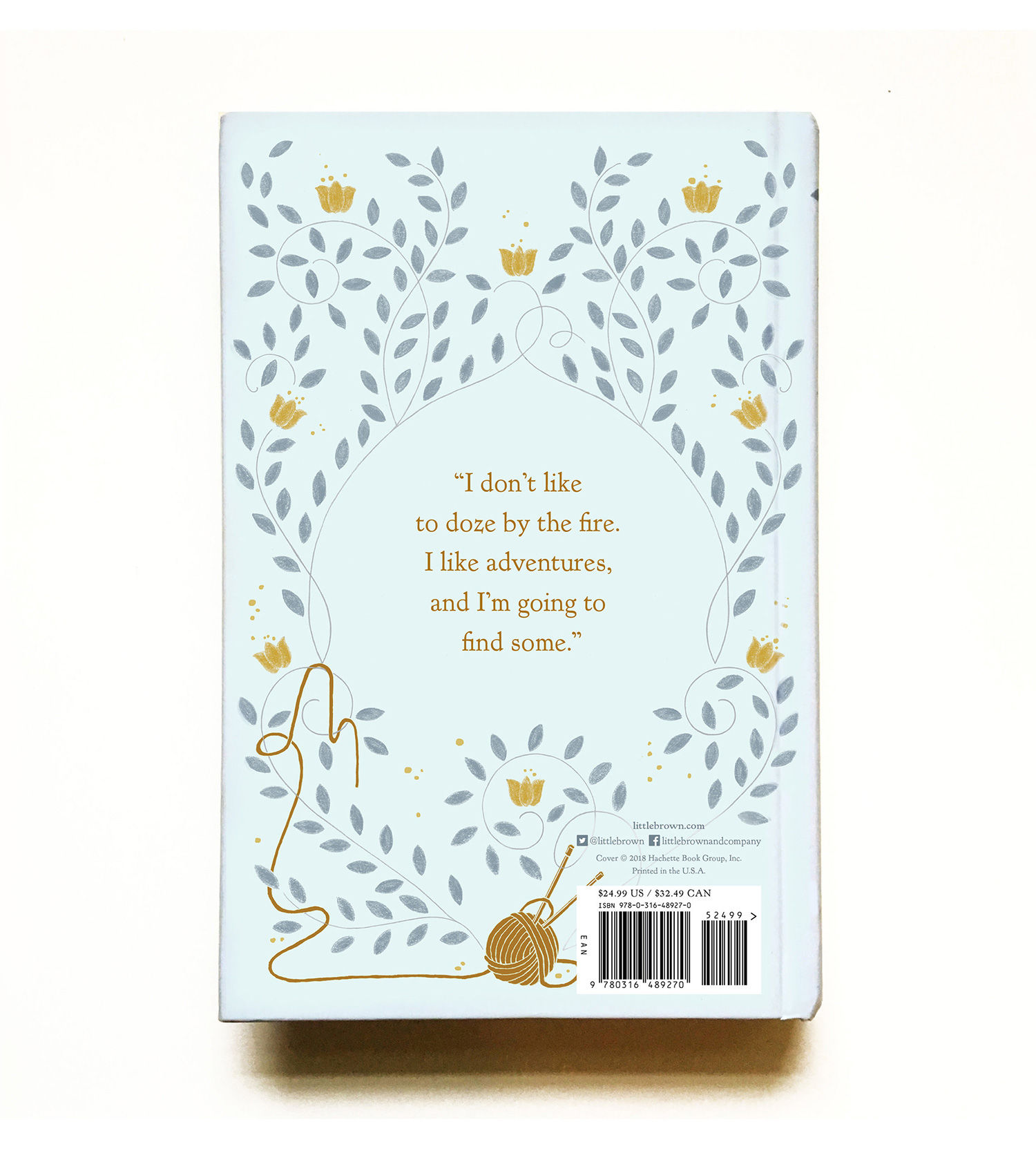
I had mentioned another typeface, but after he suggested the typeface Kennerly, an old style serif, it seemed to perfectly integrate with the illustrated pattern. I thought it was perfect.
Balancing modernity with legacy
I think different illustrators have their own way of conceptualising and representing a story. I love doing floral art, patterns and even symbols when working on something narrative. There are other illustrators who like being more abstract, or more literal.
I try creating images that give the idea of what the book is about, but also leaves the viewer wanting to know more. So far I have had the opportunity to mostly illustrate the covers, but as I have also been working as a book cover designer for over a year now, I hope to get more opportunities to start designing my own illustrated covers as well!
Related: An insider’s guide to illustrating book covers

https://www.digitalartsonline.co.uk/features/illustration/art-of-giving-literary-classic-fitting-new-look/

