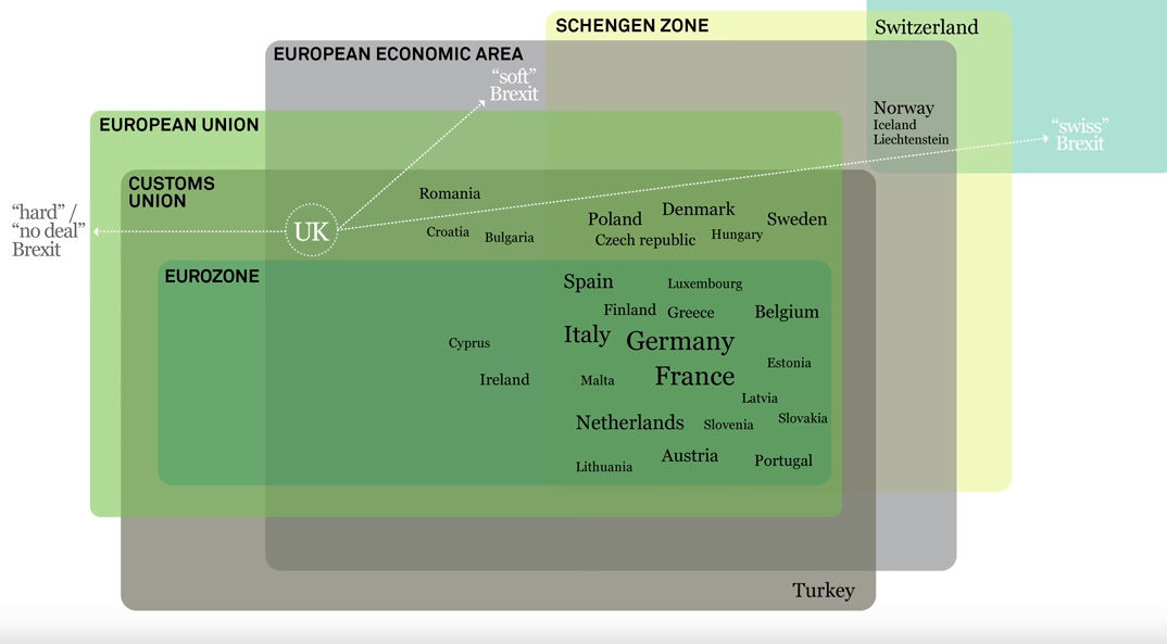
The power of a good infographic can explain everything – even Brexit.
Brexit means Brexit – but what does that mean? Nobody knew at the ballot box, and every day in England is a living nightmare of words repeated on a daily basis, winding their way into our collective subconscious like mass hypnosis: Backstop, ‘Soft’ Brexit, Customs Union, The Norway Model etc. It’s almost like the whole nation was unprepared for what they were voting remain or leave on, god forbid.
Coming in to save the day is a man who knows the value of a visually simple explainer – David McCandless, the man behind Information is Beautiful, a book and awards show celebrating the weird and wonderful world of infographics.
In a new video David attempts to explain the language of Brexit as Britain counts down to its exit from the EU on March 29th. Don’t expect visual fireworks as he assembles his graphics into place with explanations – but do expect to come away knowing exactly what options await Britain come April, as you can see in the full piece above.
It’s funny how a well thought-out arrangement of shapes, colours and text can put such a complicated issue across so effortlessly, but that is the beauty of good design after all.
Now if only we can get a guide to what game Britain’s political parties and various world players are playing with Brexit and why the referendum was called in the first place. Too much to ask?
Read next: Aardman, Blue Zoo, The Mill, Jellyfish and other creatives join the Resistance against Brexit
https://www.digitalartsonline.co.uk/news/graphic-design/no-deal-backstop-brexit-is-finally-explained-in-this-handy-infographic-from-david-mccandless/

