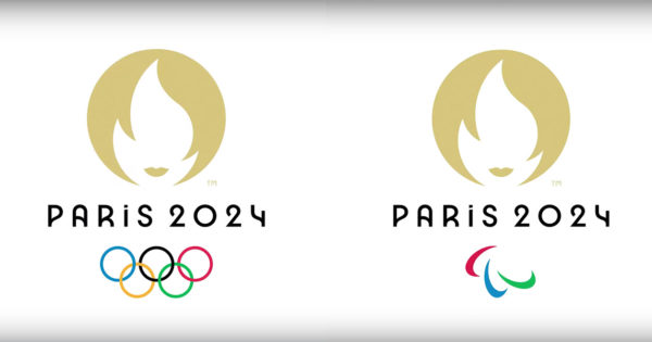
Creating a brand identity for the Olympic Games is, at the same time, an exciting and treacherous brief. On the one hand, designers have a chance to create something truly unique that is a significant part of history. On the other hand, there is a great deal of pressure and, usually, the results are met with skepticism or flat-out scorn.
Sarah Berkheimer, design director of Cactus, may have put it best.
“I recognize that branding something as culturally ubiquitous as the Olympics can not be an easy task, to say the least. And as a designer, I can only sympathize with the enormity of the challenge behind creating a mark that will be everything to everyone.”
That’s one of the significant issues designers face with a project like this. It’s about as public as it gets, and there are more constituencies to placate than just about anything.
Milton Glaser, one of the most celebrated graphic designers in the U.S., was not charitable in his assessment of historical Olympics logos. Yet there were some bright spots, including Tokyo 1964 and Mexico City 1968.
These were two logos that were consistently called out positively among a list of agency and design professionals when asked their thoughts on Paris’ 2024 brand design and Olympics branding in general.
The bad news, however, is that the new logo for Paris, launched earlier this week, is falling flat among design denizens. The main image, evocative of French national symbol Marianne, has been derided as a dating/hookup app logo, among other things. Additionally, the majority of voters on (always entertaining and informative) Brand New aren’t fond of the look, though the typeface received high marks.
Below, more commentary on Paris 2024, where more than a few people were puzzled.
The Ughs
Marian Williams, group creative director, head of design, OKRP
This particular version is lacking energy. And using negative space to show both the Olympic flame and the female face in the mark isn’t working because it isn’t visually celebrating this incredible global sporting event. I am distracted by the face and hair. It’s making a reference for France but loses a lot just to showcase that little bit of cleverness.
Jessica Tainsh, acd, Firstborn
I can’t shake the feeling that I’ve seen this before. Like mounted in peeling gold foil to the window of the local salon mum would visit to get her perm touched up, circa the early 90s. [It’s] signage that, even then, seemed dated and, well, out of fashion (sorry, mum). It’s a nice sentiment, trying to symbolize so many things relevant to the country, and the event, in the one logo, but it falls well short execution-wise, swinging into comedic territory.
Caroline Dettman, co-founder, Have Her Back Consulting
While I applaud the strategic intent of incorporating a key historical female for the first time, the whimsical design misses the mark. Instead of conveying the importance of Marianne to the French or the nod that it was the Olympic Games in Paris in 1900 that first allowed women to compete, this logo conveys no depth or the substance that it deserves. The creative in me, however, wants the Tinder logo to date the 2024 Paris Olympics logo.
Sarah Berkheimer, design director, Cactus
It checks a lot of boxes: idea is clever and clearly has thought behind it; the logo intelligently marries many ideas conceptually and visually; the mark tells a story about a nation’s history and comments on the current social climate; overtly sexual execution, cliche, girlishly superficial and maybe even a bit demeaning. I respect the story that the logo for the Paris 2024 Olympics tells, but the design distracts from it.
https://www.adweek.com/brand-marketing/paris-2024-launched-the-new-olympics-logo-this-week-and-designers-arent-thrilled-with-the-results/

