January 27, 2020
John Boardley
The pointed finger must surely be one of the oldest human gestures. In deep prehistory, long before the evolution of spoken language, and when we were considerably hairier, it is not difficult to imagine one of our primitive human ancestors pointing to a lion, a landmark, or a lemon.
Courage from Positype.
Fast-forward a couple of hundred thousand years or so, and we had evolved enough to draw those pointed fingers in the margins of medieval manuscripts, sometimes penned by copyists and scribes, or by readers wishing to point out or emphasize a significant word, phrase or passage — tasteful predecessors of the now ubiquitous neon highlighter.
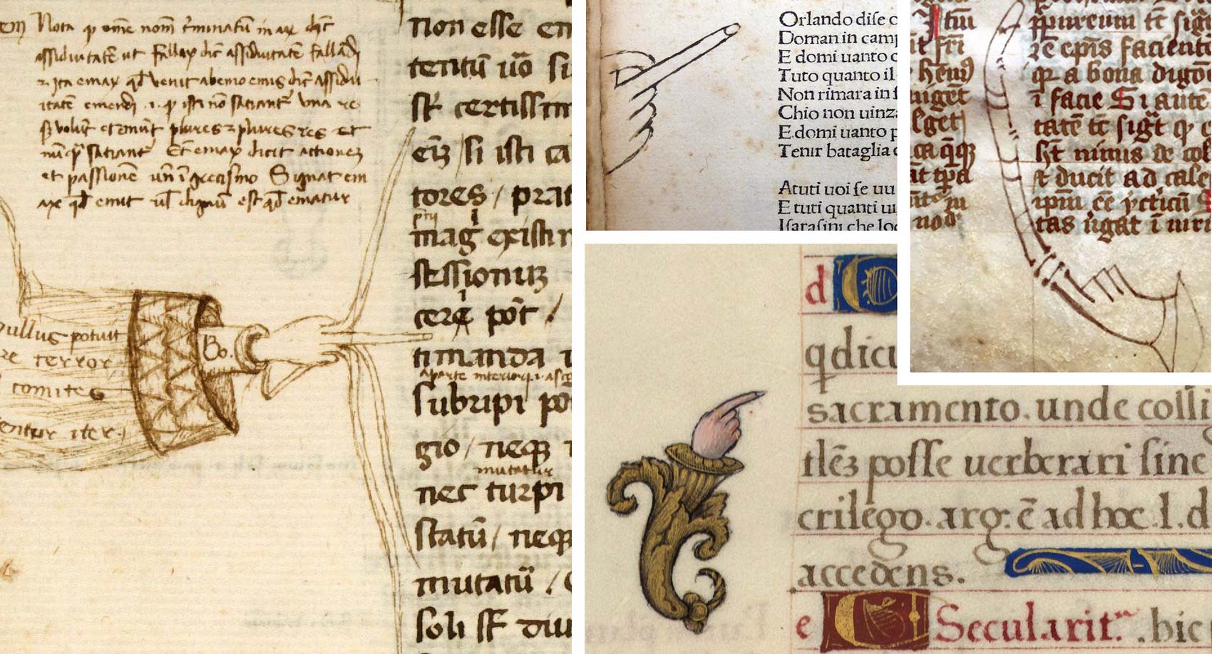
Bibliothèque municipale de Rouen.
The First Printed Manicules
This pointed-finger symbol goes by many names: mutton fist, printer’s fist, bishop’s fist, pointer, hand director, indicule, or most unimaginatively as ‘a hand’. Scholarly consensus has pretty much settled on the word ‘manicule’, from the Latin maniculum, meaning ‘little hand’.*
* Manicule shares the same Latin root with words like ‘manipulate’, but should not be confused with ‘manicure’, which is altogether different and, I believe, more expensive; although, of course, it’s from the same Latin root, mani or ‘hand’.
I was curious to discover when the manicule was first used in printed books. The earliest printed example referenced in William Sherman’s seminal essay, ‘Toward a History of the Manicule’, dates to 1484, in a book of canon law (Church law), printed in Lyon by Mathias Huss and Johann Schabeler. But something told me that it probably wasn’t the very first. After some digging through incunabula catalogs, I came upon, what I believe is the first example in print.
drum roll…
If you enjoy these articles, then I think you’ll love Typographic Firsts
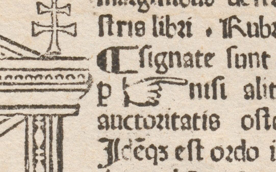
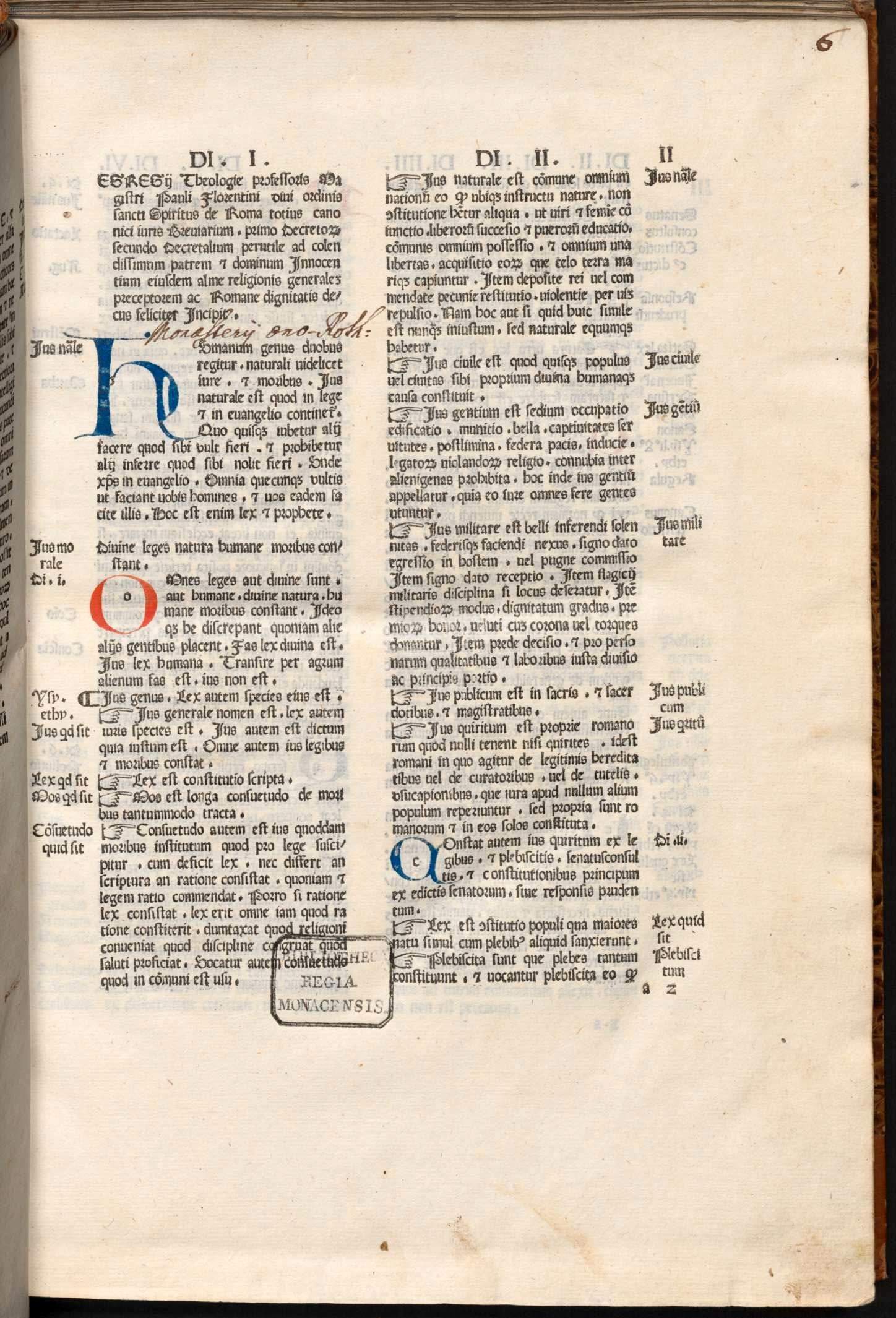
In fact, the manicule debuts in the first edition of that same summary of canon law, Breviarium totius juris canonici, compiled by Paolo Attavanti (also known as Father Paul of Florence) but printed in Milan by the German firm of Leonhard Pachel and Ulrich Scinzenzeller, on August 28, 1479.
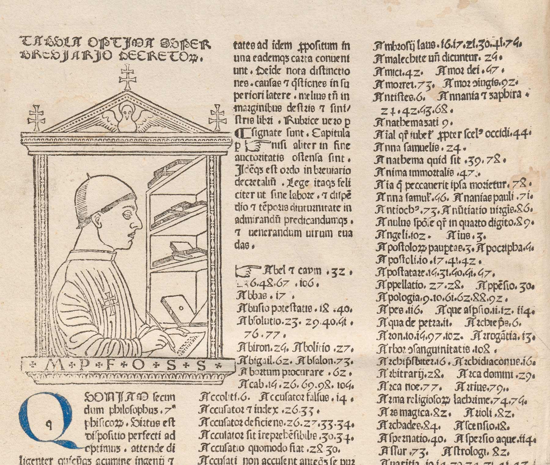
The first printed manicule appears on the book’s opening leaf, right before the ‘tabula’ or index, which in the fifteenth century often appeared at the start of the book. The author explains the use of the paragraph mark (or pilcrow) and the manicule to differentiate between points of law and authoritative pronouncements on them.
The Gothic rotunda font first appeared about a year earlier, in 1478, in another law book, Corpus Iuris Civilis, (civil law) but without the manicule, suggesting that the manicule sort was added to the font in 1479. As an interesting aside, and yet another typographic first, the book is also the first printed book to display a picture of its author.
The book was republished or reprinted three times in the fifteenth century: in Lyon by Huss and Schabeler in 1484; and in 1486 and 1499 by Albrecht Kunne in Memmingen, Germany. All of these editions copy Pachel and Scinzenzeller’s use of the manicule.
Reference & further reading:
☞ Keith Houston, Shady Characters
☞ W.H. Sherman, Used Books: Marking Readers in Renaissance England
☞ Michael Camille, Image on the Edge
—
Related: Make the Margins Bigger
—
Header font: Courage from Positype.
Legacy
The practice of annotating the margins with pointing fingers is no longer commonplace, replaced by plainer symbols, scribbles, and neon highlighters of the ink and digital kinds. However, the manicule has been saved from extinction by its inclusion in numerous digital fonts, including my favorite set in Martin Majoor’s Scala Hands.

For a fascinating and entertaining history of the manicule, I point you to Keith Houston’s Shady Characters (ch. 9) ◉


