July 4, 2019
John Boardley
What people read began to change during the Renaissance. The continued expansion of schools and universities and better literacy was bolstered by the European invention of print in the mid-fifteenth century. The rediscovery of classical antiquity and of the New World, the cosmic shifts, temporal and terrestrial, affected by the Reformation and the Copernican revolution, a renewed interest in mysticism and symbolism — it is in this world-turned-upside-down climate that new and novel literary genres emerged.
Of the new genres of books that emerged from this Renaissance soil, the emblem book was among the most successful. First appearing at the beginning of the sixteenth century it was, for the next 200 years, one of Europe’s best-selling literary genres.
“The Emblemata present a form of learned amusement full of rhetorical wit and sophisticated allusions, but never without conveying a practical moral lesson as well.”
First of its kind
The first of this new emblem book genre appeared in 1531. Its author, the Italian lawyer and legal scholar Andrea Alciato (1492–1550) had apparently no grander ambitions for his Latin epigrams than to share them among his friends. In a letter of 1522, Alciato announces his new genre, that he names Emblemata. Those early manuscript copies, circulated among his learned friends and colleagues, were most likely unillustrated.
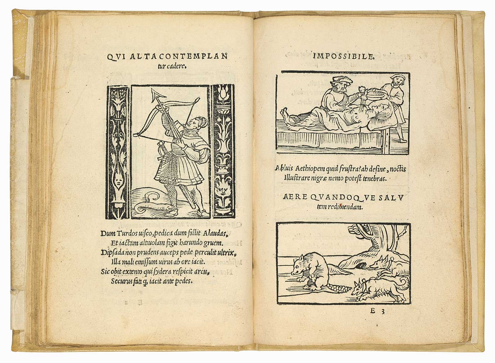
Somehow, the shrewd Augsburg printer-publisher Heinrich Steyner had gotten hold of a manuscript copy of Alciato’s emblem book. That it circulated for almost a decade without ever being printed is a little surprising. Perhaps Steyner had the same thought, for in 1531 he printed it, without the author’s permission (not at all uncommon then). And, unlike Alciato’s manuscript book, Steyner’s was illustrated. And thus the Emblem book, as a kind of learned picture book for both recreation and learning was born.
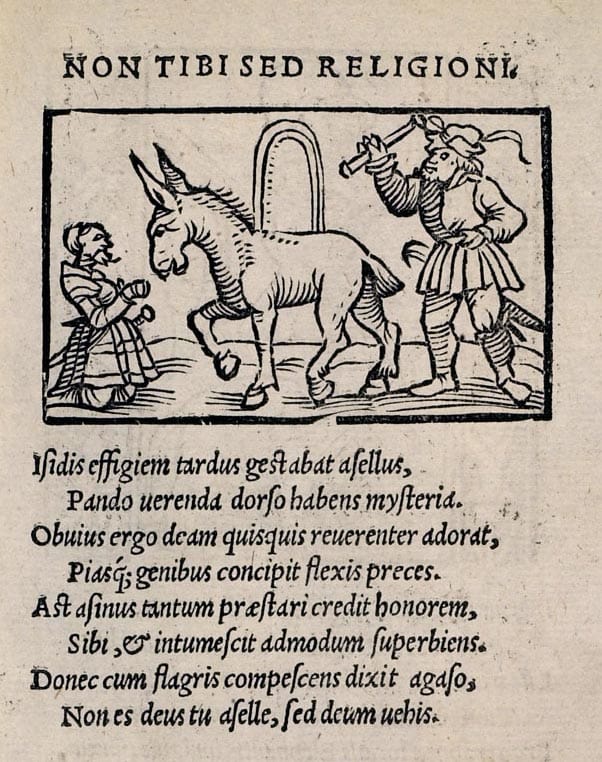
Steyner’s edition was either an instant success or he had misjudged demand and simply printed too few copies, because just five weeks later, he published a second edition. However, although a prolific printer and publisher and the first to introduce this new and popular genre, by 1547 Steyner was bankrupt and died the following year.
Unhappy with the illustrations in Steyner’s editions, Alciato, decided to print his own edition. At the time he was living in Bourges in central France, but sometimes went north to Paris to lecture at the university. It is there that he first came into contact with the German-born Paris printer Christian Wechel. Three years after the Steyner first edition, the ‘authorized’ Alciato edition was published in 1524. It is clear from the dedication written by Wechel that Alciato was intimately involved with the book’s production, correcting the errors in the Steyner edition and undoubtedly overseeing the production of the all-new woodcuts illustrations for the 113 emblems.
Inside an Emblem Book
The emblem book is a collection of ‘emblems’, with each comprising three parts: First, a title or motto that might take the form of a proverb; second, a picture often containing figures and symbols drawn from myths and fables; and third, a short explanation of the allegorical meaning of the image, frequently in the form of an epigram, or short poem. The purpose of the emblem is almost always educational or moralizing. Most of the emblems in early editions are not particularly novel, esoteric or profound. Many were sourced from the ancient allegories and proverbs of Pliny, Plutarch and Aesop. Some are noble and insightful, while others are little more than platitudes worn out by pessimism and millennia.
Why so popular?
Alciato’s emblem book was soon translated into French, German, Spanish and Italian. By the end of the 1600s, it had appeared in 200 editions and spawned more than 2,000 other emblem titles, published in thousands of editions. We might, with some obvious caveats, think of emblems as the memes of the Renaissance and they proved popular for pretty much the same reasons that contemporary Internet memes do: they capture something of the popular zeitgeist, they entertain and sometimes (although perhaps rarely in the case of Internet memes) teach us something. Alciato writes in his preface that his emblems were intended primarily as entertainment, albeit of a more cerebral kind.
Francis Bacon, writing in The Advancement of Learning (1605), describes the purpose of emblems:
‘Embleme deduceth conceptions intellectually to images sensible, and that which is sensible more forcibly strikes the memory, and is more easily imprinted than that which is intellectual.’
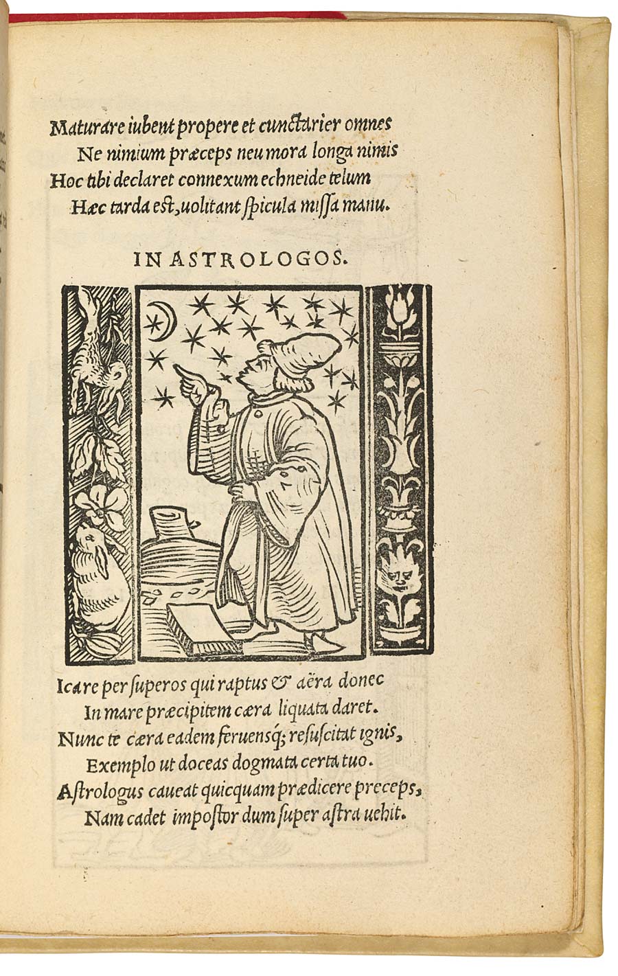
Some emblems require no interpretation, because they convey straightforward moral lessons or proverbs, like the plain allegorical message in the ‘astrologer emblem’, whose message is that we should know our place and out limits — with the added message, made explicit in the commentary, that we should be wary of the predictions of astrologers.
And the clear message in this emblem depicting a man with one arm winged, the other weighed down by a stone with a title that reads, ‘Poverty hinders the greatest talents from advancing’.
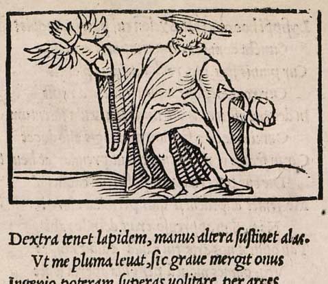
The accompanying epigram reads,
‘My right hand holds a stone, my other hand bears wings. As the feathers lift me, so the heavy weight drags me down. With my intellect I could be soaring among the highest peaks, if envious poverty did not pull me down.’
By contrast, some other emblems were wrapped in layers of elaborate symbolism and open to interpretation, thus challenging readers to decipher them – Renaissance brain-teasers, if you like.
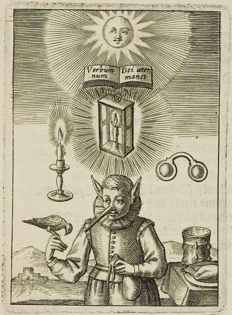
Above is a rather sophisticated and inscrutable emblem from Emblemata nova published by Lucas Jennis in 1617. I’m really not sure what is going on here. The most I can gather is that we are encouraged to use the gifts we have; for example, ‘What good is a large nose if you can’t smell well.’ I discovered this edition through a feature on BibliOdyssey.
All kinds of emblem books
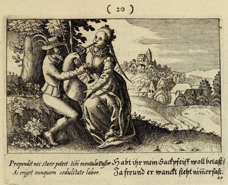
As demand mushroomed, authors and publishers saw an opportunity for themed editions. These sub-genres proved hugely popular. The Emblemata amatoria, an emblem book devoted to matters of love and courtship first appeared in 1601. This new tradition of love emblems was especially popular in the Low Countries. By the late 1600s, some of the published emblems were rather risqué, at least by seventeenth-century standards. You probably don’t need my help in deciphering the graphic euphemism in the ‘bagpipes’ emblem below:
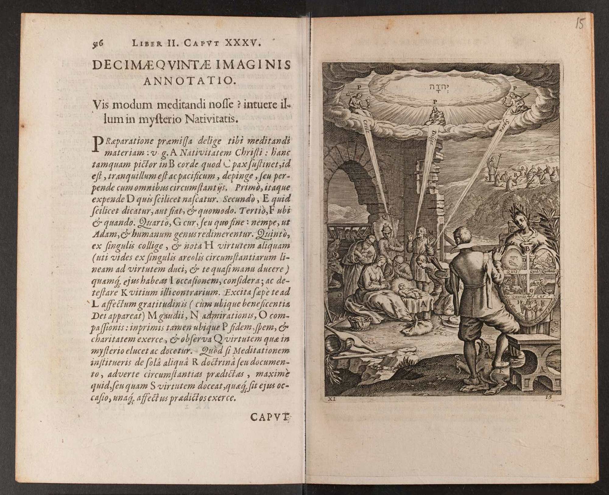
Many other themes were served too; for example, the politically themed Emblemata politica published by Jacobi à Bruck in 1618. Then the hugely popular religious or devotional emblem books; one of the first examples being Antoine Sucquet’s Via vitae aeternae iconibus, illustrating the various paths to eternal life. First published in Antwerp in 1620, it is magnificently illustrated with 33 plates by the brilliant Baroque engraver Boëce van Bolswer (1580–1633). Sucquet (1574–1627) was a leading member of the Jesuits in the Low Countries.
§ For most of the 16th century, the oblong quarto format was by far the most popular for music books (fewer line-endings, therefore fewer interruptions). If this topic interests you, then read: D. W. Krummel, ‘Oblong Format in Early Music Books.’
Daniel Stolcius’s Viridarium chymicum (‘The Chemical Pleasure-Garden’) with alchemy as its theme, first published in 1624 and printed in an oblong format (unusual for anything but music books§) ― published in German translation later the same year. It also served as an encyclopedia of alchemy. The first edition is typeset in a really lovely italic font. He writes a delightful and engaging preface, opening with ‘I write my poems for the learned and the unlearned’ and concluding with, ‘use the book to your heart’s desire and walk in our pleasure-garden.’
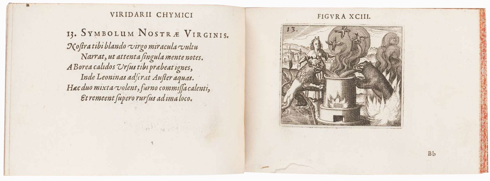
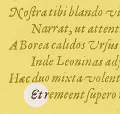
Italic e from Daniel Stolcius’s Viridarium chymicum of 1624.
Also has a very lovely italic with fine swash capitals and a particularly nicely designed cursive, ‘coiled-spring’ e.
And, explaining the purpose of the book — in fact, the whole genre — Stolcius writes in his preface:
‘Decorated with beautiful figures engraved in copper, illustrated with poetic tableaux, and explained, to the end that the eyes and the mind are not only regaled but also induced to a profound contemplation of natural things.’
Noble aims, indeed.
Although we no longer publish them and seldom read them, the influence of emblem books was prolonged and significant. Today, they provide valuable insights into the visual and verbal culture of the Renaissance and Baroque periods and, to this day, continue to both confound and entertain us.
Header image: A Goldsmith in His Shop, 1449.
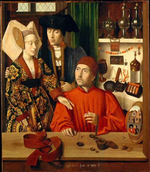
With thanks to The Met ― a shining example of how easily accessible, high-res images of art and artifacts should be shared.

