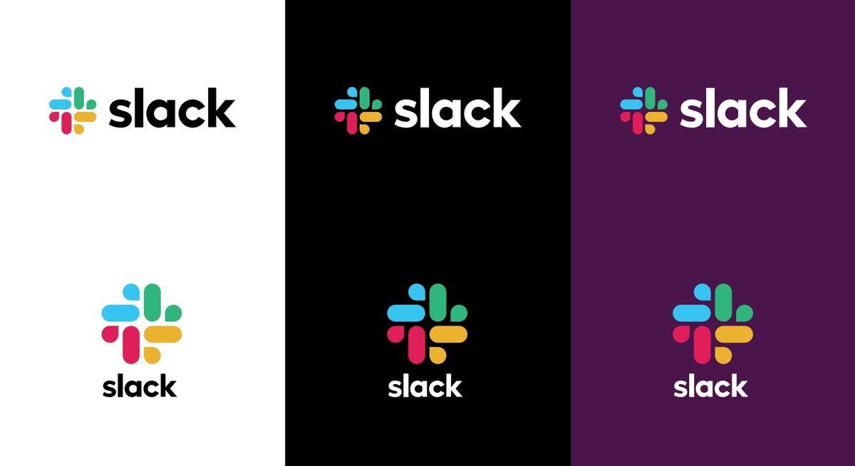
When massively popular workplace messaging app Slack first revealed that it would be trading in its wonderfully unique hashtag logo for a squirting pinwheel, I found a silver lining anyhow. “At least it’s got that nice purple background,” I thought to myself, the first time I saw the new icon pop up on my Android phone.
But it seems that Slack is dead set on making its logo as generic as can possibly be, because today it’s replacing that purple with a white background instead.
Just like half the other apps on my phone.
Incredibly, Slack says the move is designed to make it easier to spot the Slack app:
Starting today, you may notice your Slack mobile app icon change from purple to white. This should make it a little easier to see on your device. Visit the Google Play or Apple App Store to update.
— Slack (@SlackHQ) February 26, 2019
To which I say:

Yep, definitely less confusing now.
It also looks nothing like Apple’s default photo app, I’m sure.
But I suppose it’s a little harder to spot the Slack logo’s hidden swastika in the negative space now.
Below, in the lower right, you can see Slack’s phone logo as it used to be, temporarily, on phones. I will miss the purple.

https://www.theverge.com/tldr/2019/2/26/18242369/slack-icon-android-ios-white-purple

