
Shillington New York graduate Vanessa Castiglione moved from her native Ontario, Canada, to the Big Apple to study graphic design—and never looked back! Since graduating from Shillington’s three month full-time course, she’s been working as an eCommerce Designer at PepsiCo Foods Canada (the first person EVER to have that job!), tackling some amazing freelance projects and winning multiple awards! Sky’s the limit for Vanessa.
We chatted with Vanessa two years after graduation to learn about her Shillington experience,
You started your career in marketing and brand management within the food & beverage CPG space at PepsiCo. How did you learn about Shillington? And what made our design course stand out from the rest?
I discovered Shillington online in my university dorm room.
From the first time I landed on the website and explored, I knew this course would be something I wanted to do one day.
The exceptional work on the Student Work page sold me on the course. I remember wanting to be able to create work like that myself one day. The way the work was displayed, the colours, the creativity, and the diversity of all the outcomes made me believe that within three months, I would be able to do the same.
Did you have any previous design experience? How did the course build your skill set?
Yes, I started learning the Adobe programs in high school, designed for several organizations throughout university including completing an internship. I also completed a certificate at an art university one summer.
However, I found myself lacking a thorough design process and often hitting a “design block.” Throughout the Shillington course, it completely transformed the way that I approached design in two key ways. Firstly, learning the design process and ideation techniques helped me approach design in a more thoughtful way. Previously when designing, the goal was always to just make something that “looked good.”
Shillington taught me that it’s much more than just about creating aesthetically pleasing pieces, it’s about solving problems and understanding the everything that affects design like competitors, personas/users, demographics etc. to create something effective.
Secondly, the course and the process helped me avoid “design block” as I was encouraged to seek inspiration in several ways and use techniques to get the creative juices flowing. After having taken the course, I have a much more holistic approach to design problems I face and built my skill set in terms of process and how to seek inspiration.
While studying at Shillington, did you have a favorite brief? Tell us more about it and your process?
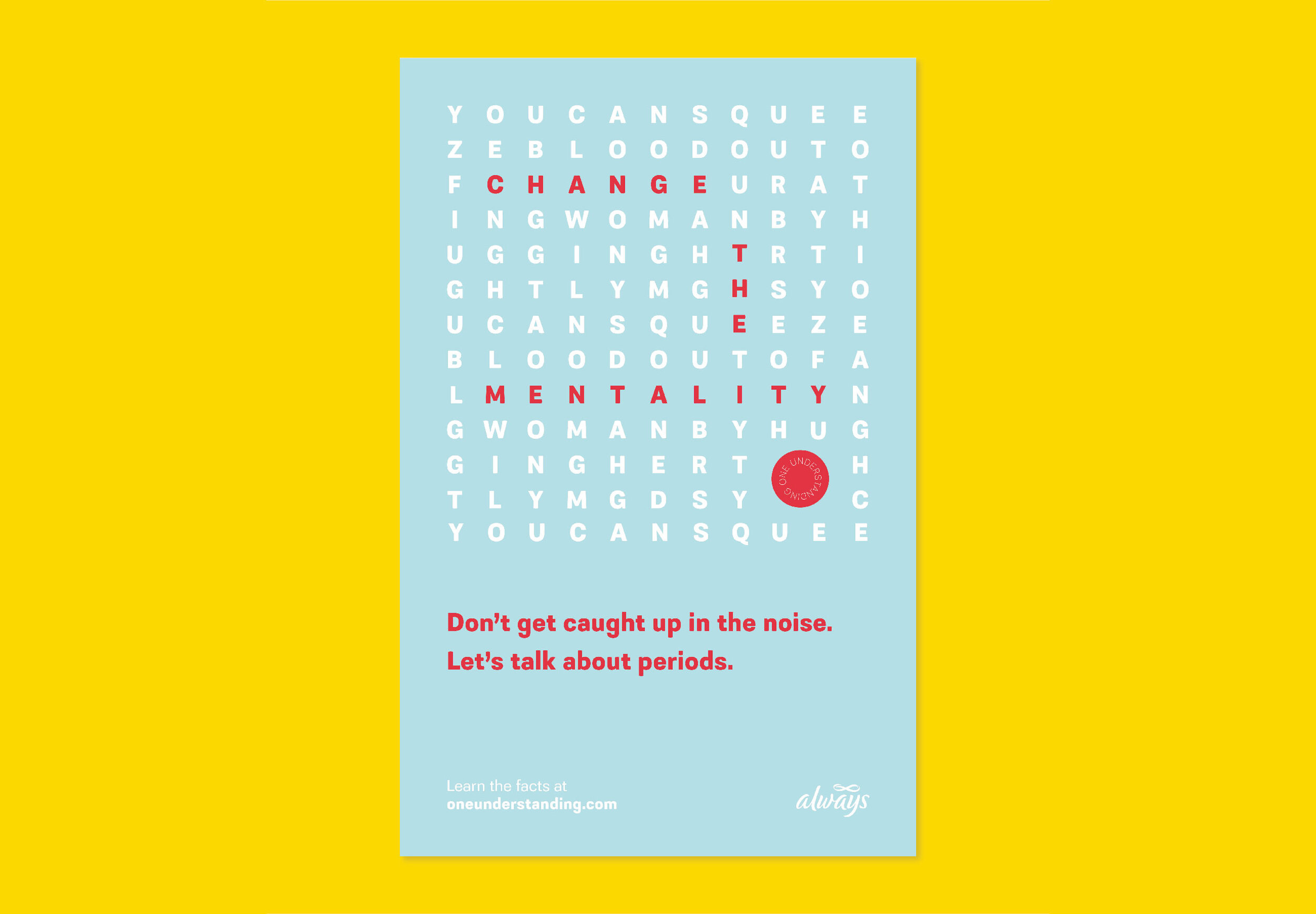
Throughout the entire course, my favourite was the campaign brief. I chose to create a campaign educating the public on periods. There are a ton of periods myths that exist and many of them are quite ridiculous. As part of the process, I spent a lot of time understanding how large brands have handled the topic of periods in previous campaigns as I wanted to take a different approach.
Additionally, I spent time understanding the most common misconceptions there are about periods. The project went through several iterations as the goal was to make the somewhat “taboo” topic more approachable for everyone… regardless of whether you have periods or not. In the end, my campaign entitled One Understanding, came to be a lighthearted, approachable, and educational branding project.
What was the course like? Did you make any lasting connections with your classmates?
I never shy away from admitting that attending Shillington in NYC were some of the happiest months of my life.
Each day, I had the opportunity to create something new and push myself as a designer further than I had the day before surrounded by supportive classmates and teachers.
The course was fun but challenging at times. It was a perfect mixture of theory, technical learning and design ideation. Coming from a business background, learning about prominent designers in the industry through classmate presentations helped me gain more of an understanding of the profession, as well as an understanding of how design has evolved because of these great minds. Having had a strong foundation in the programs prior, learning the design ideation process was the most critical piece as I now have a trusted process to tackle and design/branding problem I encounter.
I keep in contact with some classmates. We still have our group chat from a couple years ago. We share opportunities and work here and there. In addition, I keep in contact with a few of my closer friends and teachers from the course.
Since studying at Shillington, you transitioned your role from working for the Tropicana division of PepsiCo to becoming a designer for their Quaker and Frito-Lay brands division as a graphic designer. Congratulations! How were you able to make the shift to the new department?
It started with being honest with myself about what I loved to do and where I saw myself in the future. Ultimately, I made the decision that I wanted to pursue design full-time after missing the hands-on creative aspect in my marketing role. Once I was fully confident in the decision that I was making, I began talking about my aspirations and kept an eye out for design roles within the company as I learned that PepsiCo has a huge focus on design in the U.S.
With the explosion of eCommerce during the pandemic, the Canadian team coincidently created a new graphic designer role to develop all the creative that lives across online retailers nationwide. It’s been an incredible learning opportunity to shape the first-ever external facing graphic designer role in Canada into what it is today!
You’re currently responsible for producing creative assets for marketing campaigns and online product merchandising PepsiCo’s brands. Tell us about your work there as the eCommerce designer. Can you share details about recent projects?
Working as the eComm Designer for the last several months has been exciting as it is a brand-new role in Canada. I have had a ton of ownership over my projects and was able to shape the role into what it is today.
In a nutshell, I develop all eCommerce content to ensure our Quaker and Frito-Lay products look their best across retailers nationwide. To date, it has included static design work, in addition to art direction of video content alongside agency partners. Creating this content is part of my biggest project in the role: overhaul our digital content across eCommerce retailers. To be specific, I am creating product tile infographics for all Quaker and Frito-Lay products, in addition to designing brand stores and A+ content on Amazon. This design work elevates our brands online, where many consumers now buy from because of the pandemic.
Reflecting on my time at Shillington, I view this as a critical component to a successful brand rollout. In addition to elevating our year-round brand content online, I also design digital creative for product promotions across several retailers nationwide. To date, I have designed digital creative for the Super Bowl, Canada Day and other seasonal holidays.
For the past two years you’ve won Indigo Awards for your branding and packaging projects! Congratulations! Can you share more about the projects that won an award?
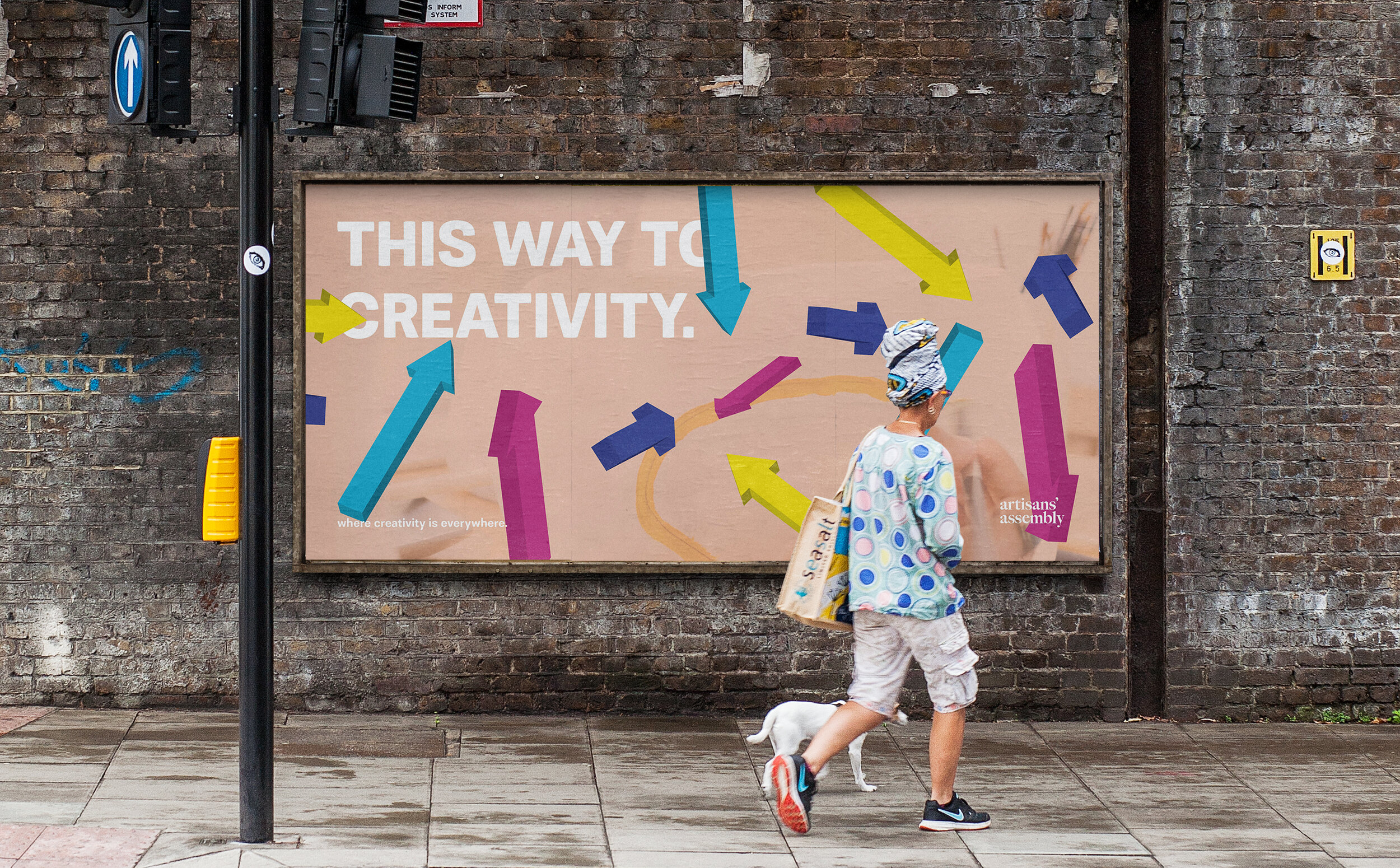
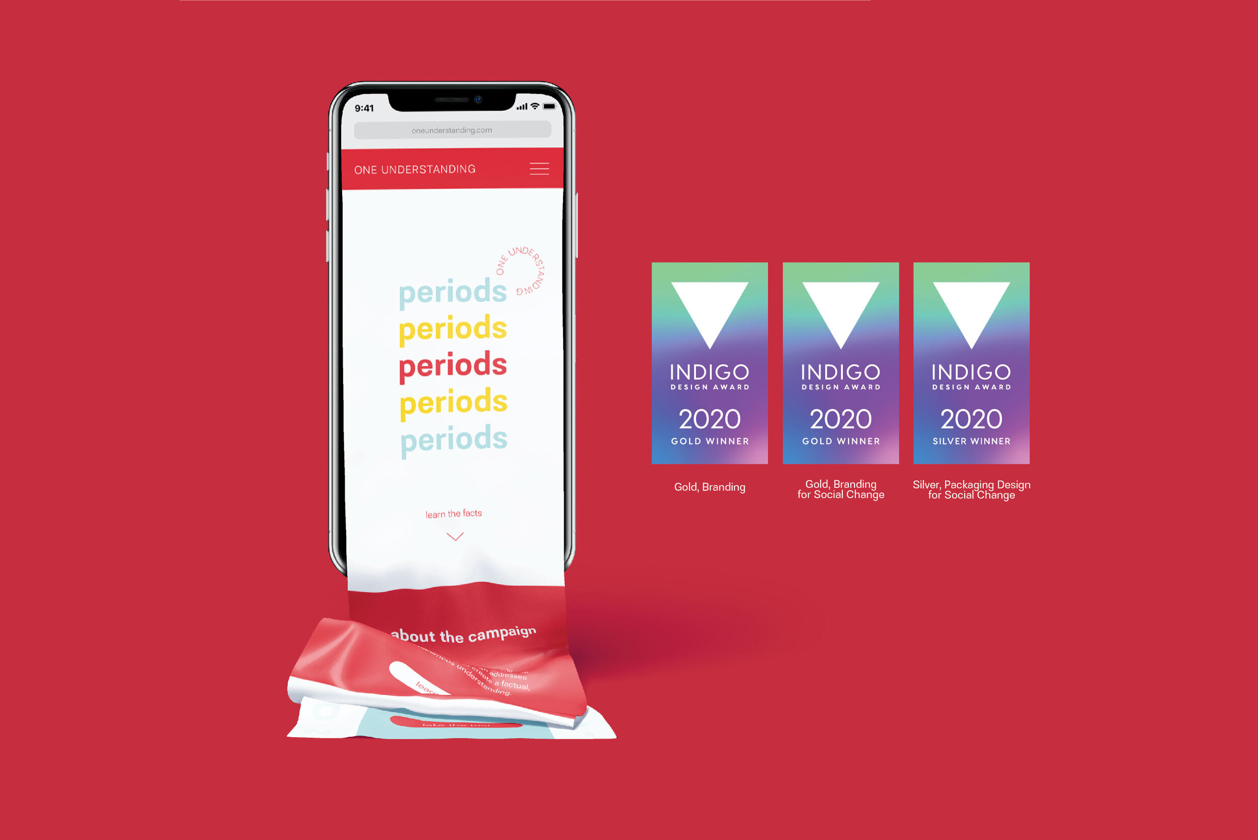
Thank you! It was a surreal experience to see my projects win awards in the Indigo Awards competition. Over the past two years, my projects branding projects entitled One Understanding and Artisans’ Assembly were recognized. Both projects were completed during my time at Shillington.
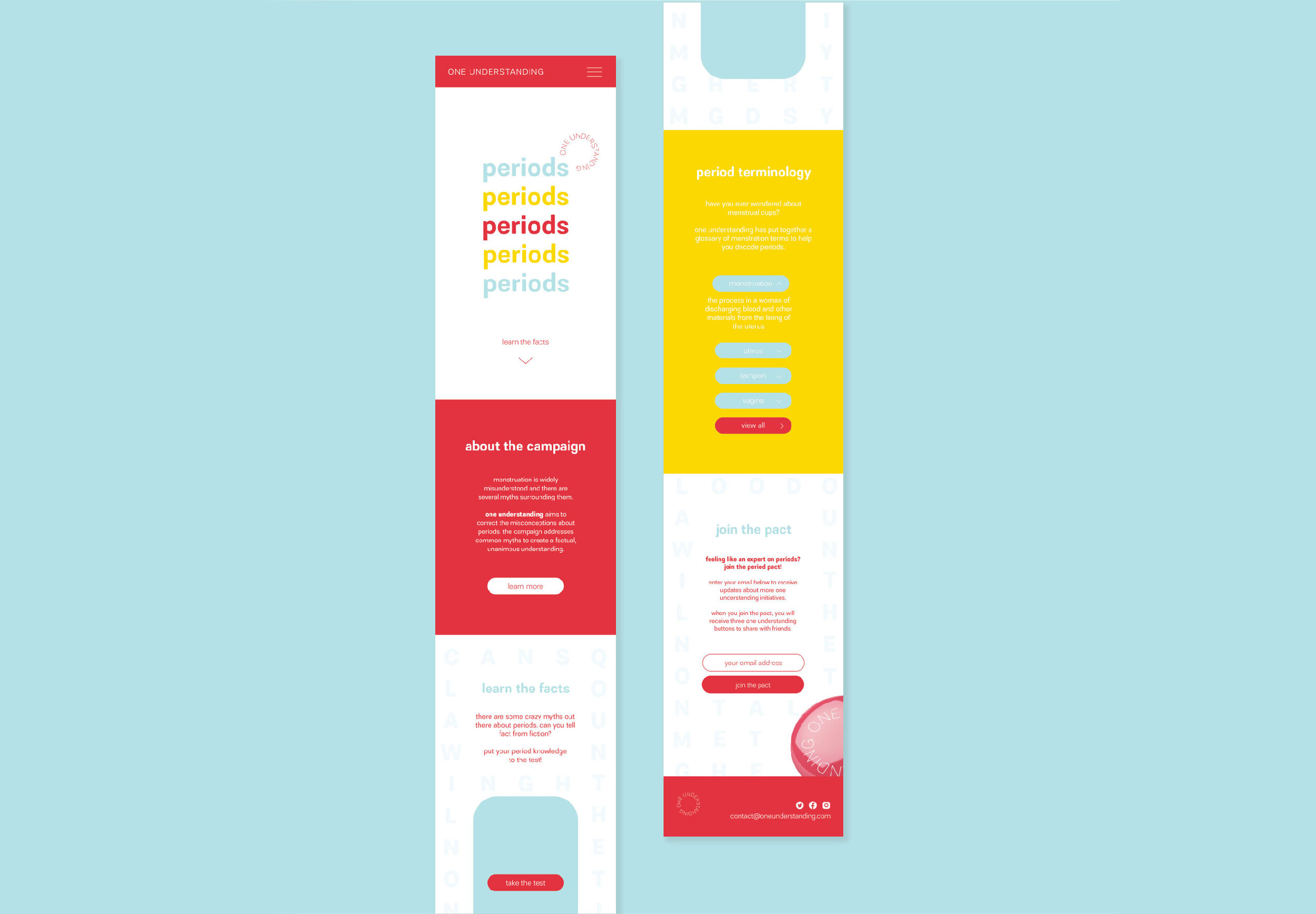
One Understanding is a period education campaign that brings to light the widespread misunderstanding of periods. One Understanding, through a fun, lighthearted visual identity system, educates the public with facts and definitions on menstruation. The campaign also fights period myths with word search visuals that spell out myths that exist in society today.
One Understanding is one of my favourite projects to date as I love the use of colour and the word search graphic elements. I believe the campaign visuals and branding are approachable and fun which I felt was important to accomplish especially with a topic that people can often shy away from.
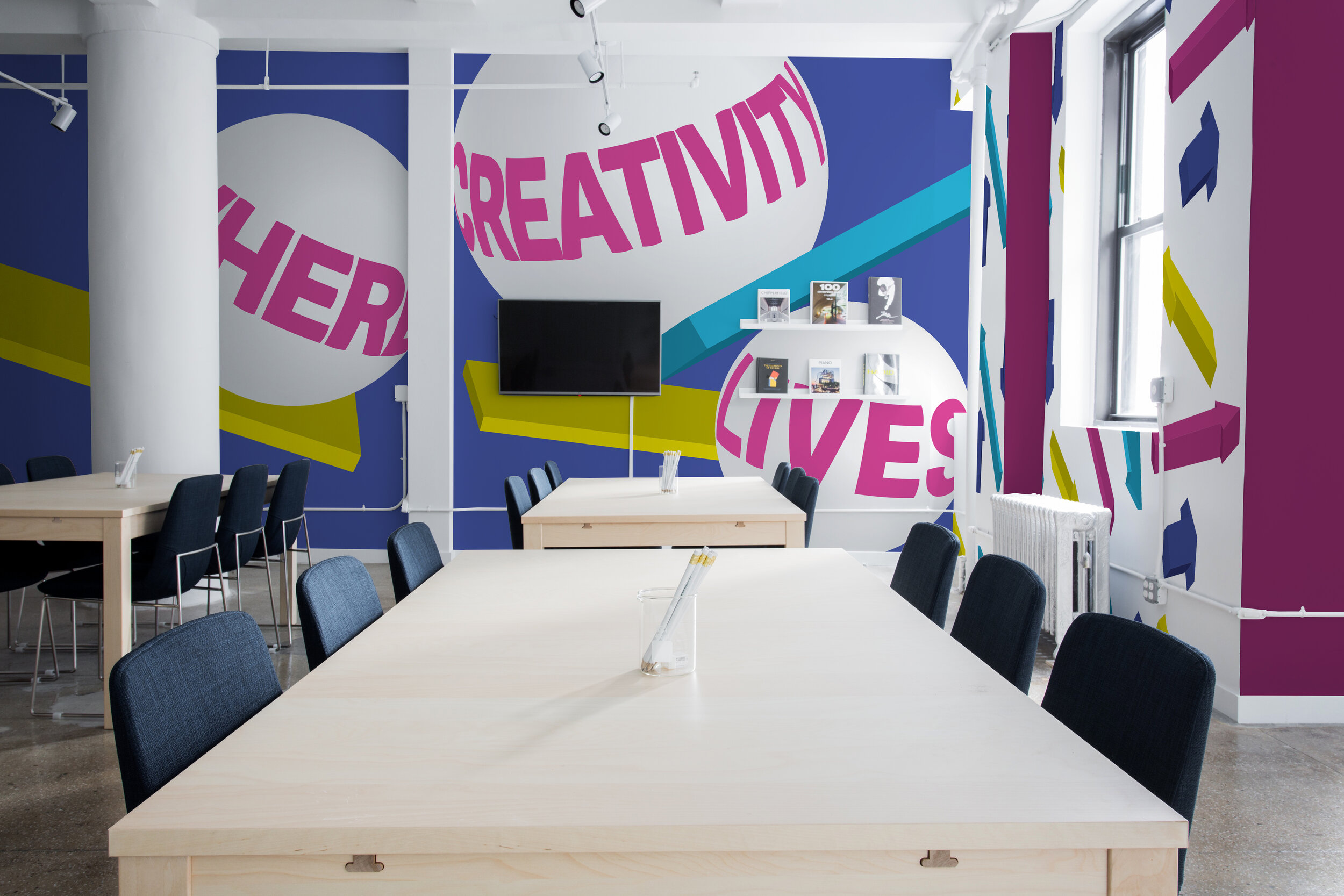
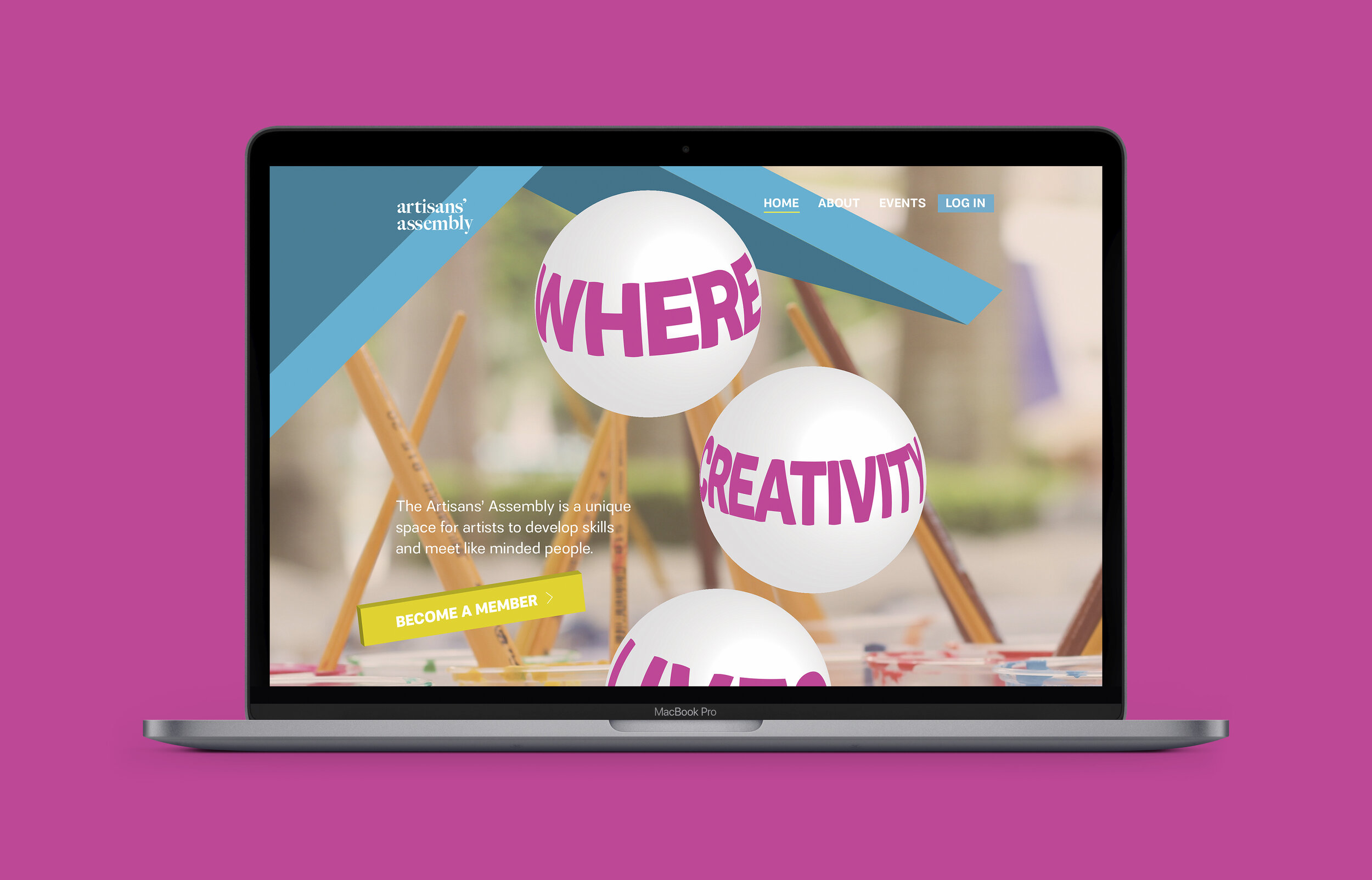
Artisans’ Assembly was developed around the idea that creativity can be sparked anywhere; this is the place for all to learn and create. I brought this to life using colourful 3D graphic elements which gave the branding a lot of life. The brand identity is fun, approachable and active.
During my time at Shillington, my teachers encouraged me to take risks with this project and try new things (like 3D elements) to make the identity stand out.
Do you think it’s important for designers to enter their work in design competitions and awards?
Yes, absolutely! I believe that it is important to enter work into design competitions and awards as it can do few key things.
Firstly, as a new designer, winning awards can help build credibility and will allow the opportunity for your work to be seen by many more people, including industry professionals.
Secondly, it is a great opportunity to learn how to effectively present and talk about your work in a written format. Thirdly, you have a chance to be exposed to other award-winning work and designers. As designers, it is important to continuously learn, grow, and develop, and when you’re exposed to exceptional work and people, that gained insight is invaluable and will shine through in future work. Whether your work is awarded or not, putting yourself and your work out there is a great growth opportunity as a designer with so much to gain!
Outside of work, you also work on your creative passion projects, including branding, UX/UI, editorial and packaging. Can you tell us about some recent work you’ve done?
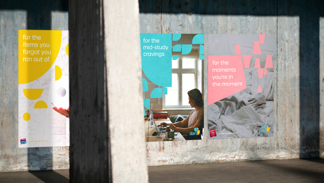
In addition to working full-time, I freelance for small businesses and local clients. In the last little while, I have completed two projects. The first project was branding and visual identity for a local delivery service called Dart. The project turned out to be urban and colourful.
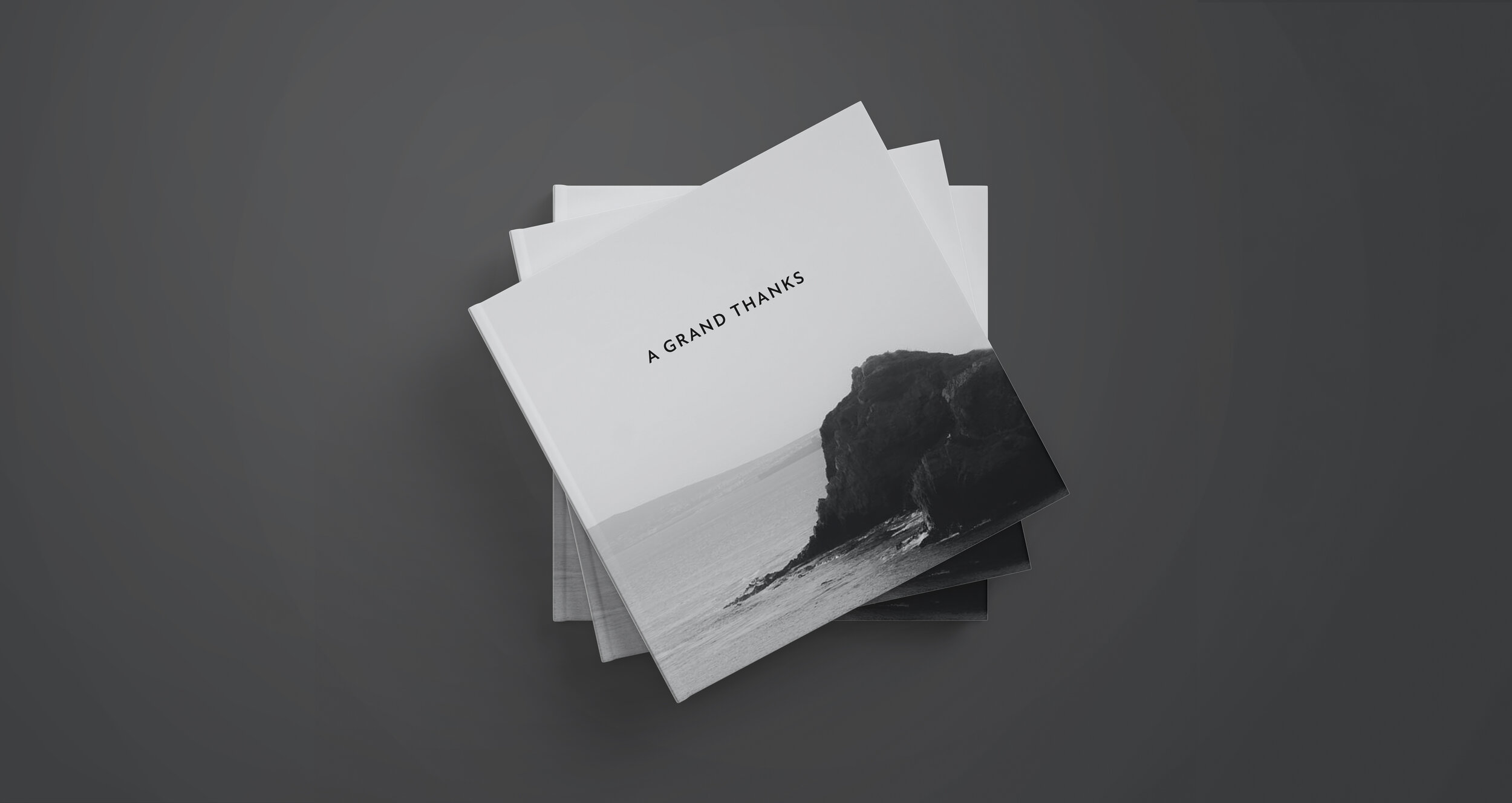
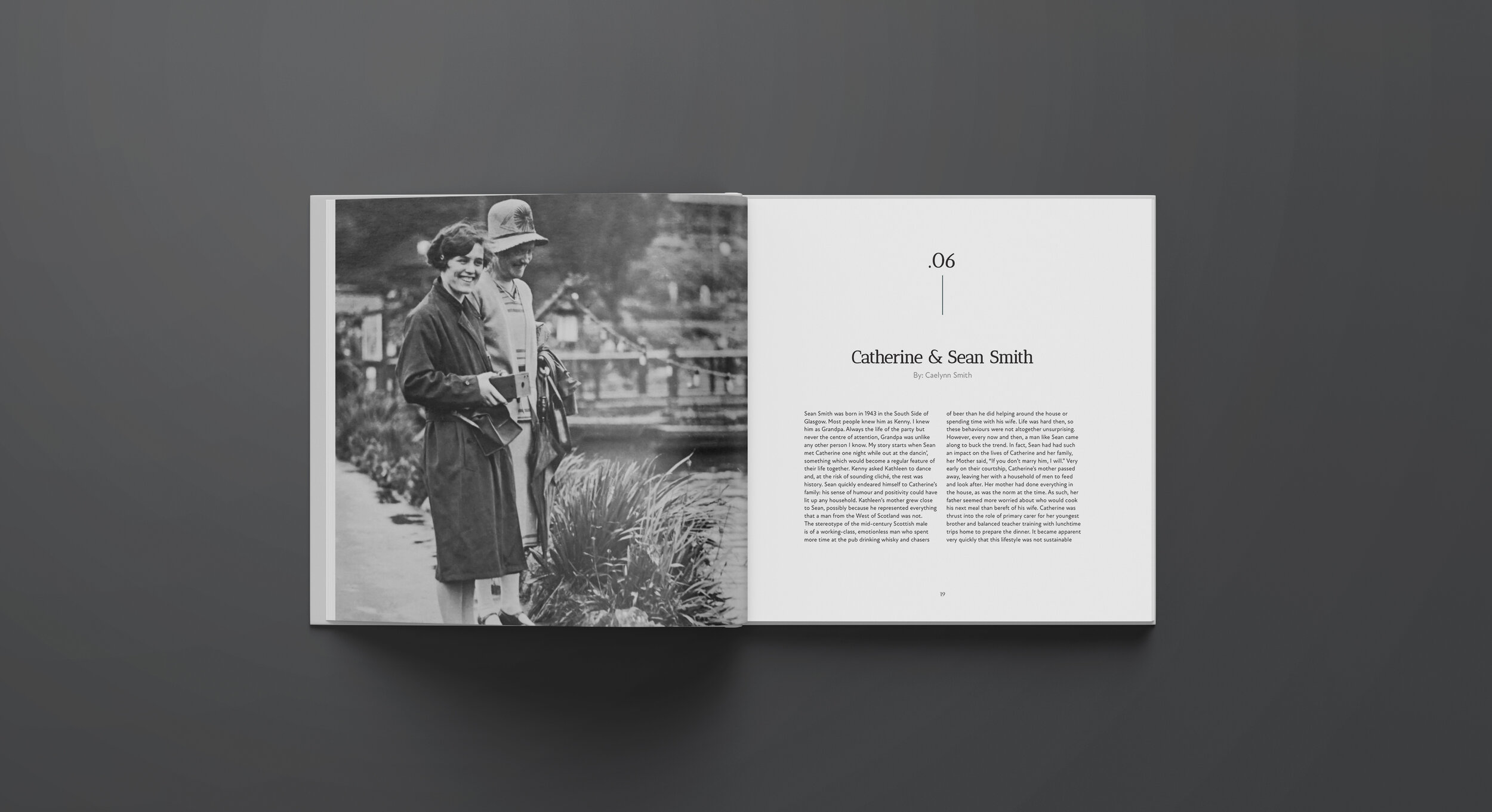
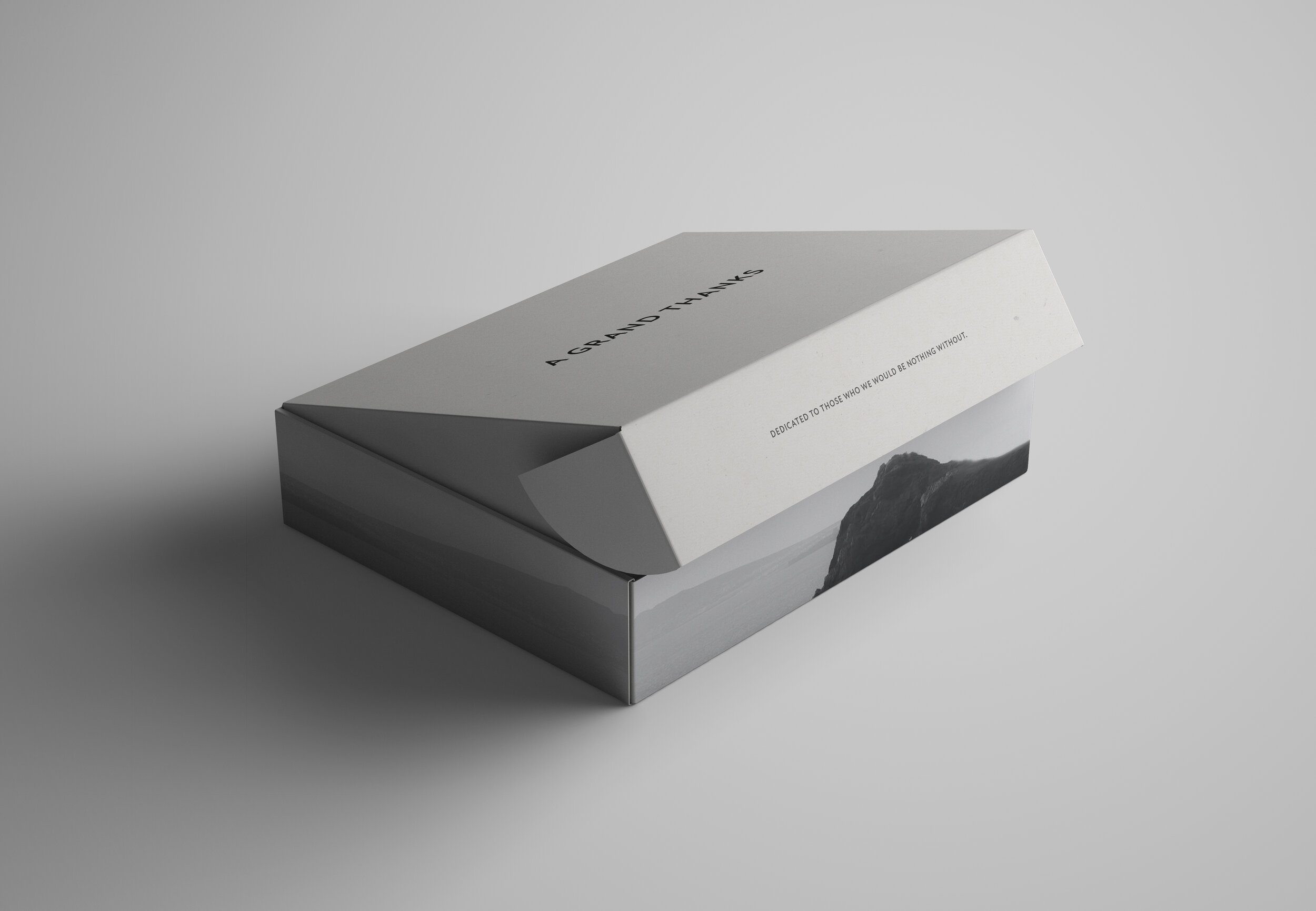
The second project was called A Grand Thanks, which was a book of cherished stories that grandchildren wrote for their grandparents. Given the beautiful stories, I took a minimalist approach to the design to allow the stories to be the focus.
If you could give one piece of advice to someone starting at Shillington, what would it be?
If I could give one piece of advice, I would say to take risks and try something that is unfamiliar.
As a designer when I feel like I’m stuck, I revert to designing something “safe” or reverting back to “my style.” During portfolio time, my teachers noticed that I wasn’t taking risks with certain projects and wanted me to push myself. Although it was a little scary at the time to start a project over from scratch under a time crunch, I was very happy that they pushed me.
Reviewing the new work with them a couple days later, both my teachers and I were excited about it and it ended it up as one of my favourite projects. Although, the most important lesson for me from that experience was learning that it is important to push myself when designing. It helped build my confidence overall as a designer.
What tips do you have for new designers entering the industry?
Continuously seek ways to grow. Early on in your career, I’d recommend seeking a mentor or take on stretch projects if you can.
Mentorship and challenging projects will continue the learning journey you’re on!
Big thanks to Vanessa for sharing her story with us! Check out her website for more work and follow her on Instagram to see what’s she working on.
Want to study graphic design at Shillington? Learn more about our courses in New York, London, Manchester, Sydney, Melbourne or Brisbane.
https://www.shillingtoneducation.com/blog/vanessa-castiglione-interview/

