May 31, 2021
John Boardley
About 2,300 years ago in Greece, Aristotle devised a system for classifying everything in the world. His three kingdoms of nature, Animal, Mineral, and Vegetable remained in use for the best part of 2000 years. In the eighteenth century, a much expanded version of it, the Linnaean Taxonomy, brainchild of Swedish botanist Carl Linnaeus, was divised and is still in use today. In 1876, the Dewey Decimal System was introduced, a proprietary library classification system which in many incarnations and adaptations is now used in some 135 countries to classify hundreds of millions of books.
These are just two of thousands of classification systems we use to make make sense of the world around us. They come into their own when groups of related things or objects become big. Such systems, in addition to naming things, also tell us about the relationships between things, highlighting both what differentiates or distinguishes one from another, but at the same time underlining what they have in common.


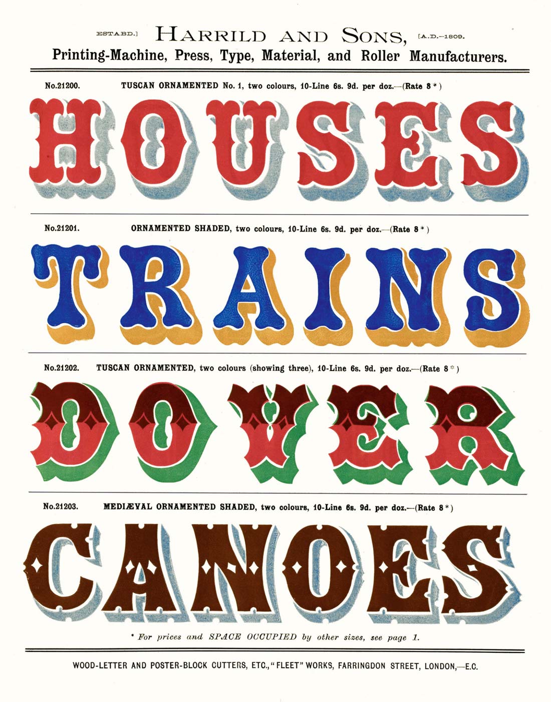
Prior to the Industrial Revolution there wasn’t really much call for a system to classify and organize fonts. But that changed at the beginning of the nineteenth century. An explosion of new typefaces, many designed for a burgeoning advertising, competed with one another in a dizzying array of styles: fatter, bolder, broader, narrower, taller, prismatic, shadowed, reverse contrast, spiky, spurred, wobbly, blobby, ornamental cartouches, slanted, backslanted, rotated, tubular, and everything in between — oh, and let’s not forget, the invention of the sans serif typeface too.
Fancy type
The proliferation of new typeface designs and genres in the 1800s led to efforts to organize them — mostly to facilitate smooth communication between printers and their clients. For decades printers and typefounders (the manufacturers of metal type) had pretty much made up their own names. Whatever took their fancy, was fashionable, catchy, or first popped into their heads. It all became rather muddled. Even sans serifs were variously referred to as gothic, egyptian, grotesque, doric, antique, or even — and my personal favorite, because it sounds like a Victorian cough medicine — ‘sans surryphs’. ‘In Practical Printing (1884), son of a printer and type historian John Southward, took a stab at font classification by separating typefaces into two main categories, namely text faces (typefaces for reading) and fancy types, a catchall for just about everything other than typefaces for reading. He then drafted six expanded categories: Roman, Antique, Sans-serif, Ornamented, Black (Blackletter), and Script (p. 22) — the first, Roman, referred to text faces, while the latter five are pretty much subdivisions of his ‘fancy types’.
“All these [classification] systems work to a certain extent, but all leave much to be desired. They are neither good science nor good history.”
BS type
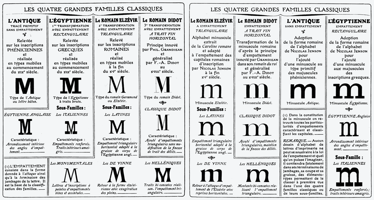
In 1921, Francis Thibaudeau devised a type classification system where all (Latin) typefaces were split into four broad categories: Elzévirs, Didot, Égyptiennes, and Antiques. Typefaces were organized into these main categories by serif structure or shape. So, for example, a typeface with slab serifs was categorized under Égyptiennes (a name arbitrary given to the first slab serif typefaces of the early 1800s). Again in France, but fast-forwarding to the 1950s, illustrator and type historian Samuel Monod devised a fairly comprehensive classification that came to be called Vox after his pseudonym Maximilien Vox. In 1962 it was adopted by the Association Typographique Internationale (ATypI), of which Vox was a founding member. By 1967, the Vox-ATypI system was adopted, in a modified form, as a British Standard (BS 2961:1967) with its nine main categories: Humanist, Garalde, Transitional, Didone, Slab-serif, Lineal, Glyphic, Script, and Graphic. The Vox-ATypI system was later expanded to 11 main classes with the addition of ‘Gaelic’ and the gargantuanly broad ‘Non-Latin’.

Something that these systems have in common is their top-down or hierarchical approach. They also place more emphasis on serif typefaces; partly owing to their more ancient pedigree and to typographic snobbism. Brilliant type historian (& type snob extraordinaire) Daniel Updike, summarily dismissed thousands of typefaces when he wrote, in 1922:
“And what are the types we ought not to want? … They are (in my opinion) all condensed or expanded types, all ‘sans-serif’ types, all fat-faced black-letter and fat-faced roman, all hair-line types, almost all ‘ornamented’ types…”
Divorce
On March 18, 2021, after 54 years’ of marriage, the AtypI board voted to de-adopt Vox-ATypI and formally withdrew its endorsement of the system. C’est vraiment fini! For those in the type ‘industry’, I don’t think the announcement came as a surprise. And to those outside of it — well, I guess it didn’t cause too many sleepless nights.
Who cares?
Does it really matter how we classify typefaces, or indeed if we classify them at all? Well, the answer depends, to some extent, on who you are and what you do. If, for a living, you make lederhosen for dogs, then probably not. If you’re a designer or in any field that requires graphic design, then it’s more likely it will matter to you. The same goes for educators. Classification is one of the basic tools used to introduce genres of type to new students, just as taxonomy is taught from the outset to students of biology, or the Dewey System taught to student librarians. So typeface classification shouldn’t be offhandedly dismissed. By all means, claim you have no need for it, but there are many others who would benefit a great deal from a better type classification system.
“The [Dewey] system is flexible and generally easy to understand. People are always finding books that they never knew existed. And that’s the magic of the Dewey Decimal System.”
It will take a village
Do I have a solution or a replacement font classification system up my sleeve? Nope! Do I think we need a replacement? Yes. Surely we can do better than our arbitrary and Frankenstein Garaldes (Garamond & Aldus) and Didones (Didot & Bodoni), and hyper-useless historical classifications like Old Style, Transitional, and Modern. But any replacement must be a collaborative effort. There’s no one on earth who can claim to be an expert in all writing systems or scripts, so it will require the close collaboration of experts (and non-experts!) to devise a system or systems that are fundamentally script agnostic, and a system that skews emphasis away from accoutrements to letterform structure.
* Indra Kupferschmid suggests ‘font filtering‘
Any classification system* — if we even want to call it that — needs to be flexible enough to make space for a spectrum of hybrids, the stuff in between, the types that don’t typically conform to existing categories — because they deserve more than to languish in a type bin labelled ‘miscellaneous’. And we need to stop classifying entire typefaces based on the shapes of their serifs. Most so-called Didone typefaces have hairline unbracketed (or slightly bracketed) serifs. But what happens if you replace those hairline serifs with, say, chunky wedge serifs, or increase the weight of the serifs until they become slab serifs? Surely the style, weight, and shape of the serifs alone should not determine how the letterforms and entire typeface is classified. Remove the serifs from a Didone and what remains still looks just like a Didone, but we’d now call it a sans serif. Somehow, we’ve let the tail wag the typographical dog.

Dogs as non-birds
A replacement system, and this is something Dr. Catherine Dixon emphasized almost 20 years ago, must embrace scripts other than Latin, and it must address the present and longstanding ‘descriptive bias’ for Latin typefaces. Perhaps now is the time to do away with the term ‘non-Latin’ once and for all as it implies that everything other than Latin is a kind of second-class citizen. Imagine being Chinese and your script, Chinese, used by more than a billion people, and much more ancient than Latin, is referenced not by what it is but what it is not — as non-Latin! If anything, Latin could be referred to as Non-Chinese (irony).
Imagine referring to billions of people as non-White or non-Caucasian while claiming impartiality. And although Latin is globally the majority script, let’s not forget how it got there. And its status as majority script is irrelevant; all the more so if your primary script is something other than Latin. Is it fair to tell Koreans, Russians, and the majority of Indians, that because their writing systems (Hangul, Cyrillic, and Devanagari), used by almost 1 billion people, are not the world majority script that there’s don’t merit proper classification? Classification is not a zero-sum game. And Latin wasn’t always and won’t always be the majority script.

Finally, it’s also crucial to remember that it’s not only aesthetic considerations that matter. How a typeface looks is just part of the story. You might well fall in love with a typeface only to discover that it doesn’t support your language, in which case it’s a proverbial mixed-metaphor white elephant on a road to nowhere. In addition to language support, OpenType features, font formats, size of the font files (especially if you’re using them on a website or in an app), and even the terms of the license or EULA — these factors will often outweigh aesthetic considerations, whether we like it or not. Those Jimmy Choo shoes might set your heart aflutter, but if they don’t come in your size—
For me, the greatest downside of type classification systems is that in our enthusiasm for tidiness and pigeonholing, we risk overlooking or at least undervaluing the stuff that doesn’t fit neatly into pre-existing boxes. And new type designers might also be stifled by the feeling that they must conform their designs to prescriptive but arbitrary categories devised generations ago. And for users of type, the present systems of classification are sometimes so cumbersome and so focused on minutiae that we often fail to see the forest for the trees.
Next month, we’re going to be diving deeper! So bring your flippers.

