Our rundown of the best graphic design and branding projects of this year takes in TV design, North Korean propaganda and the budding world of cannabis packaging.
Graphic design impressed us in a lot of unusual places this year. We saw it in the background of hit TV shows, in the foreground of supermarket shelves, and all over start-up apps on our phones. But what were the best, most unusual and downright fun projects we featured this year on Digital Arts? And how will they inspire your own work?
The answers are here, and what a diverse range it is – from North Korean agitprop to idiosyncratic illustrators branding shopping zones, and incorporating GIF work, fastidious colour toolkits and even female-targeted cannabis packaging.
Without further ado, we present the best graphic design & branding stories from this year on the site.
‘Boozy’ branding for dry drinkers
This year we of course continued our collection of the best craft beer label designs out there and noted how such designs were influencing the world of contemporary spirits branding, but did you know low and no alcohol beers are on the rise, complemented by equally delightful branding?
We examined how agencies are branding such beers for the dry drinker market recently, but why not first check out the various labels for sober booze out there that caught our eyes?
Take a look at the labels here.
Pantone Colour for 2019: Living Coral
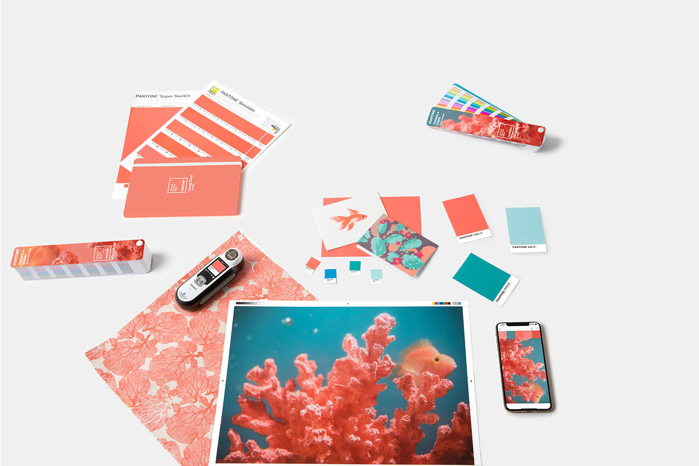
We managed to name Living Coral as one of the likely candidates for Pantone’s Colour of the Year, and what a colour it is, too.
The orangey shade managed to beat out rivals like Gen-Z Yellow and Jester Red to nab the title. Curious to see what those colours look like, and how best to use Living Coral in your work? You know where to click.
See the colour in full use here.
Graphic design in North Korea
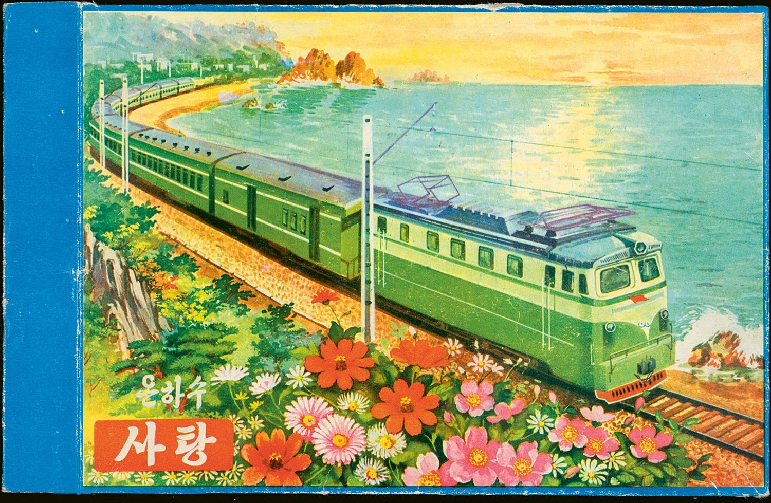
North Korea was everywhere this year, from the news to fascinating Michael Palin documentaries (to less fascinating documentaries by the lesser-talented Theroux). It was also all over top London gallery the House of Illustration, and in our feature below we looked at the colourful and vintage graphic design work from the DPRK.
See our slideshow of North Korean graphic designs here.
The awful City of LA graphic design job ad that’s actually brilliant
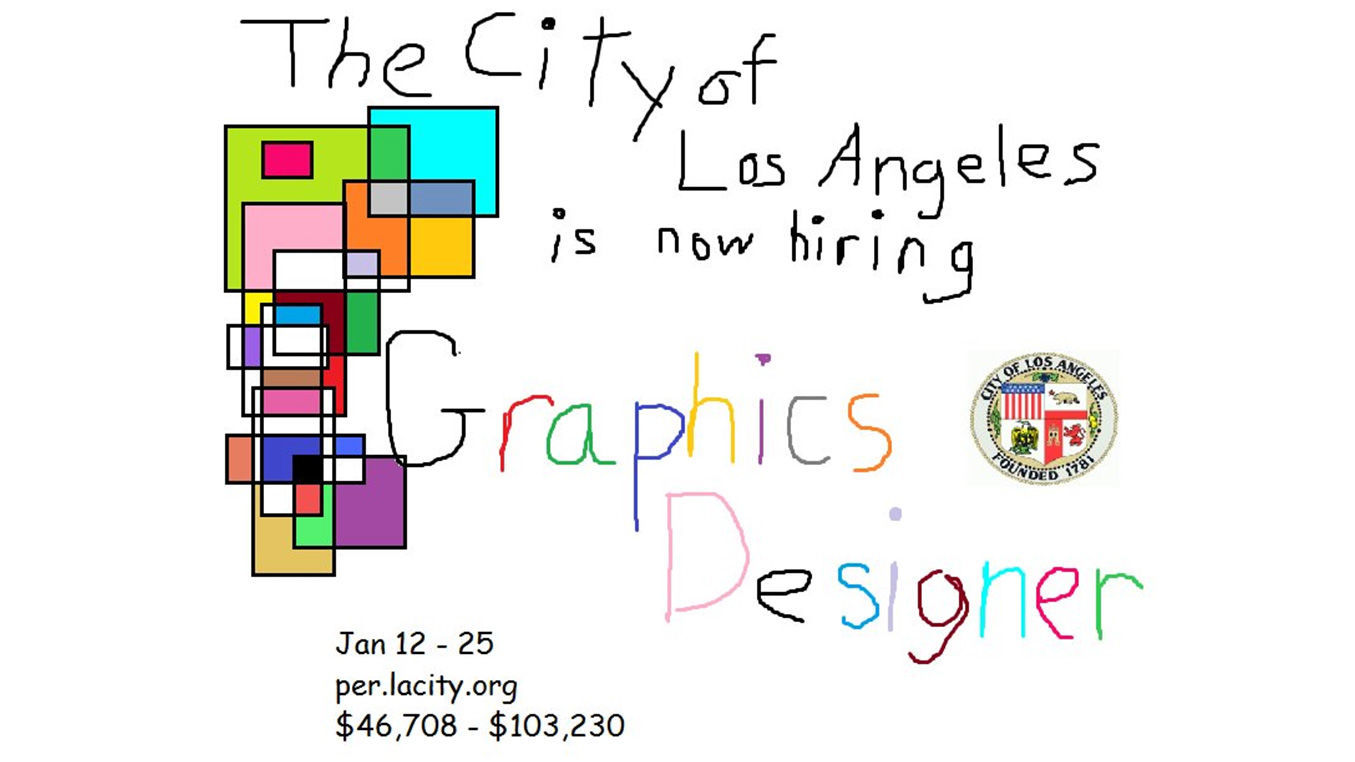
This year the City of Los Angeles advertised an opening for a new graphic designer role using a shamelessly bad ad. Everything about the image is a perfectly calculated eyesore – the child-like hand lettering, use of notorious font Comic Sans (wince) and the intriguing array of multi-coloured boxes on the left-hand corner.
After receiving countless likes and retweets, it’s probably safe to say the job advertisement achieved what it wanted. Who got the job, though, we’re not sure, but they’re no doubt making things of a far more tasteful nature.
British department stores revamp their logos
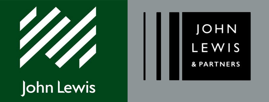
Christmas is coming, meaning British high streets are going to get slayed once again by online retailers. It’s a familiar story these days – but some of the retail giants are fighting back, and rebranding is their main weapon.
Case in point – new logos from the likes of Debenhams and John Lewis, which we gave a closer look at this year. We were also interested in the changing of well-known taglines, some as old as the shops themselves.
Read more about department stores rebranding here.
Art talent brand their neighbourhood for Coal Drops Yard
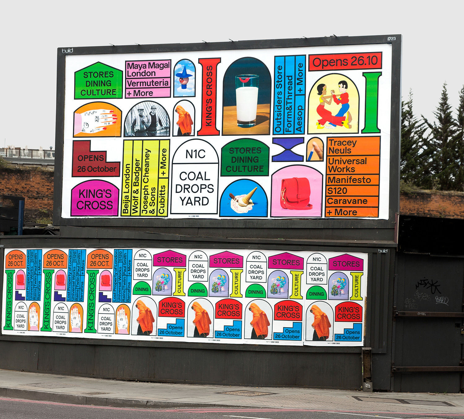
A lot of outlets covered the launch of trendy new London shopping area Coal Drops Yard, but what was lost in the fanfare and hubbub was the fact student talent were branding the area alongside star names like Jack Sachs.
We spoke to some of these rising new stars for their thoughts on the project, one of the most visually idiosyncratic in recent memory.
Check out the Coal Drops Yard campaign and its various creators here.
Blok Design’s female-led cannabis branding
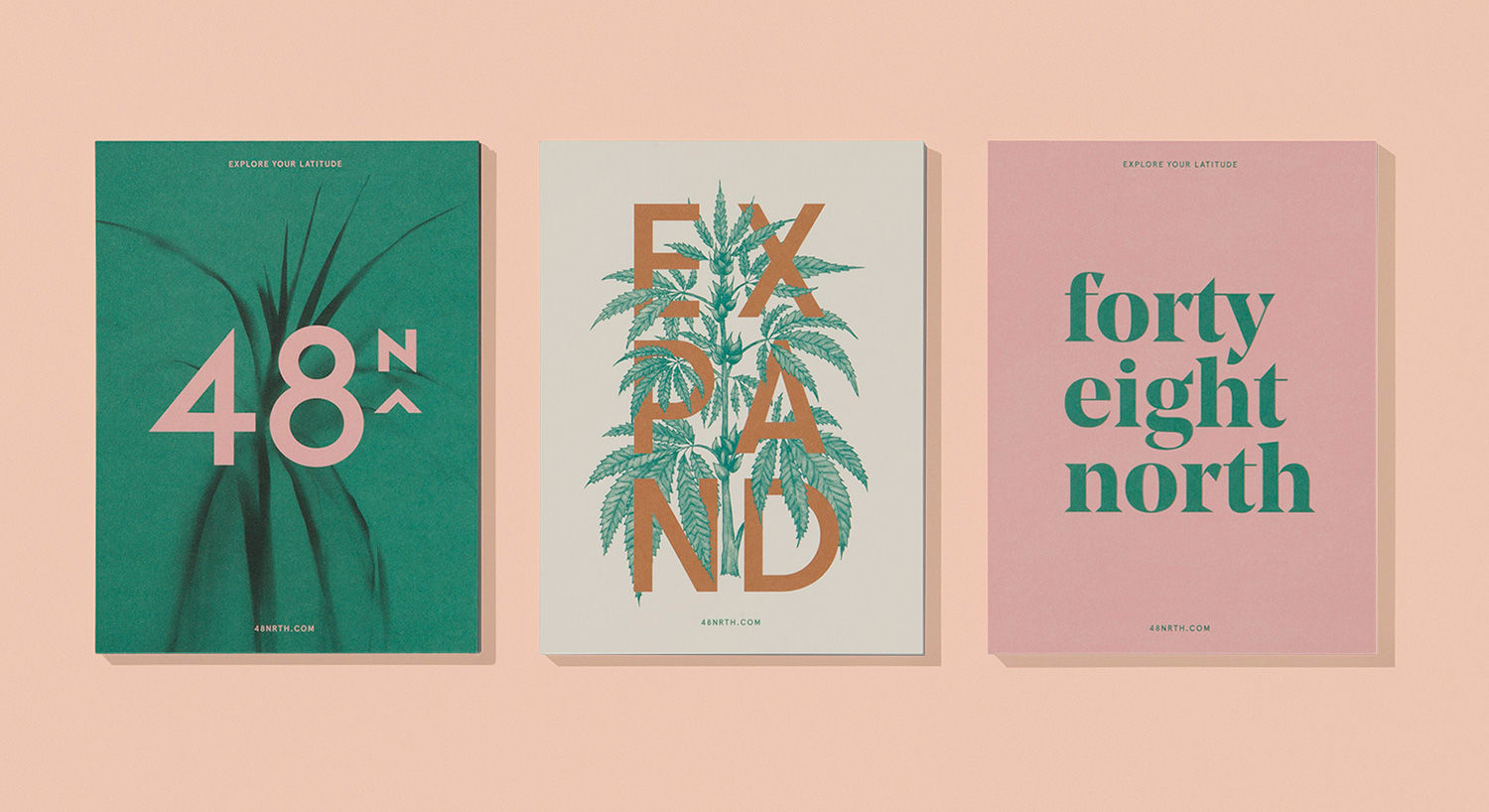
Cannabis infusions are now (kinda) legal to sell in some places; revelation one. Revelation two – there are already infusions being targeted at female users, such is the varied potential of this budding market. But how do you design for an entirely new frontier in product marketing? Blok Design had some answers for us back in the summer, and we loved their work for Canadian brand 48North.
Learn more about Blok Design’s work here.
Design Museum’s Designs of the Year
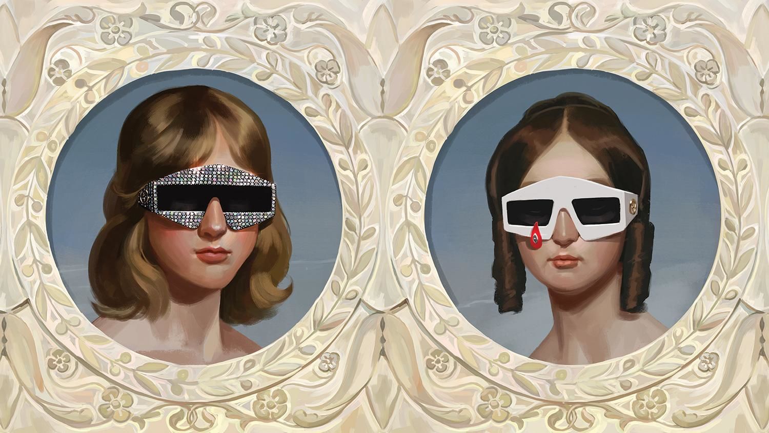
While last year’s nominees carried a distinctly political theme, the entries for the Design Museum’s Designs of the Year 2018 seemed to have one foot in the past and another in the future, perhaps as a response to a quickly changing world which is crying out for us to steady on the brakes a bit.
Retro-tinged designs to catch our eye included digitally painted ads for Gucci steeped in Pre-Raphaelite imagery to Territory Studio’s ‘tangible’ screen graphics for last year’s Blade Runner 2049, as displayed on chunky TV monitors of yesteryear.
Check out all the nominees here.
Guillaume Kurkdjian’s wonderful Lyft animations
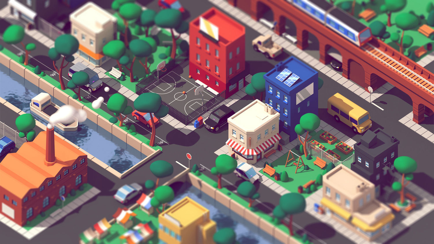
It’s rare for a brand to entrust a creator completely with a brand new campaign, but that’s what happened when transport app Lyft called upon Frenchman Guillaume Kurkdjian to populate their homepage with brand new animations.
The outcome was a series of charming, slickly animated GIFs that stir with life and bring cuteness back to the thronging world of cities and transport.
See of all Guillaume’s wonderful GIFs here.
How designers created the world of smash hit drama Bodyguard
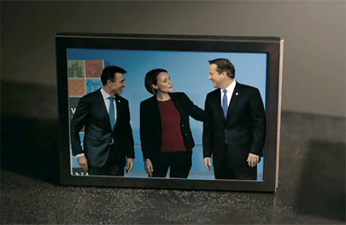
Perhaps like us you were glued this year to British drama Bodyguard, a six-part tale of a politician and her security officer as they struggle to stay alive amidst a backdrop of terrorism and conspiracy.
That show’s realism came from some great behind the scenes work courtesy of graphic designer Matthew Clark, who caught our eye with tweets detailing the meticulous work that went into bringing the show’s world to life. Matthew gave us some fascinating tidbits and great close-ups of graphics that were blink and miss ‘em in the show.
Look at all the work that went into the background of the hit show.
Beetroot studio
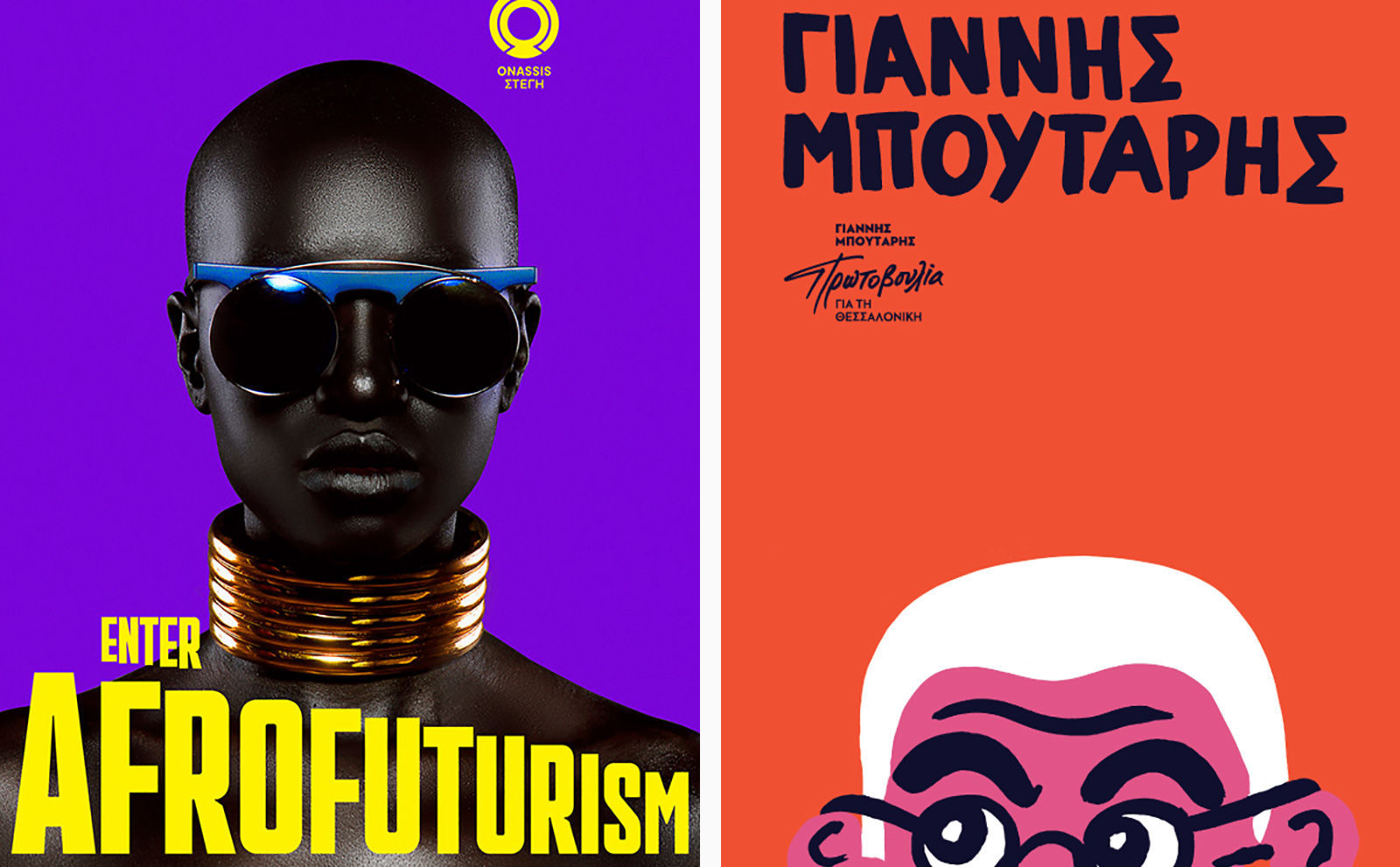
One of the most impressive creative studios to catch our eyes this year was Beetroot. Based in Greece and London, the studio has tried its hand at theatre productions, election campaign posters, Minotaur sculptures and even their own custom type tools for InDesign. This is an outfit that does more than branding and the occasional font – Beetroot is constantly evolving, with a little unit working on type projects and even a forthcoming shop selling their custom wares.
Digital Arts reached out to the group for a deeper look into their projects, and Beetroot’s history since its inception back in 2000.
Check out Beetroot’s work here.
How old Soho street signs informed some nifty new fonts
Soho-based The House of St Barnabas is a members’ club and homeless charity rolled into one, and its most interesting campaign of 2018 was one as unique as itself.
Lost and Foundry, developed by M&C Saatchi London and Fontsmith, saw the crumbling typefaces of Soho recovered to be sold online as a collection of fonts, helping to fund the enterprises’s vital work with London’s homeless. We showcased the before and after process that went into making these unique fonts, using photos of original street signs from old London town.
See how the fonts were created here.
https://www.digitalartsonline.co.uk/features/graphic-design/best-graphic-design-branding-stories-2018/

