

A decade ago, the world—and the way the news cycle works—was decidedly different. It’s also the last time The Atlantic underwent a redesign.
To better highlight the kind of coverage The Atlantic offers readers—and touts as part of its new paywall—the publisher just undertook a massive redesign of both its website and magazine, which will debut in the December issue.
To tease the branding, The Atlantic also created its first public mural modeled after the refreshed magazine cover. The campaign marks the brand’s return to OOH advertising for the first time in over 10 years and its most significant advertising effort since going live with a metered paywall in September.
The Atlantic is the latest media company to invest in a brand marketing campaign. The Wall Street Journal just went live with its own under the tagline “Read Yourself Better,” The New York Times’ “The Truth Is Worth It” campaign won a Grand Prix at Cannes Lions this year, and The Washington Post ran an ad featuring Tom Hanks during the Super Bowl.
“Readers have their news already, but not the higher perspective of what’s happening and why and [how it makes] sense of what they’re doing every day,” said The Atlantic’s publisher and chief revenue officer Hayley Romer, adding that the redesign aims to “elevate the experience and respect the readers’ time, but continue to provide the higher perspective.”
The print edition’s revised look also includes new sections like Today, a daily digest, along with multiple design tweaks to its print and digital presence, ad-free articles available in dark mode and a crossword puzzle. The publisher has also launched a new iOS app.
After going live with its new digital subscription service (starting at $50), The Atlantic doubled the number of subscriptions that execs had originally projected, though the publisher declined to provide exact figures.
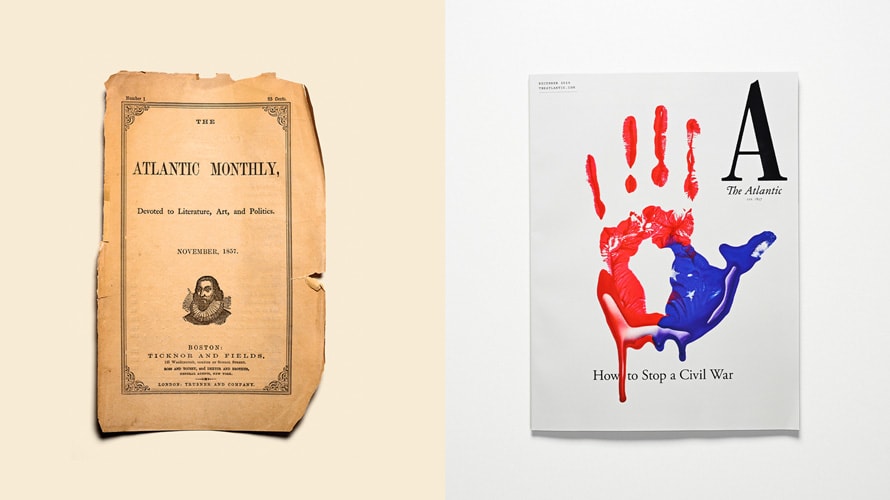
The Atlantic last went through a major redesign in 2008, when it tweaked the opinion page and unified the design. But the new rebrand is being touted as the most dramatic in the magazine’s 162-year history.
The magazine’s history still holds a prominent place in the redesign, notably with the letter “A” leading the issue—along with the image of a bloody handprint, a metaphor for “the contours of a (fractured) nation,” wrote The Atlantic’s creative director, Peter Mendelsund.
“It was more about a holistic representation for The Atlantic and what we stand for and the sign of having this new, one-letter logo and it being the first letter of the alphabet,” Romer said. “It’s a big statement.”
The mural, located in Williamsburg in Brooklyn, is modeled after the magazine’s new first cover, commissioned by The Atlantic’s director of photography, Luise Stauss. Still life photographer Sam Kaplan worked in conjunction with a prop stylist to turn the handprint into the cover.
The mural shows off the redesign through the medium of street art, which Romer calls the “most modern thing happening in our world.”
“To be able to feature The Atlantic brand in this way is something we’re really proud of,” she said.
https://www.adweek.com/digital/the-atlantic-redesign-billboard-ooh-advertising/