As predicted in the autumn, the new Pantone Colour of the Year is a ‘life-affirming shade of orange with a golden undertone’. But not THAT shade of orange.
Following on from Pantone’s pick for 2018 – a Prince-esque purple called Ultra Violet – the colour and ink company has announced that the Pantone Colour of the Year 2019 will be what it calls ‘Living Colour’.
It’s one of the colours the company noted at the London and New York Fashion Weeks back in the autumn, where Pantone also noticed designers using reds by the names of Fiesta and Jester Red; which also seem appropriate seeing as the world’s run by a bunch of jokers making everyone see red these days..
Living Coral also ties into this as said jesters are destroying the environment, there won’t be a lot of living coral left soon enough, though, so let’s enjoy it any way we can.
Pantone, naturally, has a more positive view of the colour, describing it as ‘nurturing’.
“Colour is an equalising lens through which we experience our natural and digital realities and this is particularly true for Living Coral,” said Leatrice Eiseman, executive director of the Pantone Color Institute. “With consumers craving human interaction and social connection, the humanising and heartening qualities displayed by the convivial Pantone Living Coral hit a responsive chord.”
Nope, us neither.
As you’d expect, the colour is available in forms for digital, print and textile formats.
How to use Pantone Colour of the Year 2019
Pantone has released a series of suggest palettes based on the colours.


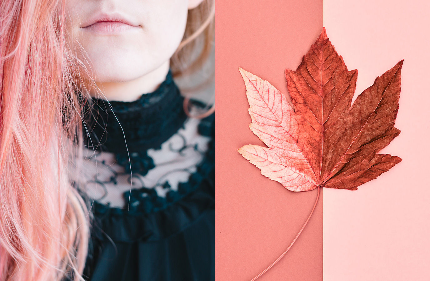
Adobe Stock has partnered with Pantone to produce a themed gallery of stock images (examples below).

Pantone Colour of the Year 2019 mugs and phones
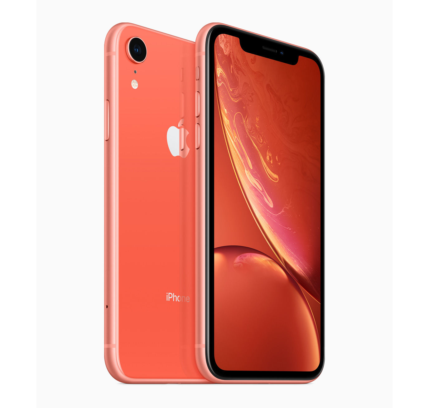
If you want a little of Liquid Coral in your personal life, you can get the usual sets of mugs and notebooks – and there’s even an iPhone XR in the shade (below).

Pantone has more recently published its 2019 colour trends for the home, made up of 72 colours in eight colour palettes that they predict will be everywhere in homes in 2019. They’re tipping something called Cravings, made up of a ‘neutral Cappuccino shade’ and grassy green touches. Alluding to ‘fetish foods’ like peppers and chocolate, this one’s all about gluttony – and doesn’t that just sum up our overstretched world as we head towards 2020?
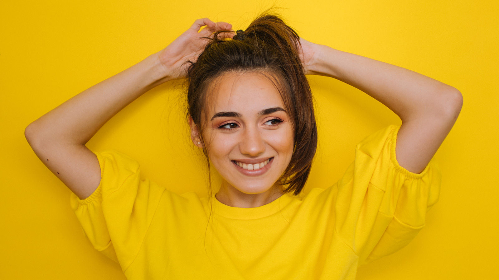
Another popular colour for next year – and one being tipped by Rebecca Swift over at Getty Images is the Gen Z yellow.

As Rebecca says, this is a bright yellow that was first brought to us by Beyoncé in her Lemonade visual album. And that’s what Generation Z is doing, making lemonade from all the lemons they’ve been given; but hey, at least they have a colour named after them (and that’s pretty much all they’ll be getting, let’s face it).
At least the Pantone Colour of the Year 2019 isn’t Trump Orange, as depicted in this suitably environment-focused pic where it’s contrasted with a more democratic blue.

If only the Jester in Chief was so environment-focused.
https://www.digitalartsonline.co.uk/features/graphic-design/pantone-colour-of-year-2019-is-living-coral/

