

Next year’s Colour of the Year is Classic Blue – and a ‘multi-sensory experience’.
Pantone is famous both for its colour library used by creatives around the world, and its now much-awaited tradition of crowning Colour of the Year, the one shade – or, this year’s case, more than just a shade – which it says will define stylistic trends for the year ahead.
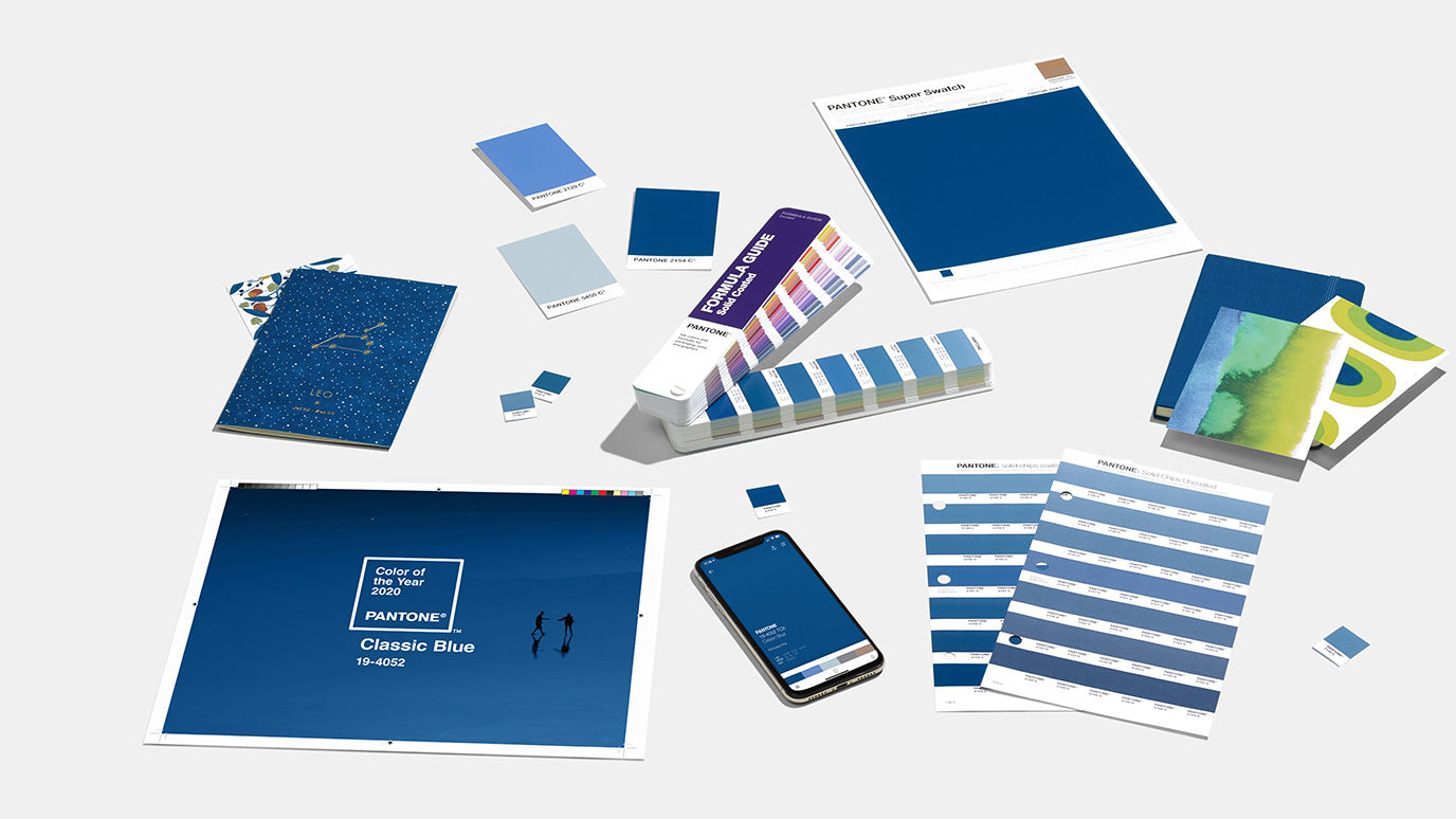
As predicted by Digital Arts last month, the taste makers at Pantone have gravitated towards some kind of blue – Classic Blue, to be exact, also known as Pantone 19-4502, a surprisingly conservative choice when you consider previous incumbents of the title.

Last year’s eco-minded Living Coral for example prophetically brought the climate crisis upfront and centre long before Greta stole the headlines, whilst 2018’s colour Ultra Violet sought to amplify women’s suffrage and LGTBQ rights.
Such bold looking, strong meaning choices always came as a surprise to the creative community, but Classic Blue arrives with no social leanings whatsoever then to perhaps encourage an age of conservatism. The UK Conservative Party is clad in a similar shade, after all – as are the blue Passports that have come to symbolise Brexit.
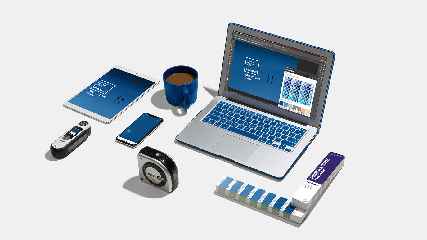
But before you assume this new Colour of the Year surprises by being so un-surprising, know that for the first time Pantone is releasing its choice not just as a colour, but also as a multi-sensory experience beyond the usual examples of the colour in print, digital and fashion (below)
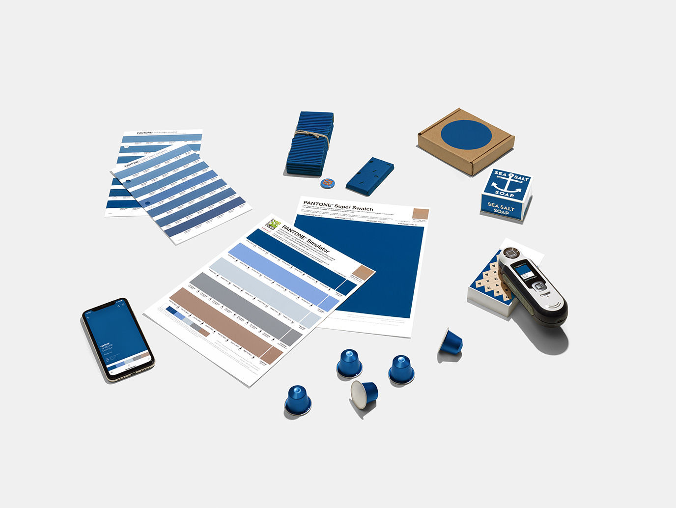
This year the brand has teamed up with Firmenich, AudioUX, LANDR, and The Inside to launch Classic Blue as a sound, texture, taste and scent on top of a colour, making for a characteristically unexpected sort of announcement.
Where the colour is meant to symbolise ‘protection, stability, peace, and confidence’, its sound via Audio UX is one that’s ‘nostalgic’, its feel a ‘soft velvety texture’ courtesy of The Inside, its taste supposedly mature and ripe, and scent one of sea salt, each of the latter two made under the auspices of Firmenich.
Pretentious stuff? Maybe, but colour forecasts have always been like that. In any case, the sensory expansion here allows the colour choice to make more sense, for if you’re going to go wild and experimental, it’s best you make your base a ‘safe’ colour in order to avoid a screaming match for everyone’s attention.
Besides, the audio aspect could suggest Classic Blue will lend to some deep jazz tunes; if not conservatism then let’s assume 2020 will be about cool, stylish creativity in the vein of Miles Davis and the legendary artwork of Blue Note Records.
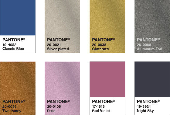
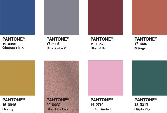
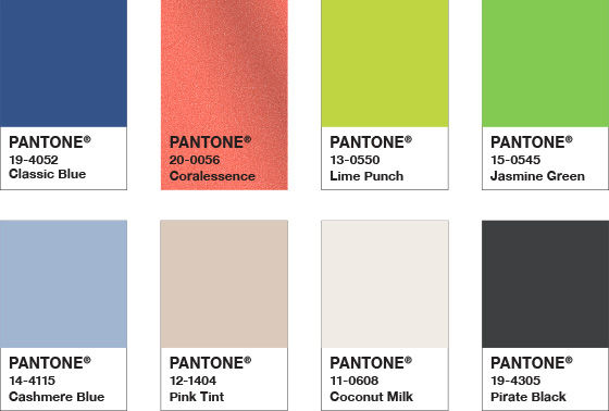
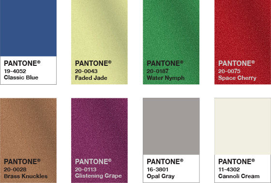
Going back to tried and tested methods, Pantone has unleashed the colour alongside the a series of complementary – and complimentary – palettes.

We look forward to seeing how creatives will use the blue next year, although we have already seen it in action during spring’s New York Fashion Week (as mentioned in our November prediction piece.)
That said, we’re still disappointed it’s not the Pantone parodying Bleached Coral we reported on earlier this year, with its very poignant overtones.
https://www.digitalartsonline.co.uk/news/creative-software/pantone-colour-of-year-2020-is-not-as-conservative-as-it-might-seem/