Illustrators Charlie Davis, Matt Johnstone, Guy Shields and Studio Muti give you tips for creating perspective that not only looks right but helps viewers ‘read’ your artworks more easily.
Guy Shields
It’s important when working to a perspective grid to not always have every right-angled object aligned to those initial vanishing points. See above for an example.
It’s more visually interesting and convincing if you can have your objects unaligned and using independent vanishing points on the same horizon line. Not everything in a room sits on the same axis, even if they all share the same horizon line. In terms of conveying a sense of depth in my pieces, I always found that if you make things further away have less contrast/brightness/saturation, then it creates a lovely depth andhaze. So I try to do that in most scenes I draw.
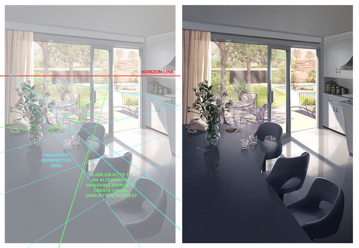
I made a self-initiated piece based off the movie The Graduate a couple of years ago (above, right) that had a pretty strong perspective grid happening in it, and while I wanted everything to essentially line up to a few vanishing points (noted in green in the version of the left), I also wanted to create a visual disruption by having forms follow various other grids/vanishing points (noted in blue).
Drawing curves and circles in perspective can be tricky, so it’s always best to draw a box first, subdivide it and then draw in your circle/curve using the grid you’ve made. See below for an example
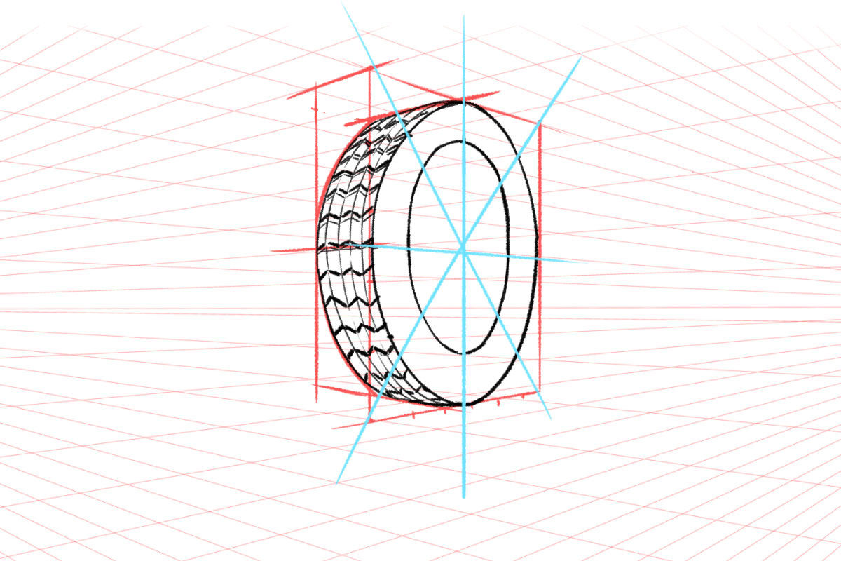
I think one thing I really struggled with initially was always having the vanishing point really obvious in pieces, and having everything getting smaller and smaller and smaller until it was tiny, where I think good perspective isn’t always obvious/evident, and unless you want things to look Fish-eye-lens, then it’s better to work with a vanishing point that’s miles off your page. The other thing I struggled with was drawing circles in perspective, but Andrew Loomis books really helped me get a grip on that logic.
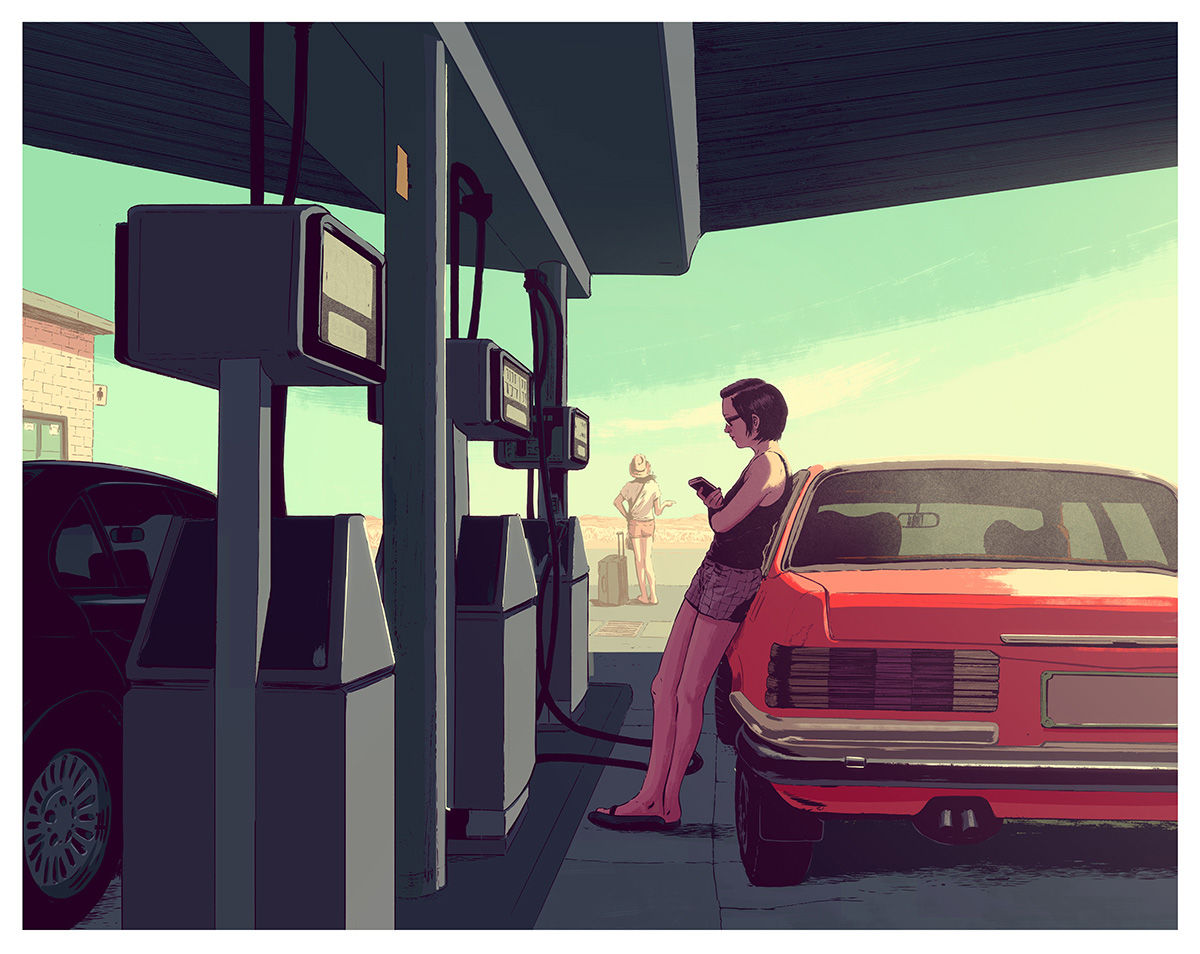
I grew up with a love of comics, and not necessarily wanting to go into the world of comic artistry (which always looked intense, and somewhat lonely), so I’ve always had a deep love for the alternative styles of artists such as Daniel Clowes and Adrian Tomine, and always wanted to take that style and extend it to a world outside comics. Some of the narratives they were crafting resonated deeply with me, so a lot of my works quite often focus on an unspoken narrative, of place and person.
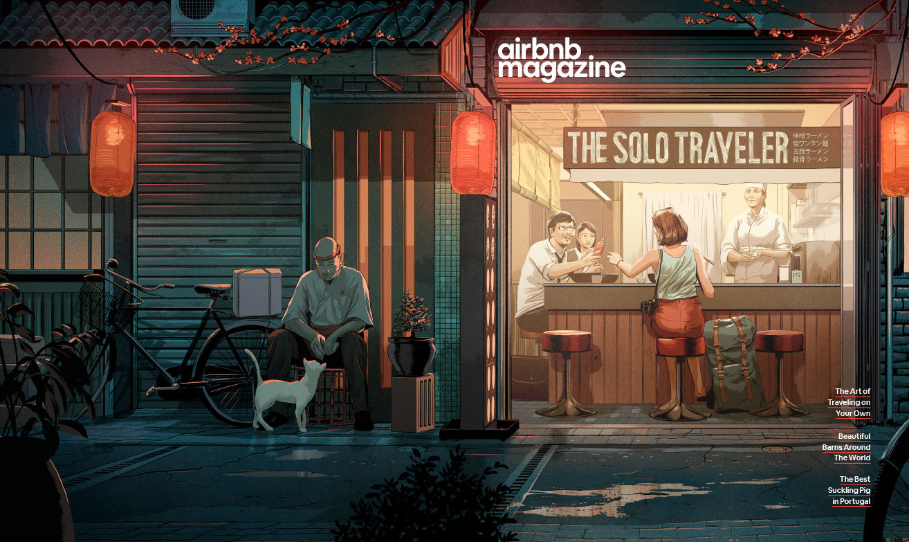
I like the idea of a viewer being able to piece together a sense of what’s going on, and often it being ambiguous but interesting. Over time my style moved from a more flat, graphic appearance to way more concentration on light and depth – as well as detail. A sort of halfway point between photography and a graphic novel.
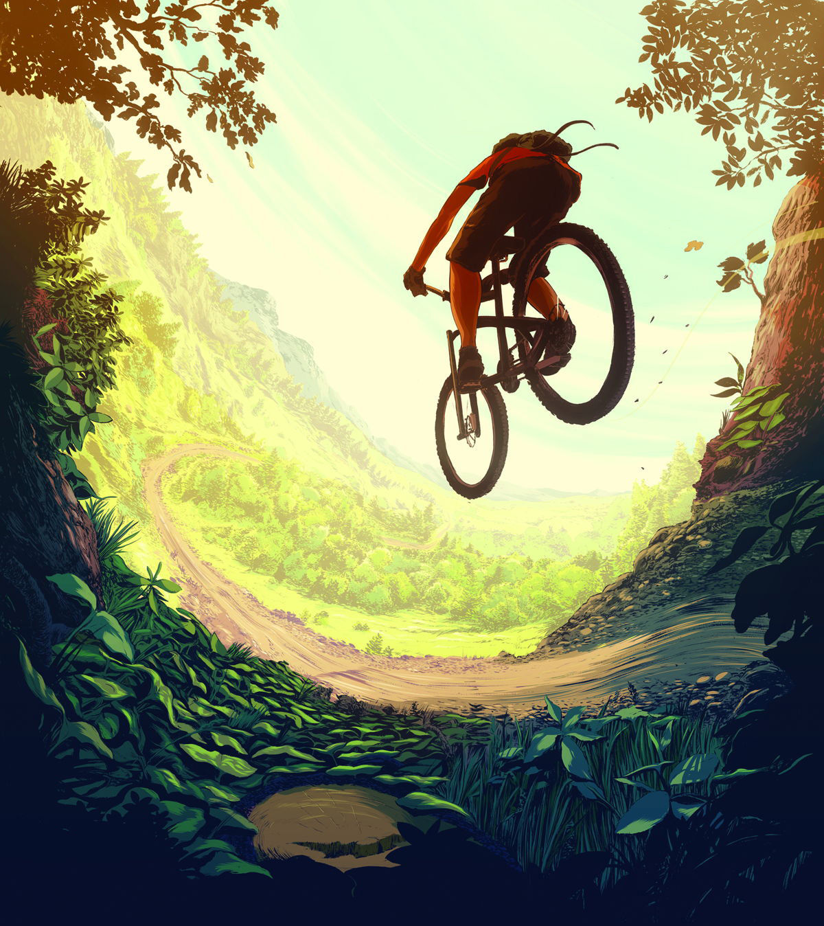
See more of Guy’s work at guyshield.com
Charlie Davis
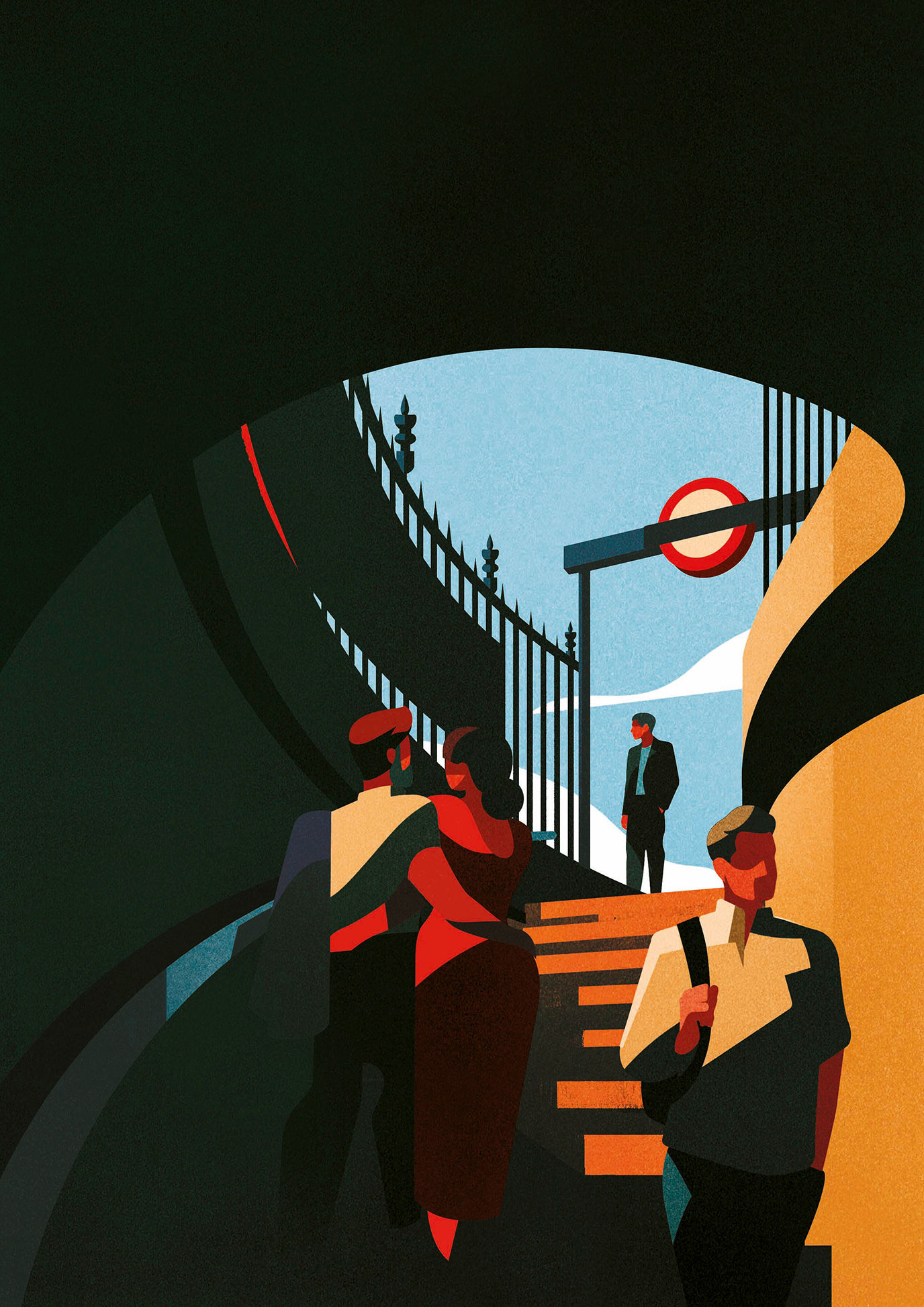
I would say that to convincingly suggest depth and distance it is important to ensure the elements further away are cooler in colour, more recessive in colour than the foreground elements and less detailed. I personally approach perspective quite instinctively and often without rigid rulers or grids. However mapping out an image with accurate perspective grids and vanishing points will ensure great accuracy.
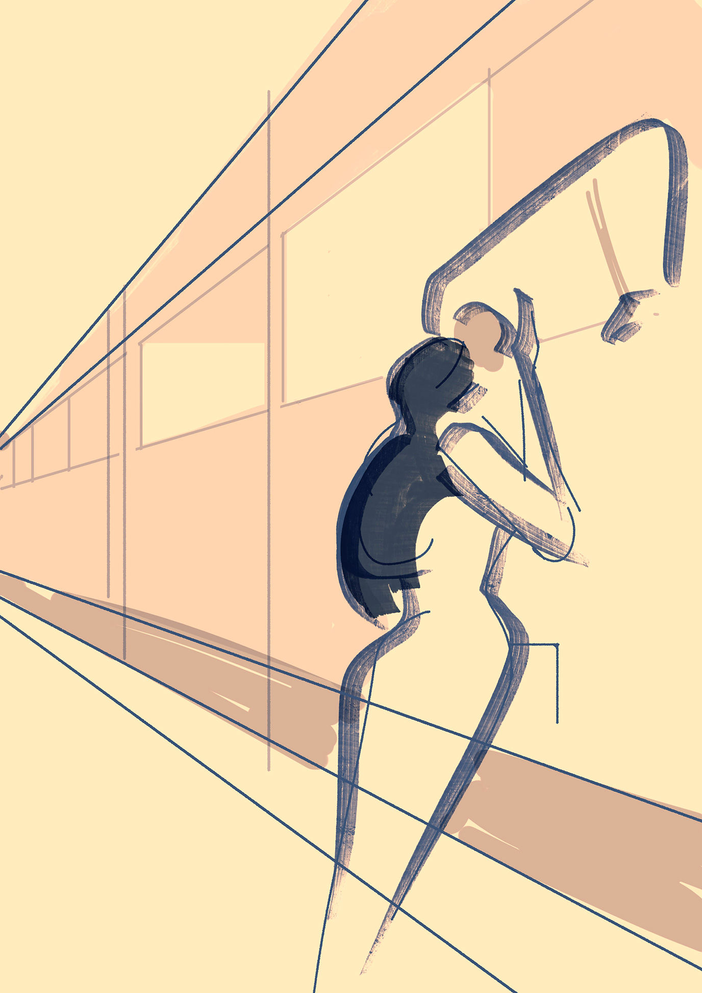
I think if following the rules of perspective accurately the main challenge is ensuring angles are true to the vanishing point and things don’t feel wonky (unless intentional!).
Also that the colours used create a sense of distance, meaning getting gradually cooler. It can be tricky to understand how more complex subjects appear in extreme perspective and I feel in these instances it is worth mapping out your image with guidelines to help.

I had a project recently where I needed to create some specific perspective of a tennis court (above) and I used Adobe Illustrator’s perspective grid tool to map out the viewpoint and follow as a guide for the illustration on top. In instances where working with perspective, I often use traditional one- or two-point perspective sketched loosely as a guide for the refined illustration.
See more of Charlie’s work at charliedavisillustration.com
Matt Johnstone
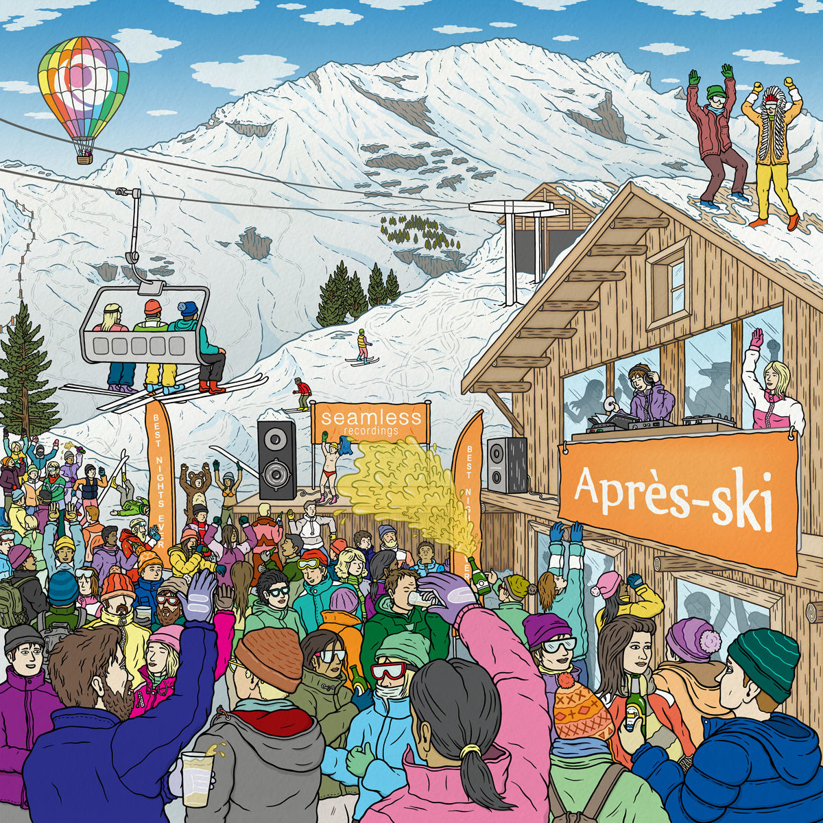
When I first started out as an Illustrator, I drew everything on paper – so I would use a traditional method of creating a perspective illustration by either drawing a single vanishing point for 1-point perspective or two vanishing points for 2-point perspective on a large piece of paper and then use a ruler to draw lines from the points.
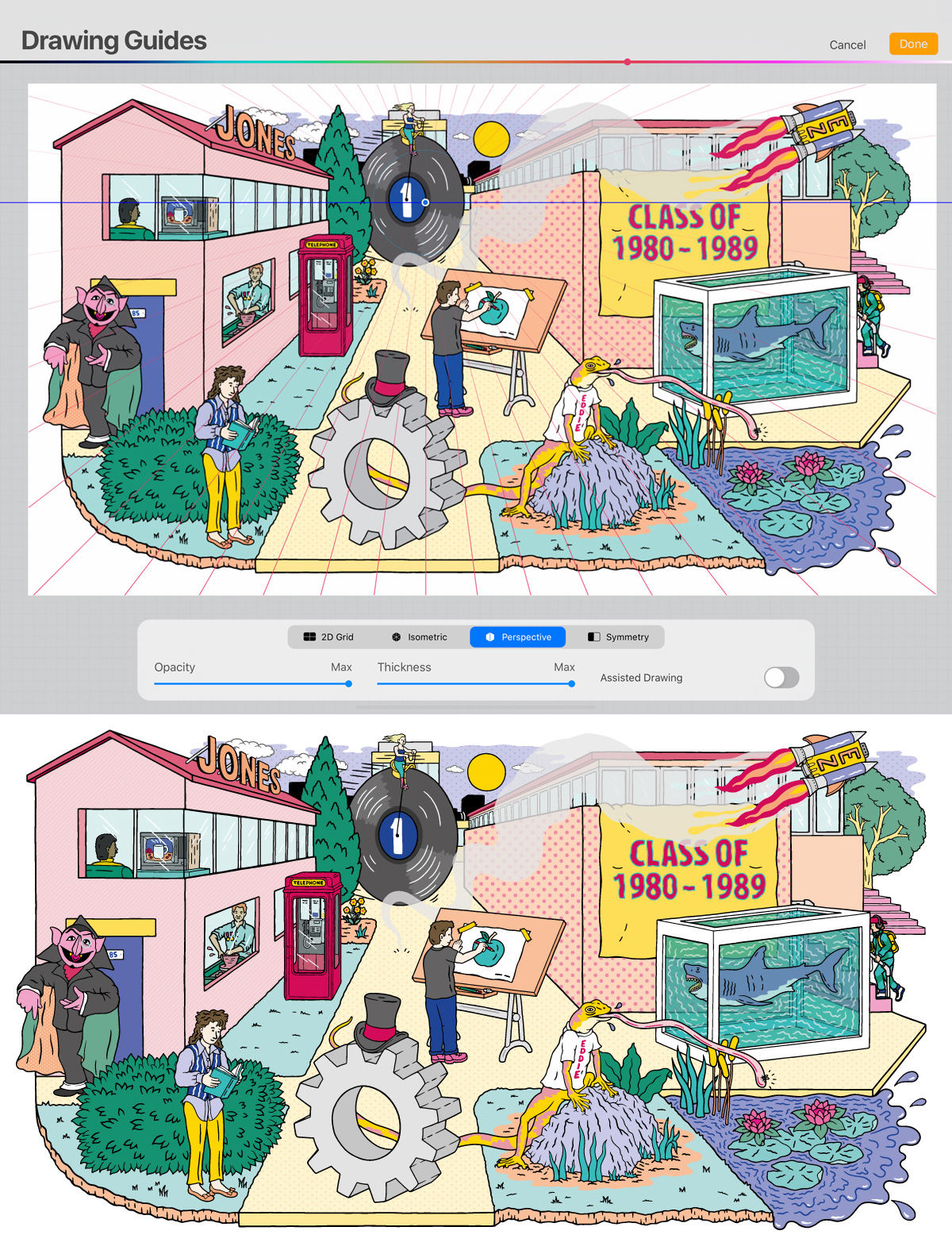
I started using an iPad Pro and Procreate to draw in a couple of years ago and really love it. There’s actually a perspective drawing guide built into Procreate so you can add can edit up to three perspective points, so I usually use that now as it gives greater flexibility to change the perspective. I just draw freehand using that as a guide but if you want to there’s a drawing assist you can turn on so all your lines stick to the perspective guide.
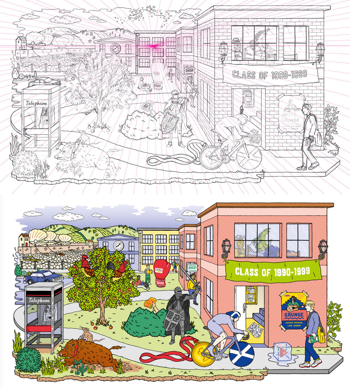
A good example of perspective drawing is the Cryptic Campus project for EY (above) which I worked on with my agent Jelly London. I created a 1-point perspective grid in illustrator that I imported into Photoshop and used as a guide to sketch the scene around.
I find it pretty easy to draw regular shapes and blocks in perspective when everything is parallel to the horizon so creating a scene of buildings and houses comes quite naturally to me – but it’s a lot harder to draw irregular shapes with curves or if you have a building that isn’t parallel to the horizon and is twisted slightly.
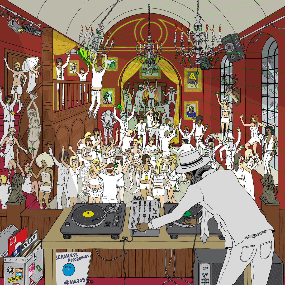
When drawing a person small in the background I would reference a person I had drawn in the foreground and draw lines from the top of their head and their feet to the vanishing point and that would give me the rough size to draw the person.
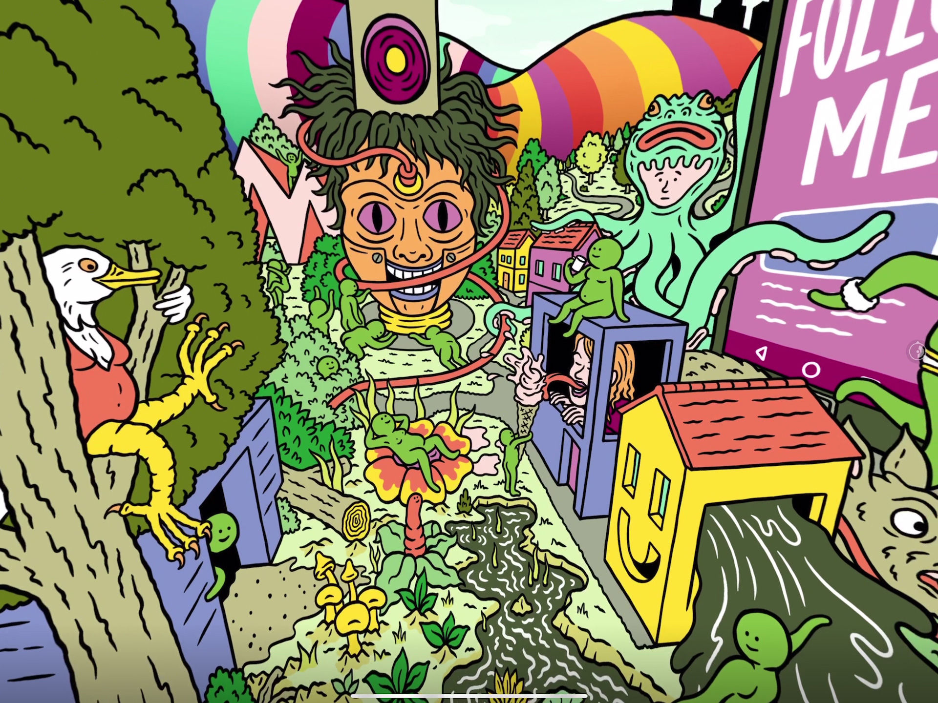
If you can get outside and sketch, you could try sketching your street or a cityscape and observe the perspective as houses and buildings get smaller in the distance. It’s a useful exercise to get familiar with perspective.
I would also try out lots of different ways of perspective drawing and see what works best for you. If you find it easiest drawing more traditionally in 1 point or 2 points on paper and using a ruler to draw lines off of them then go for it. Likewise if you draw digitally and want to create a grid template in illustrator to use in Photoshop or Illustrator that is good too, using the grid built into Procreate makes it super easy or even better just go freestyle it might suit you that it isn’t 100% perfect.
The main thing is to practice!
See more of Matt’s work at mattjohnstone.co.uk
Studio Muti
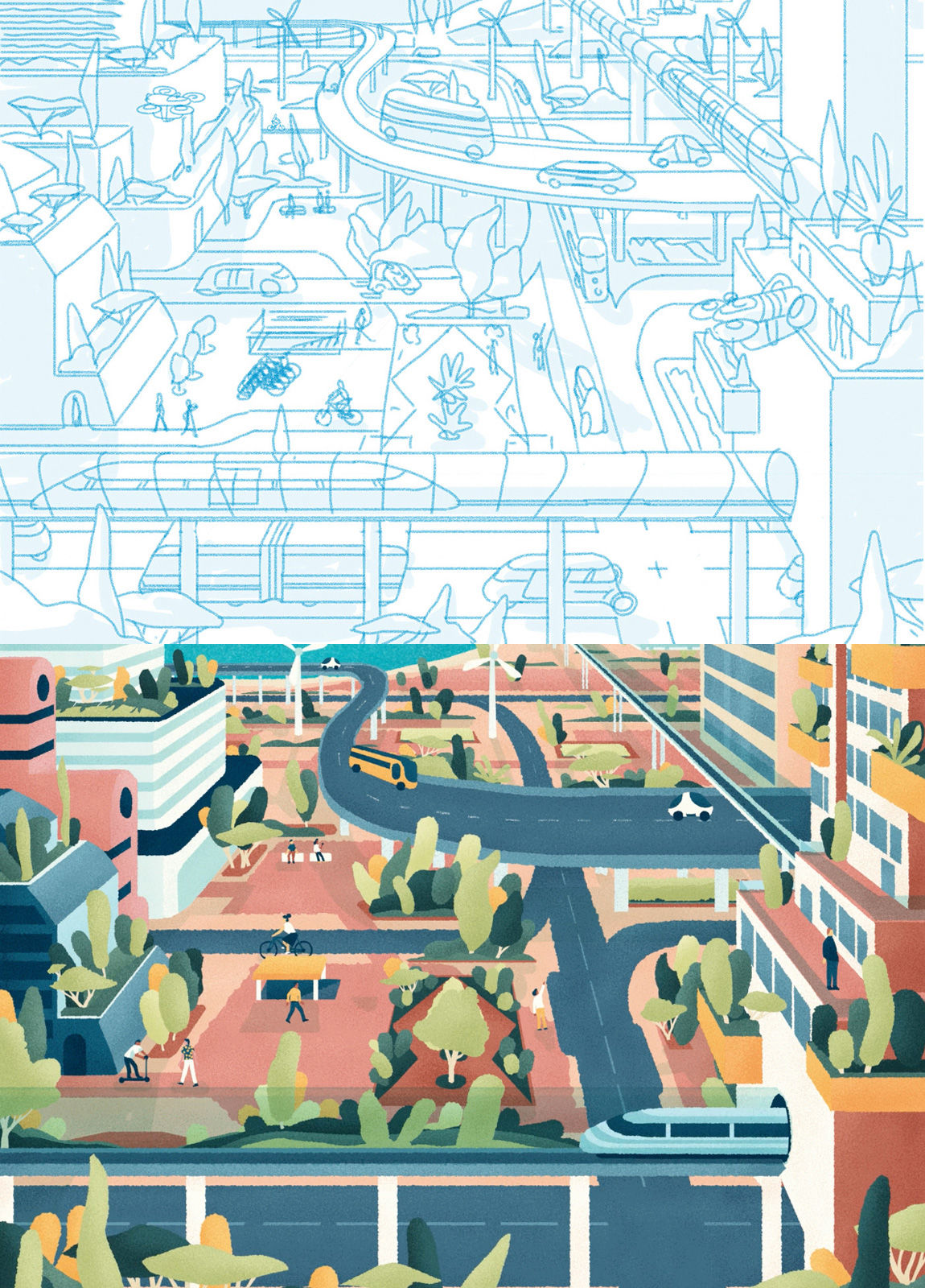
For the recent project with Süddeutsche Zeitung, our process was to start with the grid: Determine the vanishing points and horizon lines and then fill the page with guidelines that we can easily draw over for the correct angle and distance. We then do a rough sketch of where we want everything, followed by a refined sketch that has neater lines and accurate details and basic lighting.
See more of Studio Muti’s work at studiomuti.co.za
https://www.digitalartsonline.co.uk/features/illustration/perspective-drawing-techniques-of-four-top-illustrators/

