

Cannes, France—The data will set you free.
When Verizon announced that Leslie Berland was joining as CMO in December of 2023, CEO Hans Vestberg called the moment a “transformative time” for the industry. At the time, Berland didn’t know yet what that would mean for Verizon’s brand, but quickly the data showed Verizon needed a new look, feel and positioning in the market.
In Verizon’s design system, the black overshadowed its iconic red. Verizon has 99% brand awareness, but only 30% of people can identify the Verizon check mark. The brand views itself as powering how you live, but consumers view it as invisible.
With that in mind, Berland and Ricardo Aspiazu, vp of creative and brand management at Verizon, worked with agency partners to develop a new design system and brand platform that embodied its name—Verizon’s name is a combination of Veritas and horizon—and provided a window into everything the brand has to offer. Berland and Aspiazu also saw an opportunity to put the “V” front and center of everything it does. To tie everything together, Verizon’s iconic “Can you hear me now?” tagline is also making a brief return.
“We’re bringing freshness and vibrancy in our storytelling to lead with people’s lives, and then connect to what we do versus leading with the technology or promotion,” Berland told ADWEEK. “It’s flipping not just how we look at the design of the systems, but really how we do marketing and advertising overall.”
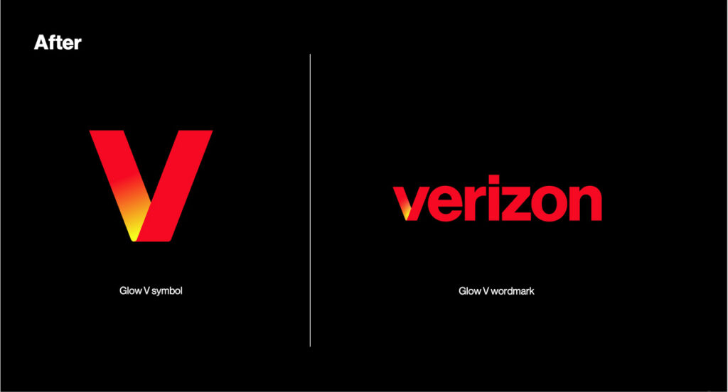
A gold flash
Berland sees an opportunity to elevate the “V” of Verizon by giving it a different look and feel throughout its marketing. It starts with a golden accent on the left side of the V which is meant to be reminiscent of the horizon. It will focus on spotlighting the wordmark initially to establish it with consumers before beginning to roll out other uses of its V logo, which will initially only show up as the app icon.
But Berland eventually has big plans for that V and the left side will also be used as a portal into Verizon’s connection to the NFL, Netflix, Apple Music and gaming. However, Verizon will ease into diversifying how the V shows up though to avoid confusing customers.