A brand identity more ‘good’ than ‘Goop.’
The Art of Healing is a Warsaw event for enthusiasts of a healthy lifestyle, combining fairs, conferences, workshops, consultations, and pro-health treatments. Its organisers, feeling their previous graphic identification did not distinguish themselves sufficiently, turned to Polish artist Victor Soma for branding of a more unusual sort.
“My goal was to create a brave and aesthetically coherent graphic identification that could radically cut off from the aesthetic clichés that dominate this segment of the market (e.g. silhouettes of people practising yoga with the setting sun in the background),” Victor emails me.
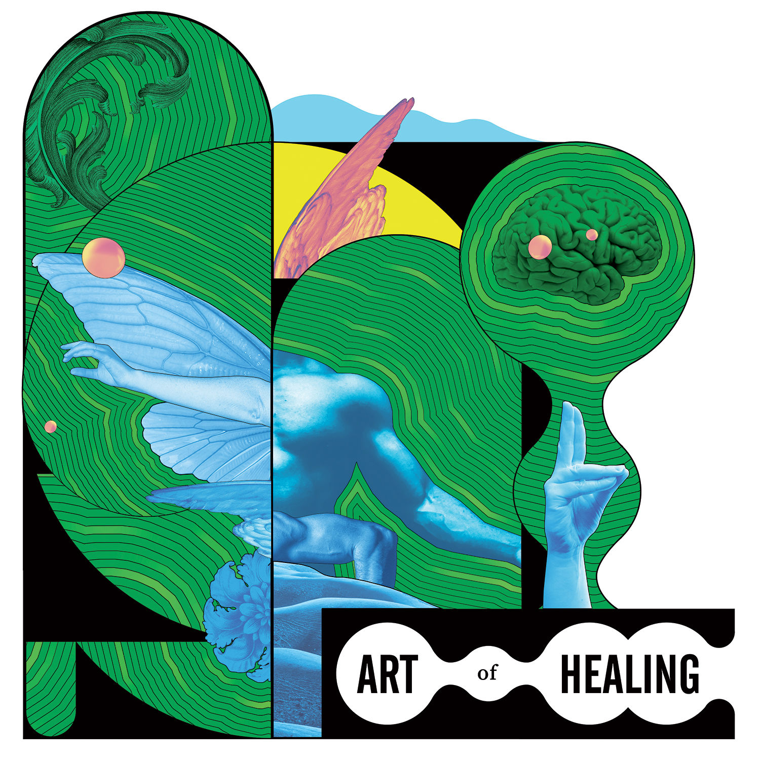
“But at the same time, it needed to be recognisable and acceptable by healthy living enthusiasts. I was asked to create visual metaphors that referred to the client’s aims such as knowledge about health, holistic approach, body and mind balance, homeostasis, ecology, veg, and life energy.
“The client leaned towards the collage technique, which combines elements of nature and modernity — this was the direction I followed.”
For the project Victor created a logotype, together with sets of reusable compositions containing the logotype, and a set of illustrations with animated GIFs.
“I did a simplified version of the logotype (monogram as a social media icon) and a full version, for which I decided to use a strong literary sign, but very illustrative, without an accompanying signet.
“The set also included two posters and graphic elements (banners, buttons, etc.) for the client’s website. The client knew my style of visual identities, like each edition of the international theatre festival Divine Comedy in Krakow; each of them is a separate surreal world full of crazy escapades deep in postmodern games of association.

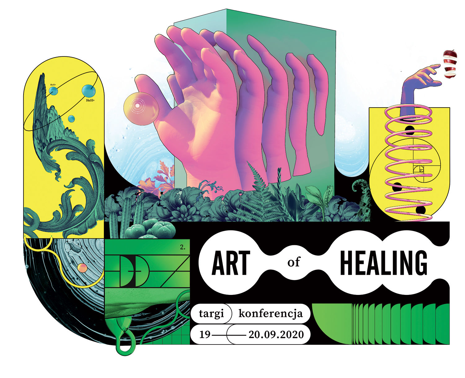
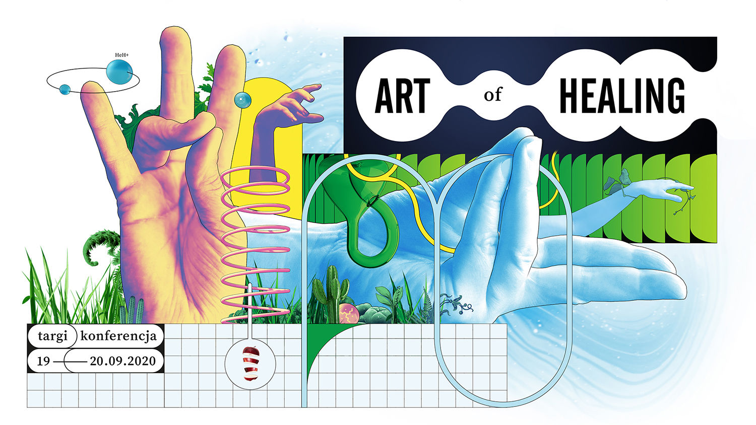
“We decided to use a similar method — branding as building a coherent alternative world. This world is supposed to express emotions and values identical to the brand. It’s like creating scenery for a movie based on your dreams. I tried to saturate the images with vibrant delicacy; this world ‘hugs’ the viewer with care.
“The strong colours represent the opposite domains: nature, science, body and psyche; they all merge into one overlapping system of connections, diagrams and energy flows.
“Despite the high degree of complexity of the composition, the whole expresses a balance.”
Of everything in this New Age world, Victor is most pleased with this poster of a man’s back, where a muscular hand is like an extension of the back, and the spring seems to be “a hidden mechanism in the body.”
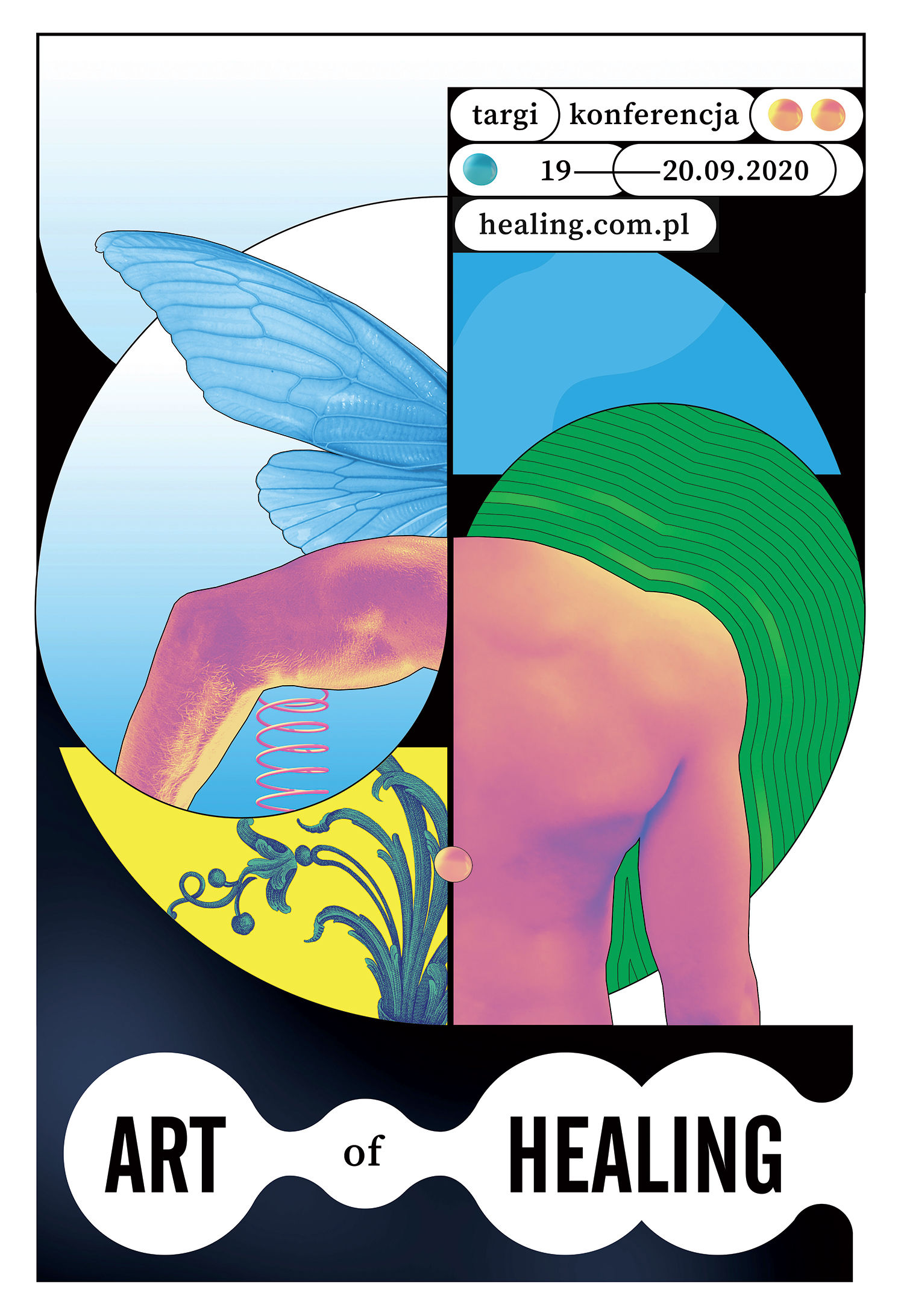
“I am also satisfied with the black divisions of space, creating a pleasant layout.”
3D models of the images were made using Cinema4d, and vectors in Illustrator, before combined with modified photography in Photoshop.
“I am invariably inspired by the Polish Poster School (a trend in Polish graphic design in the 1960s, i.e. during the communist era), posters by Shigeo Fukuda and other Japanese poster artists, comics by Moebius, Chris Ware and Charles Burns, American lowbrow art, as well as ordinary everyday life, which can be grotesque and appealingly ambiguous. You just need to be more vigilant not to miss it!”
And has Victor been inspired by the conference to lead a spiritually and mentally healthy lifestyle? Turns out he’s trying regardless.
“I try to work less and less — which can be still sometimes too much anyway. This is my greatest contribution to the implementation of a healthy lifestyle.
“I have also reduced meat and sugar consumption to a minimum; the positive effects were instantaneous.”
Find more of Victor’s sweetly strange work on victorsoma.com
Related: Ari Liloan reveals how her distinctive style comes from being blind in one eye
https://www.digitalartsonline.co.uk/features/graphic-design/victor-soma-brings-new-age-health-conference-branding/

