Probably not Baywatch Red, but there are plenty of interesting candidates among the colour forecasts for next year.
It may have passed you by, but Pantone recently released a new colour in honour of the 30th anniversary of silly TV classic Baywatch, a tone derived from the swimwear of Pammy and The Hoff known as Baywatch Red.
A fun example of marketing, but it’s usually only Pantone’s proclamation of Colour of the Year which grabs the headlines, a big announcement that usually taking place sometime between Thanksgiving and the second week of December.
The colour master has been choosing one tone that will define the year ahead since 2000, deriving from the zeitgeist and what clients are ordering to come up with their hot pick. While on the one hand this can be seen as big of a stunt as the Baywatch one, colour does remain a key concern of the design industry’s, providing a conduit for the on-trend messaging brands will be keeping tabs on to stay ahead of the competition visually.
An example of this is Pantone’s environment-centered colour for this year, Living Coral, which correctly preempted brands around the world jumping on the green bandwagon long before Extinction Rebellion and Greta Thunberg became household names.
The nineteen years since Pantone started the tradition have seen other colour and paint companies making their own forecasts, many of which can be useful in predicting the final tone Pantone will settle on. There are also clues from Pantone itself as to what that colour will be throughout the year, as we reveal in this look at possible contenders for Pantone’s new Colour of the Year.
What will be the next Pantone Colour of the Year?
Catwalk colours
Last month saw the release of Pantone’s Spring/Summer 2020 NYFW Color Palette, a collection of 12 colours inspired by New York Fashion Week in what’s another annual tradition for Pantone.
While these aren’t to be confused with the forthcoming Colour of the Year, one of the selections involved may end up under that title. They also give a useful steer to what colour families are currently trending with creatives; fashion and design don’t operate under totally separate spectrums of taste after all.
Blues dominate the palette, concurring with trend forecasts from the likes of Sherwin Williams, who’ve opted for Naval as their colour for 2020, Sico and Dunn-Edwards, who’ve both gone for Mystic Cobalt, and PPG, who’ve picked the deep blue of Chinese Porcelain.
The Pantone blue that catches our eye from the NYFW collection is Mosaic Blue, a teal which “displays an air of mystique, grace and depth of feeling” according to Pantone’s blurb. Could this spiritual feel define a more-inwards looking world for 2020?

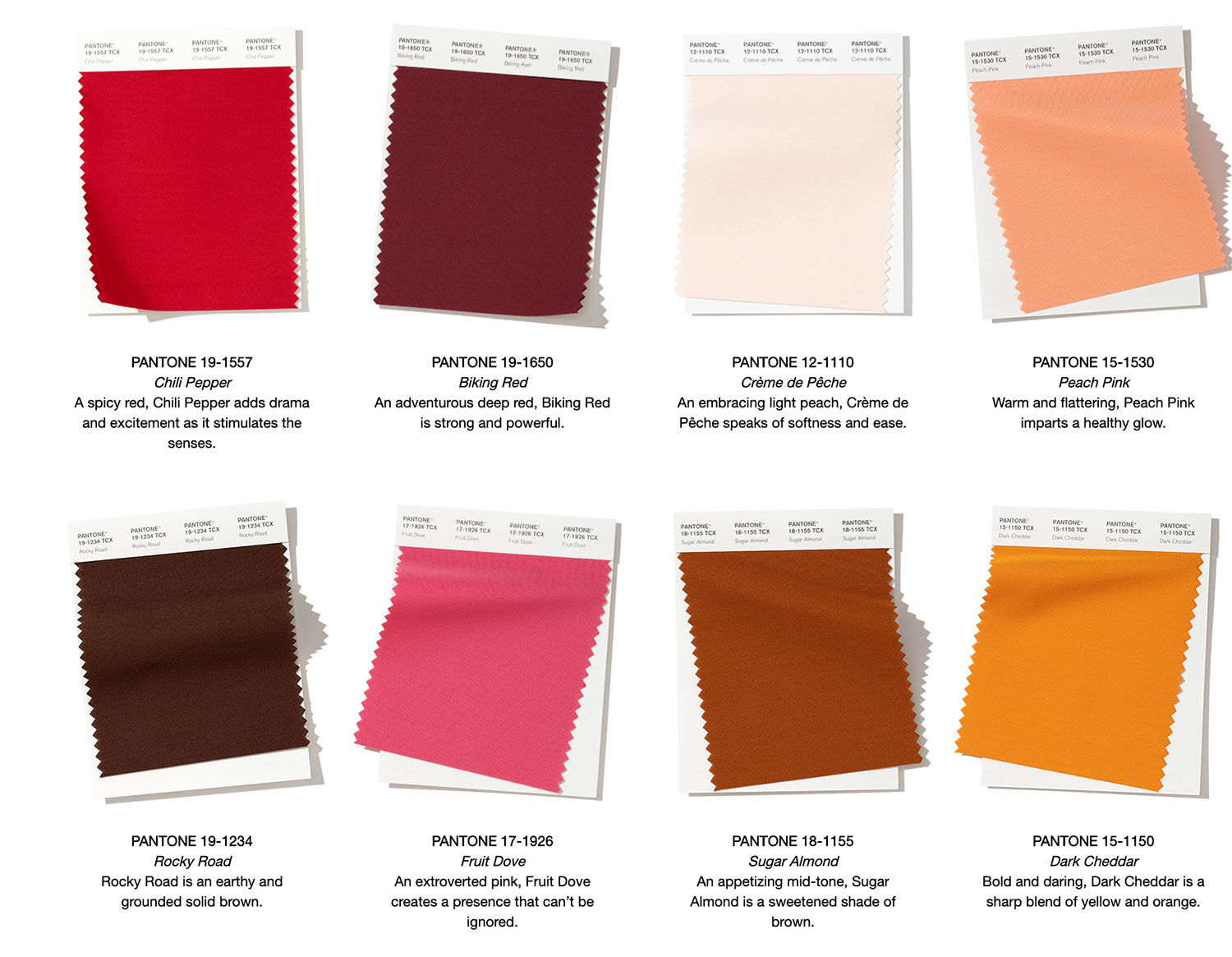
Pantone’s colour palette for London Fashion Week in spring was interestingly more dominated by bright ones like Fiery Red and Beetroot Purple. The autumnal Fashion Weeks in both cities were more similar as they usually are, with warm reds and earthly oranges defining their palettes, customarily so for the season of changing leaves. The extroverted pink of Fruit Dove (above) is our hot pick from the New York bunch.
Trending tones
We’ve mentioned blue colours being a common theme among Pantone and other tastemaker’s selections, but green shades are just as prevalent. Neo Mint is a name we’ve seen popping up everywhere; Dulux has gone for the cool green of Tranquil Dawn as its colour of 2020, and Behr has opted for the yellow green called Back to Nature.
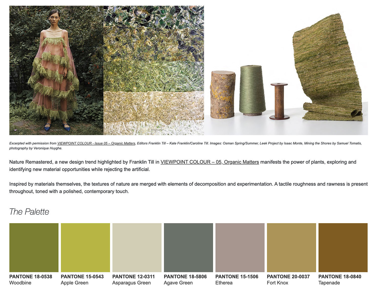
Two of the most recent trend reports from Pantone meanwhile, Nature Remastered and Tea Garden, are almost exclusively green. Obviously all these choices are reactions to the current climate crisis, but we doubt Pantone will select an environmental choice two years in a row.

Bright or dark?
If Pantone doesn’t go with a blue or a green, then we suspect it’ll will nod to the ‘scroll stopping’ trend highlighted by James Cropper’s recent Progressive Palettes report, in which colours are integral in getting social media attention.
The aforementioned Fruit Dove nicely falls under that category, along with Poppy Red, Super Pink and Spectra Yellow, the last two of which were highlighted as part of the Pantoneview Home + Interiors 2020 report.
It’s also possible Pantone might go in the opposite direction and acknowledge the ubiquity of Dark Mode on our devices, choosing from their so-called Leviathan range of ‘deep and weighty’ black and blue shades from the aquatic-themed Colour Planner Spring/Summer 2020, which also features a sea-inspired Halogen Blue and nice seaside town-odes like Fiesta.
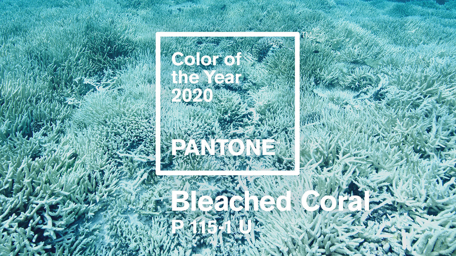
Or Pantone could just go with the equally-water based Bleached Coral spoof that we came across earlier this year, parodying Living Coral in a scorched-Earth fashion.

Who knows, it might just wind up being Baywatch Red.
Our tips for Pantone Colour of the Year 2020
- Mosaic Blue (Pantone 18-4528), a contemplative colour reflecting our increasingly yogi Earth
- Halogen Blue (Pantone 13-3920), a sea-inspired tone
- Fruit Dove (Pantone 17-1926), a scroll stopping pink
- Poppy Red (Pantone 17-1664), a scroll stopping red
- Fiesta (Pantone 17-1564), another scroll stopping red
- Super Pink (Pantone 17-2625), a pink said to reflect confident femininity
- Flame Orange (Pantone 15-1157) or Orange Tiger (Pantone 16-1358), our outsider choices as Living Coral did have an orange tint to it
Read next: What’s influencing the colours designers choose? A new report has surprising answers
https://www.digitalartsonline.co.uk/features/graphic-design/what-will-be-pantone-colour-of-year-2020/

