There’s an abundance of SEO strategies available to improve website performance. However, most strategies focus on increasing sessions.
What happens once these users land on your website?
As David Freeman explained back in 2017, UX is pivotal to the future of SEO and “what is good for the consumer is good for organic search performance.”
By analyzing user interactions on website navigation menus, measuring scroll depths, button clicks, engagement with form fields and even JavaScript errors, we can see potential barriers to conversion.
User experience (UX) metrics can be easily tracked via free and paid platforms such as Microsoft Clarity, Hotjar and other platforms.
How to measure UX with Microsoft Clarity
Before signing up to a UX tracking platform, check to see if it is GDPR and CCPA compliant, if there are traffic limits, if data sampling or sharing of data with third parties occurs and the pricing model.
As Microsoft Clarity satisfies all of these criteria and will forever be a free service, it is a cost-effective tool for measuring UX.
Sign up with Clarity by using your Microsoft, Facebook or Google account. Then, once logged in, create a new project for your website.
You will need to add the Clarity tracking code to your website, found in Settings > Setup > How to install Clarity. This installation can be done by manually adding the code to your webpages or via third-party platforms such as Google Tag Manager.
Allow for up to two hours before data appears within your Clarity project.
Get the daily newsletter search marketers rely on.
When to analyze UX metrics
Before analyzing the data provided by Clarity (or any other UX measurement platform), remember to consider:
- The timeframe of the data to be analyzed (days, weeks, months)
- Potential seasonality
- The influence of other marketing campaigns (offline and online)
- The amount of data you’re analyzing (for statistical significance)
Depending on the daily average of total sessions on your website, it may take two weeks or 10+ weeks to gather enough data as a baseline for future analyses and testing. The more data, the better!
Learn from Benny Blum when the right time to start analyzing data is and when data can be deemed statistically significant (p-value of 5% or lower).
How to analyze UX metrics

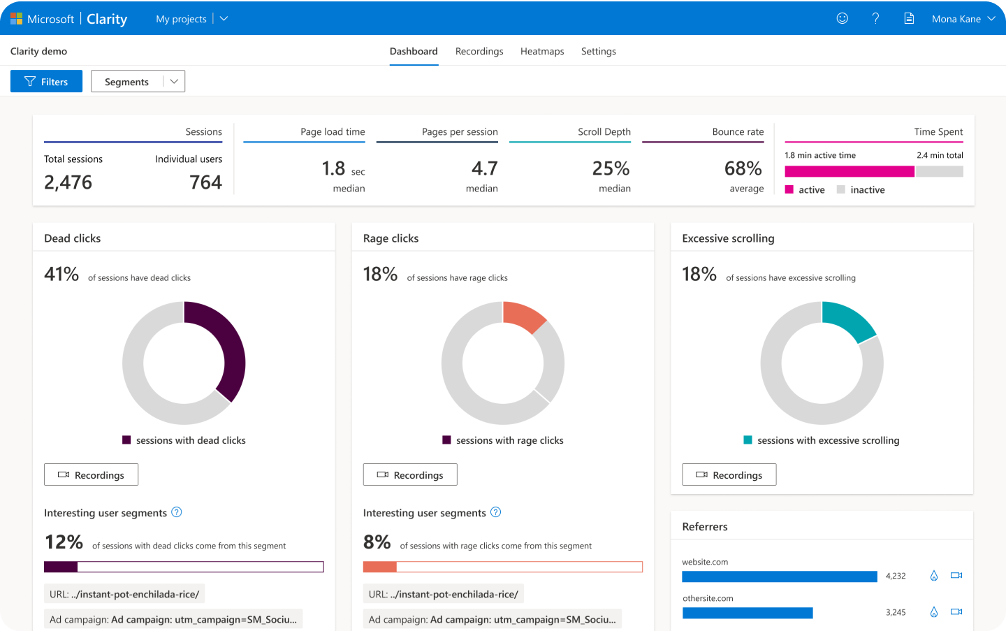
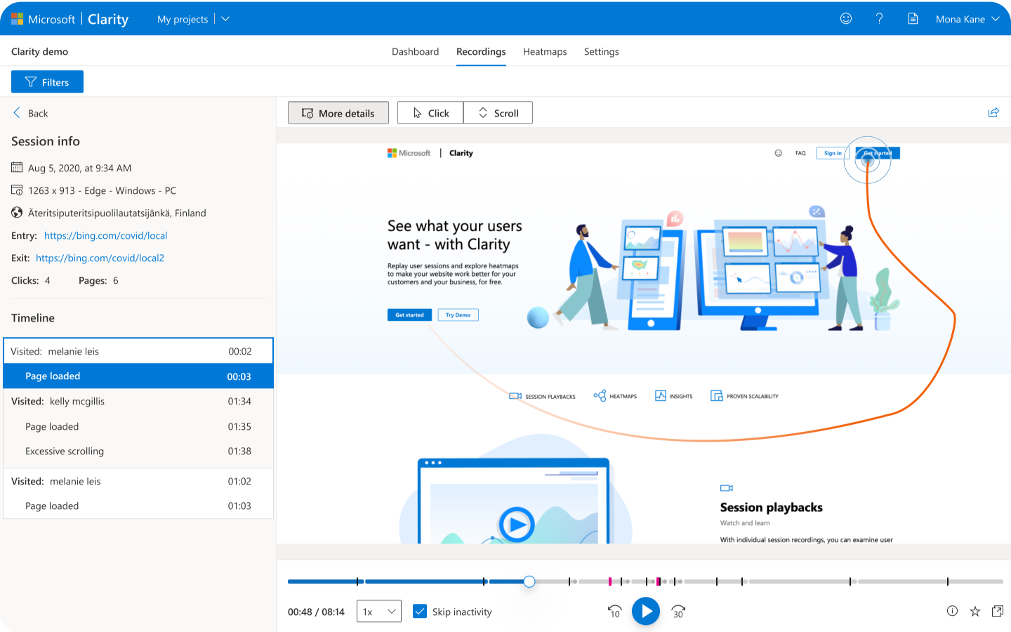
Using Microsoft Clarity as the example, start by watching session recordings with JavaScript errors and these abnormal user behaviors:
- Dead clicks. These occur when a “User clicked or tapped on a page with no effect,” which could be users clicking on an unlinked element such as a button, in-text reference or navigation item.
- Rage clicks. These occur when a “User clicked or tapped in the same small area,” which could be due to a slow website response from a link click or users highlighting text content seeking more information.
- Excessive scrolling. This happens when a “User scrolled through a page more than expected,” which could be users unable to find the information they need within the content.
- Quick backs. This happens when a “User navigated to a page then quickly returned to the previous one,” which could be considered a page bounce due to an accidental click or irrelevant content.
By watching these recordings, you can get insights into unknown technical issues, how to improve internal links and ideas for page design changes.

You can also save (favorite) recordings that show interesting user behavior, for quick rewatching at another time. You can share recordings via a link (which expires after up to 30 days) or in an email.
By using the filters, you can find the recordings of interest to you. For example, filter by mobile devices in the last seven days of users from Australia that entered the site via a URL that starts with x (to include UTMs too), with the session lasting longer than one minute, to see how users are engaging with your localized landing page.

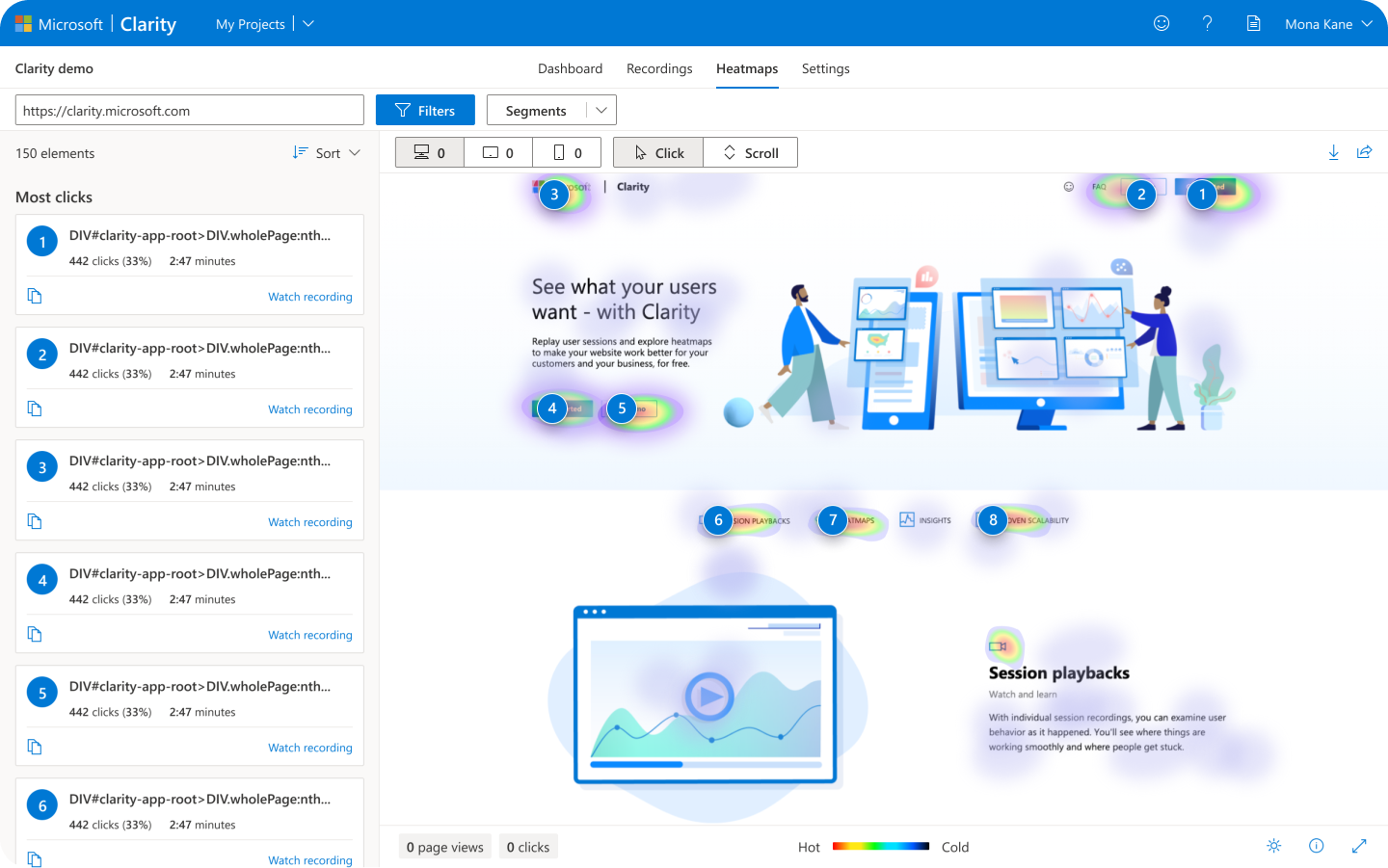
Analyzing heatmaps also provides insights into how users are engaging with content and which call-to-actions are most effective. See which elements of a webpage have the most clicks (on PC, tablet or mobile) and if that element is a video, a button, an in-text link, a drop-down navigation option or a footer link or any other area of the page.
If the key call-to-action on your page is not getting the most clicks, test a change in its design such as making it a floating button, a larger element or using different content around it.
How far users are scrolling down the page (on average) on PC, tablet or mobile can also vary depending on your page design and device responsiveness. See how far users are willing to scroll to find the information they seek and if important content is being missed.
If only a few users are scrolling to the footer and there are low numbers of clicks and engagement, test changing your page layout and adjusting your content, headings or multimedia.
Start collecting data today
Don’t miss an opportunity to improve your websites with data-driven UX insights. Set up an account, implement the tracking code and start measuring today.
Opinions expressed in this article are those of the guest author and not necessarily Search Engine Land. Staff authors are listed here.
New on Search Engine Land
https://searchengineland.com/analyze-ux-metrics-improve-seo-385559


