From the US to Korea, breakfast dining has a brand new look.
There were not one but two big stories in the breakfast world last week. The first was the closure of London’s Cereal Killer Café after six years of trading and tourist-trapping with its shelves of imported cereals at inflated prices.
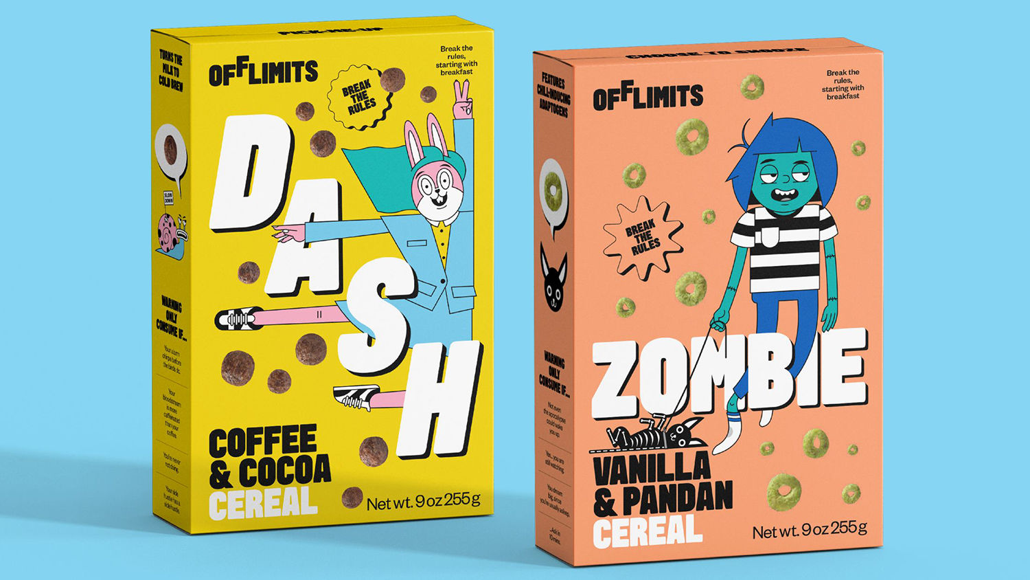
At around the same time that brekkie bombshell dropped, a new adult cereal was unveiled with branding by no loftier a talent than Pentagram designer Astrid Stavro.

When appealing to that millennial hipster market, you can’t go wrong with Pentagram’s nuanced touch, although arguably the colourfully random and in-your-face look of the Cereal Killer Café played a large part in its success over the years.
That the shop has closed doors to its grown-up punters is ironic considering the rise of so-called ‘adult cereals’, and an increase in playful cereal boxes featuring idiosyncratic illustration work. While we’re used to cartoon mascots from the big brand cartons of our youth, it’s taken a while for the cereal market to expand beyond the toned down ‘nature’-scapes of granola brands like Dorset Cereals and MOMA. Where vector drawings of nuts, grains and trees symbolised adult cereals, we’re now seeing the cartoon cheeriness exemplified by Astrid’s work for OffLimits, as reported on by Creative Boom last week, tapping into both childhood nostalgia and the blocky, cultured-yet-cuddly illustration popular on Instagram.

The designs follow in the footsteps of Magic Spoon, a ‘childlike cereal for adults’ which launched in the States last year. The OffLimits venture has taken on its template of one featured character per flavour (above), standing in opposite to the likes of Kellogg’s using the same mascot in different coloured variants of packaging.
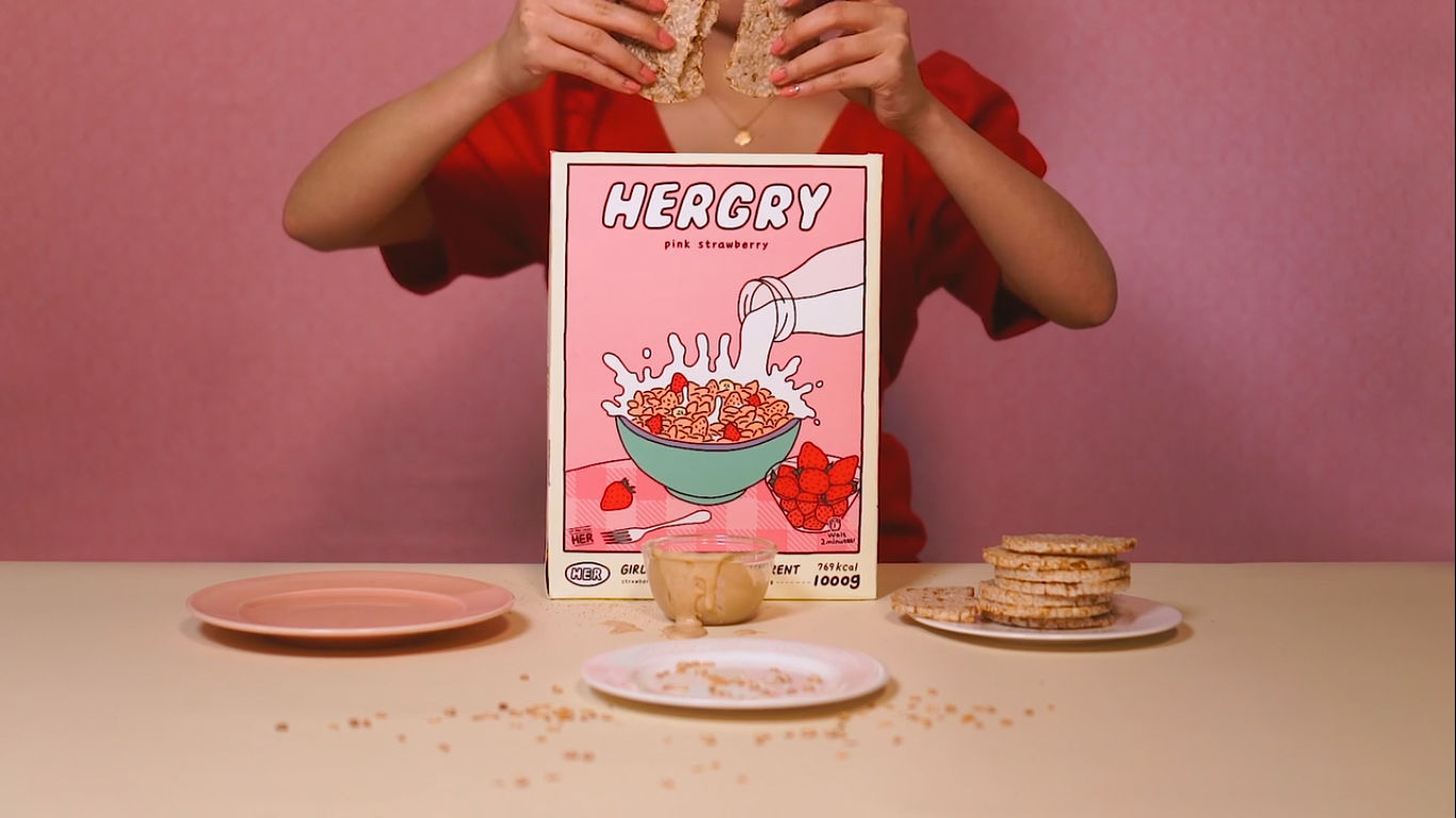
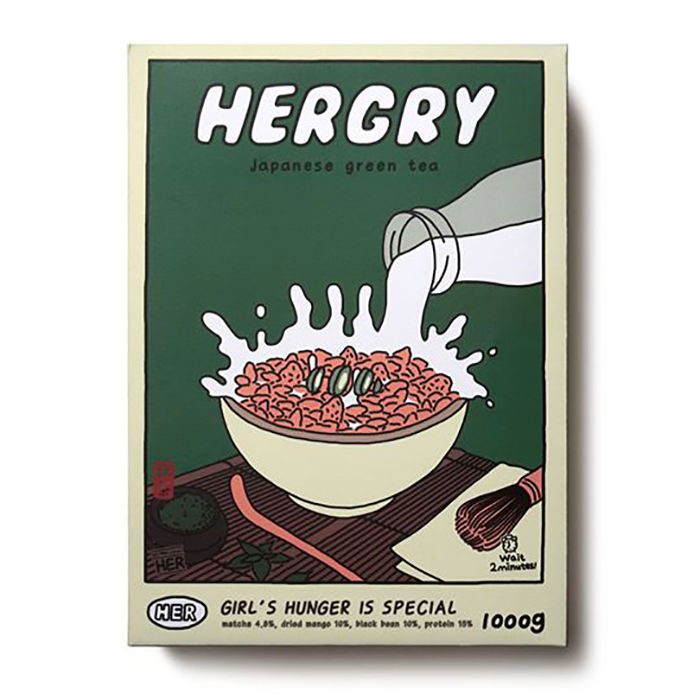
The trend has reached abroad also, with Korean brand Hergry launching its range aimed at the female market in 2019. It too has very Instagram-friendly boxes, so much so that its social channels are made up of users’ photos as opposed to original brand photograhy from Hergry itself.


It’ll be interesting to follow how the adult cereal market grows with the rise of home working; the idea of popping open a cereal box for a quick breakfast might seem less tempting when you have time for a leisurely fry up in the mornings. Conversely, with more of us being housebound, we might want to surround ourselves with nicer things in the cupboard, adding a little more flair to our morning routine whilst also having enough time for an Instagram pose before popping open the laptop.
Either way, this is good news for designers and illustrators who might want to expand beyond the world of craft beer labels into the Next Big Thing in branding. Rise and shine, folks!
Related: 32 illustration tips for packaging

https://www.digitalartsonline.co.uk/features/graphic-design/when-did-cereal-boxes-get-so-cool/

