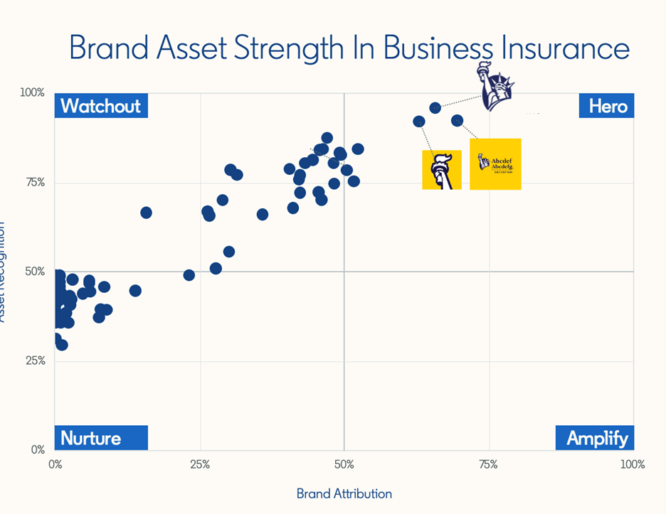
Not all categories are quite as bad as B2B tech. Take a look at the business insurance category, for example. There’s still not many hero assets, but on average, the scores are much higher.

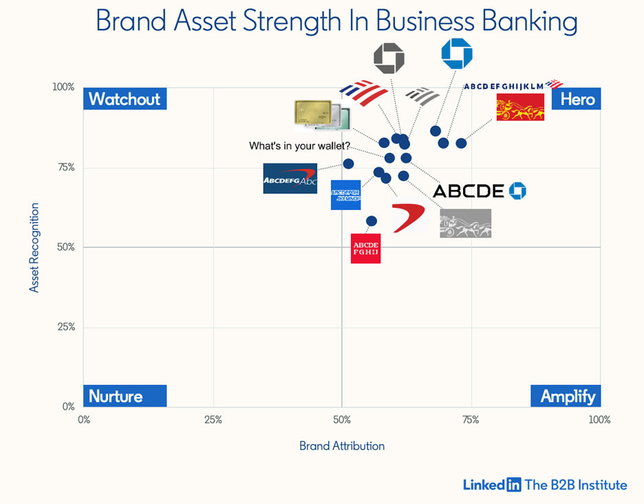
And no one does B2B branding better than the banks. Unlike many B2B tech firms, which are new companies competing in new categories, many B2B banks are old brands competing in old categories. And in branding, age is an advantage. Wells Fargo was founded in 1852, which means its brand assets benefit from 171 years of compounding equity. Financial services marketers are often criticized for being slow to change, but when it comes to brand building, slow-and-steady is a feature, not a bug.

Building a portfolio of brand assets
These banks’ success proves that building brand assets is possible for B2B marketers. Our robust analysis of over 300 brand assets doesn’t just show how big the branding opportunity is in B2B—it also shows marketers how to seize that opportunity. Get started with these five branding best practices.
Choose the right assets
Not all assets are created equal. Characters and logos tend to score highly on both recognition and attribution. In IaaS, for example, the best scoring asset is Amazon’s smile logo. Some 93% of cloud buyers recognize the smile, 67% attribute it to Amazon and only 3% attribute it to an Amazon competitor. In CRM, Salesforce’s lovable character, Astro, increases attribution by 40%. And even these world-famous assets still have room to grow.
Don’t choose the wrong assets
Colors and taglines offer the worst odds. Colors especially tend to score poorly on recognition and attribution. In business intelligence software, IBM is blue—but so is Microsoft Azure and SAS. Almost every tech and finance brand is blue. Blue is the color of the “sea of sameness,” which makes it a weak basis for distinctiveness.
That said, color can increase the attribution scores of a logo. A grayscale version of Microsoft’s logo performs 42% worse than the multi-colored version. But if you rely on color alone to carry the weight of your branding, you’re bound to be disappointed. Most assets are stronger when paired together.

