Geoff Seeley, chief marketing officer of Clearpay, explains why Pantone created Bondi Mint to link back to the company’s Australian heritage.
As Clearpay celebrates its first anniversary in the UK, 2020 felt like the right time to unveil a new visual identity consistent around the world. To create something that captures the power and value of our platform at a time of incredible growth for us as a business. Clearpay is a leading buy now pay later service with financial wellness at its core, we stand for a better future – one that powers a sustainable and more accessible economy for customers – so we wanted to create a brand identity which represents that.
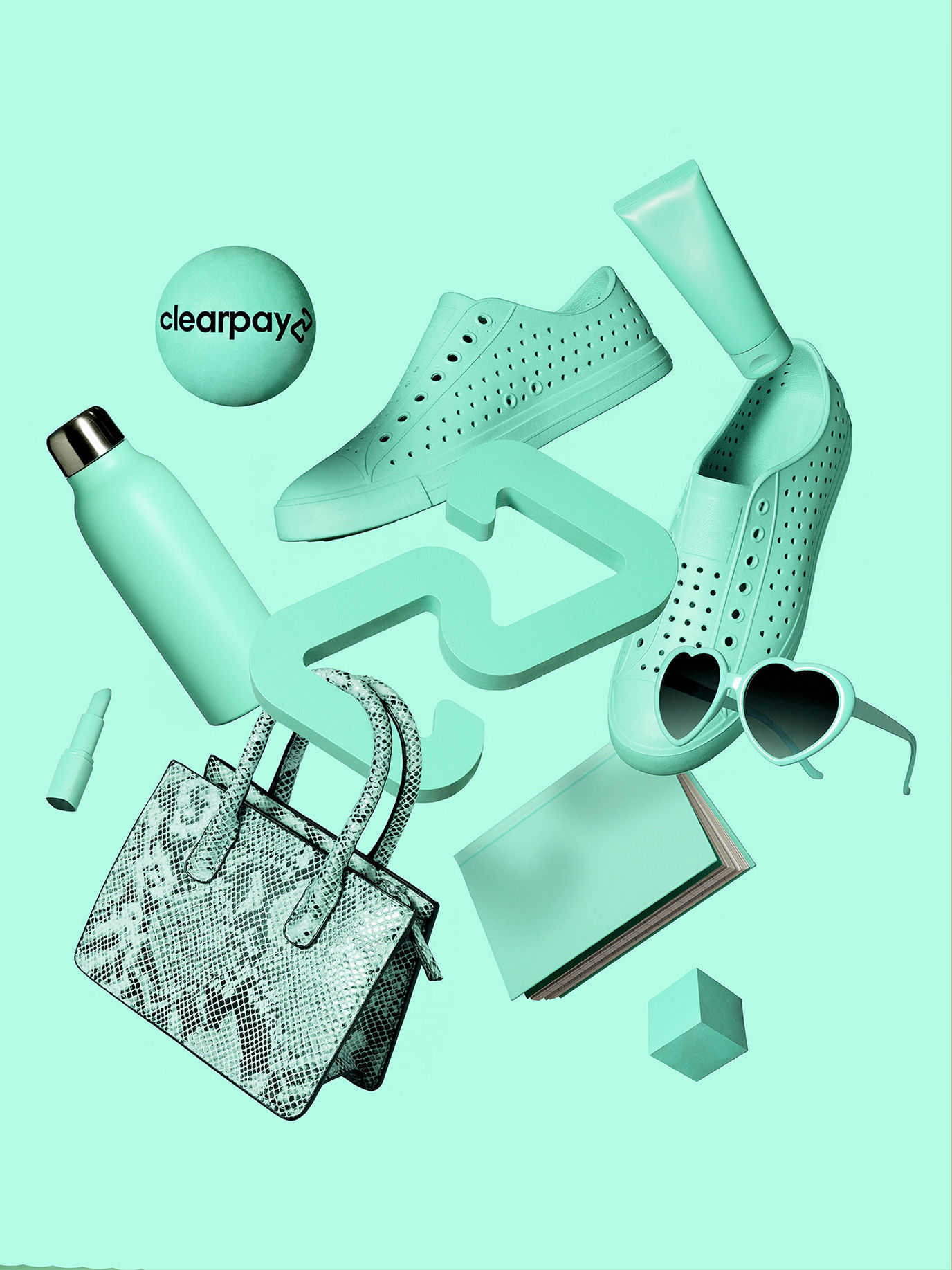
To do this, we collaborated with Pantone to create an exclusive mint hue that we named Bondi Mint, in recognition of our proud Australian origins – Clearpay was actually born out of Bondi in Australia.
Colour conveys the energy, tone and personality of a brand so being able to accurately and powerfully represent the emotion of Clearpay was really important. Bondi Mint is literally a brighter colour than our previous palette and reflects the characteristics of our Gen Z and Millennial audience and the brands and merchants they love shopping with. We believe we partner with the coolest brands and retailers on earth so to be able to reflect their personality and their attitudes was important.

From a commercial perspective, while Clearpay is the pioneer, the ‘buy now pay later’ category is getting more and more competitive as new payment options are becoming available so it was critical that we gave our brand the best chance of popping on a product display page or through the checkout flow. We wanted to be the payment option the eye is drawn to and with that, comes a recurring and recognisable presence that brings confidence in our service. It’s not just another blue-and-black, boring financial services company – we’re not really a financial services company – we provide financial products and services to people, but the role we play in our customers’ lives goes way beyond that.
We chose to work with Pantone as it is such a respected and global organisation, we wanted to be smart with the rebrand, partnering with experts like Pantone to help us and provide guidance made total sense. We knew that if we gave our brand a colour with a name that is specifically ours, it would amplify what we are doing and would add gravitas to the new brand identity – creating buy-in and pride from our employees and becoming a talking point to the outside world.

Our aim is for Clearpay to be seen as a more creative, more design-oriented business as we mainly work with fashion and beauty merchants, so it feels essential to hold our own standards around creativity as high as those of the brands that we work with and the customers who love those brands. In my opinion, Clearpay working with Pantone is the same as our customers wanting to shop with MAC.
In addition to the colour, we have also unveiled a new logo, which has evolved from our original two disconnected triangles, to a continuous “loop”, representing the infinite relationship and connection between Clearpay’s consumers and merchant partners.

With everything combined, we aimed to build a brand identity that showcases a message that appeals to our young consumer base.
Many brands try to dress themselves as something they are not but for Clearpay, we are building products and services that reflect our customers and the merchants that we work with, the branding is a reflection of that – the dressing of it. To articulate the emotion, the personality and the mission of the company and show that in a visual and typography form. We are a service in service of our customer and our branding is the visual manifestation of that.
https://www.digitalartsonline.co.uk/news/graphic-design/why-clearpay-created-its-own-pantone-colour/

