Mark Starrs of James Cropper explains how fashion has fallen out of favour with designers in the UK, with a new order of influence on colour trends at play.
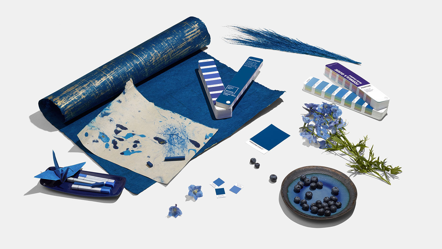
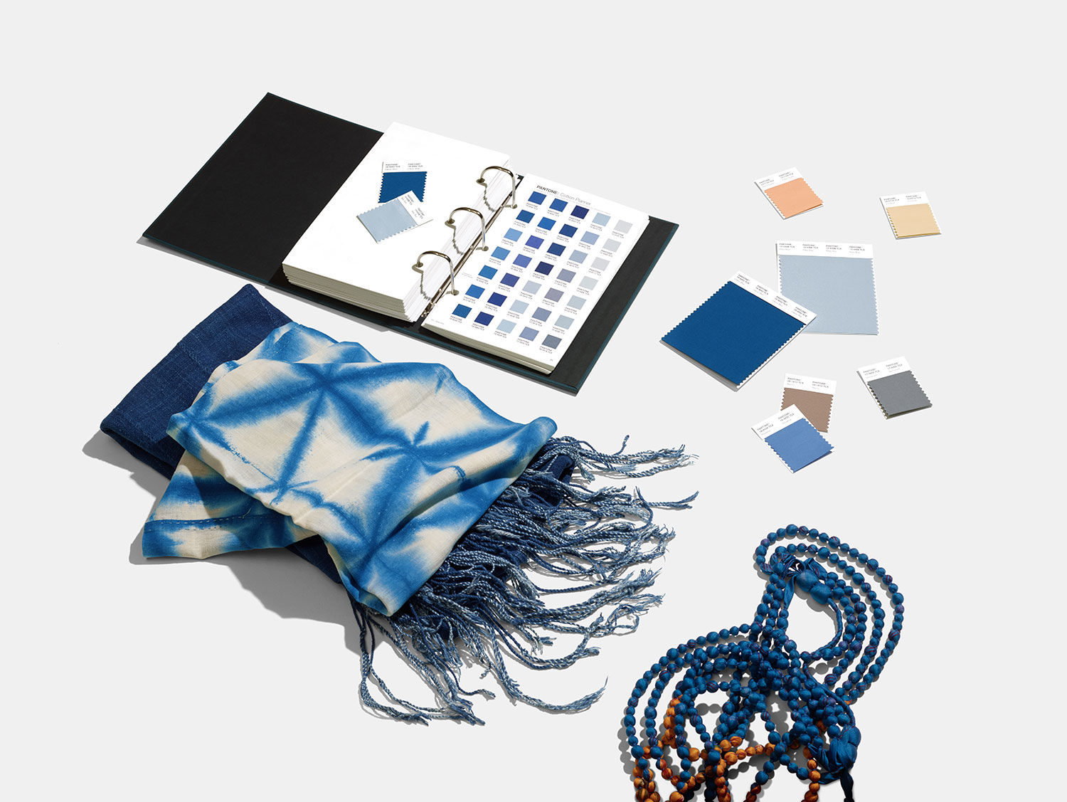
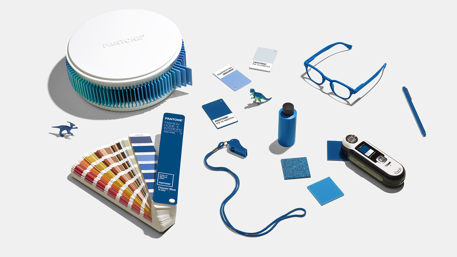
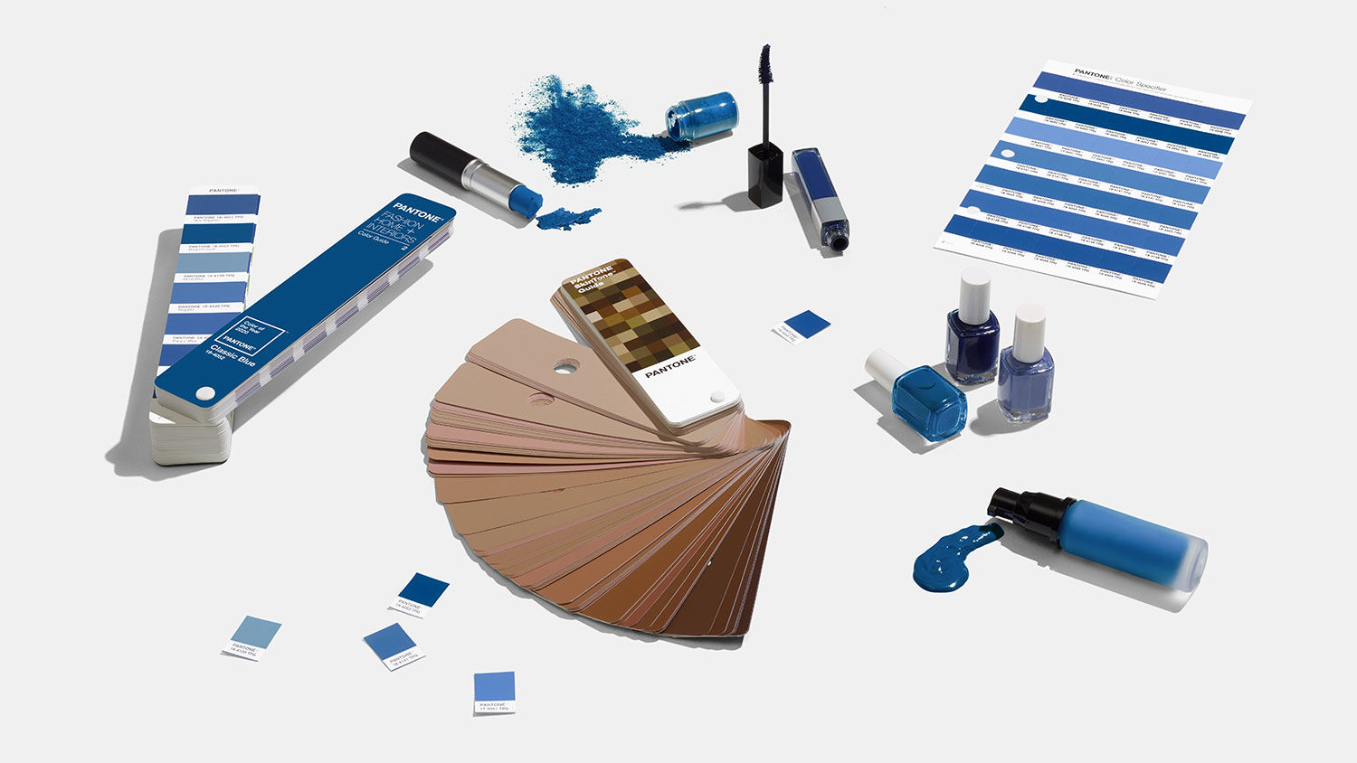
Last week saw Pantone unveil their 2020 Colour of the Year, Classic Blue. This came as little surprise to the team at James Cropper, who earlier this year surveyed more than 500 branding and packaging designers on their colour of choice, the latest colour trends and factors currently influencing their palette.
The Progressive Palettes report revealed blue to be UK designers’ favourite colour (22%), followed by purple (16%), red (15%) and green (9%).
So why is blue having a moment? At its core, blue symbolises order, calm and security. In times of global uncertainty people naturally gravitate towards ‘safe colours’. With lives lived against a background of constant clamour and unrest, blue is a constant. It offers stability, a sense of calm and order. Furthermore, in our busy digital lives, we can find ourselves surrounded by the superficial and in a desperate search of depth, feelings of which are evoked by reassuring blue.

Launched at Luxe Pack in Monaco earlier this year, the Progressive Palettes report concluded that colour palettes are more progressive, political, and environmental than ever, while being powered by a climate of pace and change that refuses to stay still.
Fashion has traditionally held the undisputed title of champion of style, inspiration and colour trends. At James Cropper we have seen the season’s most colourful collections make their way from the catwalk into our colour lab, claiming a stake in brand identities and featuring in packaging. Recently, however, a power shift has taken place. Social media has superseded the catwalk and become the number one influencer on colour choice for brands. Image-led social platforms such as Instagram are now leading the way in the design stakes and brands are embracing social networks to express their identities.

But there are other factors at play. Outside of social media, the top five influences designers cite as impacting their colour choices for brand identity and packaging are: product sector, Brexit and the Trump era, the unboxing trend, the gender debate and – last but not least – sustainability.
With a global spotlight on all things environmental, designers are having to respond to the growing expectations brands face to demonstrate their sustainability credentials. Nearly 80% of UK designers who participated in our study said sustainability is having an impact on the briefs they receive, the materials they use and the colour choices they make every day. Blues are again for this reason also dominating palettes, while turquoise and greens are proving to be just as popular, predominantly as a reaction to the current climate crisis.


Looking ahead, nearly eighty percent of designers predict that technology will become the biggest influence on colour by 2030. But with the road of uncertainty stretching far into the distance, the pace of change promises to be the only constant influencer of designers’ palettes. Perhaps therefore, it’s safe to say that blue, with all its reassuring qualities, is unlikely to lose its appeal any time soon.
Mark Starrs is master colour blender at James Cropper. Images courtesy of Pantone and James Cropper.
Read next: The Pantone Colour of the Year 2020 is not as conservative as it might seem
https://www.digitalartsonline.co.uk/features/graphic-design/why-uk-designers-love-blue-its-not-just-because-of-brexit-blues/

