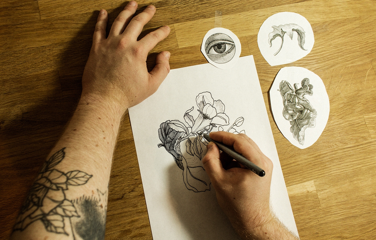
A set of fineliners with different line widths (from 0.03mm for super small details to 0.7mm for outlines) is essential. Japanese brands with changeable tips are excellent.
Hannes Hummel (GE)
Researching the right drawing paper to fit my illustration needs was the most important step. I chose 70gsm paper as it is suitable for alcohol-based pens and is bleached white for better scanning results; thin paper also gives the option to quickly redo individual motifs again and again, to have a sharp line-art result in the end.
Hannes Hummel (GE)
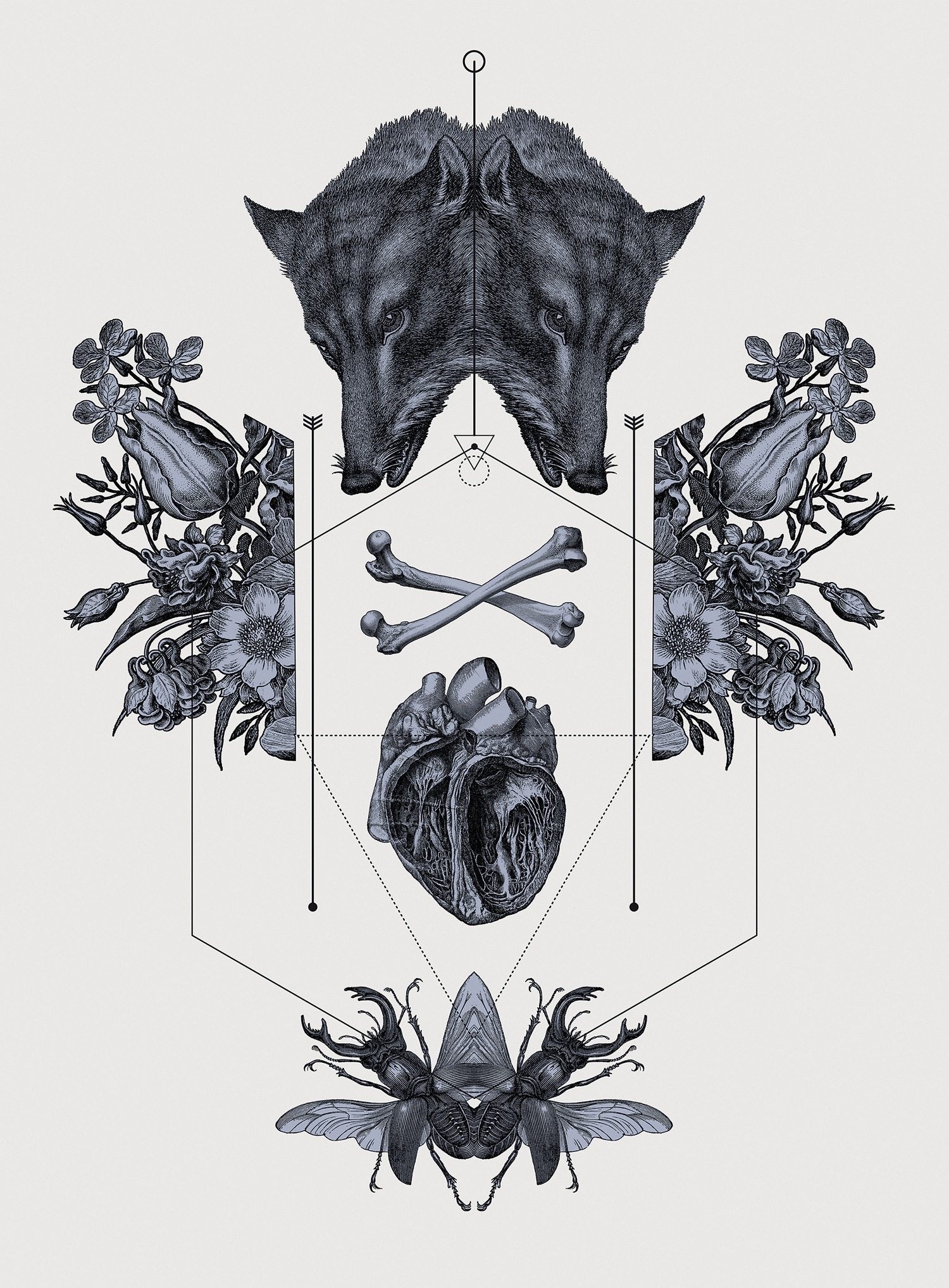
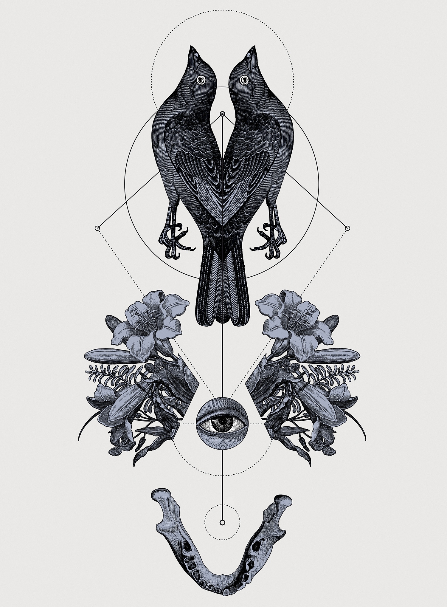
Panoply is composed of neo-traditional tattoo motif aesthetics in combination with geometric shapes and detailed etching-style illustrations. I wanted to produce the artworks with almost the same techniques a traditional tattoo artist would use to create a tattoo flash (a drawing transferred onto skin), by using a mix of detailed hand drawn outline-illustrations which would be later composed and shaded digitally.
Hannes Hummel (GE)
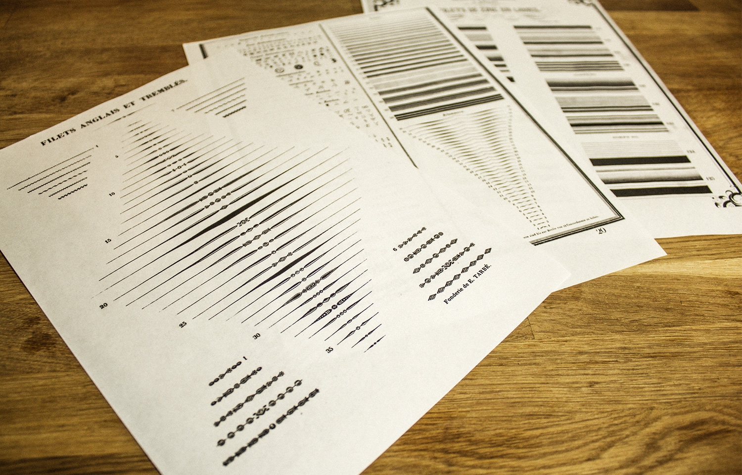
For the shading of all the objects I developed a special technique using over 50 scanned papers with different line-grids, which i drew by myself over the years to practice precise hand-drawn lines. I also used specimen sheets with line-grids from really old screen-printing manufactures – which I collected at flea markets – to give my illustration that vintage etching look. I also like to collect old etchings from books or prints from the flea market and use part’s of them as a collage to my hand drawn line-art elements.
Hannes Hummel (GE)
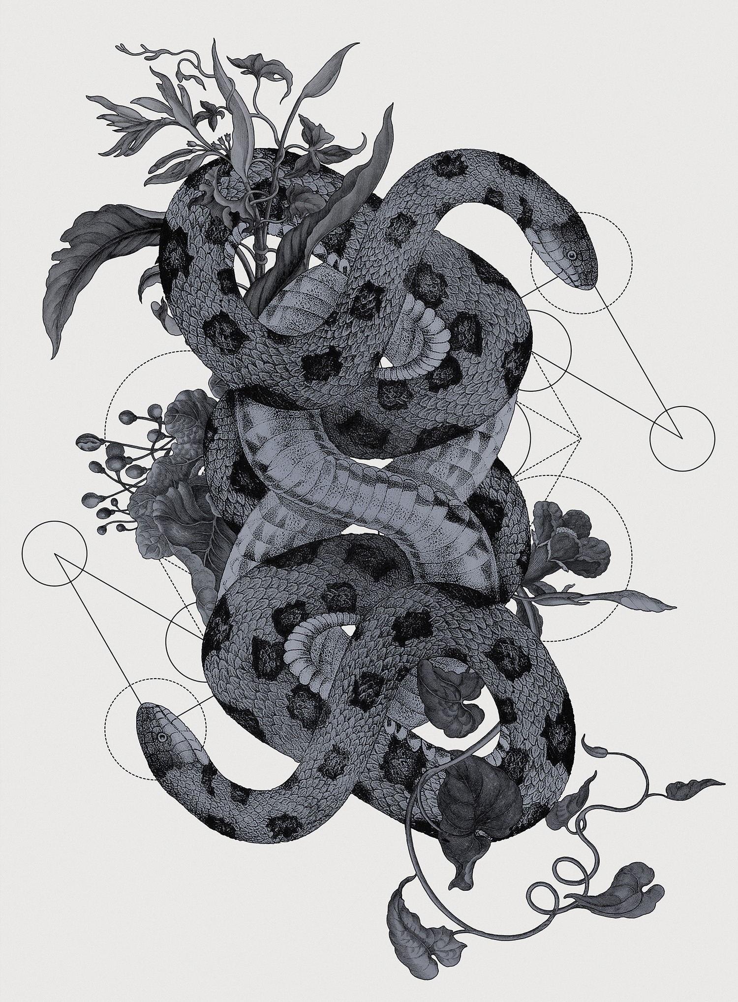
For the final composition I used Adobe Photoshop to correct any drawing mistakes – the Liquify tool saves a lot of trouble – and using scanned line-grid papers in a very collage-like workflow.
Hannes Hummel (GE)
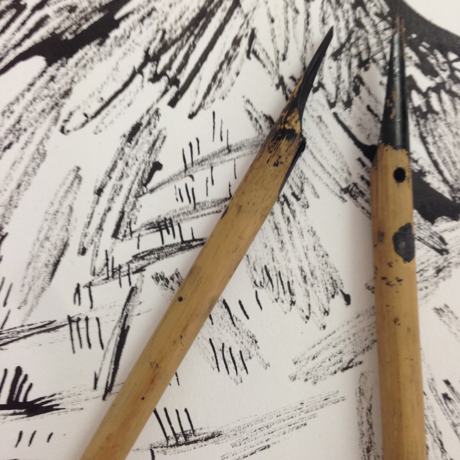
Personally I love using a reed pen for monochrome artwork. It’s easy to achieve a great scratchy line and it’s brilliant for making textures that you can save and reuse.
For drawing it gives a loose unpredictable line; combine with a synthetic brush to create detailed areas.
Isabel Greenberg (UK)
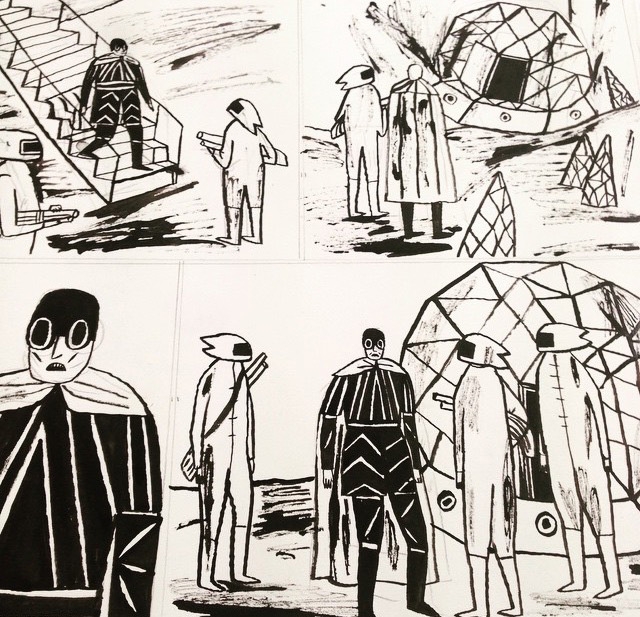
I’ve tried several but the best ones are from Cornellissons in London near the British Museum – they’re a great investment and last quite a while unless they crack!
Isabel Greenberg (UK)
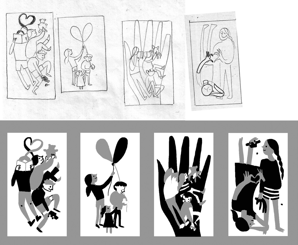
I usually start by sketching small thumbnails to figure out the dimensions and dynamics of an image to pin down the best possible composition. I will then do a sketch on the computer to see where areas of weight will be so that I’m thinking of the image as a collection of shapes rather than lines.
Karolin Schnoor (UK)
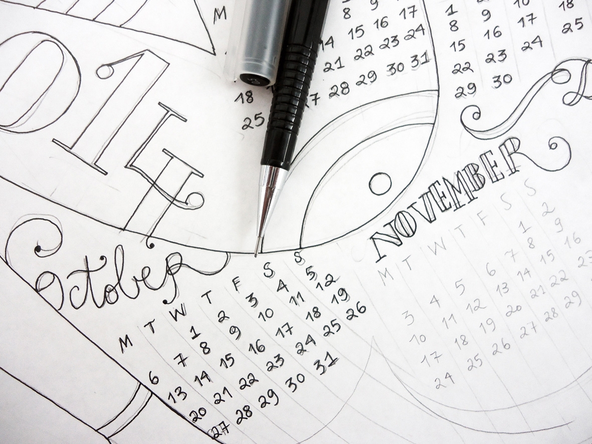
I will then do a pencil drawing from that, ink it in and scan the original.
Karolin Schnoor (UK)
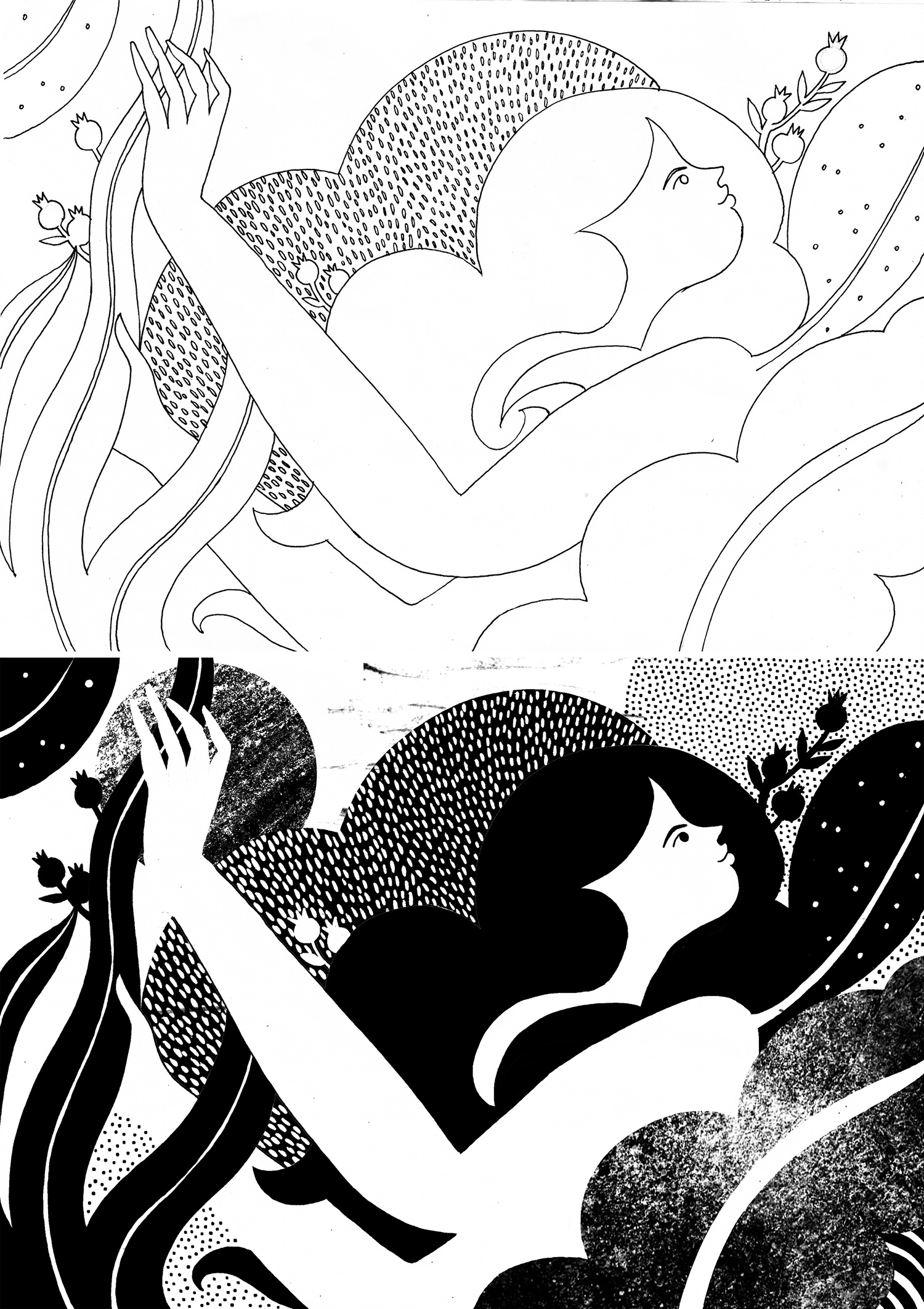
All colouring or applying of textures happens in Photoshop where I will also tweak the cropping of an image until it feels just right.
Karolin Schnoor (UK)
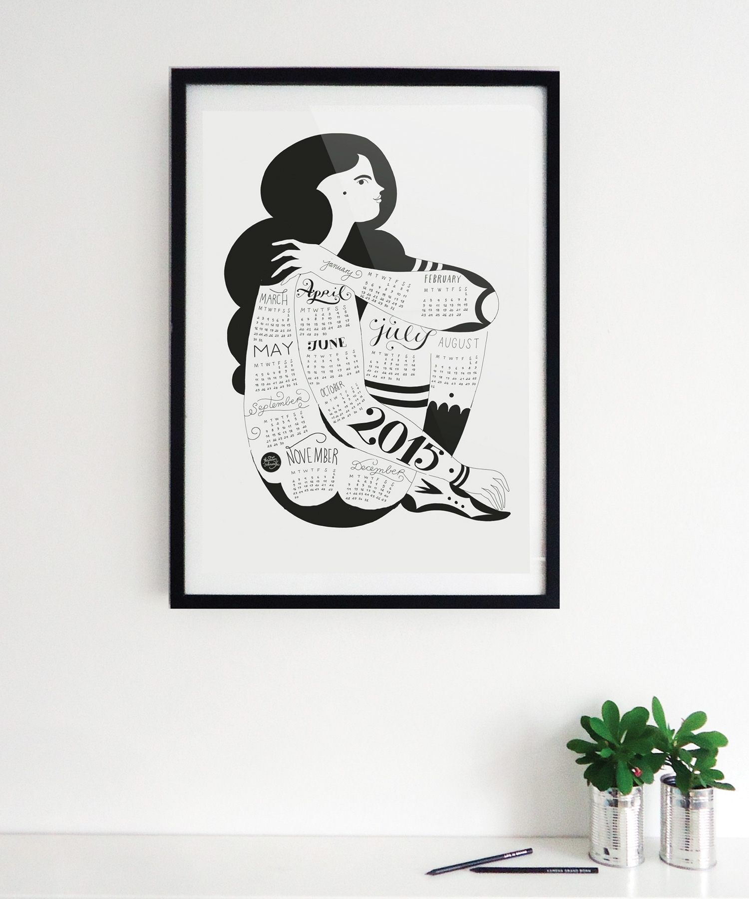
I often rely heavily on colour to shape my compositions and guide the eye around the image – so when working in black-and-white, I try to use the same ideals of balance by using areas of darkness and light (or thin line versus block black) to create the contrast.
Karolin Schnoor (UK)
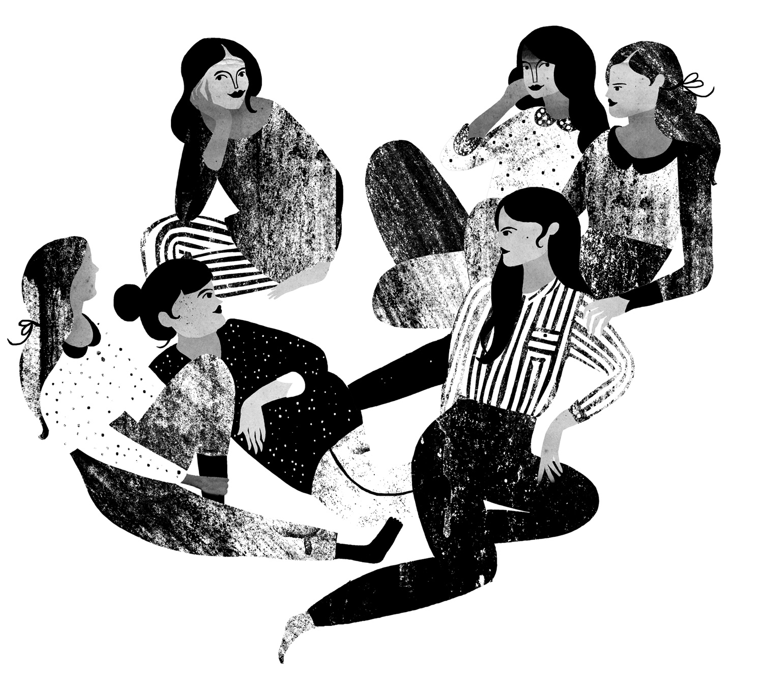
I also often use pattern or texture in these illustrations to add interest or create shapes that are in-between.
Karolin Schnoor (UK)
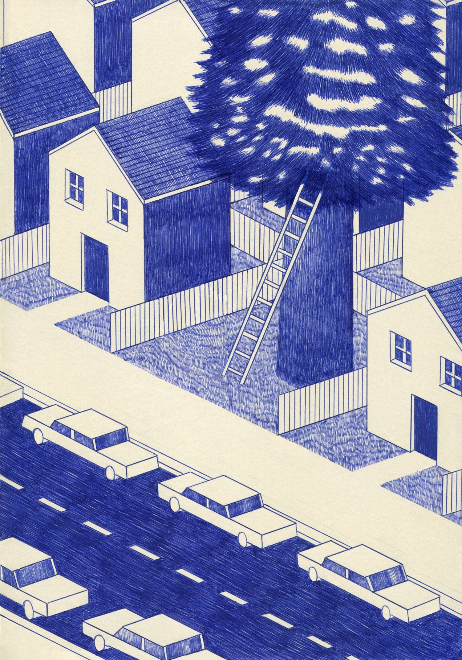
When I work on monochrome picture I tend to express an idea, a vision, a feeling with a very simple instrument – such as a biro pen. I focus mostly on shadow and light but also on geometrical structure.
Kevin Lucbert (UK)
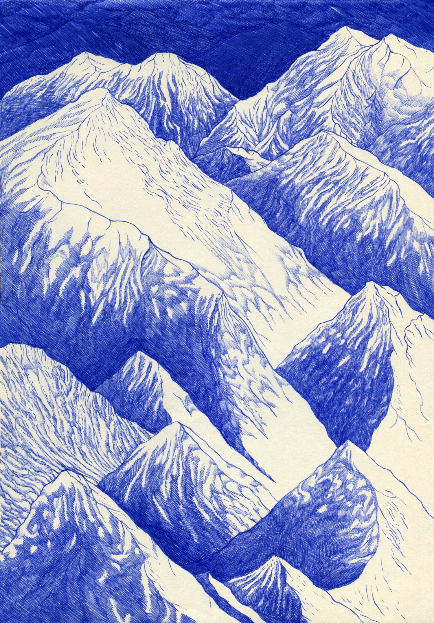
Like the “eau-forte” etching technique, there is always a possibility to go deeper into the depths of black (or blue) and white by adding and crossing more and more lines. Pressing on the pen also marks the paper with a small and interesting relief.
Kevin Lucbert (UK)
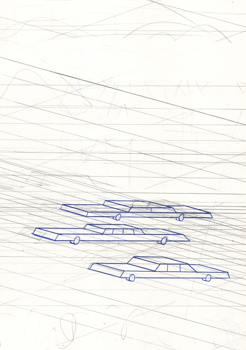
I sometimes use a ruler to make straight lines. During the sketch phase, I draw a light grid which I can erase afterwards. This keeps all of the elements within the same structure and proportions.
Kevin Lucbert (UK)
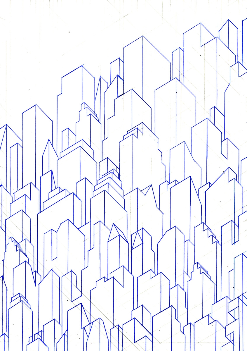
When I am satisfied with the sketch, I proceed to the inking phase.
Kevin Lucbert (UK)
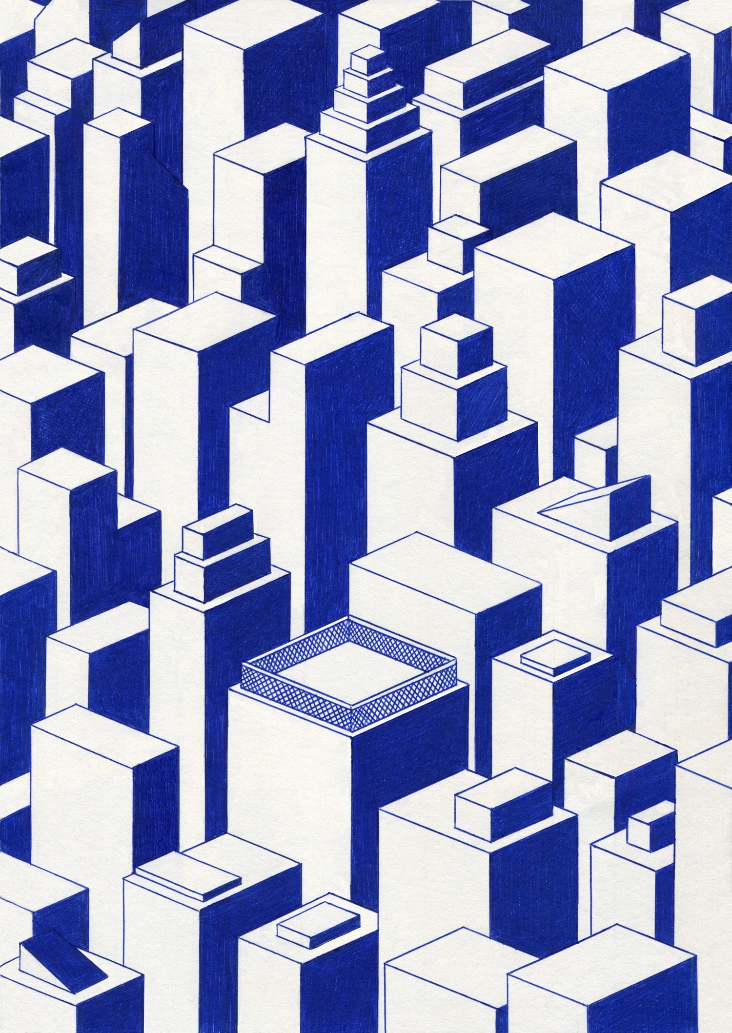
I like monochrome pictures because they evoke decorative and superficial elements – communicating the idea directly with great visual impact.
Kevin Lucbert (UK)
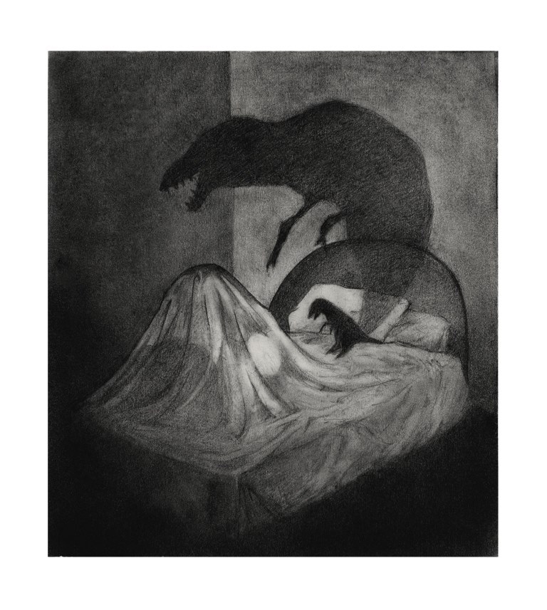
For me the story is everything. Black and white illustration seems to lend itself to capturing an idea in a stronger way to me. I like the atmosphere it creates. I want to make an image that people can draw themselves into. Drawing tools are important. I recommend investing in a good quality set of pencils and use everything from HB – 8B for a full range of effects.
Kris Jones (UK)
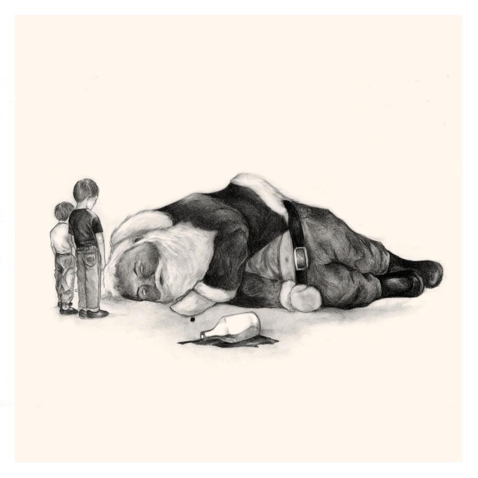
Laying down a sketch first really helps. I make several tiny thumbnail sketches in order to nail down the idea, and a rough composition. Once I’m happy I scale up the thumbnail and print it out then transfer the larger drawing to a bigger sheet of paper via a light box.
Kris Jones (UK)
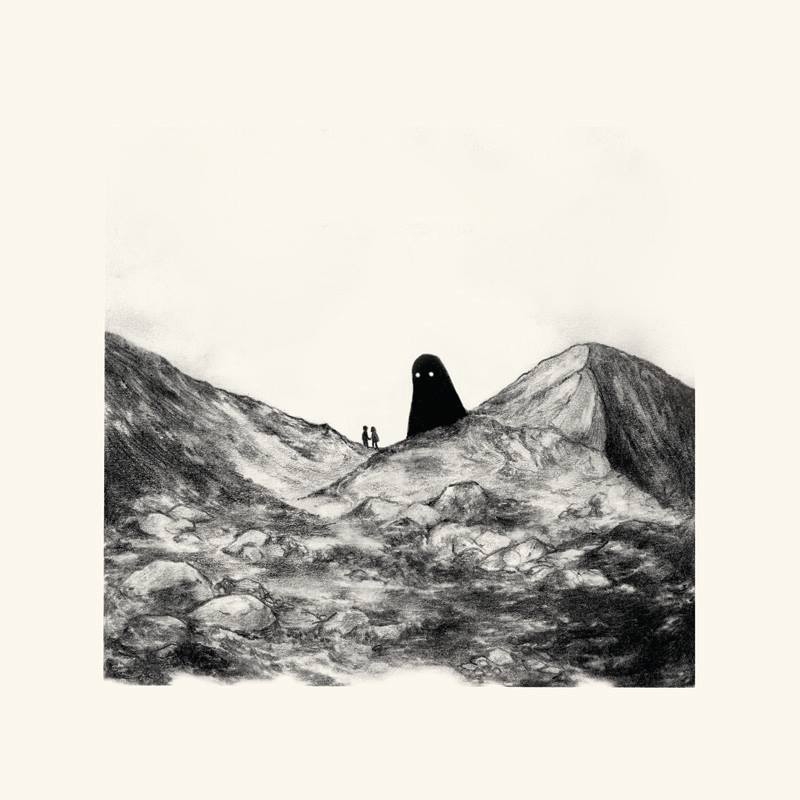
Then the very time consuming process of shading comes in. I add in my own light source and start with the darkest points first, adding shadows, and details as I go.
Kris Jones (UK)
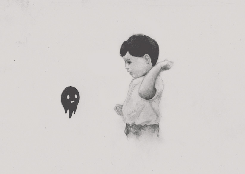
A light box is a great piece of kit. I also recommend using a putty eraser – and always rest your hand on tracing paper to avoid pencil smudges.
Kris Jones (UK)
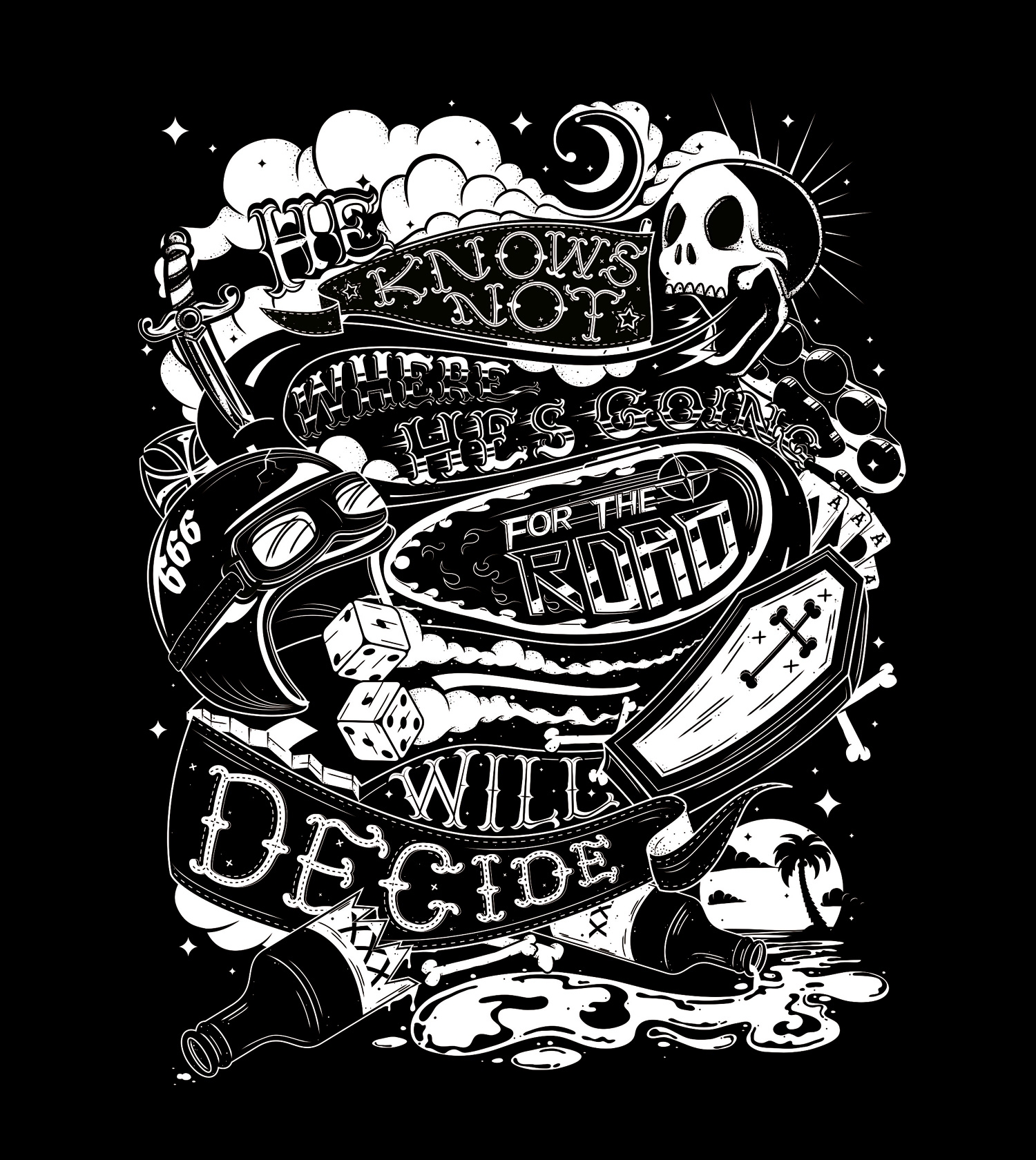
Creating work in only black and white can be a tough process. Colour can play such a strong role in conveying detail and emotion, so limiting the colour can make for quite an interesting challenge.

Playing around with the basics – like the colour of the background is a good place to start. An all-black background will give a very different feel to an all-white one for example, and can will also help determine things like lighting and shading later in your design.
Having a strong and defined outline to your shape/subject comes next. If it’s easily identifiable at its most basic stage then the rest of your job will be far easier.

Next, define your subject through lighting and shading, usually by starting with light line work, followed by large blocks of shadow to give depth and shape to your subject.
A lot of surfaces are not smooth and have rough parts which catch light or cast shadows, so adding in subtle textured shading, like stippling can really help to make a monochrome image pop and stand out.
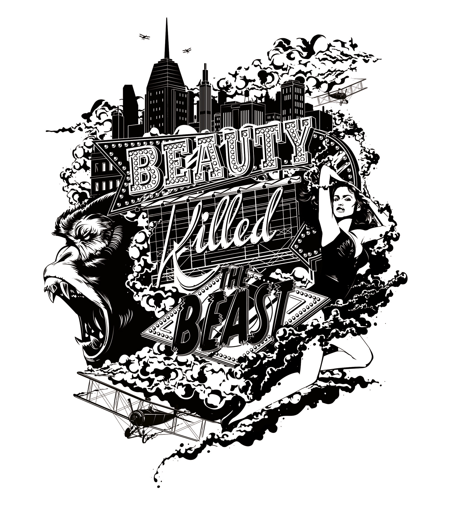
Practice this by spending time observing and looking at real world subject matter and how light and shadows interact with objects, and begin to make choices about which parts of the subject are most important to the viewer to identify it, and highlighting or shading them to allow them to stand out. Film noir or old black and white photographs can be a big help when trying to get dramatic and realistic reference for lighting.
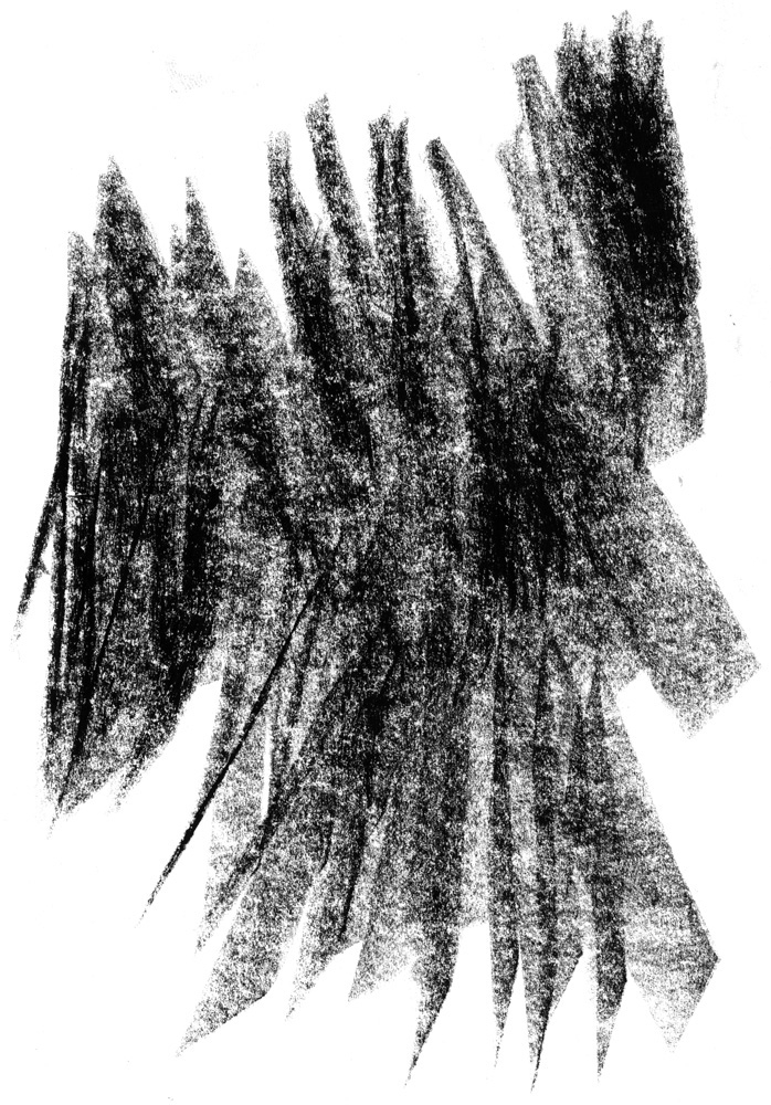
While my finished editorial work is primarily digital, many components are made by hand. It’s helpful to create a texture library containing an assortment of scanned textures and dry media marks to add handmade details to your digital design. Materials like charcoal or techniques such as dry brush or monotype are great ways of adding depth to monochromatic illustrations.
Sam Kalda (USA)
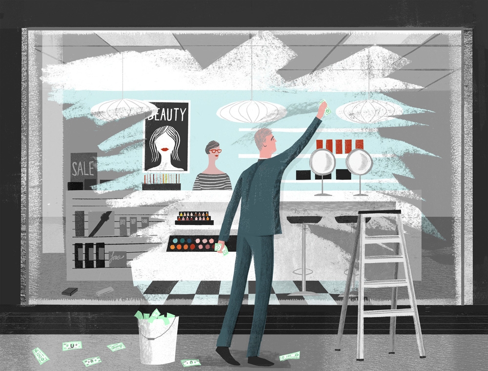
After you create your desired textures, I recommend using Photoshop blend modes like multiply and screen to integrate them into your composition. Remember to save old scans – you never know when you need a bold charcoal block or cloud-like ink smudge.
Sam Kalda (USA)
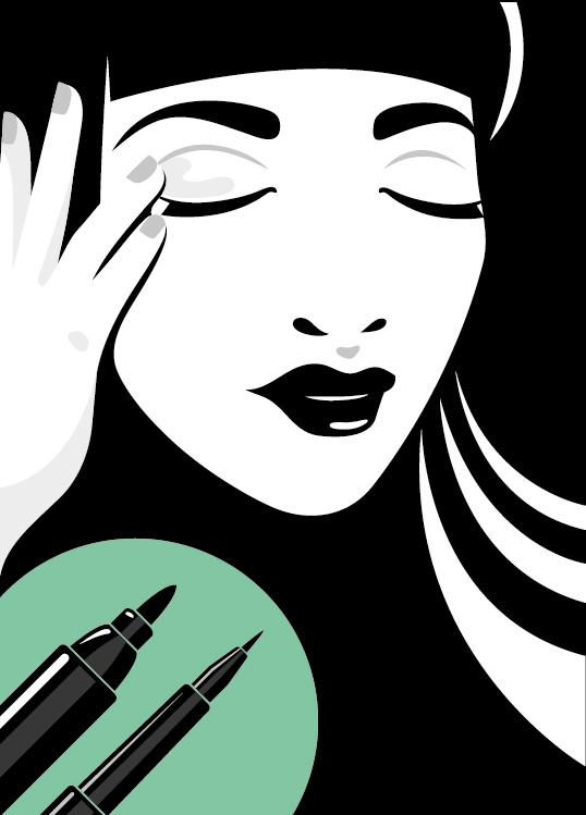
If you’re looking to make something simplistic them look at the shapes you have to work with – they set the precedent for the rest of the composition and then you can add little details to enhance and support the main graphic; it’s all about balance.
Sneaky Raccoon (UK)
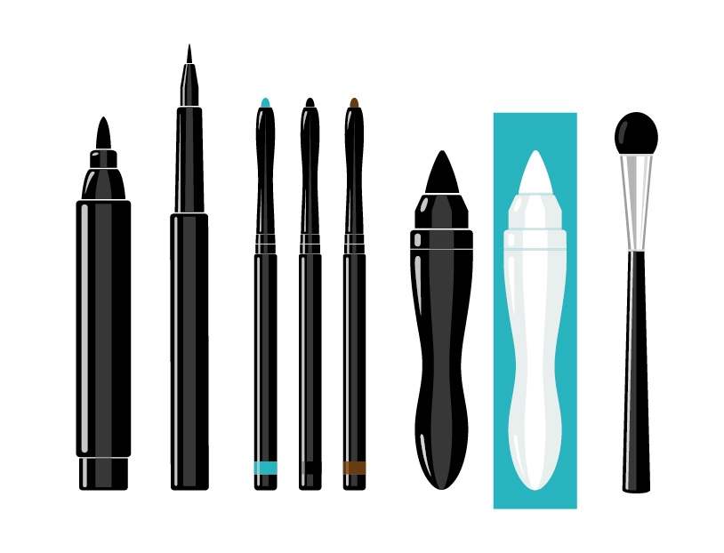
Depth, form and flow can be introduced by changing the weight of the drawn lines, adding bold areas of flat solid colour, by creating negative space between the relation of objects, as well as adding shadows through tints.
Sneaky Raccoon (UK)
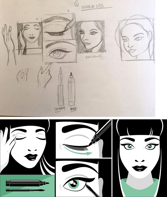
I recently designed some simple makeup tutorial graphics for The Body Shop (UK), with direction inspired by Japanese graphic novel panel layouts. The brief specified I work in black and white – with an accent colour to set each tutorial apart – to demonstrate their new range of eye makeup products.
Sneaky Raccoon (UK)
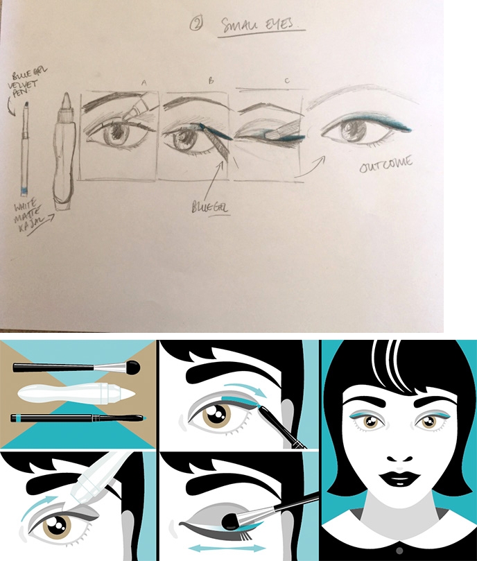
I used tints of black to create soft shadows, delicate gradients, used black boldly against the contrasting white in each panel.
Creating smooth drawn lines and bold vector shapes were key to making the graphics simple but effective. Simplifying everything into just black and white helps you communicate the basic composition of the overall illustration by simply being less complicated.
Sneaky Raccoon (UK)
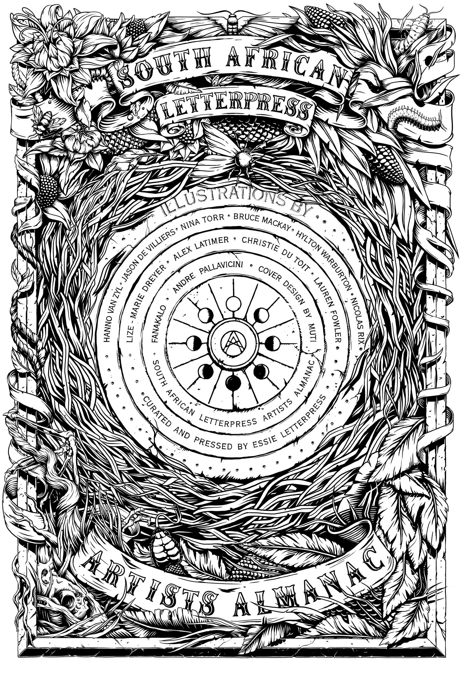
Working in monochrome means you can’t rely on colour to make the illustration a success. Spend time considering your composition and how elements sit together in the layout.
Studio MUTI (SA)
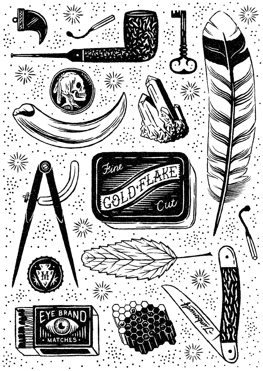
From a tonal perspective look at the juxtaposition of light and dark to ensure elements are not lost and the piece remains impactful.
Studio MUTI (SA)
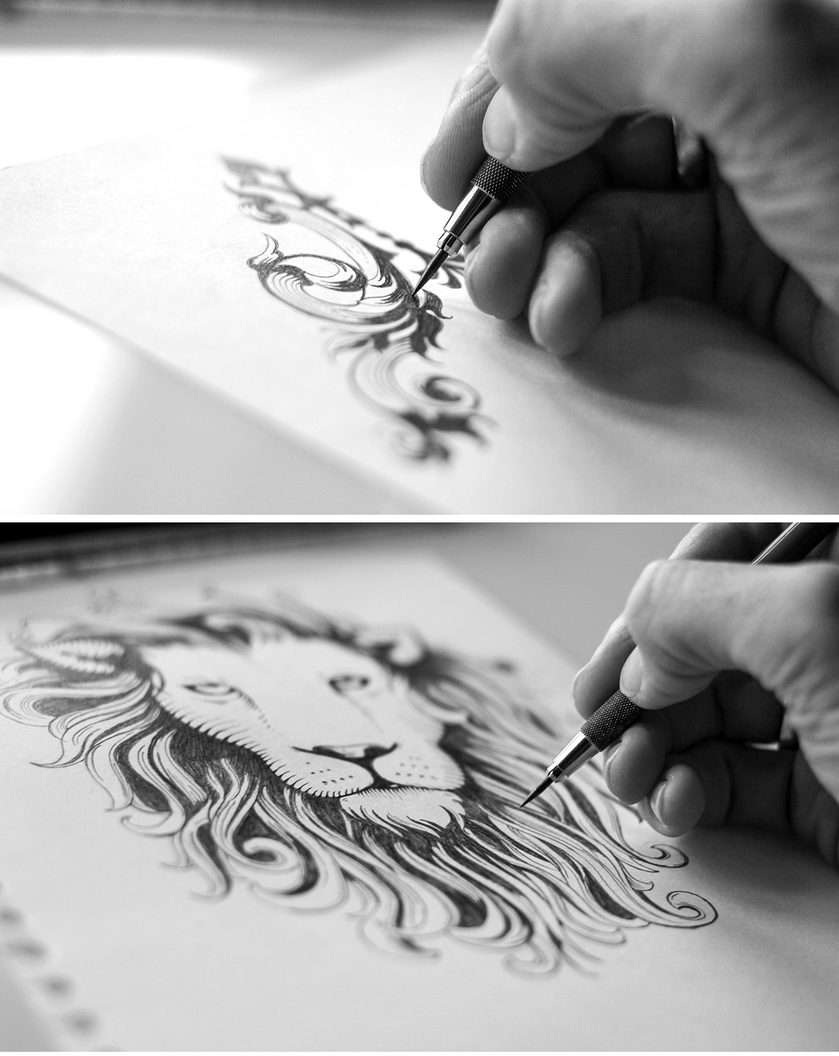
To create light and shadow in monochrome illustrations, my favourite technique is to use a traditional cross-hatching style. First, I determine where I’m going to place my lines by drawing my artwork by hand.
Tom Lane (UK)
I then scan my sketch into the computer and I vector the artwork using custom calligraphy brushes in Adobe Illustrator that has ‘Size’ set to the pressure sensitivity of my Wacom Tablet.
Tom Lane (UK)
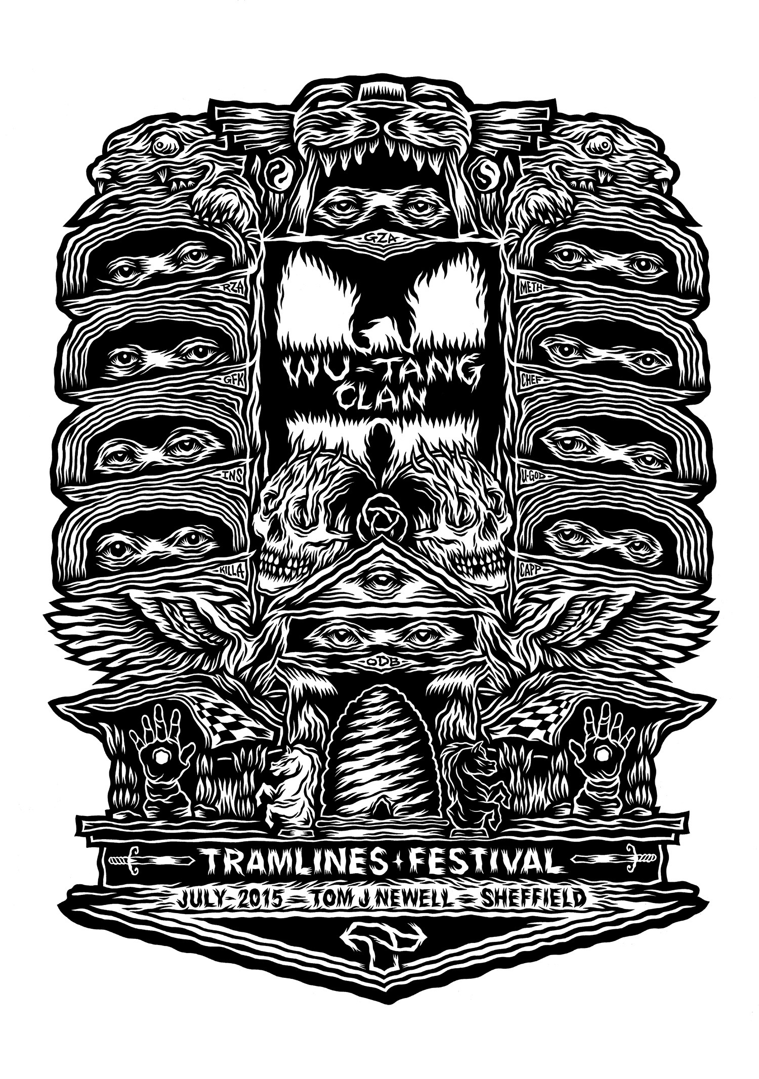
For me, the black and white is one of several pairs of opposing elements that I attempt to balance within a drawing. The relationship between curves and points, text and image, and light and dark subject matter are all things to consider within the monochromatic composition.
Tom J Newell (UK)
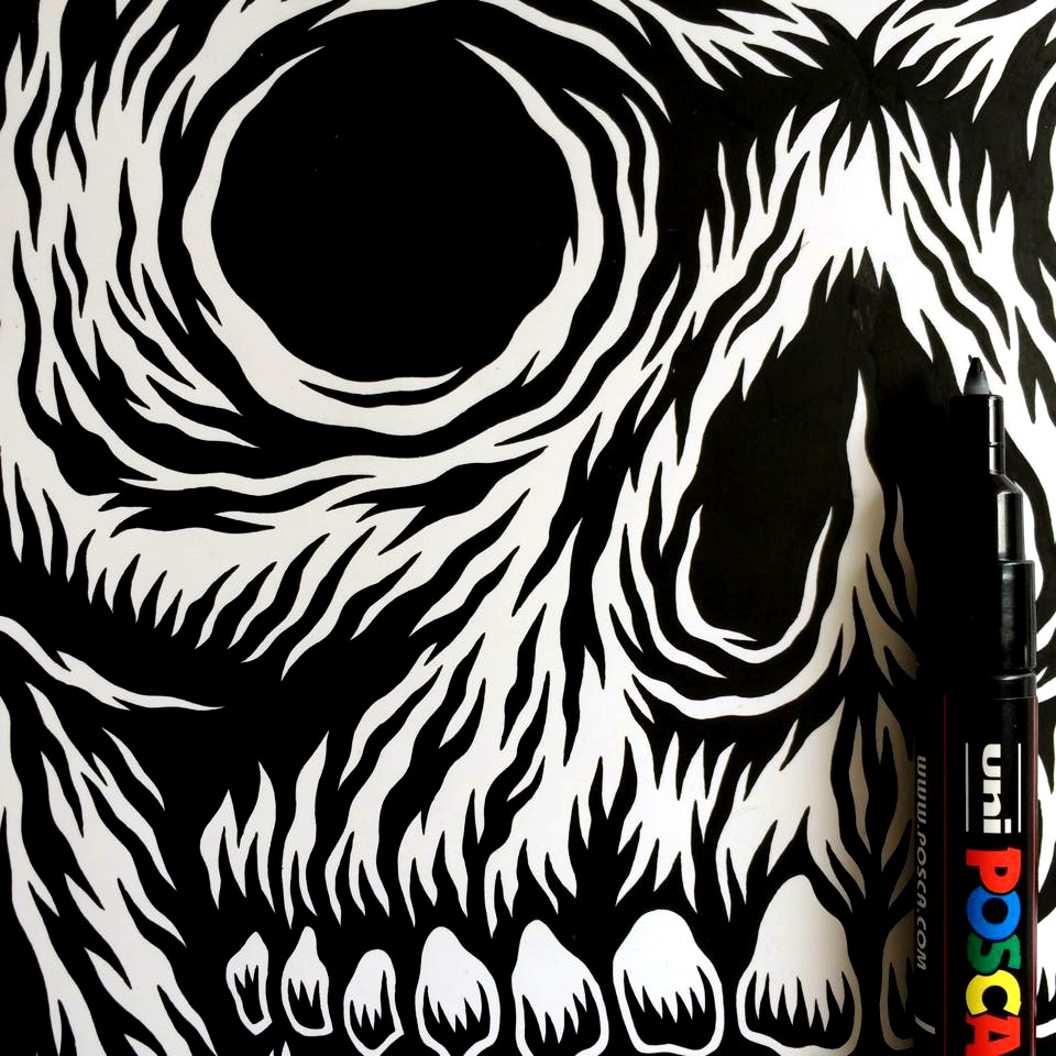
I try to work everything out on the page, with solid black inks on clean white paper. Mistakes are often adapted to become new directions, but it’s always useful to have correction fluid handy if a black line is completely misplaced.
Tom J Newell (UK)
https://mobile.digitalartsonline.co.uk/features/illustration/37-tips-for-creating-stunning-black-white-art/

