

“The backlash stems from this disconnect. The rebrand’s experimental typography and overly modernized leaper lack the timeless sophistication needed for such a leap. I’m all for change, but it should be rooted in the truth and personality of the brand.
“I would have leaned into Jaguar’s legacy, blending its classic design cues with understated touches to signify the future. Minimal yet meaningful updates could have highlighted Jaguar’s unique point of difference while maintaining its identity.
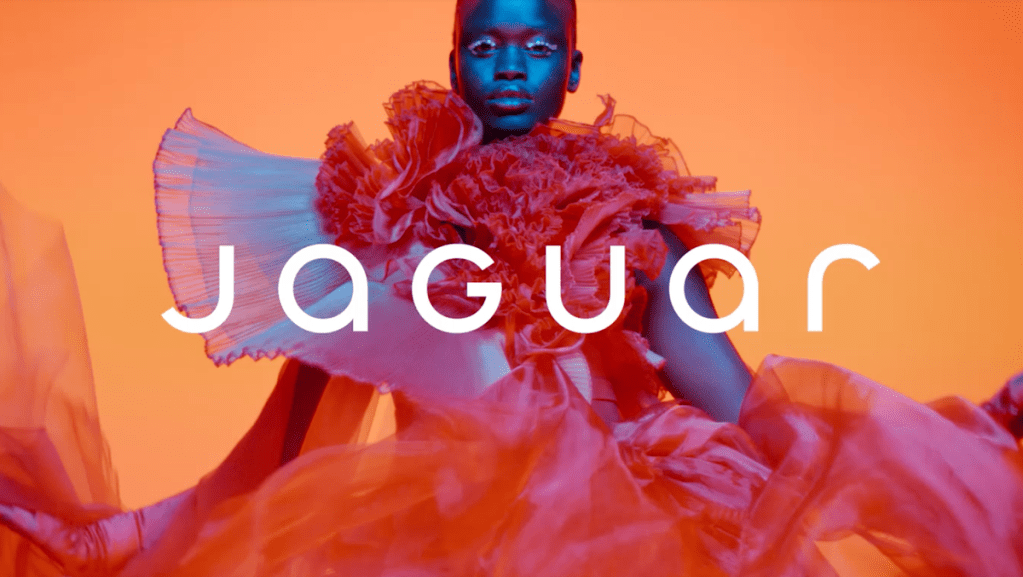
“The accompanying brand film underscores these issues. Its view of the future is more ’70s Star Trek than Jaguar—high camp and cliched. Much like the film, the campaign risks becoming a fleeting blip rather than a bold step forward. Jaguar could have embraced the future while remaining quintessentially itself, instead of heading into a galaxy of uncertainty.”
‘Heritage is a weapon, not a weakness’
Harry Sandhu, senior creative, JvM London
“Where did the teeth go?
“I’m against Jaguar’s new rebrand. Not because it’s minimalist, but because it’s soulless. My first reaction? A slow blink. For a brand built on thrill and elegance, this feels like a misfire.
“Jaguar has always been about feeling. The growl of an engine. The thrill of something unapologetic, something that didn’t just arrive, it demanded your attention. This rebrand doesn’t demand anything. It’s safe. And safe isn’t what Jaguar was made for.
“The backlash is obvious. Strip away the parts of a brand that make it human, and you leave people cold. Jaguar’s fallen into the ‘blanding’ trap, so polished it disappears. Compare this to Burberry’s branding under Daniel Lee. It reached back, dug into their roots, and brought the Equestrian Knight back to life. Burberry feels reborn, not rinsed. Jaguar could’ve done the same.
“If I were in the room, I’d have told them to stop trying to impress and start trying to connect. Heritage is a weapon, not a weakness. Imagine reworking that iconic leaping cat into something for the electric age, a symbol of movement, elegance, power. Keep the thrill, but evolve it.
“A rebrand isn’t just a logo; it’s an emotional statement. And this one feels like it’s been focus-grouped into oblivion. Jaguar didn’t need to be quieter. It needed to remind us why it mattered in the first place. Because right now, it’s not roaring. It’s barely breathing.”
On the fence…